This week was all about working out which view best showed my lobby space and then developing it. Initially I sketched the entrance as I really wanted to show this space with the feeling of isolation, but after careful consideration this didn’t really fit the brief of showing the most of the space so I decided to go for a different angle.
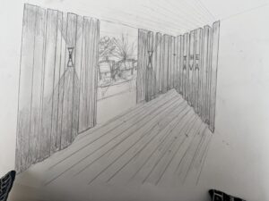
I chose this view because it is the mainmast inside the main entrance and also has views through to the lounge area at the rear/right side of the image. The next step was to start using the photoshop skills we had been taught to develop the image.

I began this process by adding concrete texture to the flooring and cutting it to fit the perspective. Next I added a stone texture to the rear wall, I changed the colours on this image to suit the overall look I wanted to go for which is highlighting the red areas within the space. I clipped the stone image that appears behind the glass and added it to a new layer before lowering the opacity to give the effect of it being behind the glass. I then added the castle in the side windows and rear windows which I changed to black and white to suit the style of my final image. I then faded them out to make it look a bit more natural and fitting.

The next step was adding the concrete texture to the celling, I tried extending this out of the image but it did not look right so I left it square on the edges. Then the sofa in the background was adujsted to give the look of being behind before adding the plants. I used a blending mode that helped the plants to look more like they were lit up. A slat texture was added to the reception desk and the colour and perspective changed. Computer screen added.

Next I changed the colour of the sofa, before adding a material texture over the top and applying this with a clipping mask, before adjusting the blending mode to create a warmer effect. Then I started playing with the lighting, after trying a warmer light I realised this didn’t work with the overall affect I was trying to create in this image so I changed it to a cooler light. This process was a bit of trial and error to get right and go through the steps correctly with outline the light with the polygon tool before applying the gradient tool then adjusting a blur over the top, applying a blending mode then adjusting the opacity to make the light look more natural and misty.
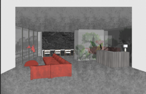
The image was starting to take shape but needs further development which I will work on this week and update in the next blog.