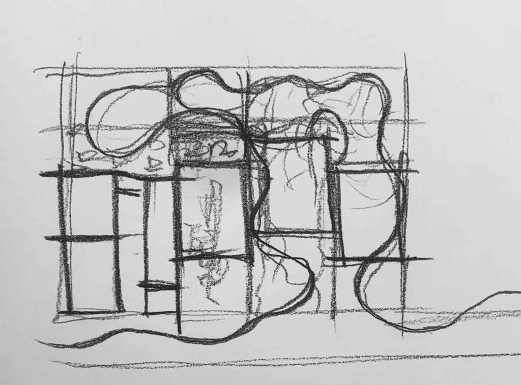
What about a gentle, childhood-liked indoor skatepark. Inspired by Alice Wonderland.

What about a gentle, childhood-liked indoor skatepark. Inspired by Alice Wonderland.
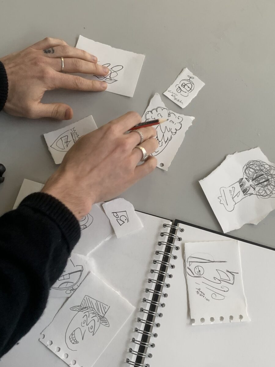
I have been documenting my inspirations in Word. Something new I realized. is that I am not very goo at managing things on the first try, I always doubt myself for managing my tasks. Also, I want things to look professional all the time. Therefore, a tiny change and unpredictable workflow would stress me out. So I waited till the last minute when I had all the information, I could then start organising. The problem is that I no longer remember explaining the information and the knowledge.
Things I need to work on are embracing change, don’t get trapped by a single mindset or ideas, trusting the process and starting arranging things from the beginning cause even if you have to redo everything again, a better-organized mess is still better than the mess mess.
We talked about the summative submission today. One thing I learned is that sometimes, we gotta learn to trust the process. I have done a lot of work (maybe not enough )but still, in the last semester. same with every year, I wold be doing work through out the semesters, however, Ill get rid of everything and start from scratch in the last minutes. Just s I can feel more in control and get things done all at once. However, it is very risk and not a very smart way of working. I will be practicing working towards my goal persistent in a long period of time, validate the work I did so I can feel motivated to keep going.
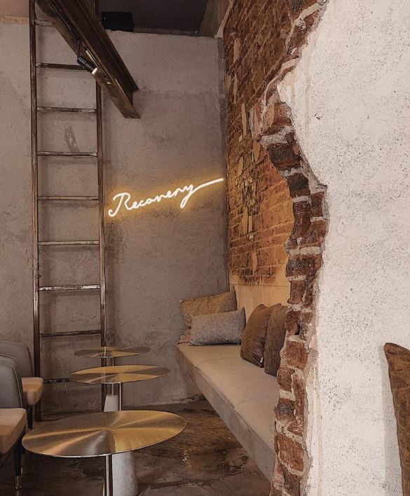
Amber has introduced one of their design project for Edinburgh Gin to us. They chose the D-listed arch building as the site for designing Edinburgh Gin Center.
She mentioned that when working with the arch building, they preserve and expose the brick to celebrate it. Adding new construction to the old building is challenging, but modern industrial design goes very well with the industrial arches. Ambe said that it is perfectly fine being in the new design to an old building instead of forcing the design to look “old”. The point of using the old building is to bring in new life and for the building to serve a new purpose.
After the tutorial with Amber, I am more sure of my design style and direction.
Their design decision reflects the brand ethos and establishes functional spaces and exciting interior aesthetics.


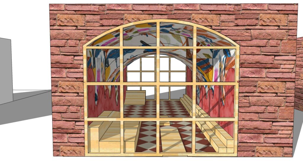
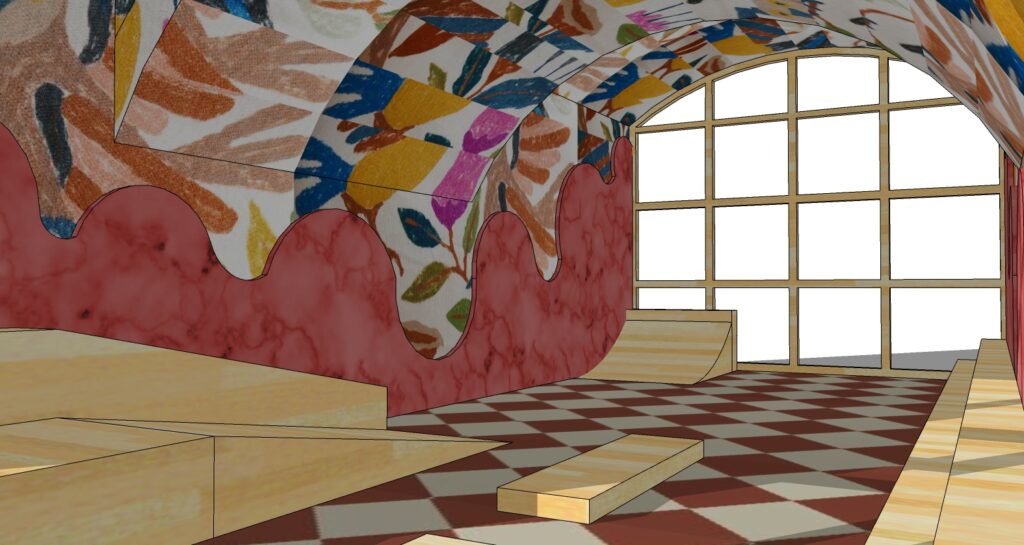
I aim to achieve an industrial ruin-style interior design.
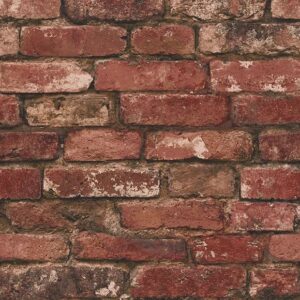
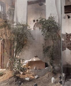
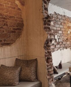
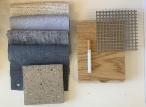
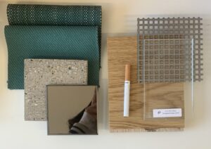
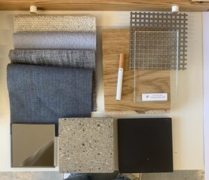
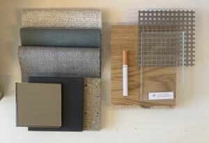
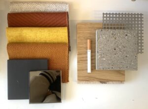
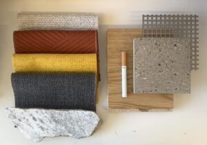
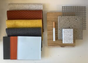
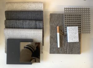
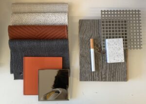
As for material choice, I want to expose the red stone brick walls of the building. To preserve the original structure and material of the building and also establish an interior industrial space, I explored various standard materials that go well with the red stone brick wall. I thought of using concrete for the bar area, non-reflective and adds an outdoor and industrial vibe to the space. Inspired by several ruins bars in Budapest. I also thought about painting part of the brick wall in a lighter color or white wall paint to cover up part of the brick wall to establish a “ruins” vibe.
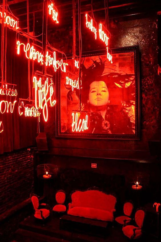
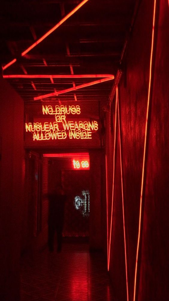
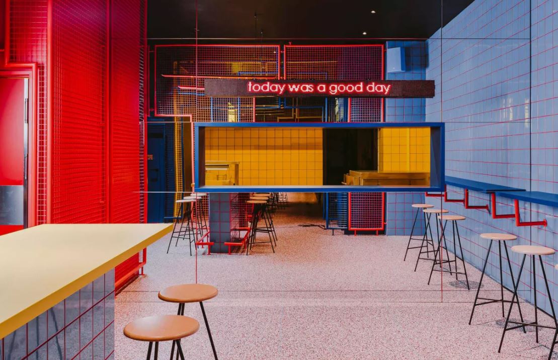
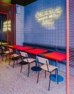
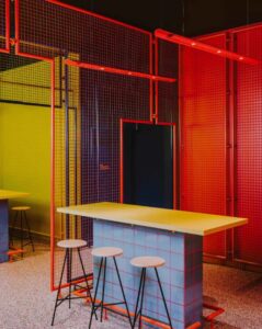
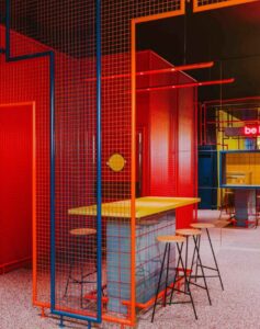
For color choice, I want to adapt furniture or metal structures with vibrant colors in the space to provide warmth to the interior space. I also consider using neon lights for signs and wayfinding systems.
I want to use primary colors, like red, yellow, and blue, as my primary color choice. I want to use retro color pallets that are less saturated and less bright for furniture. They can create an old and vintage feel to the space, which would be the perfect choice for the color of the furniture and structures. Using primary colors to contrast the earth, concrete tone-based building structures can add more vibrance to the space.


Studio BUCK designed the Wroclaw dinner in Polan with a rich look-book of 1970s Americana, particularly its moody Broadway set designs and street life.
Biggy’s psychedelic pop art flash is such a contrast to the medieval classicism of Rynek market square just outside. Steel mesh screens in shades of electric pink, red and blue demarcate zones, separating a sit-down section from counter seats lined with geometric tripod stools. – DAVEN WU (2022)
Adapting electric color for the interior structure can contrast with the original traditional railway arch building. Using color to separate the zone.
JiuJiu Cafe is an industrial ruin themes coffee shop. It is designed with exposed red brick walls, embossed wall paint, concrete flooring, a black steel frame, and a concrete installation wall. Designers use modern furniture design and choose warm colors for the furniture, wood color, and different scale of brown colors. They bring warmth to the space and unify with the overall industrial design. Address: No. C24, Jinying Road, Kaifu District, Changsha City

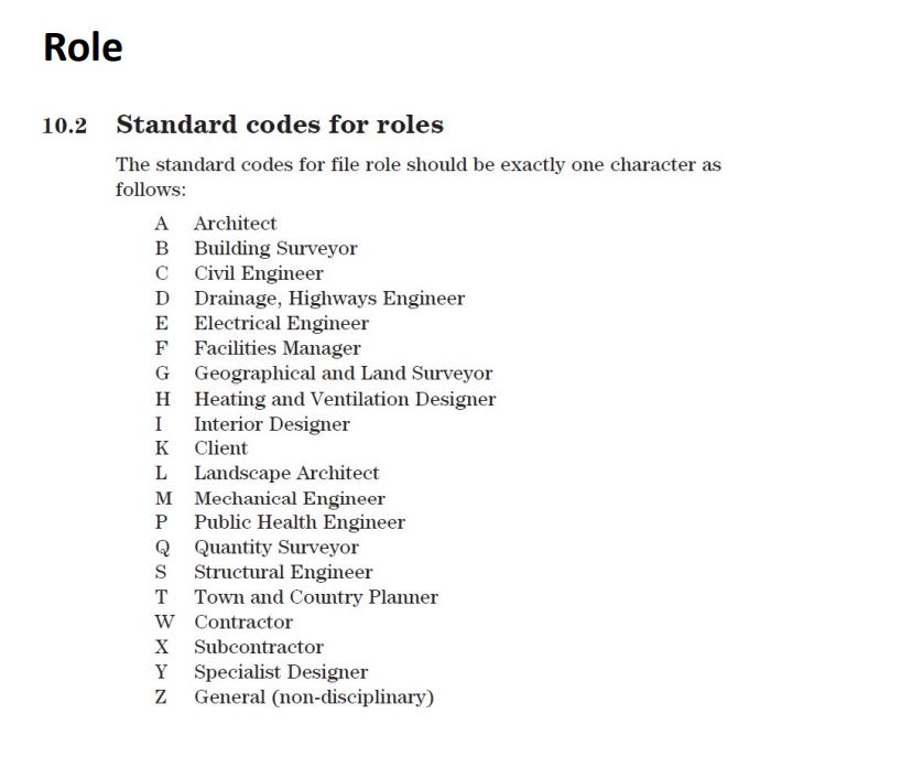
(Image from ArchDaily What is BIM and Why Does it Seem to be Fundamental in the Current Architectural Design? | ArchDaily )
BIM- Building Information Modeling
While CAD creates 2- or 3-dimensional drawings that don’t distinguish between their elements, BIM incorporates 4-D (time) and 5-D (costs). This allows users to manage information intelligently throughout the life cycle of a project, automating processes such as programming, conceptual design, detailed design, analysis, documentation, manufacturing, construction logistics, operation and maintenance, renovation and/or demolition. – José Tomás Franco
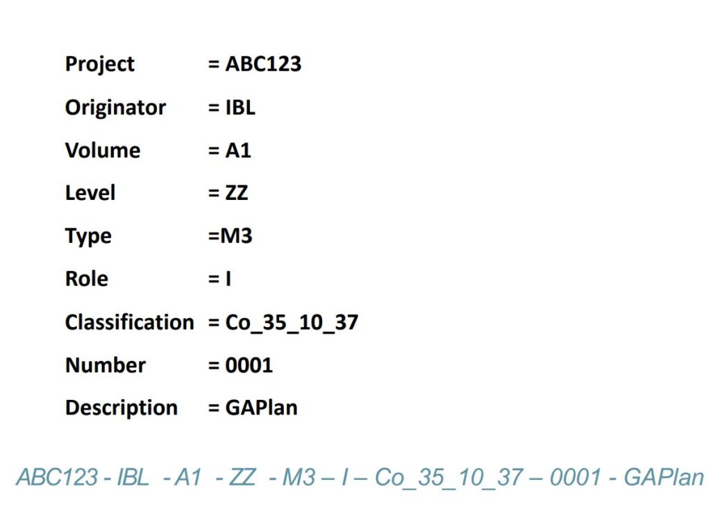
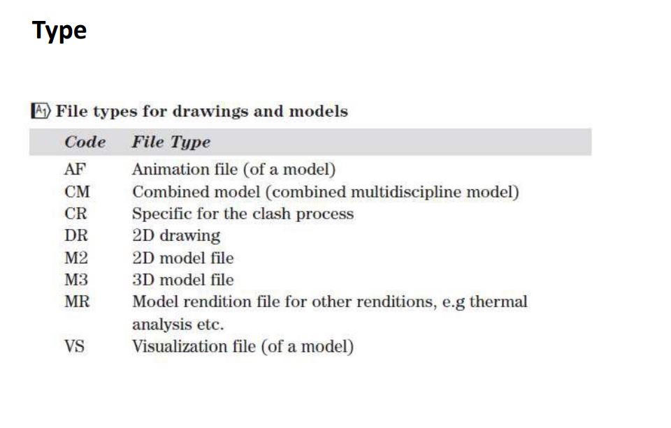
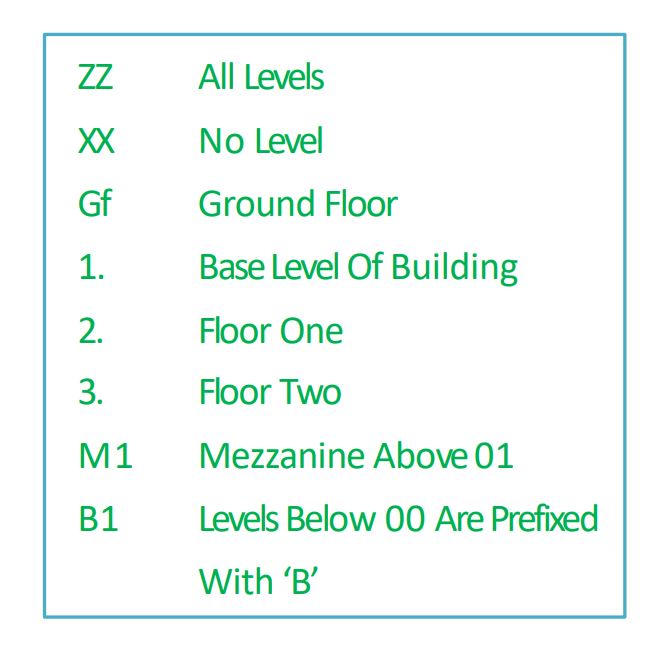
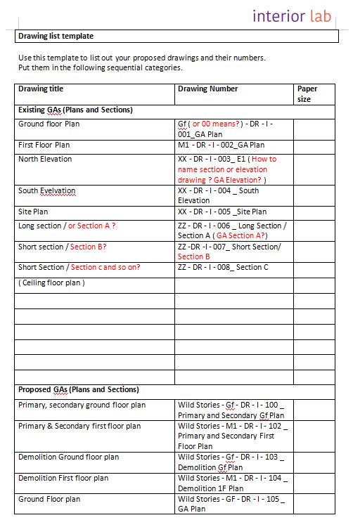
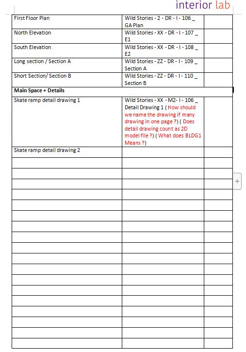
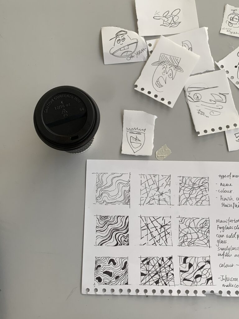
Here are the listed drawing I managed during the class. However, I still have many questions about naming the drawings.
Revision box example :
HOW TO READ STRUCTURAL DRAWINGS: A DEEP DIVE FROM A TO Z – Sheer Force Engineering
Detail for Plan drawing system:
Technical Drawing: Plans – First In Architecture
Technical drawing lable system :
Technical Drawing: Labelling and Annotation – First In Architecture
General layout fro detail and so on:
Technical Drawing: Layout – First In Architecture
( Image by Dream ai,Dream by WOMBO)
My project aims to create a comfortable and inclusive space for people. I have been working on design ideas that adapt to the original building. Red victorian stone gives off a warm industrial feeling. I won’t include that in my design instead of trying to cover it up. I used AI software to test a few ideas, brick walls with wooden floors, soft materials, metal structures, and graffiti. I want to create a warm, inclusive, and calming space for the users by using a different scale of white and brown colors calm color palette, to establish a warm interior space where people can feel at home.

( Image from Pinterest )
Second idea :
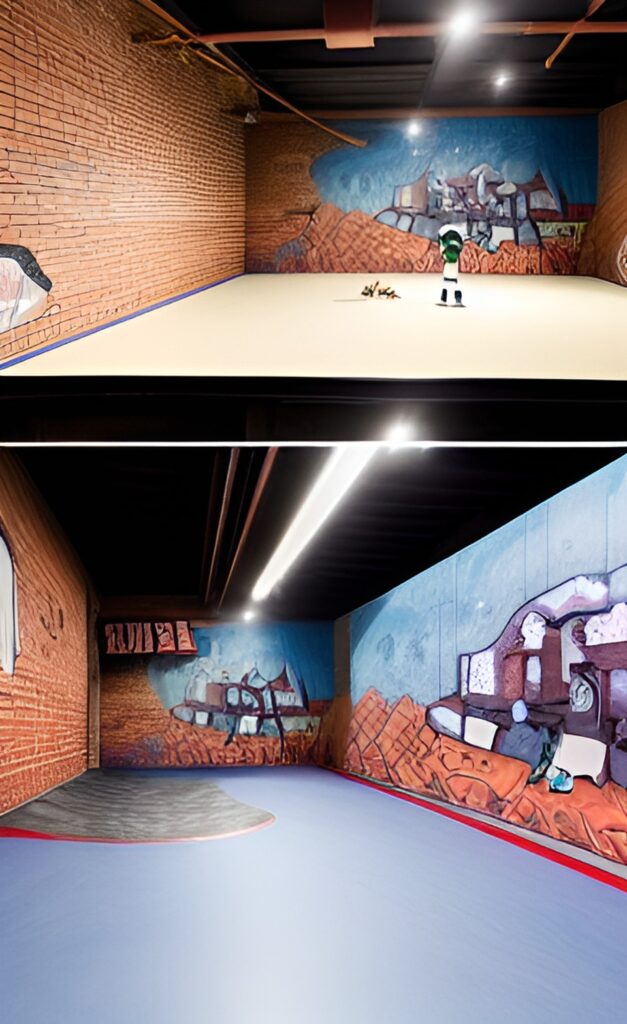
I am also considering painting the brick wall white and using comic graffiti murals on all the brick walls of the sports areas to connect them all. As if they are also part of the story as well. These walls can be used for local graffiti artists to present their work related to mental health problems. Image or text, tapestry. Words have the power to influence individuals; using words or text in the space, It can establish a sincere environment and direct people to open up to each other. Turn the surface of the building into exhibition walls.
( Image by Dream ai Dream by WOMBO)
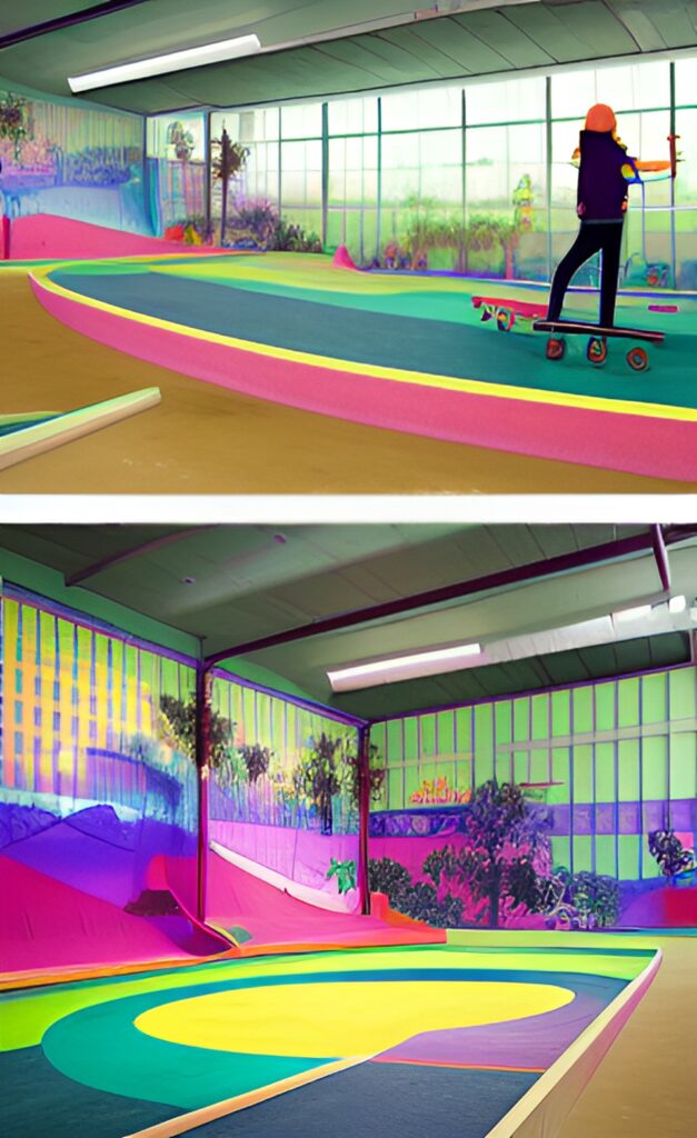
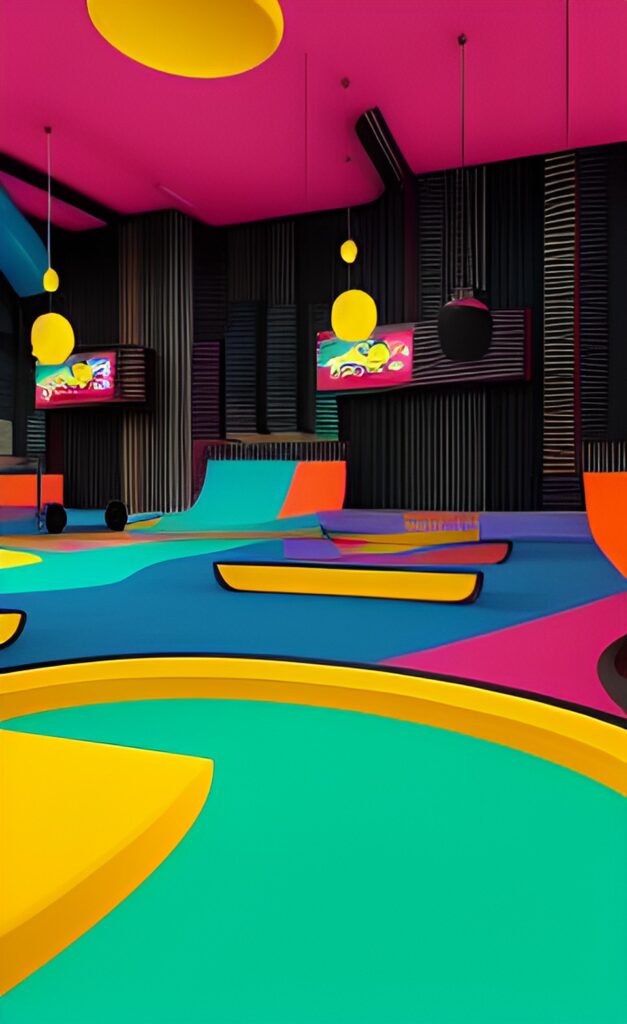
Then I consider using different color ramps and paints for the wall to create a more colorful and vibrant space. Using color can make the area less intimidating and encourage users’ engagement with the room.
Inspired by the skate park designed by Yinka llori, she applied her unique color design strategies to the skatepark. Bright colors with pastel hues add characters to the space and also convert the space into a more friendly, creative, and engaging space for beginners.
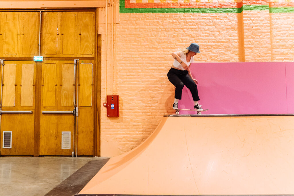
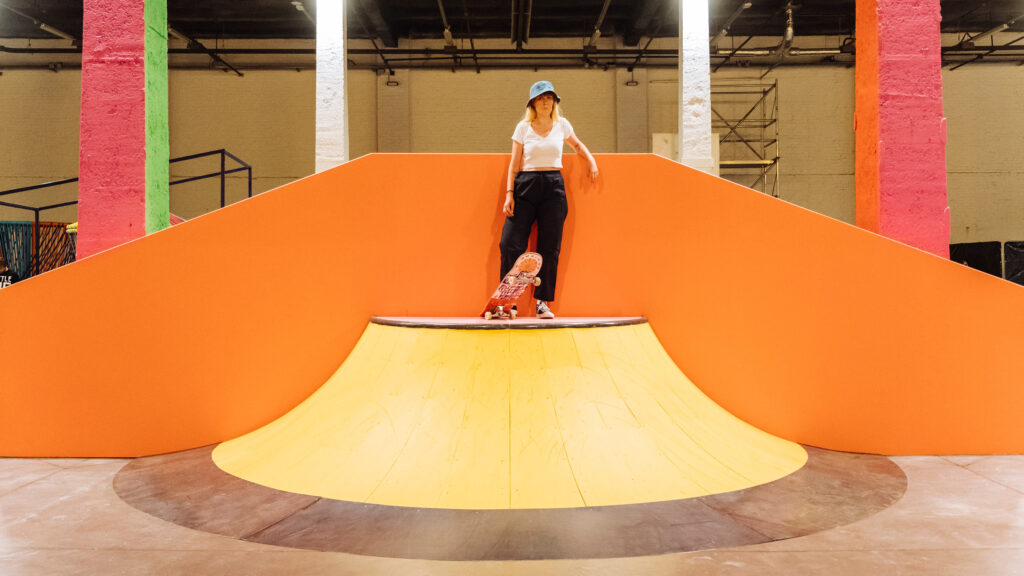
( image from Dezeen Magazine Yinka Ilori creates “joy and excitement” with colourful skate park in Lille (dezeen.com))
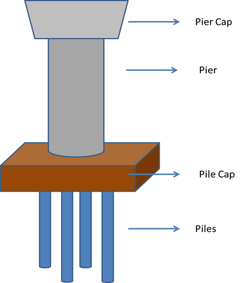
(Image from 8 Most Important Types of Foundation – Civil Engineering (civiltoday.com) )
“Pier is an underground structure that transmits a more massive load, which shallow foundations cannot carry. It is usually shallower than piles. The pier foundation is generally utilized in multi-story structures. Since the base region is determined by the plan strategy for the regular establishment, the single pier load test is wiped out. Along these lines, it is increasingly well-known under tight conditions.” — Sheikh Mahdi
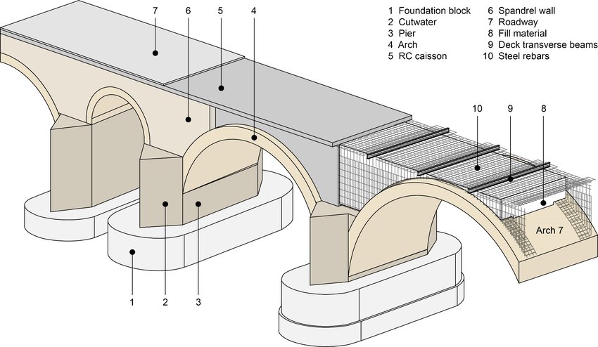
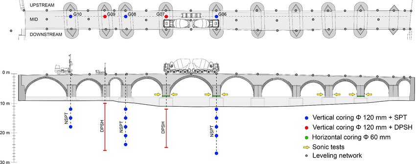
( Image from Identification of the modelled bridge parts | Download Scientific Diagram (researchgate.net))
Most of the pier construction involves foundation establishment. For my building, I assume each pier has an underground foundation. Thus, when it comes to designing a skateboard bowl skating area, I have to consider that. Either I can build the skate bowl structure with plywood and beams, or I can dig down from the ground floor level and use metal frames and concrete. However, considering the foundation structure, making a wooden skate bowl would be a better idea; it does not effect the foundation system of the orgional building.
( Image from Learning from Isolated Territories. :: Future Architecture (futurearchitectureplatform.org))
The image demonstrates the underground foundation structure of a pier.
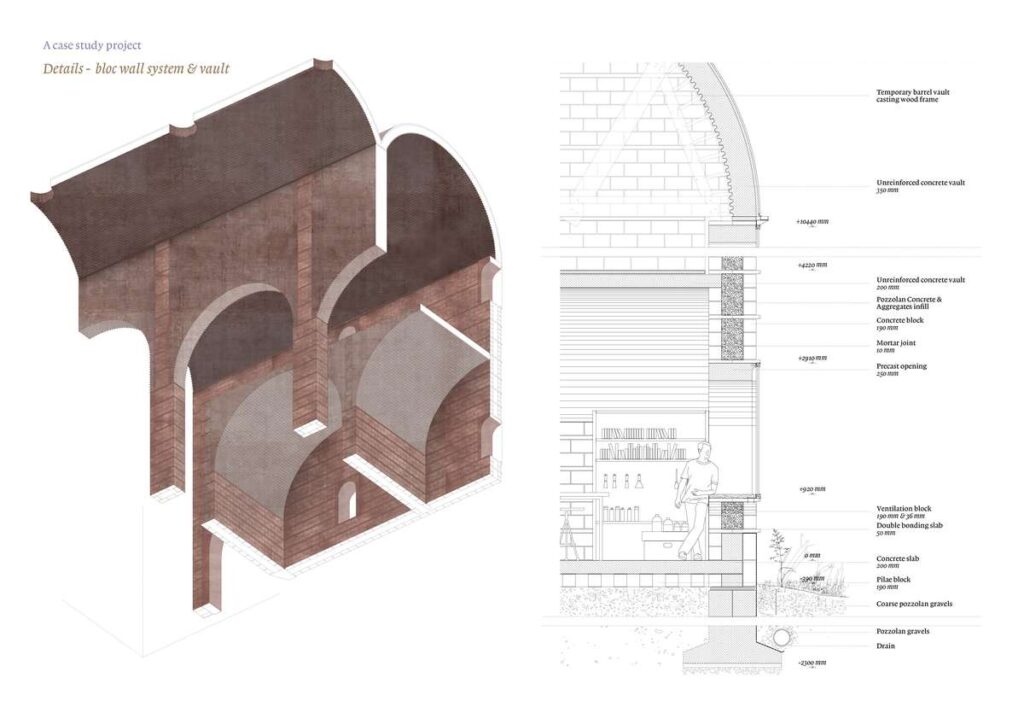
( Image from Pinterest) Demonstrates the overall material and structure of a masonry railway arch construction
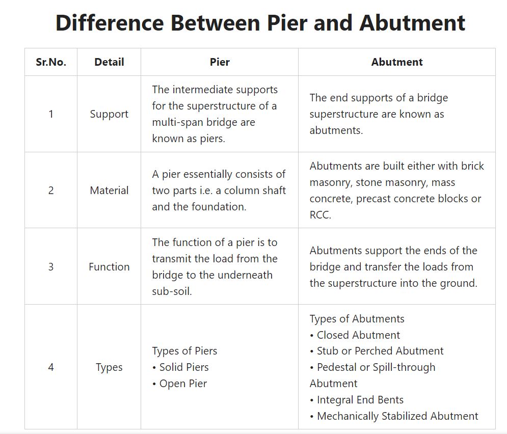
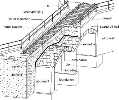
Image from ( Difference Between Pier and Abutment | What Is Pier | What Is Abutment – Civil Scoops )
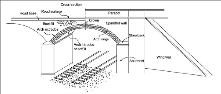
Railway Structures :
(Bridge 242 Tonbridge, photographed on 18th August 2007. photograph by Gregory Beecroft)
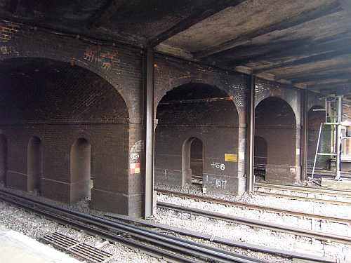
This image demonstrates the possibility of breaking walls to establish a connection between railway arches.
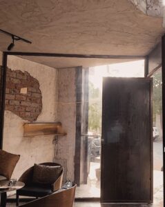
( Photograph of the site, arch structure)
(Photograph by Gregory Beecroft)
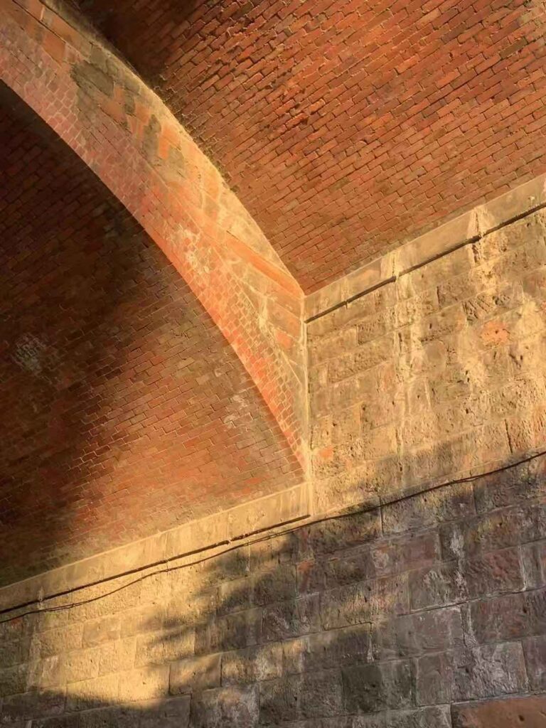
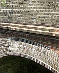
The surface brick cladding of the arch ceiling and lower arch ceiling
Soffit: The curved lower surface of an arch
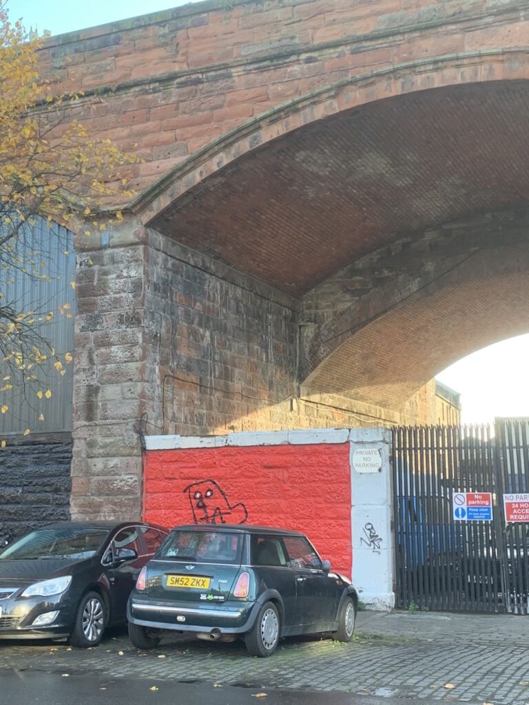
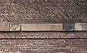
“string courses are horizontal band features on a building and are an aesthetic device that occurs in virtually every style of Western architecture, from classical Roman through Anglo-Saxon and Renaissance to modern. A great way to break up monotonous brickwork, they can be designed to be either flush within the wall or to project slightly. However you choose to incorporate it, a string course is a great contrasting element for any architectural design.”
Railway Structures (sremg.org.uk)
(Cast Stone Façade Stonework | Haddonstone GB)
(Photograph by Gregory Beecroft)
Impost: A horizontal, projecting band of brick or stone immediately below the springing point of an arch.
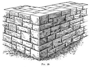
Ashlar Facing masonry:
This type of ashlar masonry is used to give the building an exposed and pleasing aesthetics, and the faces of exposed stones are chamfered and rough-tooled.
This is the finest type of ashlar stone masonry. The stones’ beds, joints, and faces are chisel-dressed to remove all unevenness and obtain perfectly horizontal and vertical joints. The mortar joints are so thin that they are barely exposed, which gives this type of masonry a very close and packed finish.
(Ashlar Masonry – its 6 [Types and Advantages] (civilclick.com) )
Bridge construction:
Bridge Types – Historic Bridge Foundation
Pier Construction :
8 Most Important Types of Foundation – Civil Engineering (civiltoday.com)
Pier and Abutment:
Difference Between Pier and Abutment | What Is Pier | What Is Abutment – Civil Scoops
Viaduct construction:
Railway Structure :
Railway Structures (sremg.org.uk)
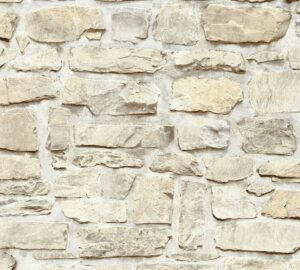
Stone material and construction:
Cast Stone Façade Stonework | Haddonstone GB
Ashler Masonry:
Ashlar Masonry – its 6 [Types and Advantages] (civilclick.com)
Stone Masonry: Everything You Want to Know About (renovationsroofing.com)
Powered by WordPress & Theme by Anders Norén