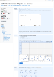
I’m working on a paper just now about my online course, Fundamentals of Algebra and Calculus. I’d like to include a high quality screenshot to show what the online course materials look like, and have finally found “one weird trick” that makes it easy!
I learned about this from a bit of googling, which led to this guide to producing a screenshot as a SVG (scalable vector graphic).
Based on that, here’s an easy way to take a screenshot as a PDF:
- Using Chrome, on the page you want to screenshot, open the developer tools (e.g. by right clicking the page and choosing “Inspect”)
- Click on the “…” menu at the top right of the developer tools window, then choose “More tools” > “Rendering”. This should open a new pane with various options.
- Set “Emulate CSS media” to screen
- Now when you go to print the page in Chrome, and choose “Save as PDF” for the printer, you will get the webpage as it looks normally, rather than the special printer-friendly style.
For the page I was saving, I found that setting the paper size to A2 gave good results. I also set Margins to “Custom” and made the page slightly narrower. I think you just need to play around with the page size, scaling and margins until you are happy.
I also used the developer tools window to tidy up the page a little, e.g. deleting some irrelevant navigation boxes, and instructor-only tools.
Et voila!

Screenshot_Polynomials-3-2-3_sketching-cubics


Hi, George, thank you very much for this tip. This will save me some time and especially nerves. So far, I’ve used the good old way of first uploading a screenshot to some software (eg Irfan view) and then saving it as a PDF. The problem with such a solution is that it will never take a screenshot of the entire web page if it is longer.
Out of curiosity (since I don’t use chrome) I tried to do it in a Microsoft Edge browser and the process is exactly the same and works! well thank you
Alan
To make the STACK quiz review page appear nicer in the printout, you can add the following CSS styles to suppress some bits of the navigation etc:
nav.fixed-top, #goto-top-link, footer {

    display: none;

}

div.formulation, div.outcome {

    break-inside: avoid!important;

}

table.quizreviewsummary {

    display:none;

}

div.columnleft section {

    visibility:hidden;

}

#mod_quiz_navblock {

    visibility:visible;

}

.questiontestslink {

    display: none;

}