
by Liz Stanley
https://www.visualcapitalist.com/history-of-pandemics-deadliest/
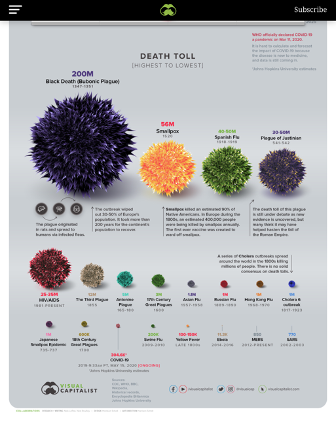
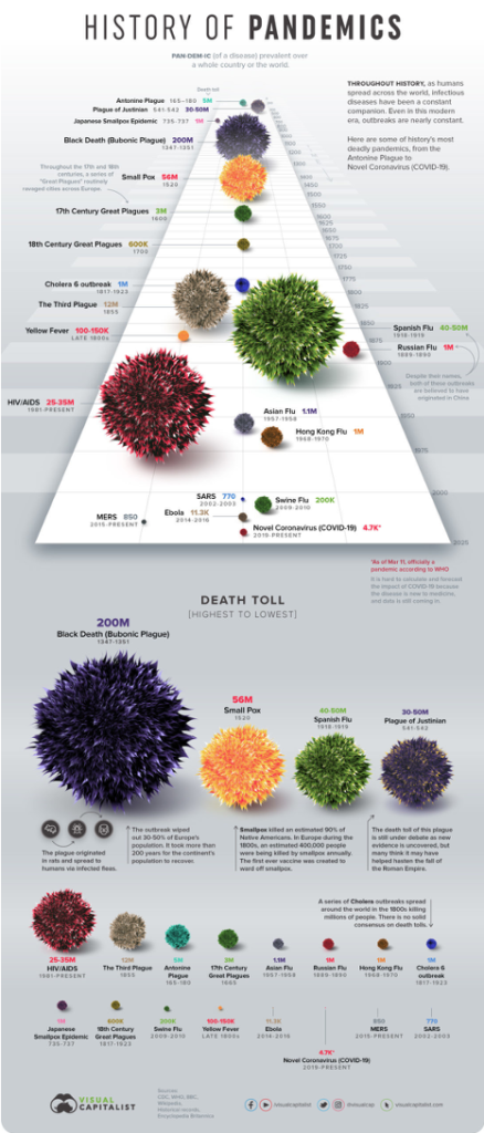
An interesting visual depiction of pandemics in past times appeared on internet sites a while ago, with these placed in an order of how the most to the least lethal has been gauged. It uses a fuzzy ball shape for each, seemingly based on Covid-19 images. It originates with an internet body called VisualCapitalist.com. It shows a rogues gallery, with each pandemic fuzzy ball standing for much pain and suffering, millions of deaths, enormous grief, and profound changes in the social, economic and political order.
The website is published by an editorial team at VisualCapitalist.com under the caption of Covid-19 and provides some connected visuals and text on ‘the facts’ for the various pandemics featured. Its ranking of pandemic morbidities from the Black Death (most morbidity) through to SARS (least morbidity) rests on sources which the text and footnotes acknowledge are sometimes less than fully reliable.
https://www.visualcapitalist.com/history-of-pandemics-deadliest/
For instance, what it calls ‘Spanish Flu‘ is not usually called this now and wasn’t generally called this at the time. Spain was neutral during World War I and had wider reporting of non-war items than combatant countries, and its King had had the influenza; and the 1918 to 1920 pandemic was given many names, at different times and in different places. Also the figure of 200 million deaths in this pandemic is a guesstimate on a range which other sources indicate as starting with something much less than this and ending with something rather more.
The VisualCapitalist.com website provides some helpful information about its graphics and data and its mission concern with media changes and the role of data in this. It is an organisation with a mission, and its account of this is interesting.
https://www.visualcapitalist.com/
However and in spite of its footnotes and brief cautionary comments, its view of ‘the facts’ of pandemics in past times and the data used still has to be taken on trust.
So what do these images add up to? They are posters, with the advantages and disadvantages of such. They are striking in having a colourful and visually striking clarity in conveying information. The ‘history of pandemics‘ information is laid out in bite-size chunks on them with one pandemic following another in morbidity order, and in fact covering a vast time-period although this is difficult to discern without scrutiny of the small font captions beneath each pandemic image. And the ubiquity of this fuzzy ball image does a lot of work, for as well as being striking it coveys, perhaps without really meaning to, that these pandemic are linked and take the same visual ‘viral’ form as Covid-19.
One thought on “Pandemics in past times – a rogues gallery”