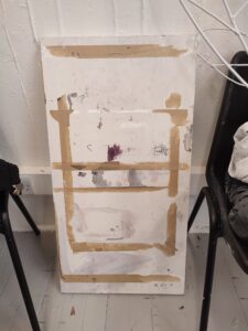
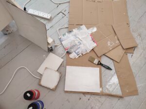
Our second project for Art in Practice 1 asked us to create a minimum of five supports for painting using our own choice of materials and subject. We were encouraged to recycle our creations from project 1 to experiment with new and non-white/typical surfaces, as well as to use unfamiliar processes in order to expand our creative limits. I visited the Free-use Hub to find materials which I could use to paint on other than a standard canvas, including: cardboard, wood, MDF, papers and a board from flatpack furniture with various marks and tape on. I began by coating some of these materials with gesso primer to prepare for oil painting.
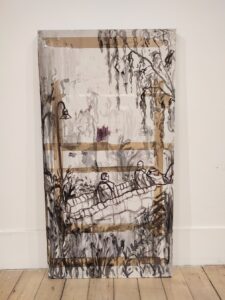
Before I decided on what I intended to communicate through this painting project, I experimented with new ways of painting. I was confronted with the long piece of wood, marked with various materials in shades of grey and purple. During my visit to the Royal Botanical Gardens the day before, I had taken a photograph of the bridge and its surrounding foliage, which I decided to depict in a much more loose and abstracted style using heavily thinned oil paint in purple-tinted black (inspired by the watermark textures which were already on the wood).
After some reflection on the brief and what I want my art to communicate, I decided to produce paintings based on both familiar and unfamiliar things, including imagery from my home and objects/scenes which I have photographed during my first month in Edinburgh- a very new and unfamiliar place. This is underpinned by the idea of defamiliarization, which is defined as a technique in which common things are presented in an unfamiliar way to show a new perspective. To respond to this, I experimented with colour, texture and cropping photographs I had taken to focus on a specific detail or action rather than painting the whole scene, thus forcing viewers to actively decipher the painting and conduct their own narratives. I named the collection of paintings, ‘Look Closely’ to convey these ideas and encourage audiences to actively look at them.
Through the paintings, my audience gain an insight into how I- as the artist- see the world, fixating and finding fascination in the small details of overlooked things such as facial features, textures and everyday/mundane actions. Similarly, the paintings reflect snapshot memories which are both highly personal yet universal; the figures are anonymous and simply depict the life of the average working class Brit, making them unglorified and relatable.
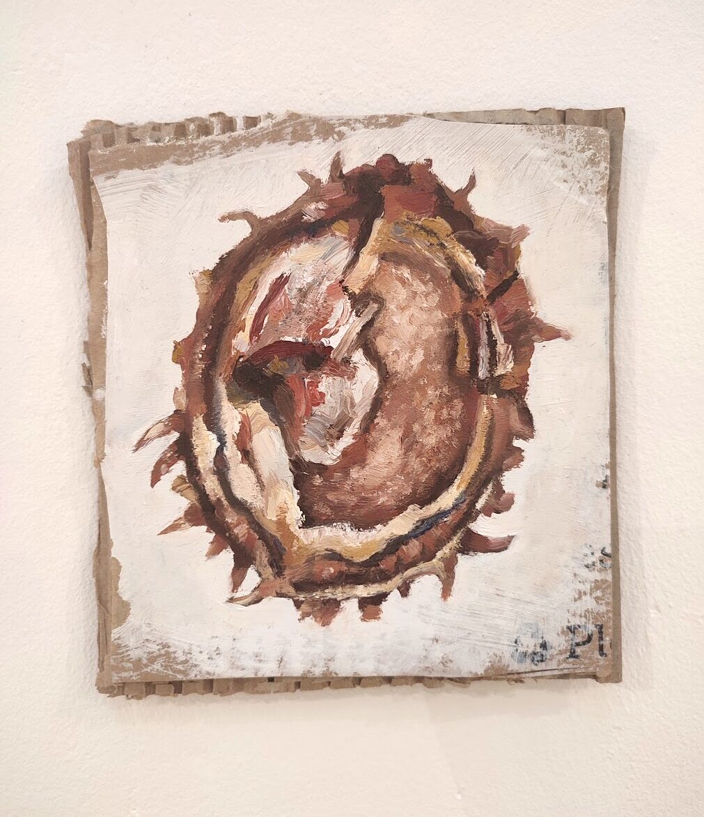
The first painting I produced on this theme was an oil painting of a conker which I had found on the ground; I was captivated by the colours, textures and shapes, which I painted in a gestural, slightly abstracted style. To maintain the natural effect, I left some of the cardboard surface exposed and used a craft knife to reveal the corrugated texture.
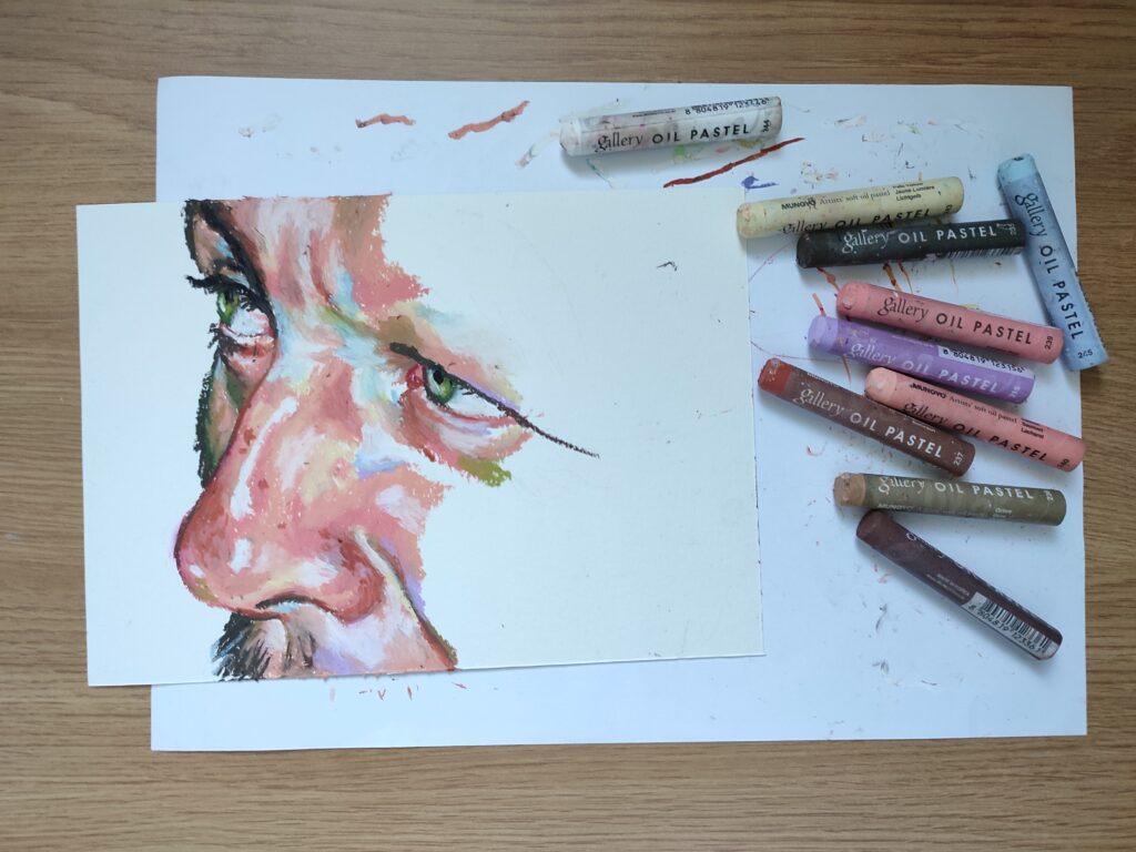
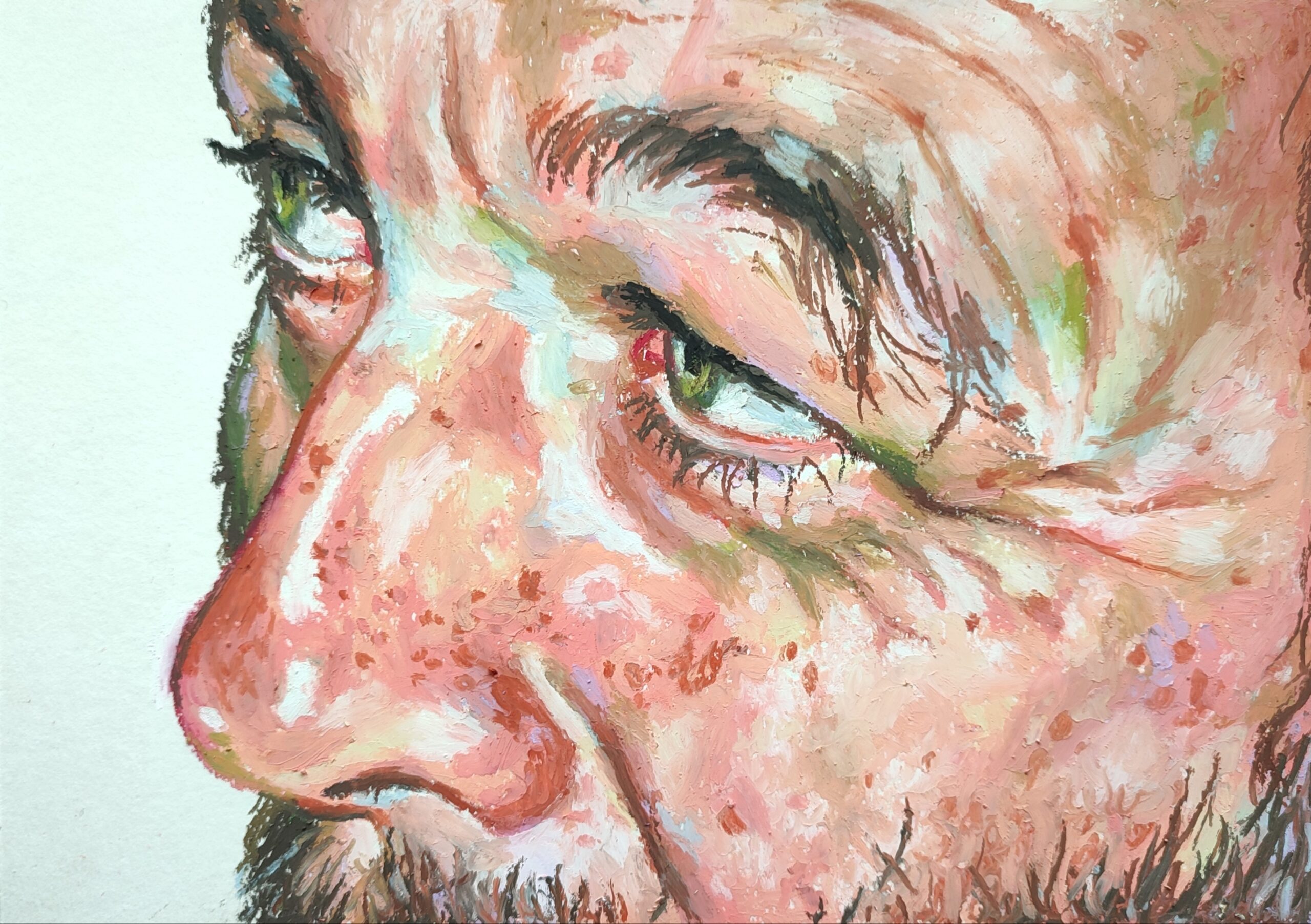
For my second artwork, I explored oil pastels as a new painting medium, which I applied in the same manner that I would use oil paint. Here I experimented with saturation and colour; I observed my reference closely to pick out subtle colours within the flesh which I exaggerated to produce a more visually intriguing piece of art, linking to this idea of intense observation of flesh.
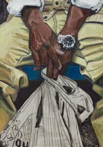
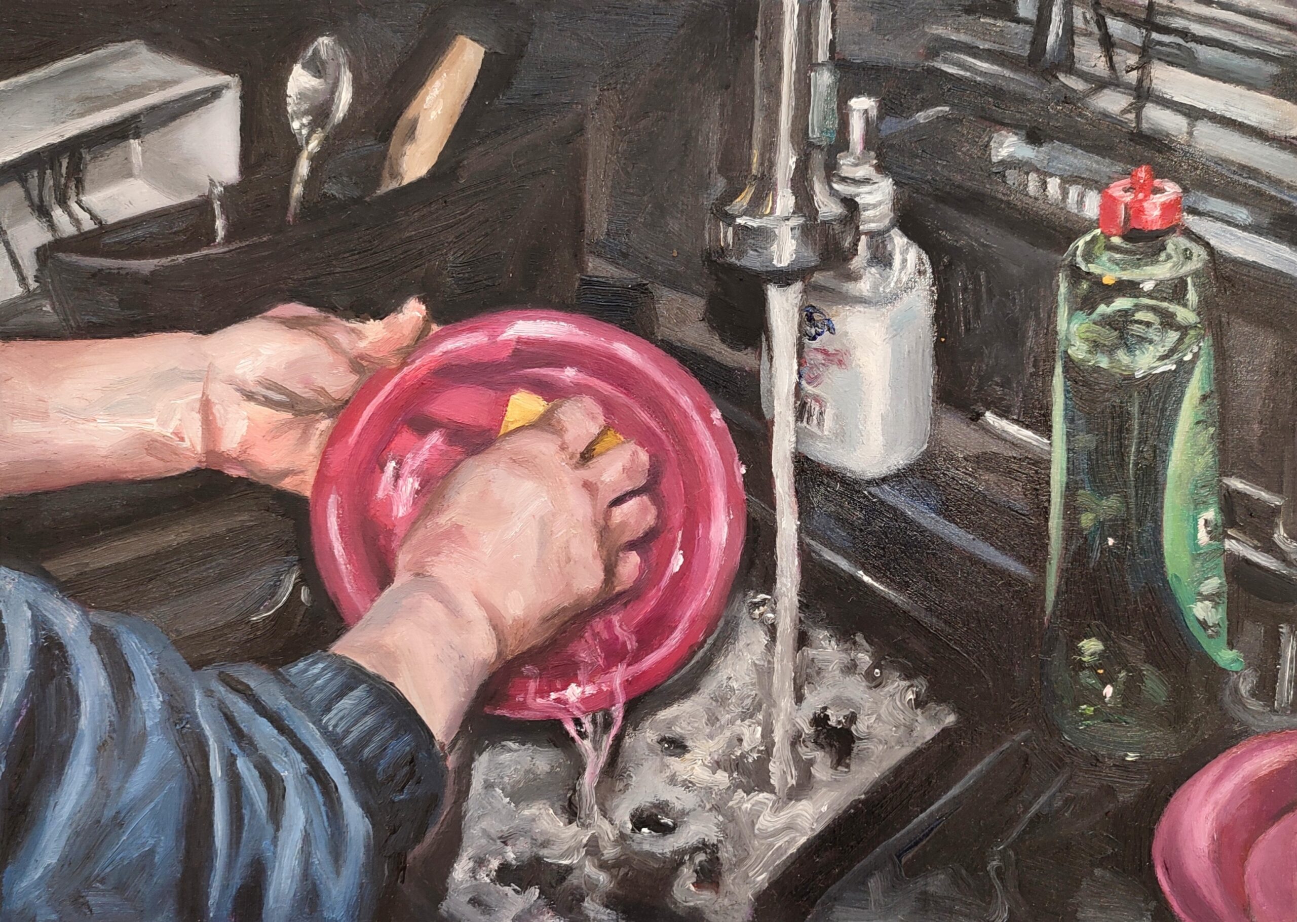
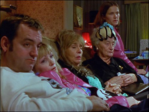
For this series of work, I drew inspiration from a range of artists. To explore the working class, I looked at artists like photographer Martin Parr (who also influenced my choice of composition) and Grayson Perry’s Smash Hits exhibition, which I have created a separate post for. I also stumbled across the American artist Jordan Casteel, and was particularly inspired by her ‘Subway Hands’ oil paintings, articulating the phenomena that is the ‘ordinary’. I personally find hands to be highly expressive, creating narratives within gestures as well as each wrinkle, callous and blemish.
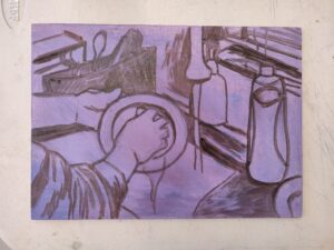
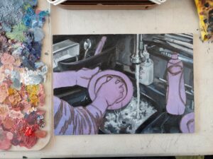
Martin Parr’s images of hands performing day-to-day actions particularly influenced by third painting; I was intrigued by how even a just a person’s hands have so much personality and can reflect culture and class. In response, I chose a photograph of my mum washing the dishes due to its bright, contrasting colours and composition. I challenged myself to paint on a small scale using wood (which I cut to approximately 21×29.7cm) as a surface.
I found that this was interesting in how the scale forces you to look closely at the painting, making you feel as though you are peering over the shoulder of the unknown figure. As a result, this evokes childhood memories of watching a parent washing the dishes- a task which, as an adult, feels much more tedious than fascinating- as opposed to showing a first-person perspective.
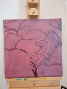
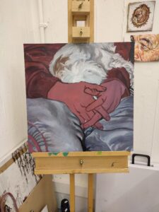
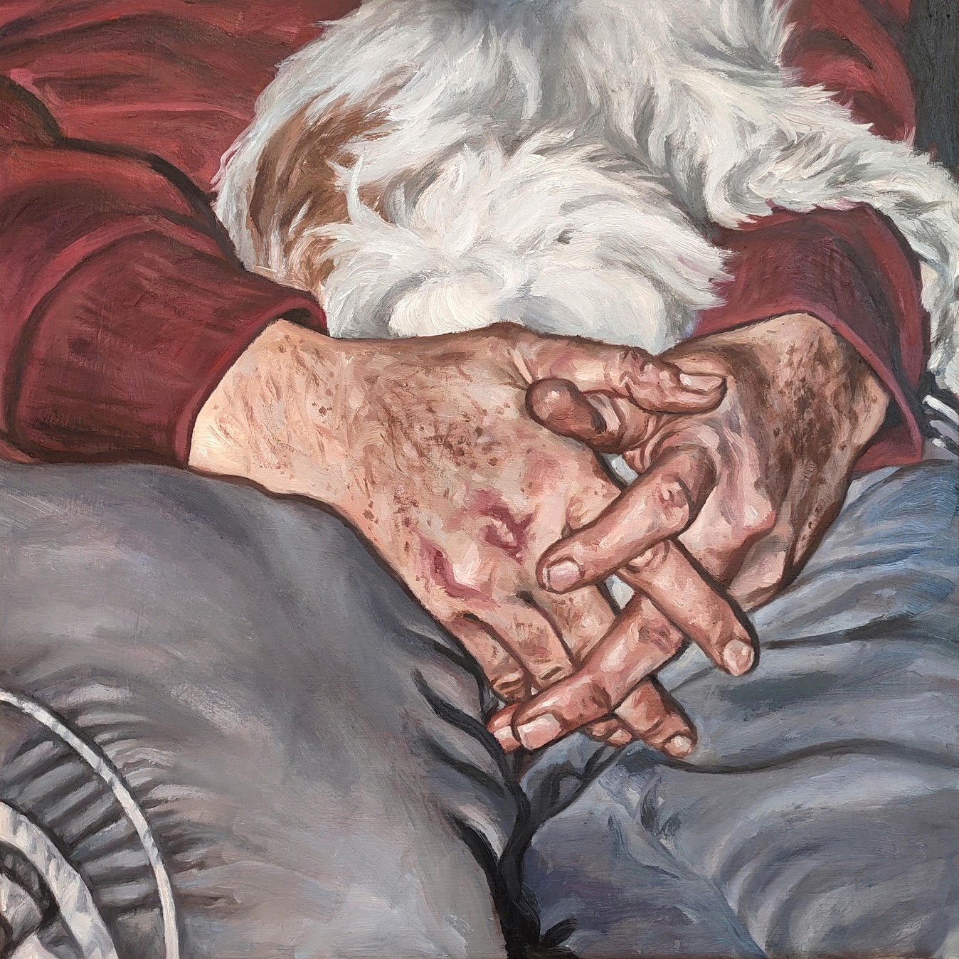
I also found a photograph I took of my dad on the couch with our family dog. I really enjoyed the way his hands were clasped on his lap and wanted to translate that into a painting. I cropped the image to focus on solely his hands, and painted the work in a slightly dark and desaturated manner, influenced by the use of colour in film to present the working class, juxtaposing the usual bright colours of typical broadcasts. This is shown in British TV programs such as ‘The Royle Family’ (1998-2000). Additionally, hands are key in conveying the working class themes in my project and my dad’s life, depicting the hardened and calloused hands of a manual laborer.

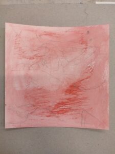
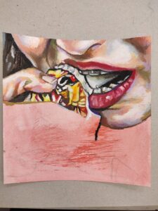
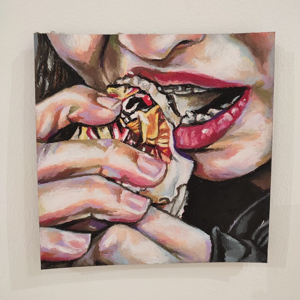
For my final painting, I wanted to experiment with oil pastels again. This time, I toned the paper with red acrylic paint to ensure no white would show through the pastel. I cropped a photograph of my sister eating a Lion Bar so that, in combination with the bold colours, it would be difficult to decipher the image without looking at it closely. I also thought it was interesting that oil pastels are synonymous with the post-impressionist movement of the late 19th century. This period was dominated by landscapes, which contrasts significantly with my ungracious painting of a working-class teenager.