Week3
Reflections and answers to the questions in the Portrait Gallery worksheet
-
Part A
Natural light is present in the gallery and can be let in throughout the gallery space through the opening of the overhead window in the ceiling and the window on the side, while the intensity and amount of light entering the space can be controlled by controlling the opening and size of the overhead window. However, the overall amount of sunlight entering these spaces is low and basically only reveals some natural light, while in the gallery space in Fig. 1 there is basically no daylight entering the gallery space.
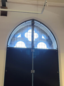
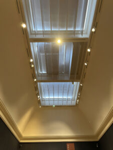
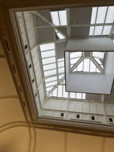
Fig.1 Fig.2 Fig.3
I think that the artificial light gives the painting more visual focus. For example, in Fig. 4 the artificial light is shining on the central object, and we can measure the luminance with the software and see that the central object has the most light entering our eyes.
On the contrary, in this space with more natural light (fig. 6), it is difficult to find the visual centre of the picture and to focus on the painting in front of us, as the light is more diffuse and brighter in this space.
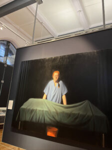
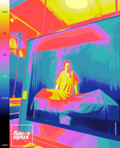
Fig.4 Fig.5
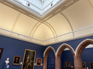
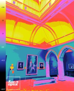
Fig.6 Fig.7
Through field research, I found that the Portrait Museum places more emphasis on accent lighting and uses a large number of tracked top LED narrow-backed spotlights in the gallery, which vary in size and are usually used in modular combinations on a single track (Figure 8).
According to visual inspection, the smaller tube spotlights are around 60mm in diameter and 50mm in length, while the larger ones are around 100mm in diameter and 140mm in length.
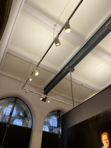
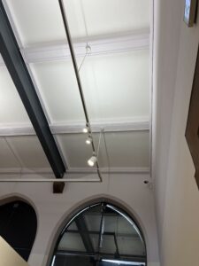
Fig.8 Fig.9
-
Part B
In this space the lighting is warm white led downlighters, the backdrop is red, the floor is wood with dark and light stripes, and the paintings on display are mainly in black, with the red backdrop forming a distinct colour difference to create a visual impact to better complement the paintings.
I believe that the colour rendering of the lighting illuminates the painting to some extent, as can be seen by the distinctive shades of red on the back wall, and that the blue in the background of the painting might not have been as apparent if the painting had not been illuminated.
It can also be seen from the picture above that the spotlights hanging from the track are illuminated at an angle of about 65° to the horizontal, probably because they are in front of the painting and are higher up, so they can illuminate more of the picture at about 65°, whereas if they were at a smaller angle they could only reach the upper part of the painting a little.
I used the software Fusion Optix to measure the luminance contrast values (Fig.12).Because black absorbs colour and does not reflect much, the luminous intensity measured on the background of the painting was only about 1.5 cd/m2, but the luminous intensity measured on the three characters in the picture was 4.9 cd/m2 and above, showing a visual change around the visual centre of the painting of a sub-strong – weak – strong luminous intensity.
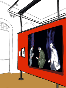
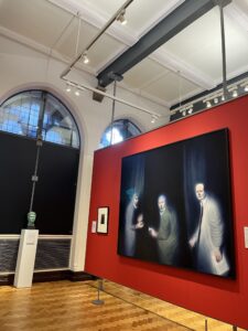
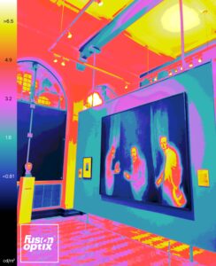
Fig.10 Fig.11 Fig.12


Recent comments