This week I made a start with adding furniture to my floor plan, getting it ready for another discussion and development in the next week. I gathered a lot of inspiration from the Aman Hotel in Tokyo, the one I researched a couple of weeks back, as I found the overall finishing’s and design of that space inspiring for my work- and has the perfect mix of modernity while also taking note of the traditional style japan evokes. Shown below is the 1st draft of the design. I’ve only shown floor 4 as this is the only floor that will hold the public space as the floor above is the bridge- with the double-height ceiling. When first exciting the lift or staircase, the individual will be greeted with a feature wall which separates the public space from the entrance. This entrance was inspired by the Virgin Hotel hallway in Edinburgh, where the guest walks through a Pink Himalayan salt entrance (pictured below), before attending the check-in desk. When I stayed in this hotel, it was a highlight feature for me- and the first thing I remember when visiting this hotel. From this inspiration, the hallway will be covered in a black texture covering, with 2D lantern light features all around, each one having a slow gradient of glow, bouncing off one another. When entering the public space around the feature wall, I placed another feature point in the public space which is of a tree, seated on top of a shallow bed of water which is encapsulated by a dark stone. I decided not to have an excessive amount of seating as the hotel does not have a lot of rooms, to begin with- so I placed 4, three-seater sofas, each one facing the other, these being placed next to the reception, There is another seating arrangements which is attached to the back wall, which will have seating cushions- this being inspired by the iconic scene of Charlotte sitting in her room peering out over the city of Tokyo. The check-in area is minimalistic with it being attached to the back wall. Towards the back of this space there is another desk area, which is the concierge and bag drop off area, with toilet facilities to the right of it.

Draft 1 of the floorplan. (floor 4)
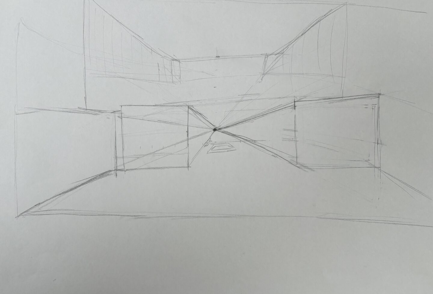
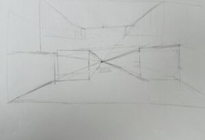
For class this week we have made a start to creating a key-view of the public space, looking at how designers have addressed these key-views and making a start to sketching the perspective. Pictured below is the first sketch I made, which was of the entrance wall (I originally wanted to have neon signs but decided against it after doing this drawing as I thought it looked more childish which was not what I was wanting to achieve with this space), I struggled to draw the perspective of the room behind the wall, and found this task quite difficult.
Drawing 1
After doing this sketch, i decided to try again with another perspective of the room, and drawing the perspective with help from Claire-Ann, where she showed me different techniques to drawing the space (such as sectioning the page with dashes which correlate with the measurement of the space, and placing eye-level dots to draw out from) The sketch from having help did seem to improve however I still found the overall task quite difficult, and frustrating at times as I couldn’t seem to draw what I had in mind onto paper.

Drawing 2
Drawing 3
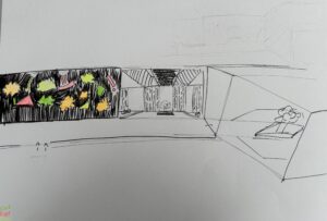
On Fridays class with Elain, we worked on developing out photoshop skills in preparation of the Key-view drawing we were to do in the next week. We were looking at how to place objects into a space and have them appear as though they belong there to begin with. We were working with a image of a cactus and placing it into a kitchen setting, including aspects such as colouring, shadows and lighting- Pictured below is the one I made and I am overall pleased, I’ve found learning about these has made me feel more confident in approaching the task in the next week, and looking forwards to seeing my finished design
Photoshop cactus into kitchen setting


Leave a Reply