Any views expressed within media held on this service are those of the contributors, should not be taken as approved or endorsed by the University, and do not necessarily reflect the views of the University in respect of any particular issue.
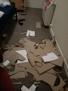
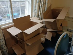
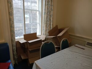
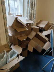
Shown above are some photos which give you an inclination of the carnage that took over my room while I worked on this project. Carboard is not a friendly material, as my carpet and irritated palms can attest to, and it takes some wrestling to get it to behave in any useful or attractive way. The making of these pieces therefore took much longer than I had anticipated/planned for.
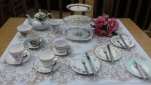
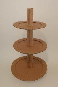
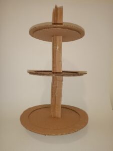
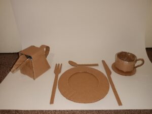
I ended up basing my set on this image found on Google, from an eBay sale of a vintage tea-set. It felt like a good amount to tackle.
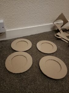
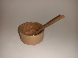
The centrepiece, a three tiered cake stand, was the first piece I made. Measuring each piece was a challenge, as you can see she turned out rather wonky, but I think she’s pretty cute nonetheless. “Rustic charm” springs to mind.
I actually debated for some time over which style of cake stand to emulate – so much so that I delayed the project from starting by at least half a day as I ruminated on which I preferred (the first) and which was feasible (the second). I inevitably gave in to practicality :/.
I decided to make a tea set as my first foray into cardboard because I knew it was something the whole flat would enjoy using, something which we wouldn’t otherwise have access to and it would test the limits and uses of the material. I had recently attended afternoon tea at the gorgeous (very expensive!!) Prestonfield House Hotel, which we had discussed wistfully as a flat, knowing that we could never afford a trip there together without our parents as financial sponsors, so I think this is what inspired the idea.
The juxtaposition of the typically high-class activity with the low-class materials interested me, and I thought added a level of humour to the event. Why dine from fine china when you can reuse your food packaging, adding Sellotape and glue here and there…
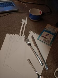
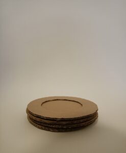
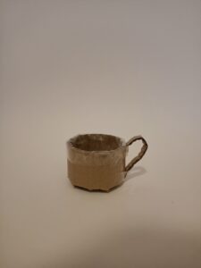
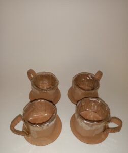
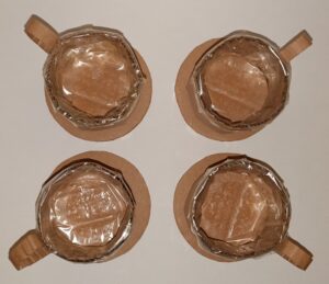
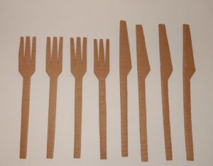
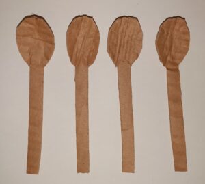
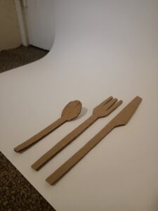
A tricky part of the process was the fact that I have 3 flatmates, therefore four sets of crockery were required. I used paper patterns and the natural lengths and creases of the cardboard to try and make them as uniform as possible, but of course the pieces are incredibly crude in their design and execution. I’m an ideas woman, not an artisan.
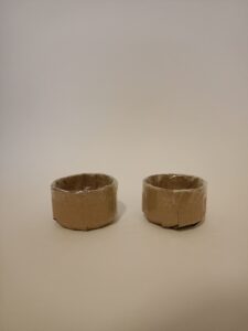
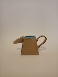
I used a combination of plastic folders, Sellotape and a freezer bag to waterproof my creations. The cups, jars and the teapot all received this treatment in an effort to make them at least partially functional. This was very time consuming, much Louis Theroux and 60 Day’s In was consumed during this process.
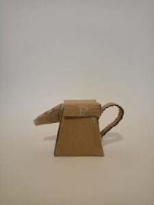
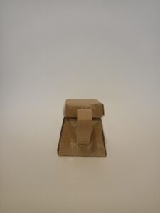
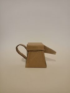
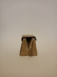
The teapot was probably the most aesthetically gratifying piece to make – it’s just so goddamned cute. Adorable one might say. This was made in four pieces; square based pyramid body, handle, V-shape spout and a folded lid. It took me a long time to make, and I knew it was highly unlikely I would even use it to pour tea, but I think it really brought the set together.
Overall, not the most enjoyable process, very time consuming, at times mind-numbingly boring, and irritating on the hands. However, I was very happy with the results, possibly because I was acutely aware of the effort that went into them, and once I found my rhythm I did come to enjoy making the pieces, the cups being particularly fun to make. Making took me three days in total.
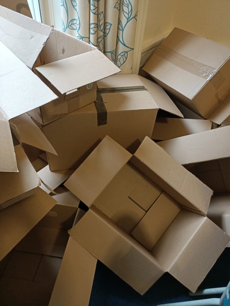
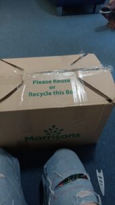
On the 7th of October 2020, my flat, occupation five students, went into self-imposed isolation after one of my flatmates, Molly, tested positive for Coronavirus. Over the next two days we received a total of 11 cardboard boxes, each filled to the brim with snacks, cooking materials and ingredients. While well-appreciated, after we had put all of our food goodies away we found we were now the proud owners of 11 large empty cardboard boxes, that piled up in the corner of our dining-room-cum-living-space began to block some of the light from the windows, and appeared quite unsightly.
Now of course, we could have simply flattened all 11 boxes and gifted them to the recycling bin on our road. This would have been a fast and practical resolution to our conundrum. However, I am nether a fast or a practical person, so I decided I would bestow upon the boxes a second chance at life, in the form of material for my ‘Extraordinary Object’ project – which I had previously been struggling with.
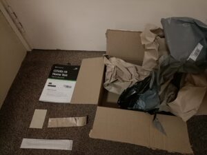
A twelfth cardboard box arrived at the flat a day later, on Friday the 9th of October, after I ordered a Coronavirus home testing kit from the Scottish Government. For some unknown reason, while the actual test package was quite small, it arrived encased in a much larger cardboard box, which I kept, alongside some of the materials from the test.
On the morning of Thursday the 15th of October, a further 6 boxes were delivered, their vacant corpses soon joining the growing pile in our living room.
Later that day, a 19th box was delivered, a gift from my parents to offset the pains of living in a predominantly vegan flat. The box came complete with two freezer bags and heavy ice packs. A 20th box, a meat package from the uni, arrived the next day, therefore completing the collection.
I decided upon some rules for my project, they are as follows:
Every piece made as a part of this project must include material taken from these boxes.
By the end of the project, all boxes must have been utilised in some capacity.
I may use any other material in conjunction with the boxes.
20 Cardboard Boxes. All delivered within two weeks, and all to be used, every last piece, in my project- or so help me god.
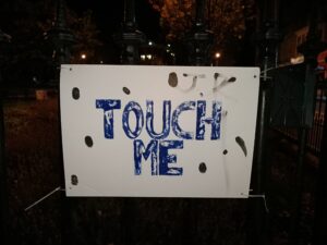
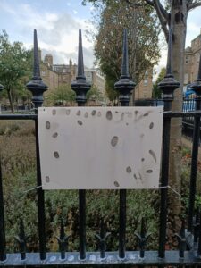
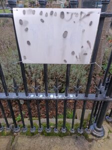
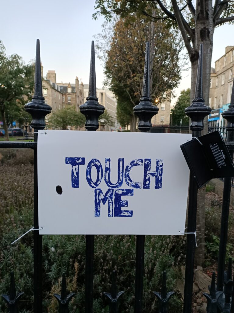
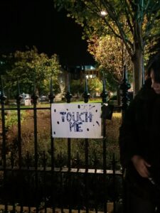
Upon my last check of TOUCH ME, pictured above, I discovered that the rain had washed away my original print, leaving only faint black fingerprints on the board. The ink pad was gone, along with the tags that had kept it in place, and blue and white sediment from the ink was visible on the railings directly below the piece. The piece has therefore been stripped of its original purpose, both by the elements removal of the instruction, and human removal of the mark making material. However, I believe that through this, the piece has also somewhat achieved its goal of connecting with the public of Nicholson Street, and leaving a physical imprint of the public who frequent it. The piece now looks as though it belongs in its surroundings more than ever, having gone through sunshine, wind, rain and time on the street. To me this is a great achievement, I have made a small landmark of the public of the street, and even if it is taken away soon, for now it is at home in its place, it belongs to the street.
One room exhibition in the basement of City Art Centre. Varied collection (although almost all 2D work) and I enjoyed looking around. One annoying attendee playing a loud game on her phone. Family of gingers also in attendance.
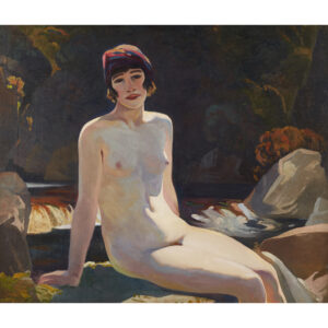
‘Cecile Walton at Crianlarich’, Eric Harold Macbeth Robertson. Oil on canvas, 1920.
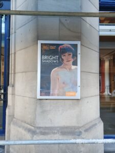
This piece is new to the gallery and as such was made the “face” of its ‘Bright Shadows’ exhibition. The hair, hat and build of the lady pictured certainly do scream 1920s so you can see why they chose it. In the gallery the accompanying information describes how this piece was scandalous and revolutionary for its time as the lady is painted nude in a relaxed, outdoor environment, she seems comfortable and in control, staring towards us, and indeed the sitter was the wife of the artist. I’m personally in two minds about the piece. While it is refreshing to see a nude where the lady seems relaxed and real, to me this still feels nude rather than naked. The sitter is deliberately posed, and even if the pose is relaxed this jars in my mind with the idea of her having more control. It also got me thinking about the exhibition of the piece and its use in promotional materials, particularly posters hung up around the city. To me, this doesn’t seem like a moment that was intended to be put on display to the public. Her body centres the piece, your eyes drawn to her flesh before even her face. It feels like a holiday snap, a moment shared between lovers, with the woman’s body admired under the males gaze. I wonder if she thought, while she was modelling for this painting, that her body would be used to advertise a City Art Centre exhibition 100 years later. The pair also divorced 7 years after the creation of this painting, with both of their careers falling apart shortly after and Eric turning to alcoholism. This piece perhaps then represents the bitter sweet happiness of the past, its resurfacing a little sad.
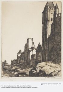
‘The Ramparts, Carcassonne’, James Mcintosh Patrick. Lino print on paper, 1927.
Really liked this piece in person – less so when viewing online.
‘The Pink House’, 1928 and ‘Iona, Mull and Ben More in the Distance’, 1929. Samuel John Peploe.
Peploe was one of the four Scottish Colourists – along with Cadell, Fergussen and Hunter. My favourite of the two pieces was ‘The Pink House’ because I found it really evocative of the feeling of being in a warm foreign street, on holiday and feeling free.
“The Scottish Colourist S.J. Peploe was first introduced to Iona in 1920 by his friend and fellow artist F.C.B. Cadell. He proceeded to return to the island almost every year until his death in 1935. The peaceful atmosphere offered him a sense of freedom and mental rejuvenation, while the brilliant white beaches proved an enduring source of inspiration. Peploe’s paintings of Iona cemented his reputation during the 1920s, and still remain among his most iconic works.
Rather than depict the grassy southern end of the island, the artist favoured painting in the north, taking advantage of the views towards Mull. He often worked outdoors, sometimes in a single sitting.”
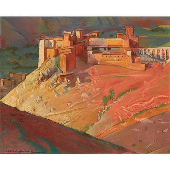
‘Kasbah Taguendaft, Morocco’, Alexander Graham Munro. Pastel on paper, 1920s.
This was my personal favourite piece in the exhibition. It is very beautiful in real life, the colours are absolutely gorgeous and the landscape dreamy, foreign, hidden in hills, mysterious and like something from a story.
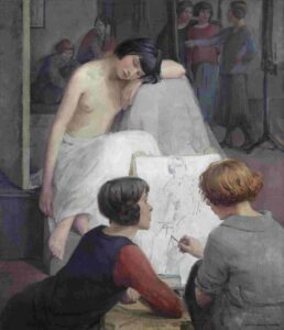
‘Rest Time in Life Class’, Dorothy Johnstone. Oil on canvas, 1923.
“Dorothy Johnstone was just 16 when she enrolled at Edinburgh College of Art. Having excelled as a student, she joined the college’s teaching staff in 1914.
This painting offers a glimpse into one of Johnstone’s classes. A life model is shown taking a break from posing, while students discuss and refine their compositions. Johnstone herself appears in the top right corner, working at an easel.
Rest Time in the Life Class was displayed in 1924, the same year that Johnstone married the artist D.M. Sutherland. She was subsequently obliged to resign from her teaching position, as married women were barred from holding full-time posts. Although opportunities for women artists slowly improved during the 1920s, discrimination remained common.”
I liked the accompanying study portraits, and was interested by the story of the young artist at ECA.
‘Spring Morning’, David Gauld. Oil on canvas, 1927.
I was really drawn to this piece in the gallery. I liked how washed out the colours were, which, combined with the outskirtsy subject, made the scene appear dreamy and forgotten. I also liked the large scale, and found the choice of frame interesting (large, antiquated and brown).
“David Gauld is one of the lesser-known artists associated with the Glasgow Boys. During the 1880s and 1890s he was one of the innovators of the group, creating illustrations, paintings and stained glass designs with a strong Symbolist aesthetic.
Spring Morning is characteristic of his later work. Gauld was drawn to semi-derelict buildings in rural locations, and painted many such scenes of farmhouses, barns and mills glimpsed through trees. The setting of this picture has not yet been identified; it could be somewhere in Scotland or France.
Gauld was elected as a full member of the Royal Scottish Academy in 1924. This canvas was exhibited at the Academy’s annual exhibition in 1927.”
‘Daydreams’, Francis (Fra) Henry Newbery. Oil on canvas, 1920.
“a painter and art educationist, best known as director of the Glasgow School of Art between 1885 and 1917. Under his leadership the School developed an international reputation and was associated with the flourishing of Glasgow Style and the work of Charles Rennie Mackintosh and his circle. Newbery helped commission Mackintosh as architect for the now famous School of Art building and was actively involved in its design.
Born in Devon to a shoemaker and his wife, Newbery went to school in Bridport, Dorset where he qualified as a teacher, and later as an art master. While working and studying in London he won an ‘Art Master in Training’ scholarship in 1881.
At the Glasgow School of Art he was a vigorous and innovative headmaster. He gave teaching posts to practising artists rather than relying on certificated art masters. He established an art club allowing students to branch out from the national art school course, and employed several women teachers, unlike most other UK art schools of the time. Newbery established craft workshops and introduced embroidery classes where his wife, Jessie Newbery, played an important part. Overall, he wanted students to have a strong training in traditional techniques, while developing their unique individual talent. His own painting was associated with the Glasgow Boys‘ and he was close to James Guthrie and John Lavery.”
Fra just seemed like a cool dude. He advocated for greater gender equality in arts teaching, and the Newbery family are apparently interesting artists.
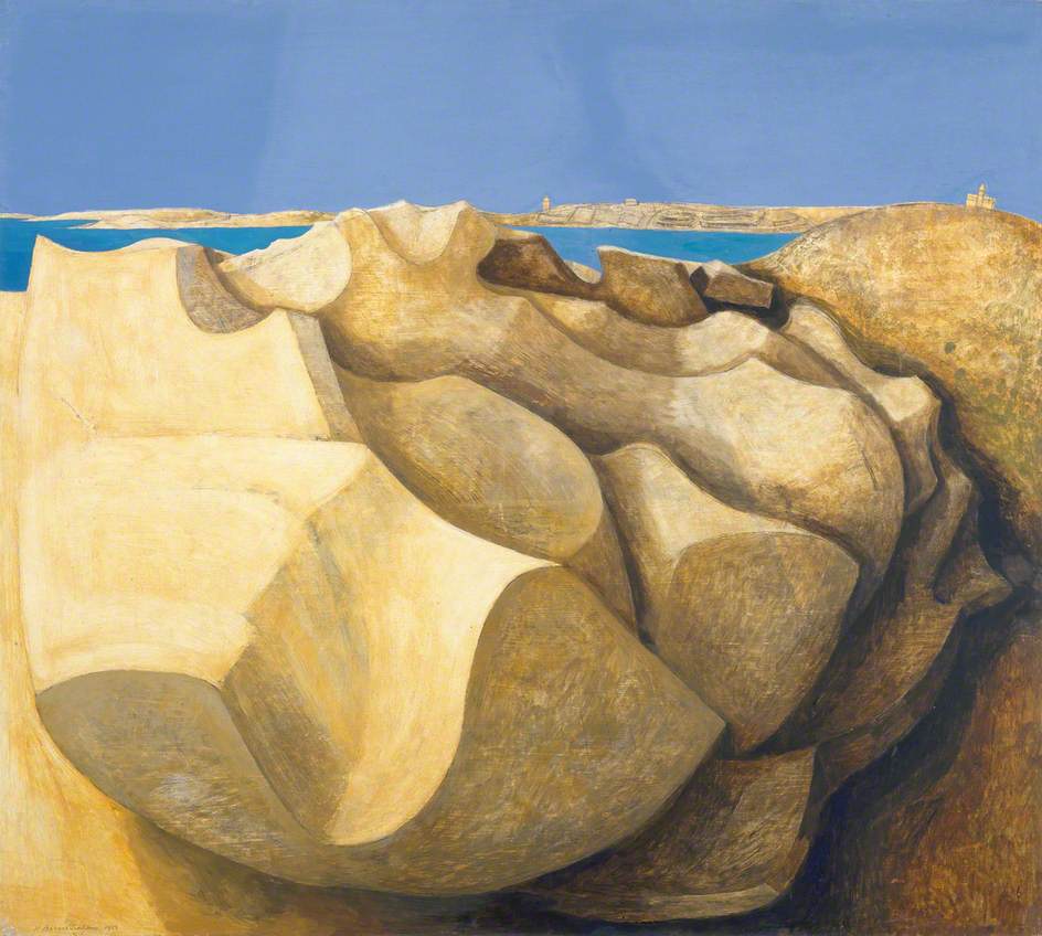
‘Rocks, St Mary’s, Scilly Isles’, Wilhelmina Barns-Graham. Oil on board, 1953.
Artist a friend of Barbara Hepworth. Surrealist natural forms/abstraction. Like smoothness and weird landscape.
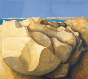
‘Poppies’, George Henry. Oil on canvas, 1891.
Oriental inspiration. 2D-ness makes garden seem denser and secrets.
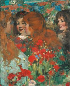
‘The Flight of the Swallows’, John Henry Lorimer. Oil on canvas, 1906.
Artist painted a number of paintings set in surroundings inspired by the beautiful Kellie Castle, where him and his architect/furniture designing younger brother Robert Lorimer holidayed in their youth. This piece reminds me of Peter Pan. The flight of the swallows is said to be allegorical of growing up and leaving childhood, hence the weeping girl to the left. A very beautiful painting to see in person – soft and dappled brush strokes and large in scale. I liked the reflections in the mirrors.
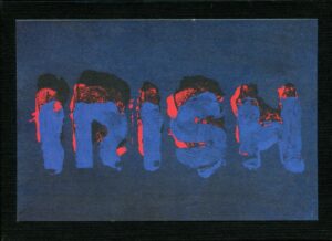
‘Irish’, Sol Lewitt. Set of eight prints with book and box, 1997.
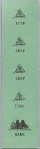
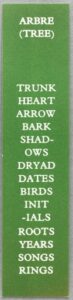
Ian Hamilton Finlay, bookmarks. ‘Leaf leaf leaf bark’, 1978 and ‘Arbre (Tree)’, 1979.
Leaf/Bark was on display and I found Tree online. I like the simplicity, reminds me of my own use of postcards with simple prints. Never thought of using bookmarks before but I like that they have a vaguely practical but outdated use, like a postcard. Discardable object made exhibited artwork.
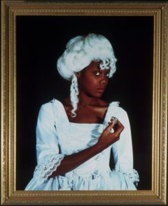
‘Terpsichore’, Maud Sulter. Photograph, 1989.
“This photograph is from a series of portraits of creative black women by Maud Sulter, who is of Ghanaian and Scottish parentage. The series is called Zabat and shows each woman as one of the nine Greek muses. The word Zabat describes an ancient ritual dance performed by women on occasions of power, and her use of it signifies Maud Sulter’s call for a repositioning of black women in the history of photography
The model here is the performance artist Delta Streete who had created the costume she is pictured wearing as part of a dance performance and installation called The Quizzing Class, which explored relationships between women, particularly that between slave and mistress. Here Streete is presented as Terpsichore, the muse of dance.
Maud Sulter produced the Zabat series for Rochdale Art Gallery in 1989, the 150th anniversary of the invention of photography. It was a direct response to the lack of a black presence at other celebratory events and exhibitions.”
Found it quite powerful & commanding in the gallery. Makes you rethink the pieces you’ve already seen and their lack of black subjects.
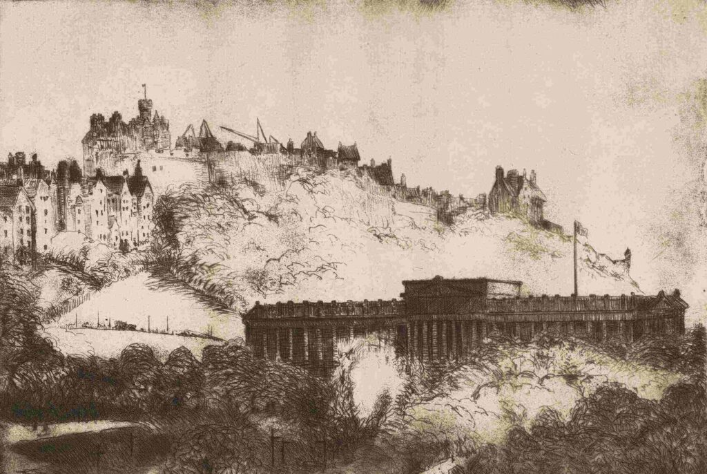
‘National Gallery and Castle, Edinburgh’, Nicol Laidlaw. Etching on paper, 1925. Shown in the exhibition ‘Bright Shadows: Scottish Art in the 1920’s’.
“The Scottish National War Memorial was the most significant public art project to take place in Scotland in the 1920s. Designed by the architect Robert Lorimer, and located within the precincts of Edinburgh Castle, the Memorial was devised to honour the causalities of the First World War on a national scale. Construction work began in 1923 and continued until 1927.
This etching by Nicol Laidlaw records the progress of the project in 1925. A series of cranes and temporary structures can be seen on the horizon, gradually transforming Edinburgh’s architectural skyline.
The revival of printmaking was a major trend in Scottish art during the 1920s. Increasing numbers of artists earned a living making etchings for a buoyant commercial market.”
‘The Enchanted Capital of Scotland’, Jessie Marion King. Children’s book illustration, 1945. Shown in the exhibition ‘City Art Centre at 40: Highlights from the City’s Art Collection’.
Bright colours and playful style stood out to me in contrast with the countless “serious artworks” and dreary grey views of Edinburgh.
‘The Entry of George IV into Edinburgh from the Calton Hill’, John Wilson Ewbank. Large scale oil painting, 1822. Shown in the exhibition ‘City Art Centre at 40: Highlights from the City’s Art Collection’.
Stands out to anyone as a very impressive painting due to its scale and subject.
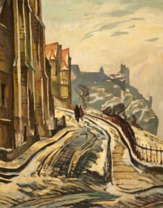
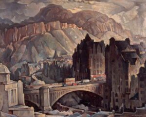
‘View from the Mound, Edinburgh, Looking West’, William Crozier. Oil on panel, 1929. Shown in the exhibition ‘Bright Shadows: Scottish Art in the 1920’s’.
A snowy day in Edinburgh. Mysterious, inviting and scenic.
‘North Bridge and Salisbury Crags, Edinburgh, from the North West’, Adam Bruce Thomson. Oil on canvas, 1930s. Shown in the exhibition ‘City Art Centre at 40: Highlights from the City’s Art Collection’.
‘the beautification of our public buildings in Scotland’ – a new view of the Old Town.
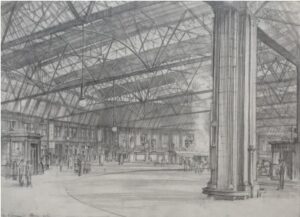
‘Princes Street Station’, William Wilson. Pencil on paper, 1926. Shown in the exhibition ‘Bright Shadows: Scottish Art in the 1920’s’.
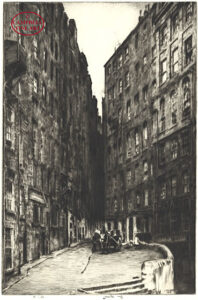
‘The Saut Buckets, Edinburgh’, 1926 and ‘Edinburgh Tenements’, 1934. Ernest Stephen Lumsden, drypoint etchings. Not sure which specific piece was shown at City Art Centre.
‘Moonrise Over St Giles’, Katherine Cameron. Illustration for Haunting Edinburgh, 1920s. Shown in the exhibition ‘Bright Shadows: Scottish Art in the 1920’s’.
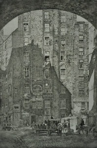
‘John Knox’s House and View of High Street’, Joseph Gray. Etching, 1920’s. Shown in the exhibition ‘Bright Shadows: Scottish Art in the 1920’s’.
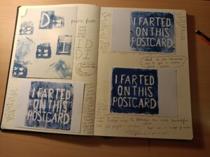
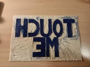
I am very interested in the DADA way of thinking, in both art practice and life, humour, spontaneity and a divergence from the norm/a lack of “class” are very important to me. I particularly enjoy distributing my pieces myself, and am a big fan of public art, ephemera and performance.
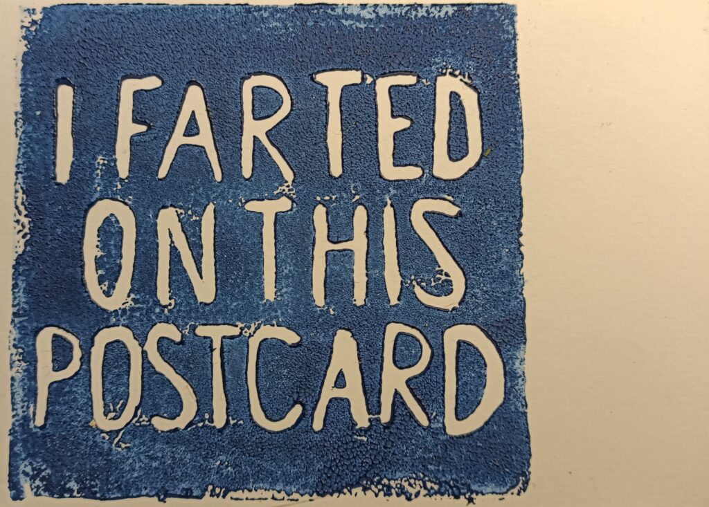
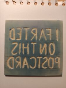
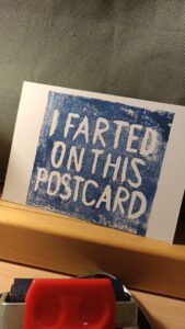
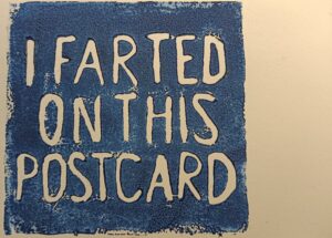
With this postcard I approach the idea of truth in art. I declare an action has been taken upon the postcard that cannot be proved, and by doing this change the narrative of the piece of card. You will never know if I have indeed farted on the postcard, therefore to you, I both have and haven’t, it is forever in question – Schrödinger’s Fart. I’m interested in this state between knowledge, as well as how our knowledge of actions taken on or with objects impacts our view of those objects.
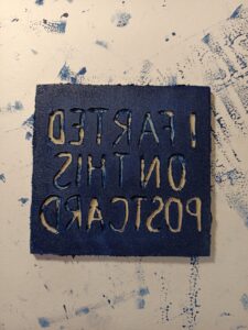
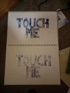
This print is of course quite graphic, by printing on the cards I have physically altered them, so it is not the same thing as me simply handing someone a blank card and verbally telling them I have farted on it. Perhaps I could experiment with that way of looking at these ideas, however I really like the appearance of these prints (although the ink quality could definitely be improved) and I think they hold more power as objects having gained the fart print. It is also much easier to convey the idea of the action if it is permanently stamped onto the object, rather than attempting to speak to everyone you hand the cards out to.
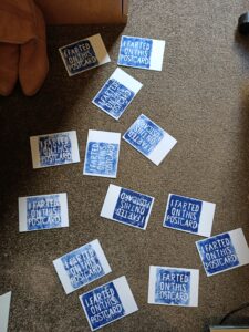
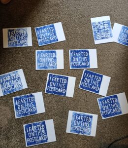
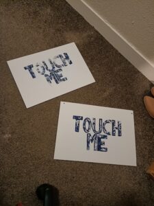
I distributed the pieces by plaguing strangers on the Royal Mile, asking if they would like a postcard in a similar manner to those charity workers whose job it is to flag down members of the public in busy parts of Leeds (and probably every large city). The biggest hurdle in giving them away was the first contact as many people are simply not interested in stopping, talking or taking a hand-out – this may be related to Coronavirus. I found however that the majority of people who took the time to look at the postcard would then soften up, usually taking one with a laugh. There were definitely a fair few weird looks, but I really enjoyed giving out the cards and would like to do something like that again.
Batman even came over to receive a card at one point, and I am told he later sniffed it.
One of the most interesting parts of a postcard, in my opinion, is that it is a platform for connection and relationship. The tactile nature of a postcard lends itself to an intimacy between its sender and recipient, the effort of sending a postcard itself creates the implication of closeness between the two parties, even more so in the modern world where instant communication is the standard. Historically postcards are known to have contained messages to distant family members, or separated lovers, as well as stories of holidays and life changing events.
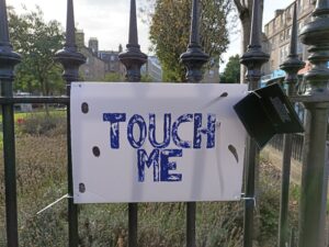
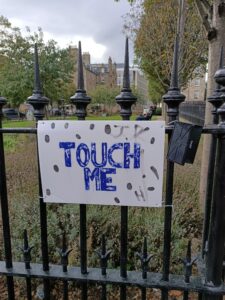
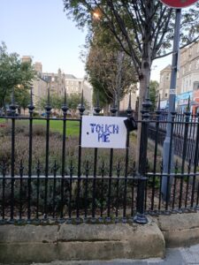
Due to the current Coronavirus pandemic, physical connection with others has been stunted. Our worlds have grown smaller as “the general public” has become a slur for “the infected masses”, it currently being illegal to meet with anyone living outside of your household. ‘TOUCH ME’ embodies my will to connect with those around me, a pulse check on the city; are there others out there?
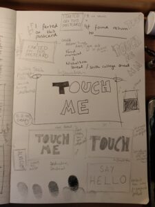
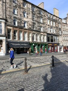
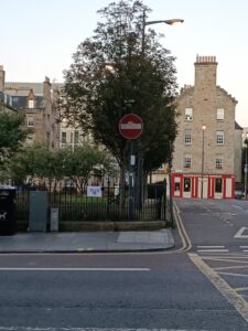
The print is on an A3 piece of Styrofoam (not waterproof at all), and I zip-tied it and an ink pad to iron railings in a busy section of Nicholson Street, known for its abundance of students. I installed the piece at 7:00am on Sunday the 27th September, and placed the first finger print myself.
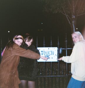
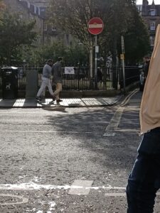
I checked up on the card at around 2:00pm the same day, happy to see that it was still there and had gained a couple responses. While I watched it garnered a few looks, with a couple of groups slowing down to look but no one going so far as to contribute.
At 1:00am on 28/09 I checked on the card a final time and it had gained a fair few more responses, doubling since my previous visit. Still, the visual effect was less than impressive and gave my cause to think about the difficulty of engaging an anonymous public in an artistic piece, particularly if it requires the sacrifice of an inky finger. I was, however, very happy with the appearance of some variation, in the initials which appeared in the top right hand corner, and I was glad that it hadn’t yet been taken down. I have therefore decided to leave the postcard up, and will continue to monitor the response, if any.
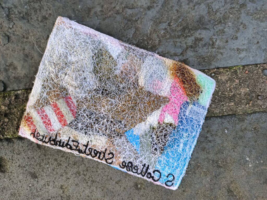
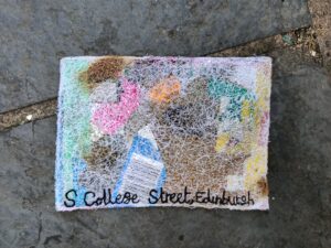
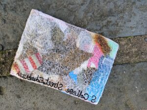
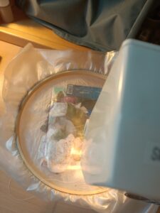
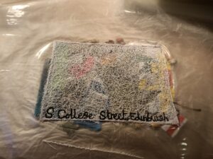
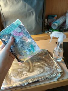
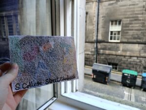
For my first postcard I decided to expand on work from my FMP at Foundation, ‘Post’. I was interested in the materiality of a postcard, as it is an object which is meant to be touched, felt, something which has been undermined in this project by the nature of the coronavirus pandemic and our lack of communal studio space. The commercial postcard is also often originally something of little value, produced in bulk and sold in tourist shops for often less than a pound. Value, in my view, is only added to these objects once they are taken by a person and changed, written on, sent, collected. I wanted to experiment with this idea of attributing value to otherwise unloved objects, as well as looking at my interest in place and material. Using the water soluble “sandwich” technique and a web of machine embroidery I combined pieces of detritus sourced from the street to create a postcard reflecting the nature of my address, South College Street.
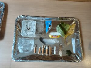
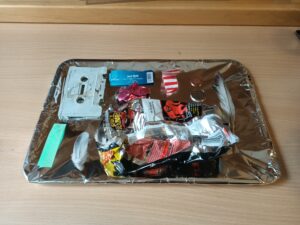
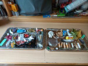
I spent around half an hour collecting materials, using disposable gloves and freezer bags, and found the process quite enjoyable, peaceful even as I got lost in scanning the floor. The most plentiful items were cigarette butts, followed by a large amount of feathers, but there were also gleaming jewel wrappers, coins and half a cassette tape. While the process of collection was fun, upon returning to my room I quickly realised that I hadn’t accounted for the smell that I had invited into my space – largely wafting off of the damp cigarette butts.
The sewing process was surprisingly easy, this is probably due to the new, thicker water soluble fabric that I used for the two sandwich pieces. The machine handled the varying textures and heights very well and didn’t put up a fuss about being asked to allow freehand embroidery. Next time I wouldn’t trace the postcard shape onto the fabric in pen as this was visible after dissolving.
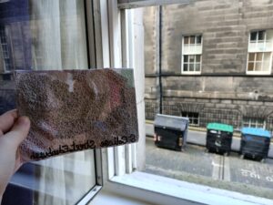
The above images show the piece after the water soluble fabric has been dissolved and it been given time to dry. After dissolving much more colour and detail of the materials is visible through the stitching. I am fairly happy with how the piece turned out; the process is both enjoyable and feasibly repeatable and the outcome mostly lives up to my idea of portraying the location through what is found there. I really like the variation in materials height on the back of the card, as I think the lumpy bumpiness has more visual impact than the flatter front. I would really like to improve on the thread used in the piece, either making it less prominent by finding a thinner or transparent thread, or using a less foreign material on the piece, perhaps by sourcing thread within the location. I could also ham up the involvement of the thread, playing into the lace-like texture and then the juxtaposition of lace and street rubbish. I would also like to make the embroidered location name neater, smaller and more uniform.
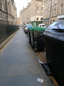
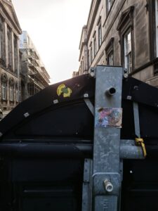
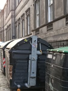
The postcards final resting place – stuck to the side of one of the large bins on the street (around which I found most of the materials it is made from). The back of the card was still sticky from dissolving the water soluble fabric, so I was able to stick it to the metal part of the bin without extra materials. I hope it will stay there for a little while as a small piece of public art commemorating the street. In any case, it has been returned to where it began, and is out of my hands now.