For this week I spent a lot of time trying to figure out the best way to lay out my boards. Unfortunately when I went to buy mount board they had run out of white so I had to buy a slightly grey coloured one, I will try ad get some more for my actual final boards for hand in.
Originally I was going to enter for the woven W1N THE CLOTHWORKERS’ COMPANY AWARD, for interiors, because I started by doing woven samples, however I changed my idea and technique to knitting halfway through so the category my boards are made for is the K1 THE CLOTHWORKERS’ COMPANY AWARD, in knitting for either fashion or interior products.
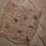
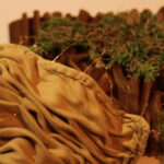
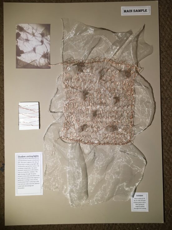
My final sample is aimed at interiors, and more specifically lighting in interiors, the basis of the idea is that the textiles would be made into lampshades, that would then cast/project knitted patterns around the room.
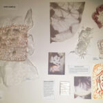
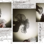
I knew that the final sample needed to be the highlight of the board and the eye needs to be drawn to it when looking at them together, so I tried to make everything else a little bit smaller than the final sample so that it would stand out. I have 2x A2 boards (shown below), I put the main sample on one board with a bit of information about how its made and the concept behind it, a yarn-wrap and an image of the shadows it projects when a light is shone through it. And then for the second board I added my supporting samples, a sketch, some more images of the shadows and more information about the project.

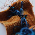
For my supporting samples I have added a smaller piece of the wire knitting, so as to break down the elements of the design, I have also added some manipulated wire faces which was a variation of light projection that I was playing with, I have also added a small piece of gathered organza to show the different materials on their own.
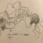
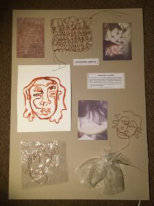 For some reason there was something nagging me about the what I’d put on these boards and the layouts, they just didn’t seem quite right. After having a conversation with my peers and lecturer we discussed that it really would look better on a white board, it would make the samples stand out, as the copper wire is too similar in tone to the grey. it was also suggested that some of the images could be different sizes and that there should be plenty of space around the main sample. Maija also told me that it could actually be one board as long as it was sized A1, and we thought that it would possibly look better with everything together. we also realised that the samples of wire faces did’t relate enough to the final sample, and they didn’t have enough textile techniques in them to be textiles samples. and that the sketch is a little bit too big, it is the thing that your eyes are drawn to the most on that board, this could also be because it is white on the grey background so it stands out a lot.
I will be making all of these adjustments for my final boards for the final handin.