I created a survey using google forms which I forwarded to a number of people on social media. The survey was then passed on from the initial participants to others and so on. The participants were asked to fill in their age and fill out the survey consisting of the 17 questions listed below:
Has being in lockdown during COVID 19 made you:
- Cook at home more/less/same?
- Eat healthy food more/less/same?
- Think about food more/less/same?
- Snack more/less/same?
- Eat ready meals (fresh/frozen/microwaveable) more/less/same?
- Eat out (cafes/pubs/restaurants)?
- Get take away/delivered meals more/less/same?
- Go on picnics/barbecues (in park/garden etc) more/less/same?
- Eat more/less/same in general?
- Support restaurants participating in the Eat out to help out scheme more than average? Yes/no
- Cook for others (household members/family/friends etc) more/less/same?
- Have others cook more/less/same for you?
- Document/share photos/posts of your home-cooked meals/recipes more/less/same on social media?
- Learn/experiment with new recipes more/less/same?
- Bake more/less/same?
- Shop for groceries online more/less/same?
- Wash vegetables/disinfect groceries before use and consumption more/less/same?
Within 24 hours I received 65 responses. Participants varied in age from 15 to 64 years. I divided the data collected into 3 age groups: teenagers(15-17), young adults (18-24) and adults (46-64) as I wanted to see if age was a factor in the changes in peoples eating habits and food preparation during COVID 19. The grouping of data made changes in behaviour patterns more visible and made the data more manageable and easier to translate into practical samples in some cases.
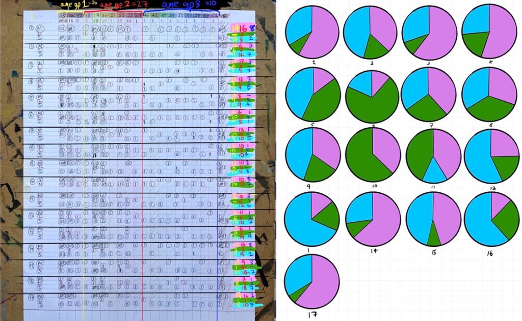
Table and Pie Charts displaying gathered data from my survey.
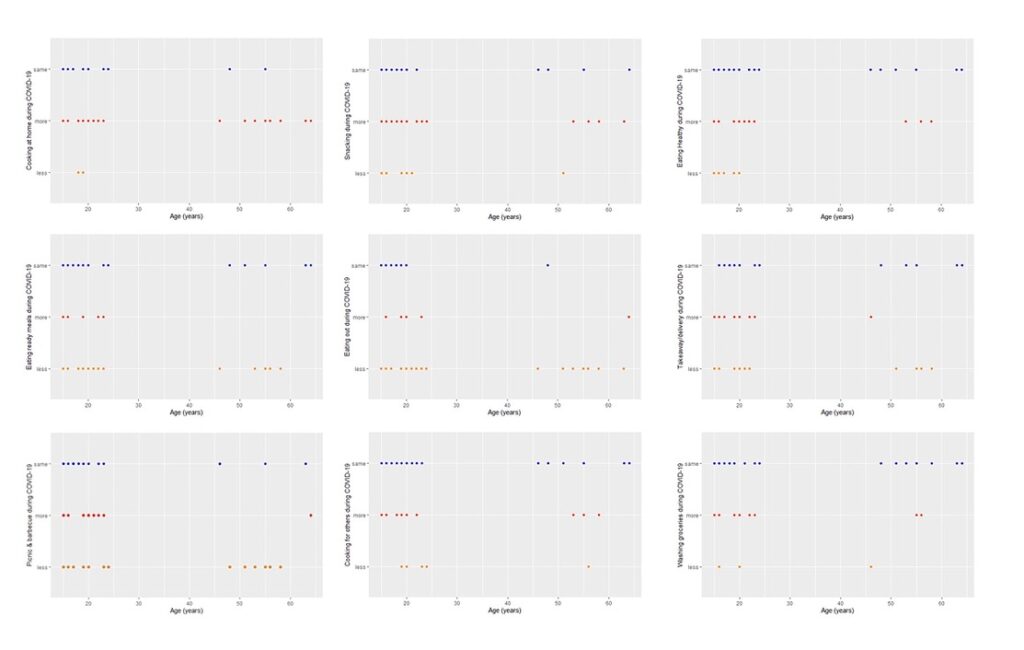
Graphs showing data from a few selected questions from my survey.


lrichar3
Very clear post. I particularly like the 3 different formats of the data you gathered. Lovely way to develop pattern.