I started the week with big plans for beginning my data visualisation journey but small data processing errors threw obstacles into my path. Eventually the dates were fixed and I could begin to produce my final map on ArcGIS Online.
The Errors of Adding Temporal Data
In my last blog post I discussed how I was starting to add temporal dates from the Scottish Survey of Witchcraft such as dates of trials, arrest and flee dates using OpenRefine. Since then I have discovered that the dates had been uploaded in the incorrect format with the month being recorded as the day and day being recorded as the month making every date wrong. Therefore, I had to remove all of the incorrect dates and then upload the dates in the correct format. Although this was a massive pain, it has taught me to double-check, triple-check even quadruple-check to ensure that all of the data is being uploaded in the correct format.
If you ever make the error of adding incorrect information to Wikidata it can luckily be easily removed using QuickStatements (which is a website used for adding bulk volumes of data onto Wikidata with statements created in OpenRefine or GoogleSheets) and adding a minus sign in front of each statement.
For example when wanting to delete the statement that Issobell McKie had the significant event of being arrested at the point in time of 08/01/1617 with the URL Reference of “http://witches.shca.ed.ac.uk/index.cfm?fuseaction=home.trialrecord&search_string&trialref=T/LA/245”.
Then you would put a minus sign in front of the statement ‘– Q43395276 P793 Q1403016 P585 +1617-08-01T00:00:00Z/11 S854 “http://witches.shca.ed.ac.uk/index.cfm?fuseaction=home.trialrecord&search_string&trialref=T/LA/245”
The dates have now been added in the correct format using the expression which was provided by Simon Cobb which is used to rearrange the dates within the cells ‘value.split(‘T’)[0].split(‘-‘)[0] + ‘-‘ + value.split(‘T’)[0].split(‘-‘)[2] + ‘-‘ + value.split(‘T’)[0].split(‘-‘)[1]’ in cell transformations on OpenRefine.
Although my next hurdle is that the dates have been automatically added as Gregorian dates rather than Julian dates and so will need to be manually changed. This change is needed because the dates recorded in the Scottish Witchcraft Database are dated from before 1751 when the Julian dates were used rather than Gregorian which has been used ever since.
But on the plus side, now that these dates have been uploaded it is adding a new aspect to the visualisation of the Witchcraft data by allowing timelines to be created.
Beginning to use ArcGIS Online
Once I had fixed the dates, I could then properly think about the different visualisations. I have been given access to ArcGIS Online and I have decided to use this software as one of my platforms for visualising different parts of the dataset. I had briefly used the software before to view different online datasets but visualising the Witchcraft data was going to be a new challenge.
I started off by looking at different blogs and tutorials that teach you how to use ArcGIS and what cool things could be done using this software. I became instantly entertained by all of the different ways of visualising data using this software and wanted to get started straight away.
Using ArcGIS Online, it is very straightforward to produce an array of maps from point to choropleth maps and the map can then be personalised for different projects with original symbols and base layers (background map).
Adding residence data to ArcGIS Online
Once I felt as if I had more knowledge of using ArcGIS Online, I had a shot at making my first map.
Firstly, the data was added to the map in a CSV file which was downloaded from Wikidata’s Query Service see query here.
The query asks for the accused witches: name, residence, residence coordinates, social classification, occupation, place of detainment, manner of death and place of death.
The coordinate point will allow for the accused witch to be located on the map and then the extra information will be produced as a pop-up when the point is clicked on.
An issue with querying so many different things about each accused witch, is that not many of the accused witches have a full set of information and so there were lots of empty pop-ups. Therefore, I tried to neaten up the data by splitting the CSV file into many smaller files that all contain the same amount of details for example an accused witch with a recorded gender, social classification and place of detainment.
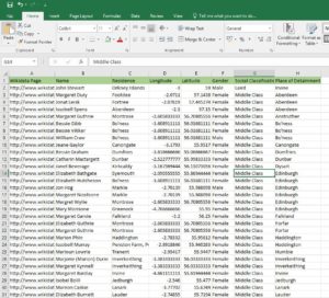
Example of the CSV file used to upload data onto ArcGIS Online (Carroll, 2019)
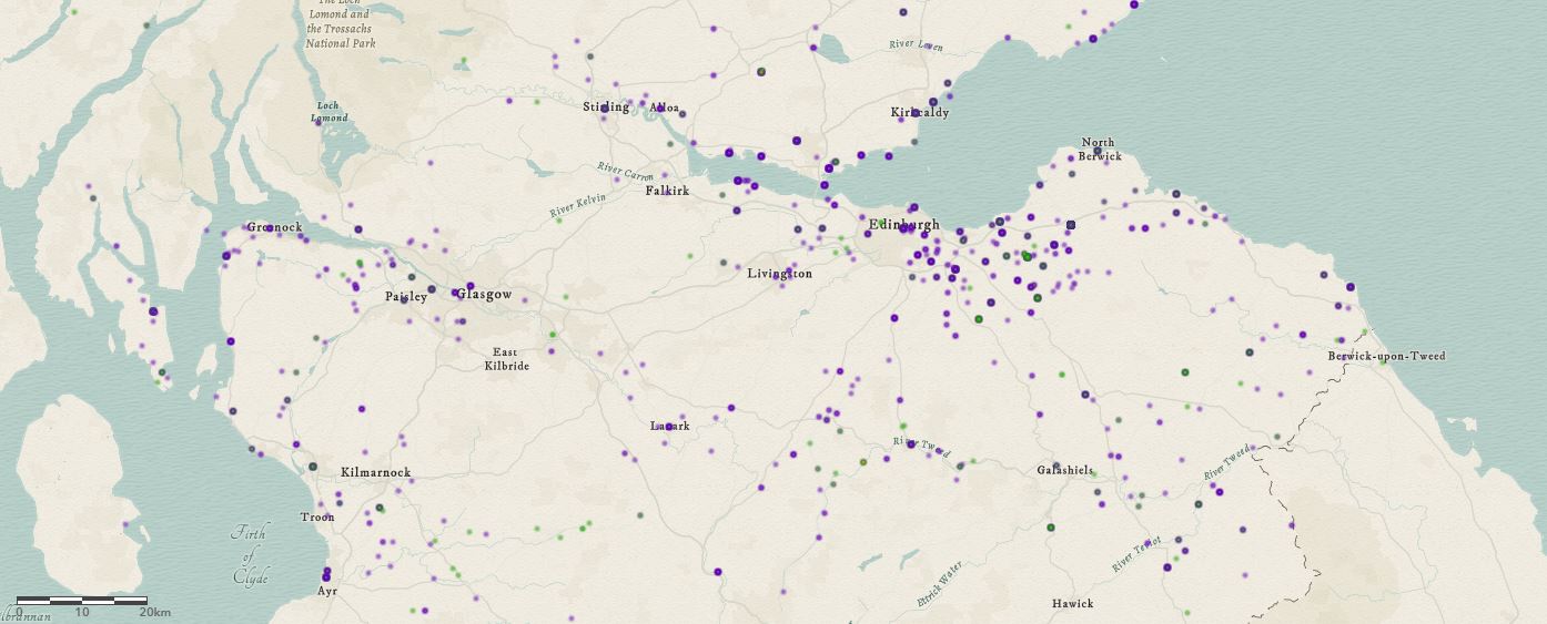
Each file was then added as separate CSV files to the map and this then allowed for a neater visualisation. The coordinates also had to be rearranged from having the latitude and longitude in one column to being in separate columns in order to be projected onto the map which needed some pro excel skills (thanks Karen). But once the manipulation was complete each CSV file could effortlessly be projected onto the map and then further customised for a preferred style.
Here is my first map produced on ArcGIS Online here
Map created using ArcGIS Online showing the residences of the accused witches (Carroll, 2019)
Next week I hope to keep using ArcGIS Online to produce other visualisations to see what this software is capable of. Aside from visualisations, I will also need to tidy up the Witchcraft data which has already been added to Wikidata.


Leave a Reply