image_pdfimage_print

4. Mood board + FFE schedule development

image_pdfimage_print

As we approach the finish line of our design project, we’ve turned our attention to creating a mood board and FF&E (furniture, fixtures and equipment) schedule. Up to this point, we hadn’t focussed our energy on considering the aesthetic qualities of the space in terms of textures, colours and decoration.

In order to approach this task, I spent some time doing some more in depth research about the history of the building and the architect who had designed it. Through my research, I was able to find out that Sydney Mitchell & Wilson (the architecture firm behind 117-121 George Street) were actively influenced by the Arts & Crafts movement around the turn of the century. I was also able to find a small number of images of interiors designed by them, and while these images are black and white, I was able to use them as touchstones to refer to in creating a modern imagining of how they might approach this design task. In addition to this, my aim was to embrace biophilic design through materiality as opposed to filling the space with an excess of plants.

Once I had gathered my research findings pertaining to FF&E manufacturers, I created a six swatch colour palette in Mattoboard and did a sort of brain dump of images to begin to understand how my initial thoughts and selections would fit together. This made it easier to identify areas where certain materials would fit together well, giving the series of spaces and zones a cohesive look and feel.

3. Esquisse session!

image_pdfimage_print

Using the plans we had made following our site visit, user research and reflecting upon the reading we had done on spatial planning strategies, we did a deep dive into some initial ideas using an esquisse session! It proved to be a valuable exercise in brainstorming. I had considered some elements of how I might approach this, however was trying to remain open-minded and flexible in my thinking as I was conscious that my ideas may not all fit the spaces we are working with.

It became immediately apparent that planning a natural flow of traffic through a long, narrow space would prove to be challenging. Striking a balance between the practicalities of a modern workspace (such as proximity to natural light sources, and networking as a fundamental part of our working lives) and the features that would make the design fit for the purposes of the brief I had written (namely, a workshop and photo studio) will require some reflection on the ideas generated in the esquisse session.

Working between digital and analogue is invaluable in terms of understanding the site and design process in a more pragmatic sense – and a continuation of this workflow should enable me to find feasible design solutions to drive this project forward. As our skills in CAD develop, I’ve found it useful to create hand drawn trace copies of my working ideas, with small moveable thumbnails of elements I hope to include – allowing me to play with and evolve the design, then translate my findings into the digital sphere.

2. Research case studies: Richard Murphy Architects & Cirrus Logic offices

image_pdfimage_print

As part of our research, we visited two local offices which acted as case studies for our design project.

Richard Murphy Architects office is located just off the Royal Mile. The office neighbours another Richard Murphy project – a small residential building which Richard noted provides clients, upon their arrival at the office, with some insight into the work they have undertaken. The space itself is located in a former mission hall, with a lofty pitched ceiling and large Venetian windows which allow in a lot of natural light – quite surprising given that they face out onto the narrow close. An upper mezzanine level built into the centre of the space maximised the available floor space effectively, giving the reception area and meeting rooms below it a cosy feel, without making the adjoining office area feel cramped.

Cirrus Logic’s offices are also located in an historic area of Edinburgh: Quartermile. The site is located at the former Edinburgh Royal Infirmary however the office itself is in a new development constructed of glass and steel. Despite the inspiration for the interiors focussing more on the company’s work in creating semiconductors and microchips (there was a lot of detailing around the office nodding to musical instruments, for which Cirrus creates parts), there was a harmonious flow between the interior and exterior with mirroring of certain patterns and colours. Clever use of acoustic panelling in the suspended ceiling which were both functional and provided visual interest. Definitely a high budget design – but with lots of details which can be applied in practical ways to projects of varying sizes and budgets.

1. Site visit and initial thoughts

image_pdfimage_print

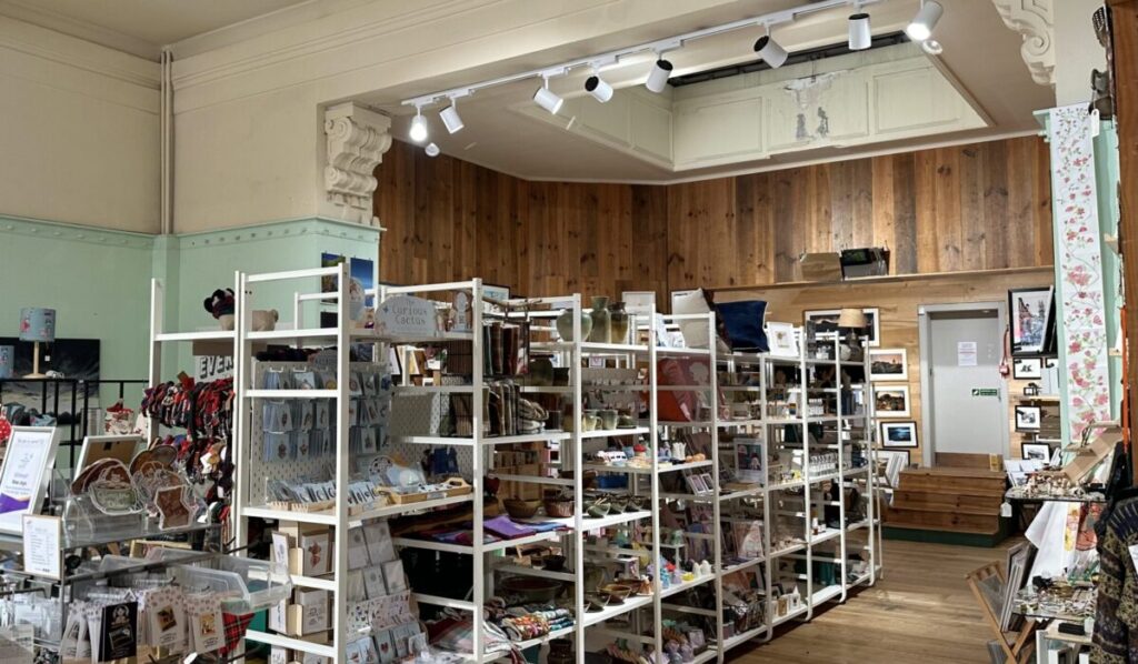
Photo of ground floor interior

Located on Edinburgh’s historic George Street, the space is neighboured by a mix of retail, hospitality and office/work spaces. With a large south east-facing glass frontage, the ground floor receives significant natural light – allowing for the possibility of creating light wells opening up to the lower basement level.

The ground floor is airy and spacious with 4m ceiling height and large structural columns creating a natural delineation of areas within the space – which may aid in zoning and creating a natural flow of traffic throughout. Decorative cornicing at the top of the columns and two curved glass light wells at the back area of the ground floor nod to the building’s historic setting. These are juxtaposed by some exposed steelwork which makes for a slightly industrial feel which I quite liked.

Upon entering the basement level, I was struck by the shift in atmosphere due to the lower ceilings. At present there is no natural light source and the space has far more industrial/utilitarian feel, meaning there is a fairly jarring contrast compared with the spacious height of the area above. This may present an interesting opportunity to create a more harmonious atmospheric flow between these areas while highlighting the building’s existing interior details.