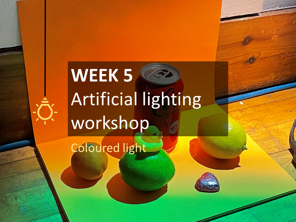
Workshop pictures
Different colour temperatures
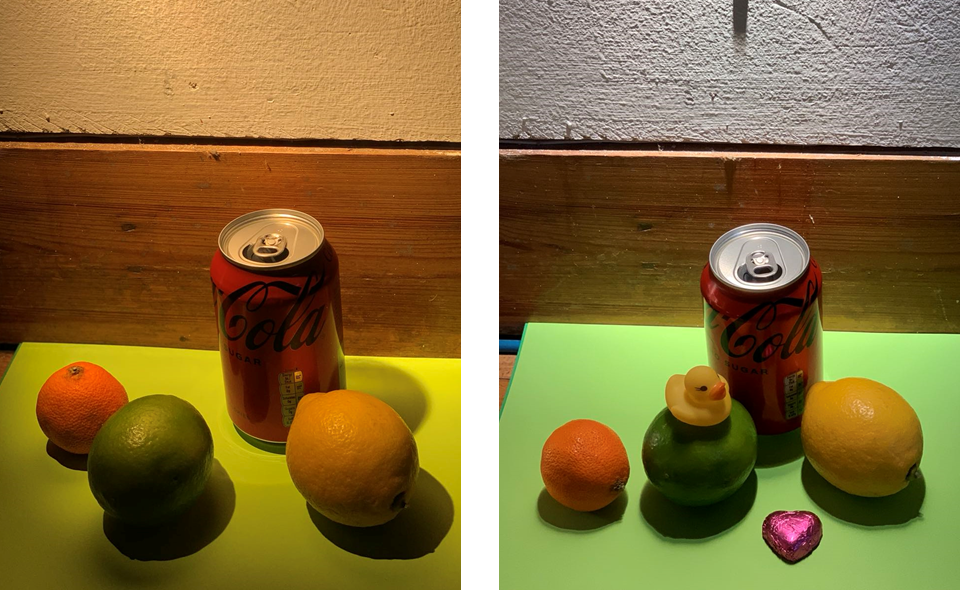
The team and I experimented with placing the light source on top of the object and used two colour temperatures for contrast.I noticed from the comparison of the two images that the warm light on the left makes the fruit more bright and attractive, while the cool light on the right emphasises the metallic texture of the can and the metallic packaging of the pink love chocolate. I associate this with the lighting design within the retail space, where the setting of the warm and cold light is closely related to the material and reflectivity of the product.
Comparison of different colour temperatures 1
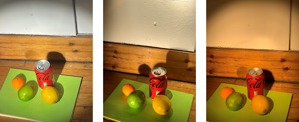
This time we adjusted the position of the light source by placing it directly in front of the object and experimenting with three different colour temperatures. I found that the objects reflected light off each other and that the colours of some of the objects were faintly visible on the green background.
Comparison of different colour temperatures 2
Light sources at different heights
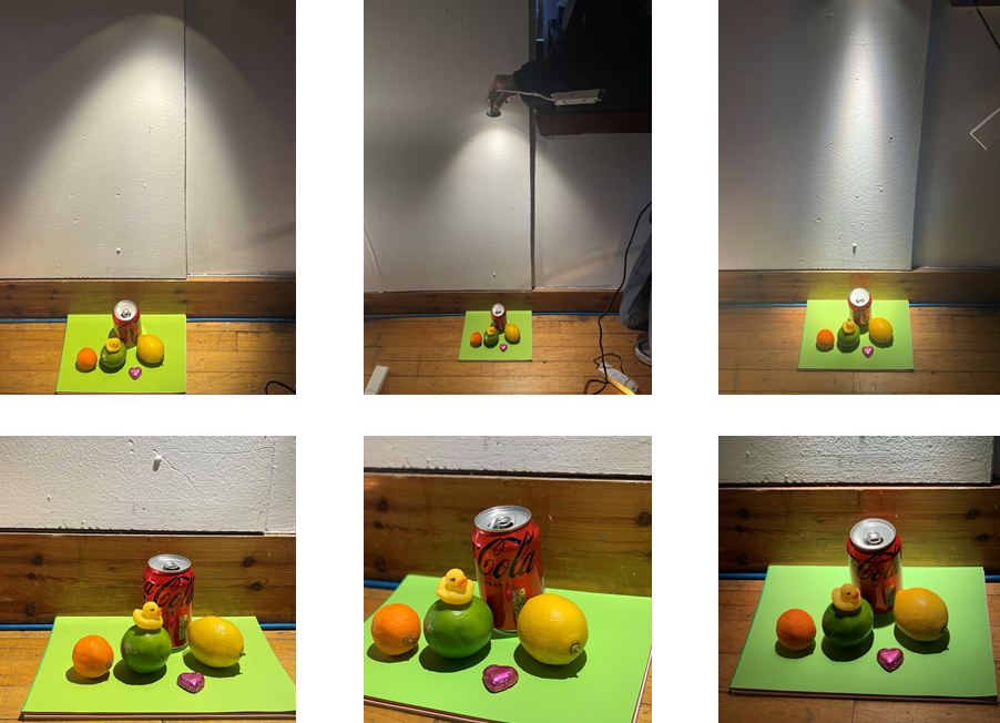
The group and I experimented with placing the light source at different heights and the intensity of the light became less as the height increased. This little experiment helped me to understand the relationship between the distance between the light and the object being illuminated.
Different heights of the light
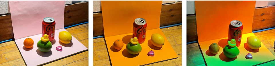
Different coloured backgrounds and lights colour
I tried changing the background to a different colour to see the effect of the ambient colour on the objects and could see that the picture with the pink background had a neutral tone, while the picture with the orange background had a warm tone. I also worked with the group to block out half of the light source with a green PVC sheet to produce different coloured light and as you can see from the picture the little yellow duck, orange and lemon immediately changed colour.
Workshop videos
My team and I used transparent PVC sheets in green colour to change the colour of the light. We first tried to cover the general light so that we could observe the contrast in colour at the same time. Then, in the second video, we changed the colour of the whole light to produce a very dramatic visual change.
Want to continue my journey in week 5?
For more posts on this week, please click here.


Leave a Reply