La Chapelle de Ronchamp
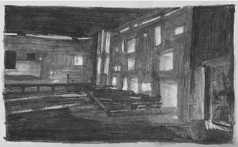
sketch 1: light and shadow
I used the properties of the pencil to draw a light picture with strong variations in light and darkness.
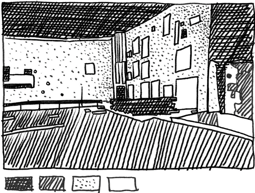
Sketch 2: lines and dots
I try to use other ways to understand and express the light and shadow effects inside the building. This image is made up of lines and dots.
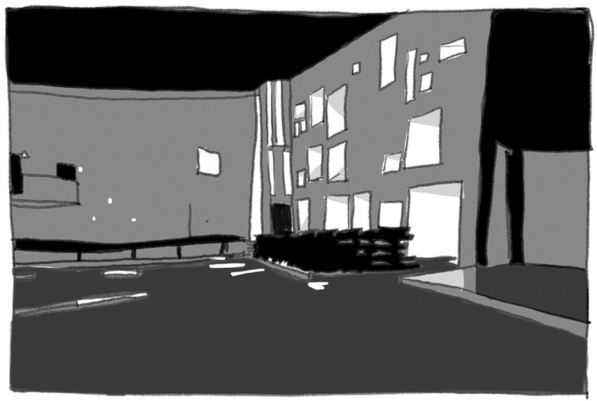
Sketch 3: black, grey, white blocks
I generalised the different light and dark areas into a uniform colour and painted them again.
The building has a very unique appearance and I tried to search for the information to understand the story of its design.
Lighting and atmosphere
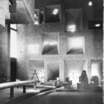
The interior of the chapel is very dark. Although it has many windows, most of them let in little light because they are either very deep or very small. It is not easy to see at first. The spatial order and material character of the interior only emerge from the shadows, after the eyes have had time to adjust. In other words the measure of the space can only be taken in gradually. Although most of the wall surfaces are white, it slowly emerges that two areas are strongly coloured: the east end of the north wall, which is violet, and the north-east chapel which is red.
Lighting and colours
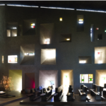
The light shines through the different colours of the glass, and the architects have made good use of this to bring colour into the interior through the light coming in.
Steane, Mary Ann. The Architecture of Light : Recent Approaches to Designing with Natural Light, Taylor & Francis Group, 2011. ProQuest Ebook Central,

http://ebookcentral.proquest.com/lib/ed/detail.action?docID=1075089.
How did the architect create such an atmosphere?
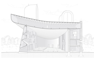
Section
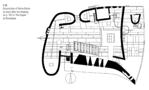
Plan
The architects have placed most of the building’s windows on the same wall, using the other windowless walls to create a darker interior, which allows for a more intense perception of light in a dark environment.
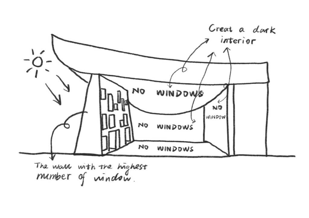
Sketch of the relation between daylight and walls
I tried to draw a cross-section of the building to understand the architect’s use of light. The following is my understanding: the multi-sided windowless walls help to have darkness, the wall full of windows becomes the only source of natural light in the room, and the light becomes sacred and beautiful in the dark ambient atmosphere.
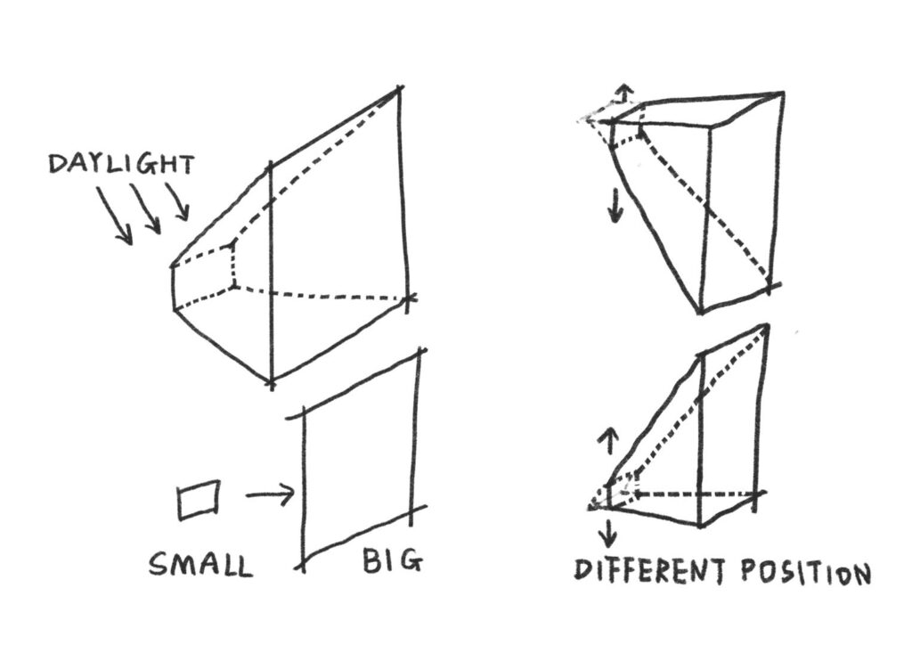
Sketch of the windows
I analysed the windows on that particular wall and tried to draw the window in 3 dimensional way. During my analysis, I found that although they vary in size and shape, they are essentially all quadrangular prisms, and they have two faces that are always parallel. With windows of different heights, they have different shapes, sizes and different angles of light penetration. They all consist of trapezoids and rectangles, which take on the task of bringing in light in walls of varying thicknesses.
I really like the way it handles walls and windows. This unconventional way of using light is very inspiring to me, breaking my limited thinking. The walls are not necessarily the same thickness, the windows are not necessarily the same size and shape, and it doesn’t need to be vertically cut holes in the wall. When I was appreciating this building, I was also thinking about the influence of weather on the lighting of this building. With thick walls and windows of different sizes, will the indoor light be darker on cloudy or rainy days? This might have some impact on the activities of the people inside.
Want to continue my journey in week 1?
For more posts on this week, please click here.


Leave a Reply