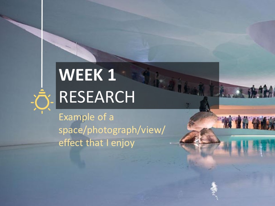
EXPO 2010 DANISH PAVILION
Company: Bjarke Ingels Group
Location: Shanghai, China
Year: 2010
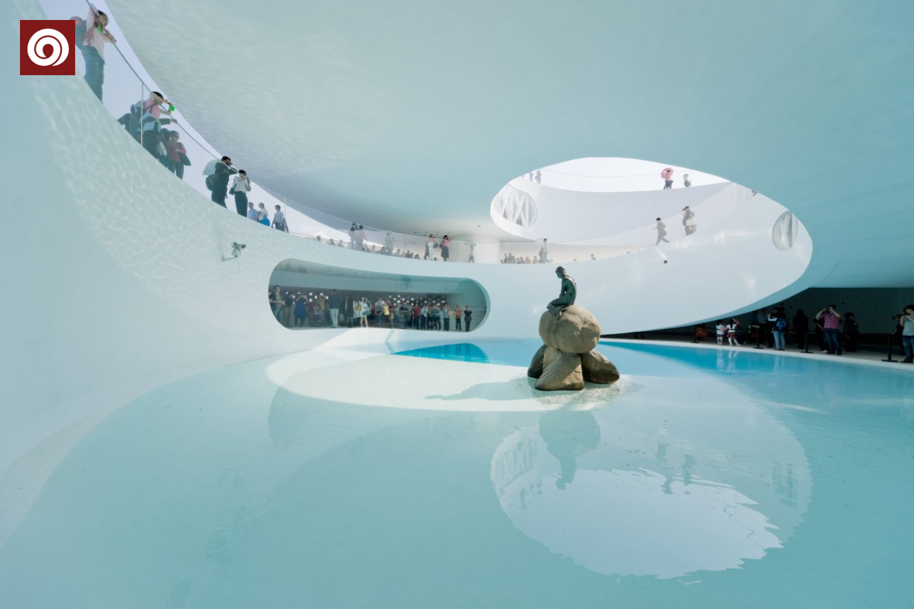
The Danish Pavilion was designed to not only exhibit Danish virtues, but, through interaction, to give the visitor an experience of some of the best attractions in Copenhagen: the city bike, the harbour bath, the nature playground, and an ecological picnic.
The effect:
The semi-open structure blurs the boundary between interior and exterior, and the openings in the top of the building bring natural light well into the pavilion. The architect has also aligned the light with people’s eyes, with the little mermaid being located in areas where the natural light is most concentrated and people’s eyes would concentrate on it in response to the light.
The use of water also gives the whole building a sense of movement. The architect has transported water from Copenhagen’s harbour into the pavilion, and the natural light is reflected on the walls by the refraction of the water, revealing shimmering waves. The movement of the sun throughout the day also allows the light inside this pavilion to change with the time of day, offering a different view at every moment.
Comments:
Natural light, water and white walls are blended in the design and the experience of people entering the pavilion changes with the light. The story behind the design, the inspiration, the concept, and the interesting architectural structure all appeal to me. Hans Christian Andersen’s fairy tales are recreated in architectural language, and the use of natural light brings the tranquillity of nature into the man-made objects, which makes me feel very enlightened when I see such a view.
ARTIFICIAL LIGHT AT NIGHT
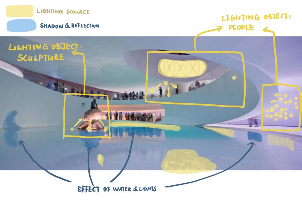
Analysis of the lighting at night
Through my observation, there are only two types of artificial lighting at night according to the lighting objects, one is people and the other is display items. The lights that mainly provide lighting for people are relatively soft, but the lighting for the sculptures in the water is very strong, probably to allow people in the distance to see clearly. It also inspired me to consider the objects to be illuminated when designing lights, and the distance between objects and people. Since water is used as an architectural element, the influence of water on the light also needs to be considered in the lighting system. I used yellow to represent the light source, and blue to represent the shadow and reflection. I wanted to know the ratio between the light and the shadow, but during the drawing process, I found that it was difficult to find the dark side and shadow due to the difficulty of judging the dark side and shadow at night out the proportional relationship between them.
Want to continue my journey in week 1?
For more posts on this week, please click here.


Leave a Reply