Task 1: ARTIST STUDIES
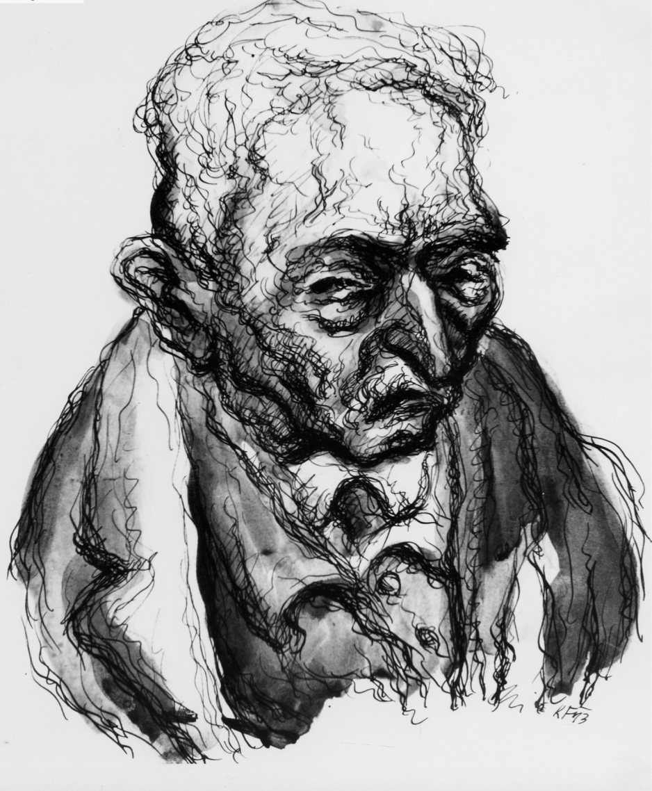
Karel Fleischmann
-
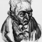
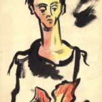
- ‘Figure of a Man’
-
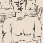
- My study using watercolours and biro
-
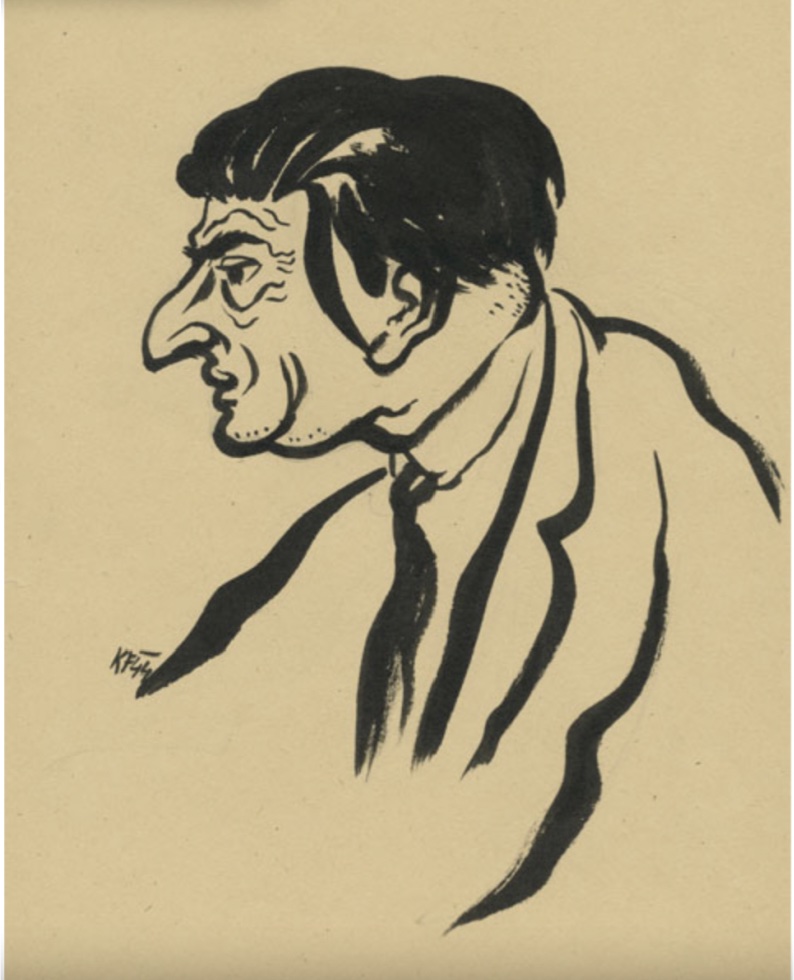
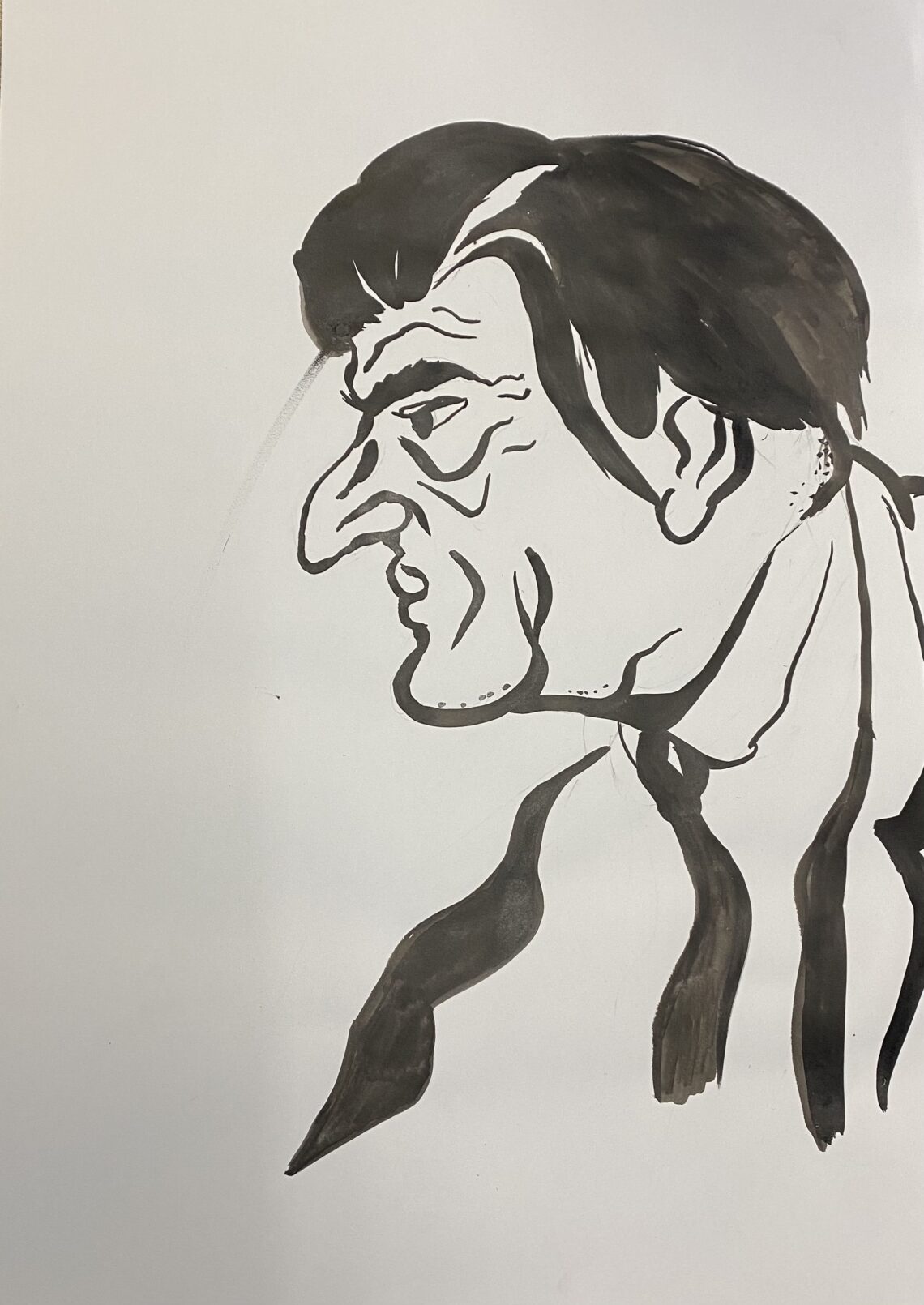
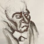
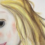
- Ing. Otto Zucker, Therestadt Ghetto, 1944, Ink on Paper
-
- My study using ink
-
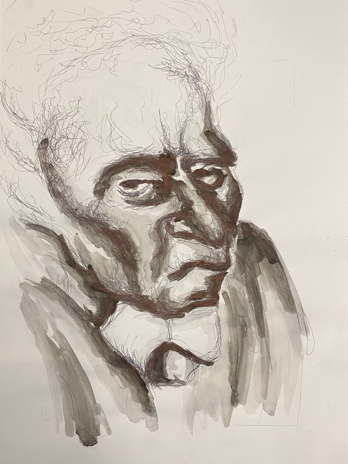
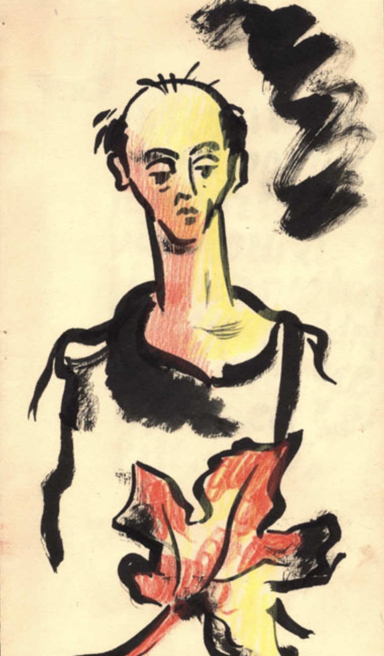
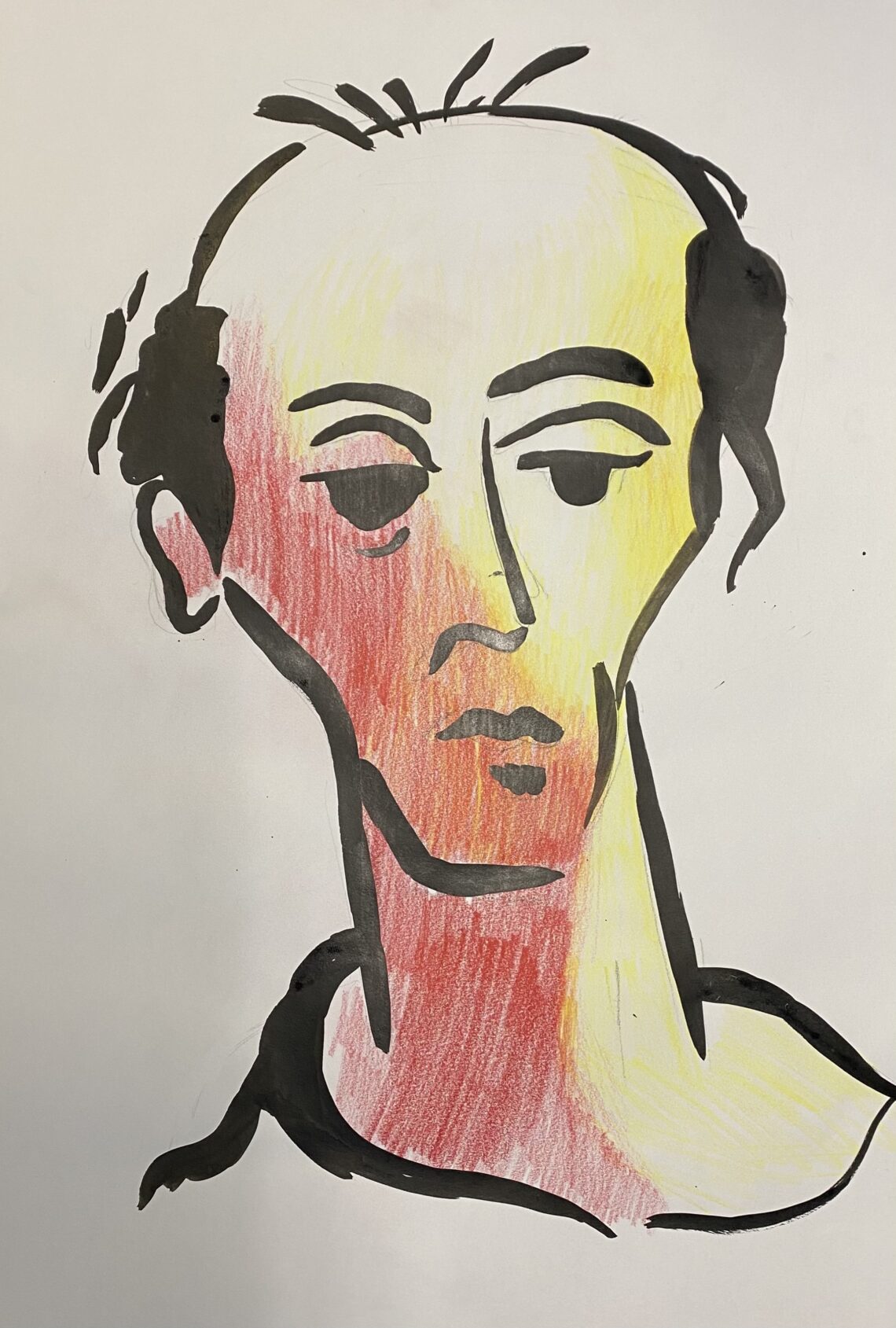
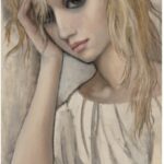
- ‘Dr. Erich Munk, From the Illustrated Poem, 1943’, Theresienstadt Ghetto,1943,Ink and coloured pencils on paper
-
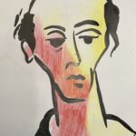
- My study using ink and coloured pencil
(Top) I feel I was successful in achieving the melancholy emotion of the subject through his facial expression especially in how his brows are frowning, yet I feel I could have used more concentrated black watercolour in order to emphasise the dark tones and sinister links to the holocaust in Fleischmann’s portrait.
(Middle) I think I was effective in accurately capturing the facial features on the subject in this study; working on A2 has definitely been beneficial as I have been able to be more free with my hand movements to create more natural and flowing marks on the page.
(Bottom) I enjoyed using pencils as a ground for the ink, to me the red replaces dark tones and shadow and the yellow areas show the light hitting the figure’s face. This can represent the evil of the concentration camps and the hope that the prisoners had that they would survive.
About the Artist
Karel Fleischmann was born in Klatovy in 1897. He was a writer and editor of a newspaper but also wrote poetry books which he illustrated too. During the Second World War he was sent to the Theresienstadt Ghetto where he documented his life, the pieces above are of the elderly inmates he was in charge of looking after. In 1944 Fleischmann was later murdered in Auschwitz. (Last Portrait , Painting for Prosperity, Yad Veshem, The World Holocaust Rememberence Centre, 2021)
A Brief Analysis
My eyes were immediately drawn to Fleischmann’s use of strong confident and sweeping lines used to create his portraits. I chose to study his work in order to practice using a new media (ink) and to encourage me to draw more freely with my arms and less with my hands.
Uche Okeke
-

- Church in the Forest, 1966, Lino, AP, ed. 5 of 10, 6×5 inches. Courtesy of the artist and Skoto Gallery
-
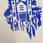
- My study using ink
-

- “Face of Onwa” (1981) charcoal on paper, 12×9 in. Soko Gallery
-
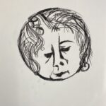
- My study using cryaon
-
- Portrait of Oga, 1965, Pen on paper, 31cmx11cm
-

- My study using fineliner
(Top) I liked the way Okeke had used colour to carve out the shape of buildings and people instead of conventionally using media to paint objects in a scene. I want to explore this method and focus on the silhouettes of objects and the individual shapes that compose them throughout the semester. I chose to use ink in my study (left) as I think the fluidity of the ink is helpful in creating smooth improvised shapes on the page.
(Bottom) In my study I experimented with different ink pen thicknesses to show different textures and the emphasise the man in the foreground more compared to the objects cluttering the background.
About the Artist
Uche Okeke was born in Nigeria in 1933 and was passionate about creating art that advocated his Igbo culture . Okeke prioritised drawing during his creative process which is why a lot of his documented works are sketches and scribbles. Drawing was also a very important part of his traditional Igbo culture; Uli was a mark making technique that reduces form down to lines widely practised by women on the body or in wall murals. (Among Others: Blackness at MoMA, ed. Darby English and Charlotte Barat (New York: The Museum of Modern Art, 2019)
Margaret Keane
-

- ‘The Littlest Clown’, Fine art giclee print on canvas, 8 x 10 in.
-
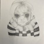
- My study using graphite pencil
-
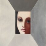
- ‘No Boundaries’ 1969
-
- My study using coloured pencil
-
- ‘Pensive Beauty’ Oil on board, 29.8cmx14.6cm
-
- My study using oil pastel
(Bottom) I wanted to zoom in on the flowing hair of the figure in my study (left) because I thought that i could capture its movement effectively with oil pastels as they can be blended but can be used to create individual hairs.
About the Artist
Margaret Keane was born in1927 in Nashville Tennessee and is widely known for her portraits of children with very large eyes. This style has gone on to influence other artists such as Tim Burton and Craig McCracken, the creator of Power Puff Girls.
A brief Analysis
I really enjoyed the way Keane’s use of intense shading and bright colours create a playful atmosphere which compliments many of the children in who are subjects in her work.
Task 2: Using artists techniques
-
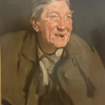
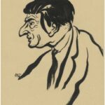
- Samuel John, c.1902, Man Laughing (Portrait of Tom Morris), Oil on Canvas
-
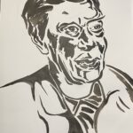
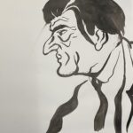
- My ink study in Fleischman’s style
-
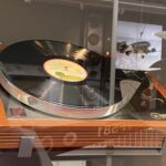
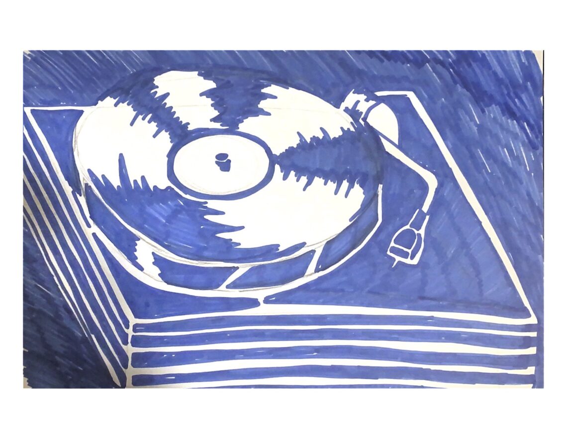
- Sondek LP12 Record Turntable, 1972, Linn Products Ltd, Design Gallery
-
- My study in Okeke’s style using fineliner
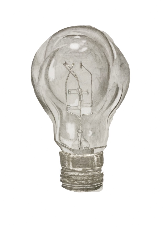
-

- Pointolite Light Bulb,1930, Edison Swan Electric Co Ltd, Design Gallery
-

- My Study in Keane’s using graphite pencil
(Top) When studying John Samuel’s ‘Man Laughing’ I recognised that the noticeable brush strokes on the page of the original could be recreated in Fleischmann’s style with ink. Next time I would not use as much block shading on the face and instead let simple line illustrate the subjects features.
(Middle) This graphite pencil study of a seed from my collection of objects is loosely inspired by Margaret Keane. Instead of imitating Keane’s ‘big eye’ style (which may have been the obvious choice) I felt that focusing on the way she uses light and dark tones so vividly especially by leaving areas of white on the page would be more beneficial to my drawing skills.
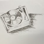
(Bottom) The background of Okeke’s Portrait of Oga is very cluttered with household items like radios which is similar to the vintage record player in my catalogue of objects therefore i decided to capture it in Okeke’s rough pen/ink sketch. The process of loosely sketching with a pen was very liberating so I will consider doing drawing exercises like this again. However on reviewing this piece with my tutors I felt I could explore the composition of the record player more effectively in ink which led me to create the study below.
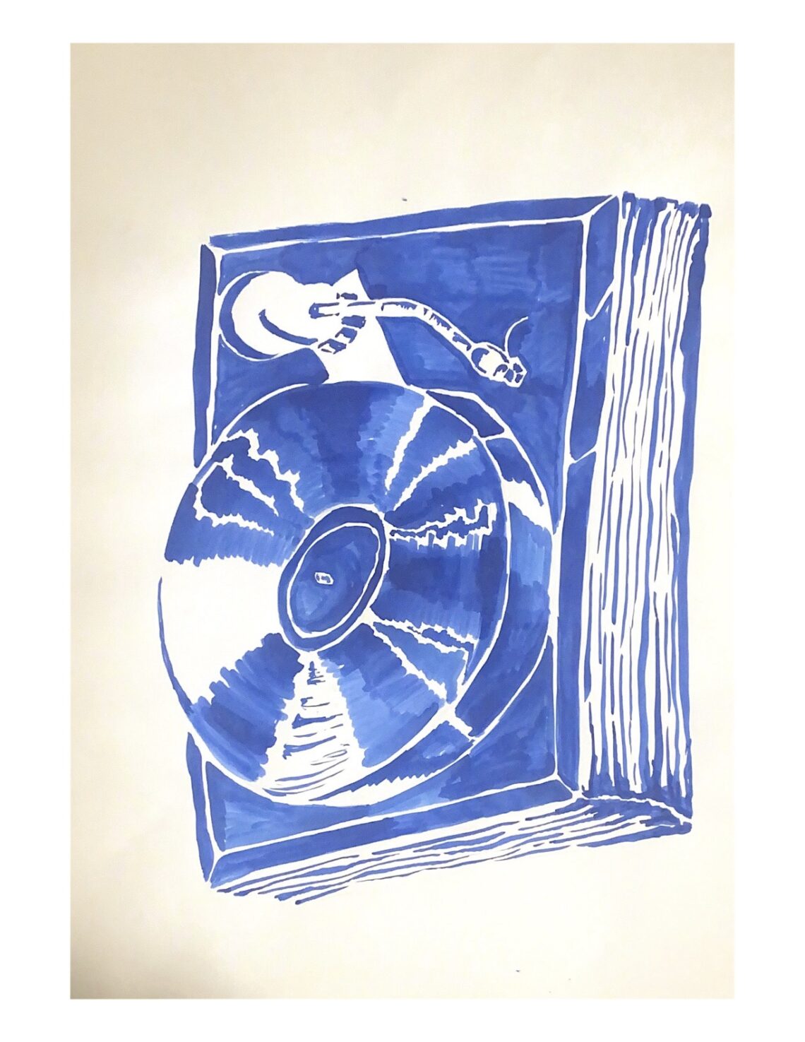
Week 9 + 10 developments
-

- My marker study
-
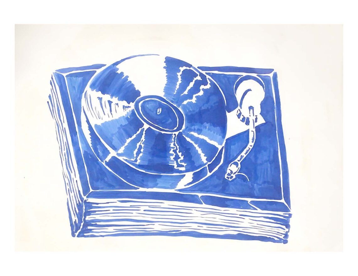
- Sondek LP12 Record Turntable, 1972, Linn Products Ltd, Design Gallery
-
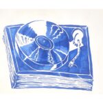
- My study in Uche Okeke’s style using ink
(Left) A small marker pen sketch planning how I would colour on the page, I prefer having the record player surrounded by white space so the viewer can appreciate its form more.
(Right) After developing , my skills using ink throughout the semester this is a lot more successful than the initial fine liner study. By using the ink I was able to successfully convey the shapes that create the record player.
-
- My study using ink and coloured pencil
-

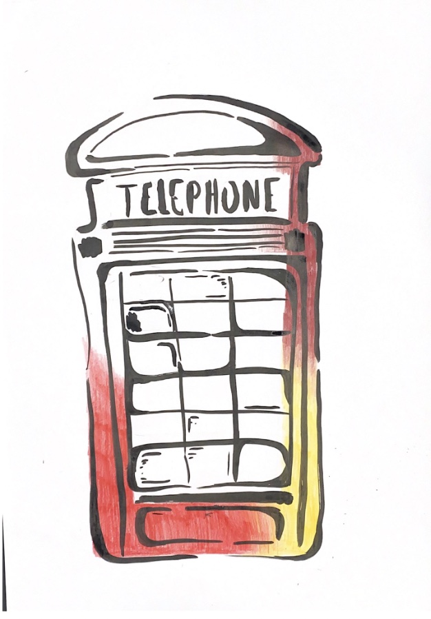
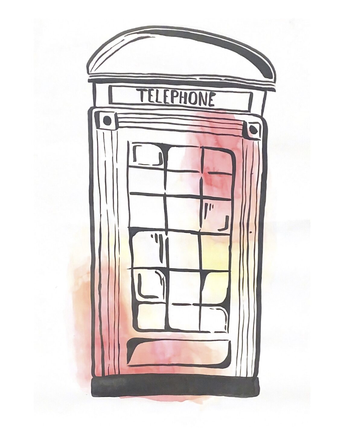
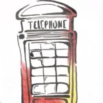
- Telephone Box, Design Gallery
-
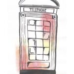
- My Study using ink and watercolour
I liked how Fleischmann injected colour into his portraits by using coloured pencil scribbles as a partial background, the red in his work was similar to the tone of the telephone box so I wanted to develop the ways I could use his style on objects rather than portraits. I think the water colour study is more successful as the red and yellow pigments blend together to create subtle orange tones
-
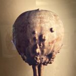
- Gourd (Cucurbita sp.), The Hidden Beauty of Seeds and Fruits
-
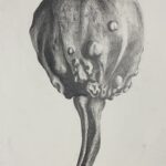
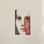
- My study in Keane’s style using graphite pencil
By concentrating on how Keane dramatically uses shade (see ‘No Boundaries) I was able to successfully show how the light hits different areas of the seed and casts interesting shadows.


Leave a Reply