I found the presentation interesting as light is something I feel has a large affect on me. It was a coincidence to hear about the Philips Wake-Up Light, as I have had a similar one to this for years now. It is much nicer to wake up this gradual way, as opposed to just an alarm. I didn’t know that age affected the way we see colour and light, so this was useful to learn about and something that I will be able to consider in my designs going forward.
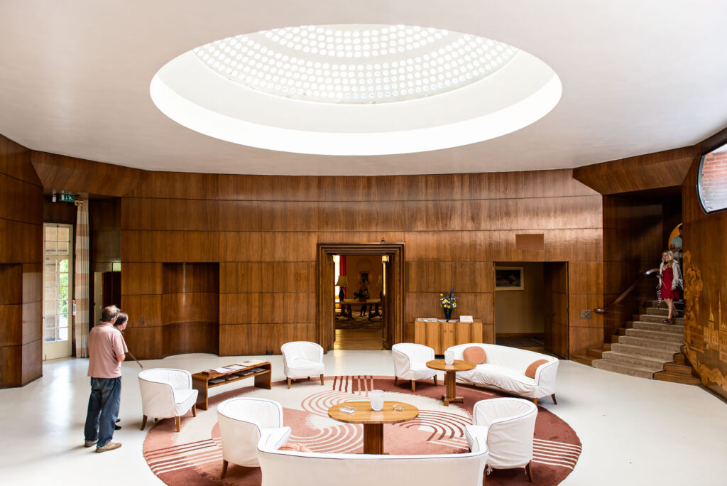
The first image is of Eltham Palace, which is the example I chose for lighting that I enjoy. This is really near my family home, so I have visited many times and have always admired the use of the skylight, which is detailed with circles in concentric spirals. The image shows the art deco extension, which was added in the 1930s. I like how much natural light is allowed into the space and the focus it creates on the central seating area.
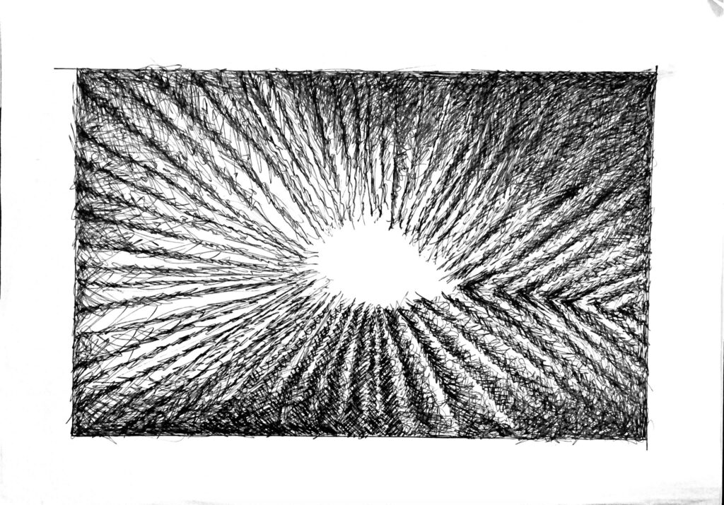
The second image is my tonal drawing of the case study photo I had. I used black fine liner and cross-hatched to achieve the varying areas of light and dark. I’m pleased with this technique as it appears quite dramatic. I think it communicates the tone of the photo successfully but if I were to do it again I would perhaps try with charcoal, allowing me to smudge the lines.