WEEK 7: LIGHT AND COLOUR

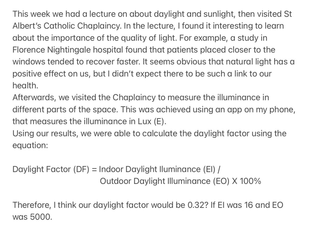
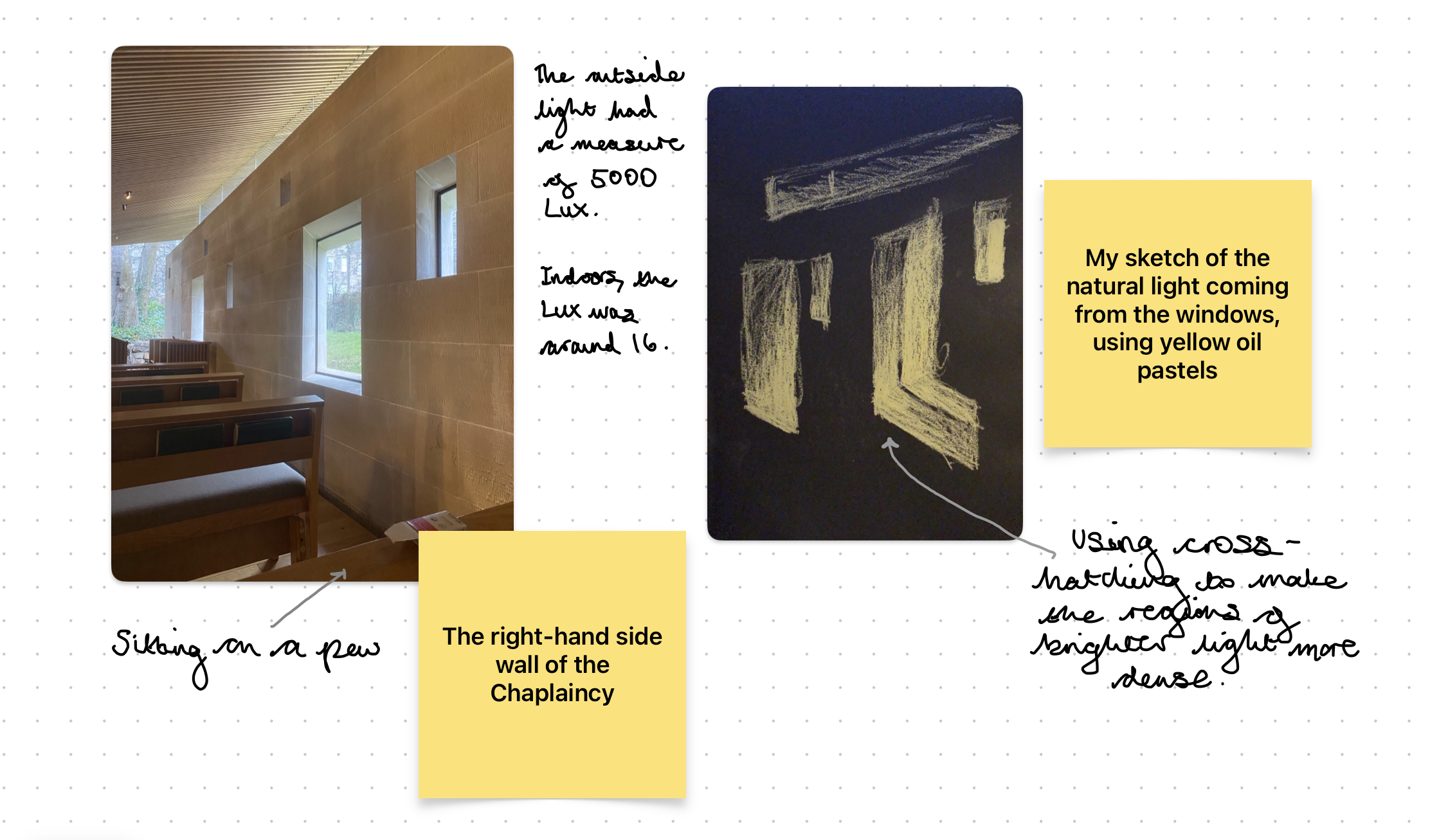
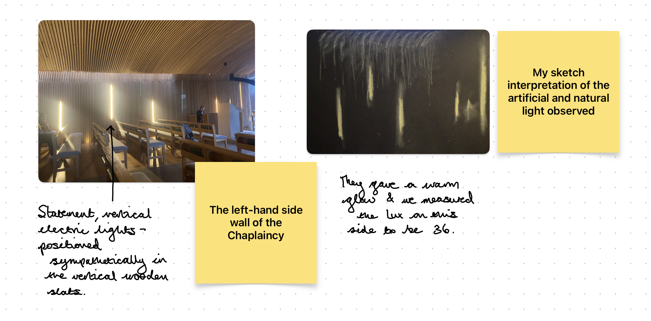
I found this week’s presentation interesting as it is very relevant to my project. I am thinking of using coloured light to distinguish between each of my floor levels and to create different atmospheres, such as a relaxing one, more neutral one and a stimulating one.

I liked learning about non-spectral colours, and how these cannot be created with light of a single wavelength. Therefore, I might consider how this could relate to my design and the potential.

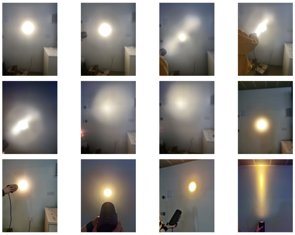
Additionally, I hadn’t properly thought about how colour can be influenced by its surroundings, so this was valuable to learn about.

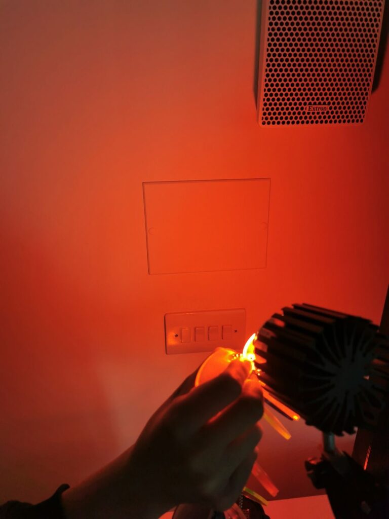
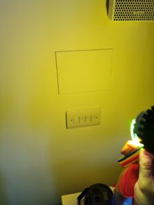
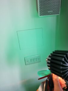
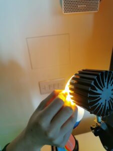
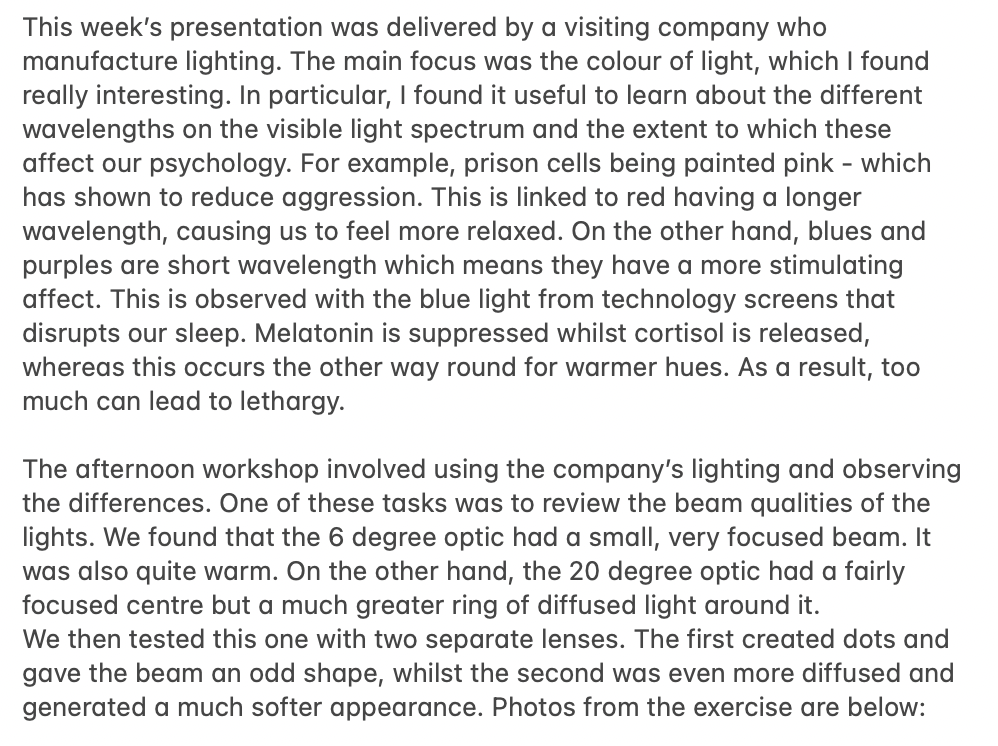
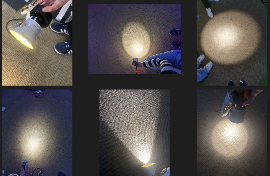
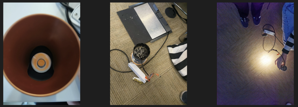
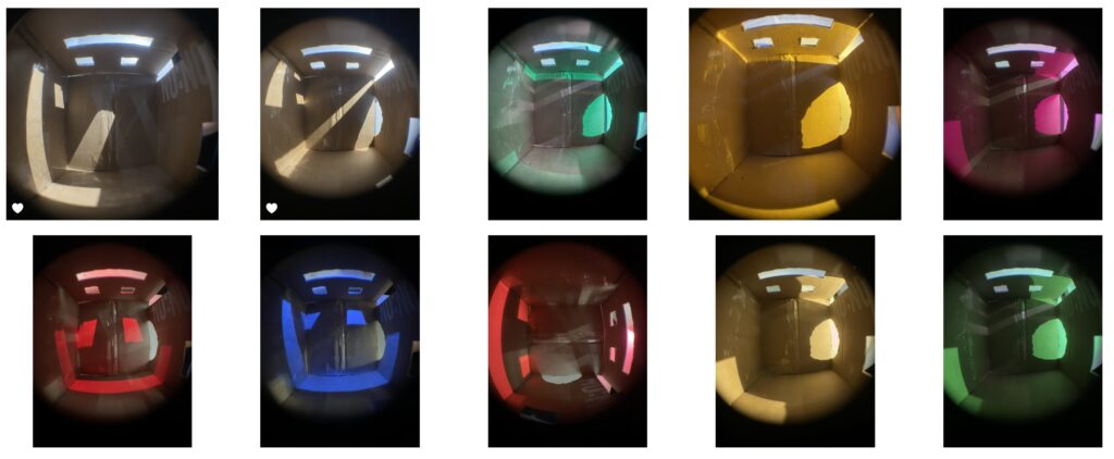
Then we had the workshop in which we played around with different coloured lights. It was fun to see how all the colours combined create white, as shown in the first photo below:

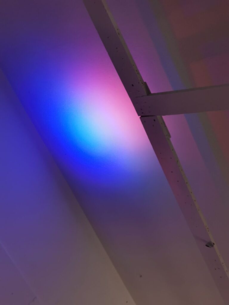
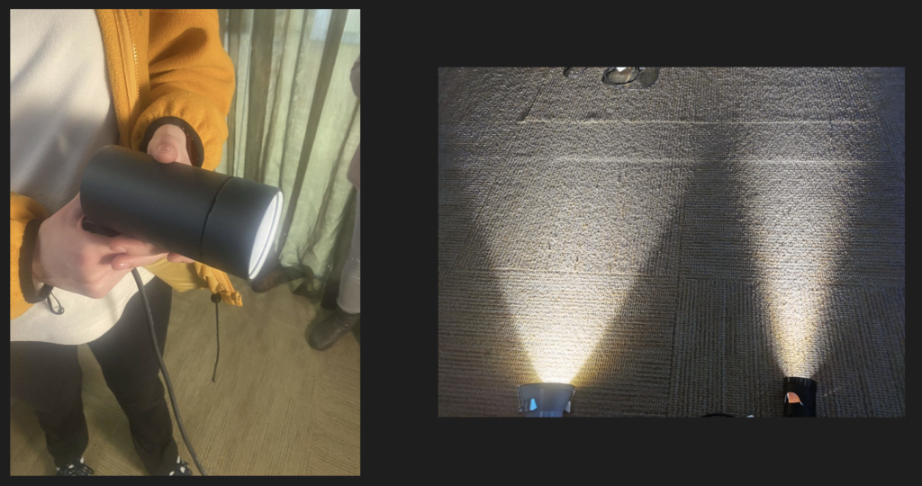
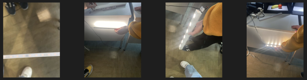
I liked the range of colours we experimented with on the wall, which I could use on a model for my own project.

Week 1: Introduction

I found the presentation interesting as light is something I feel has a large affect on me. It was a coincidence to hear about the Philips Wake-Up Light, as I have had a similar one to this for years now. It is much nicer to wake up this gradual way, as opposed to just an alarm. I didn’t know that age affected the way we see colour and light, so this was useful to learn about and something that I will be able to consider in my designs going forward.

The first image is of Eltham Palace, which is the example I chose for lighting that I enjoy. This is really near my family home, so I have visited many times and have always admired the use of the skylight, which is detailed with circles in concentric spirals. The image shows the art deco extension, which was added in the 1930s. I like how much natural light is allowed into the space and the focus it creates on the central seating area.

The second image is my tonal drawing of the case study photo I had. I used black fine liner and cross-hatched to achieve the varying areas of light and dark. I’m pleased with this technique as it appears quite dramatic. I think it communicates the tone of the photo successfully but if I were to do it again I would perhaps try with charcoal, allowing me to smudge the lines.