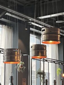
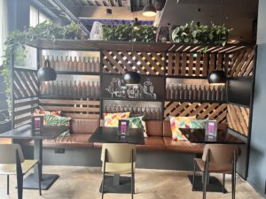
Moxy hotel has a very playful feel to the space there is a lot of things to do with beer and whiskey throughout the space. Beer crates for decoration on the walls, kegs suspended from the celling for lighting, lots of visible pipes running along the celling to whisky stills. It is not quiet apparent what the association with these “boozy” props are but considering Moxy’s motto is about “play” I think this is to reflect their fun playful atmosphere.

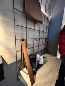
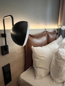
The hotel bedrooms were small but I thought generally quiet spacious for a city hotel I really liked the way the incorporated a more lounge style seat into the bedside table making great use of this small space. The coffee station also doubled as a workspace with a pull out seat underneath. Overall I thought the room was very functional for a guests needs and the design was well thought out with a great combination of originality and practicality within the space something that is maybe lacking in other areas of the hotel.

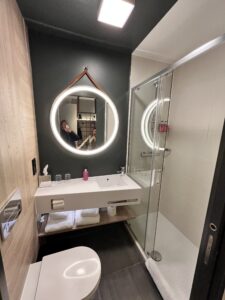
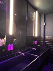
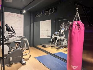
The communal areas like toilets, elevators and gym facilities incorporated the fun elements of Moxy’s ethos into the spaces through colour and hand written quotes written on mirrors and walls which was a nice touch. The location of the gym was situated behind the bar area which I thought was quiet in practical as this is also the area where breakfast is served so it is a high traffic area during peak service time and then you would have to walk through this area to get to the gym which is not ideal for the guests or the staff working in this space.
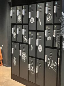
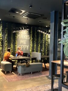
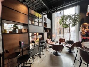
The main area of the hotel foyer had lockers and a separate area for people working on laptops, this is a great idea for creating a quieter work area and separating this function form the more social areas of the foyer. The ratio of seating for working compared to social space is quiet large given the number of rooms and could be done in a way that made better use of the space.
The main foyer/lobby space has been divided up by different shelving still creating a level of visibility between the different zones. The bar is long and runs most of the length of this space and is also home to the main reception and the breakfast service. I like the relaxed feel this design gave off but during breakfast/evening drinks when this area is populated with many guests I think the area would be extremely congested as there is not a large amount of seating for the number of rooms in the hotel (200) the area behind the bar having so many things going on in the one space is probably quiet in practical for staff and not enjoyable to work in as you would be constantly under each others feet and also have guests circulating in areas where people are trying to check in and this does not seem like a well thought out design to me, an aspect which was confirmed by staff working in the space.


Week 8 – Moxy Hotel Visit / Josie Lancaster / Interior Design 2B - Change of Use (2023-2024)[SEM2] by is licensed under a

