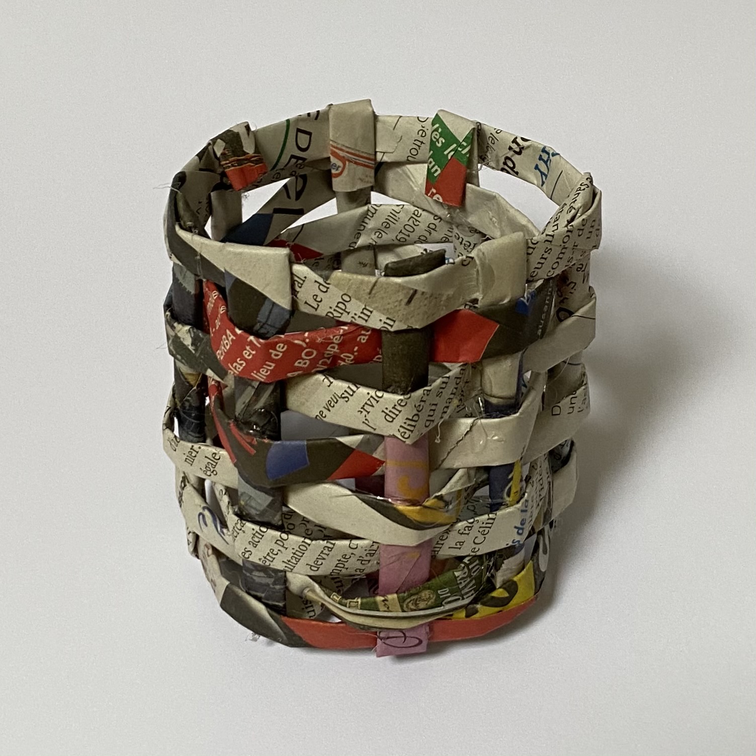
For my first attempt, I used rolled up tubed of newspaper. This made a thicker, more solid material. However, it lacked a bit of flexibility, so the result isn’t as neat as I would have wanted. However, I also really like the newspaper look. And I managed to get it generally symmetrical.

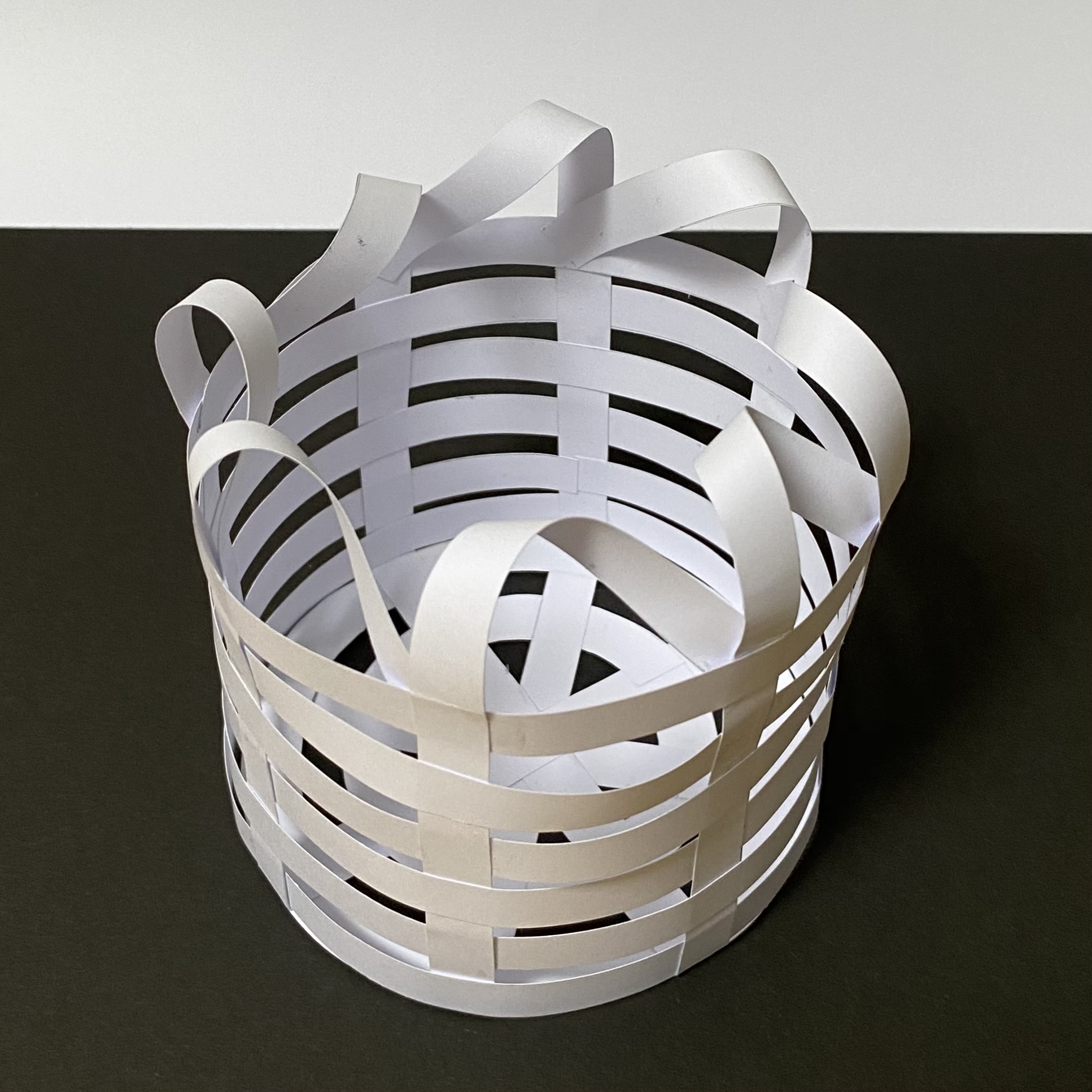
For the second basket, I thought to have more flexibility I would just use thin strips of paper. Though the result is a bit less sturdy, it is definitely neater and more symmetrical. I also decided to try folding the leftover ends to the side to create a nicer top, rather than just folding them over and having a flat top.
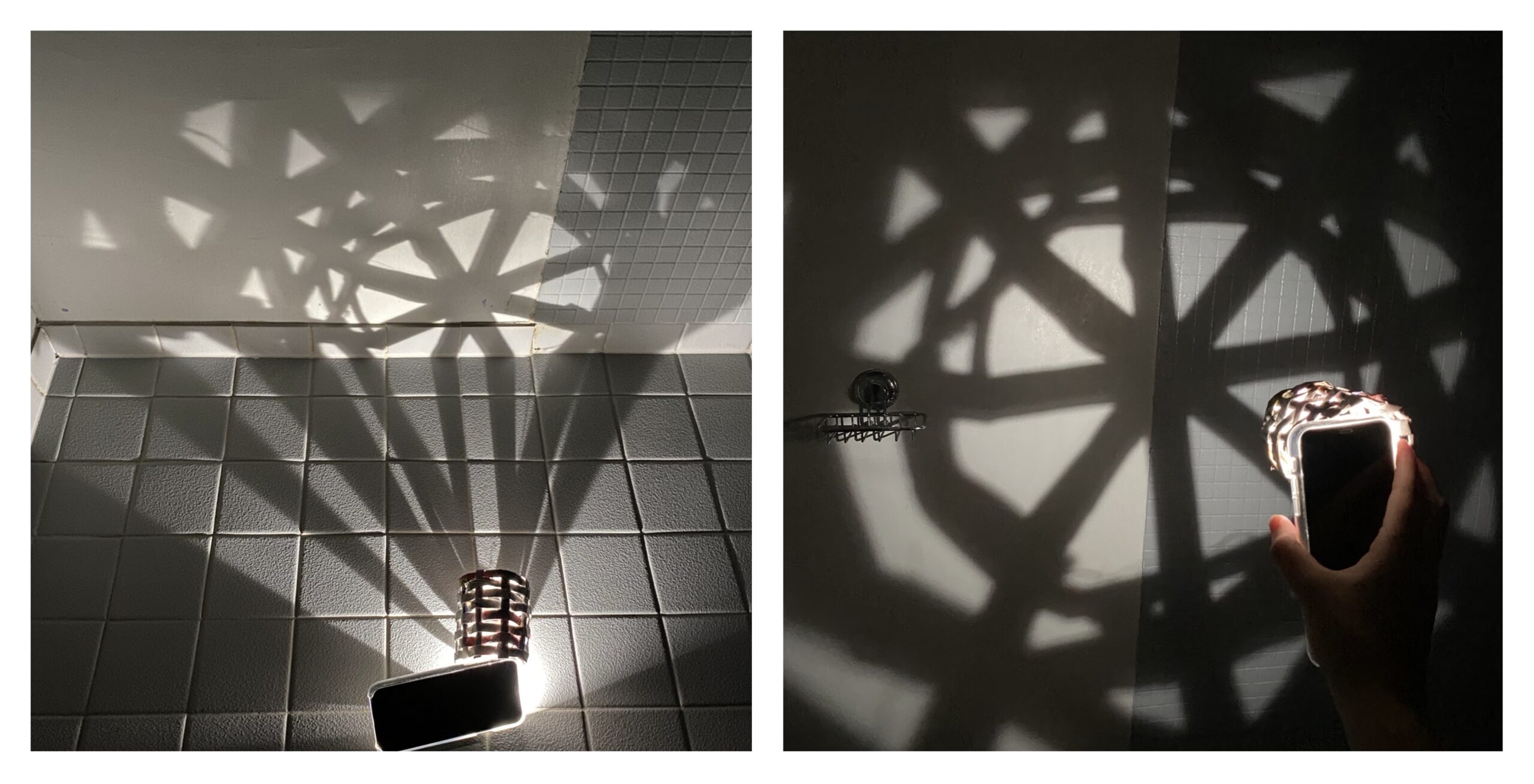
 I then tried seeing how these ‘baskets’ would interact with light. The first one due to the material used, and its lack of perfect symmetry gave off a more natural, somewhat more organic light, which I thought was really cool.

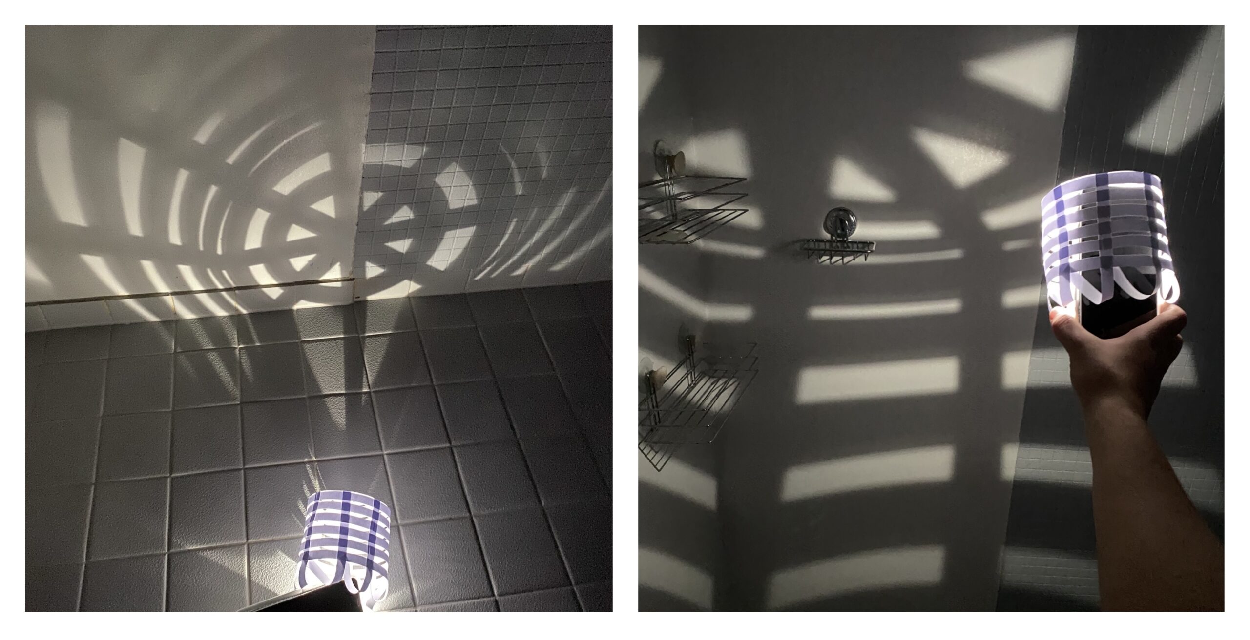
The second one gave off a way more neat and symmetrical light, which also looked really nice in a completely different way.

This activity was really interesting because it was a lot of fun to see how small differences in the object could cause a lot of variation in the light effect.


Excellent exploration and presentation Quentin!
Very nice presenting, truly like the clear shapes of thee shadows which your basket made.
Really like the idea of using different materials for the Light Basket , good job.
After going through your whole blog, I can assure you your attempt at being successful at product design is exceeding expectations!!!!!! Lovely work and exploration and addition to the course by using different materials 😉