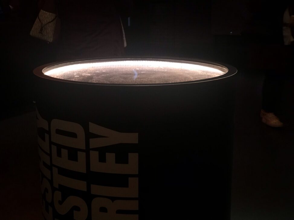
Around the end of March I visited the Guinness Storehouse in Dublin. I was on the look out for effective and ineffective use of light in the exhibitions. The top image shows a roasted barley exhibit which consists of a metal barrel with a glass top. I have adjusted the image to show the linear LED lighting that has been used to light the barley inside. I thought a similar method could be employed to light up the displays position around the walkways and perhaps also the surfaces of the larger digital displays.
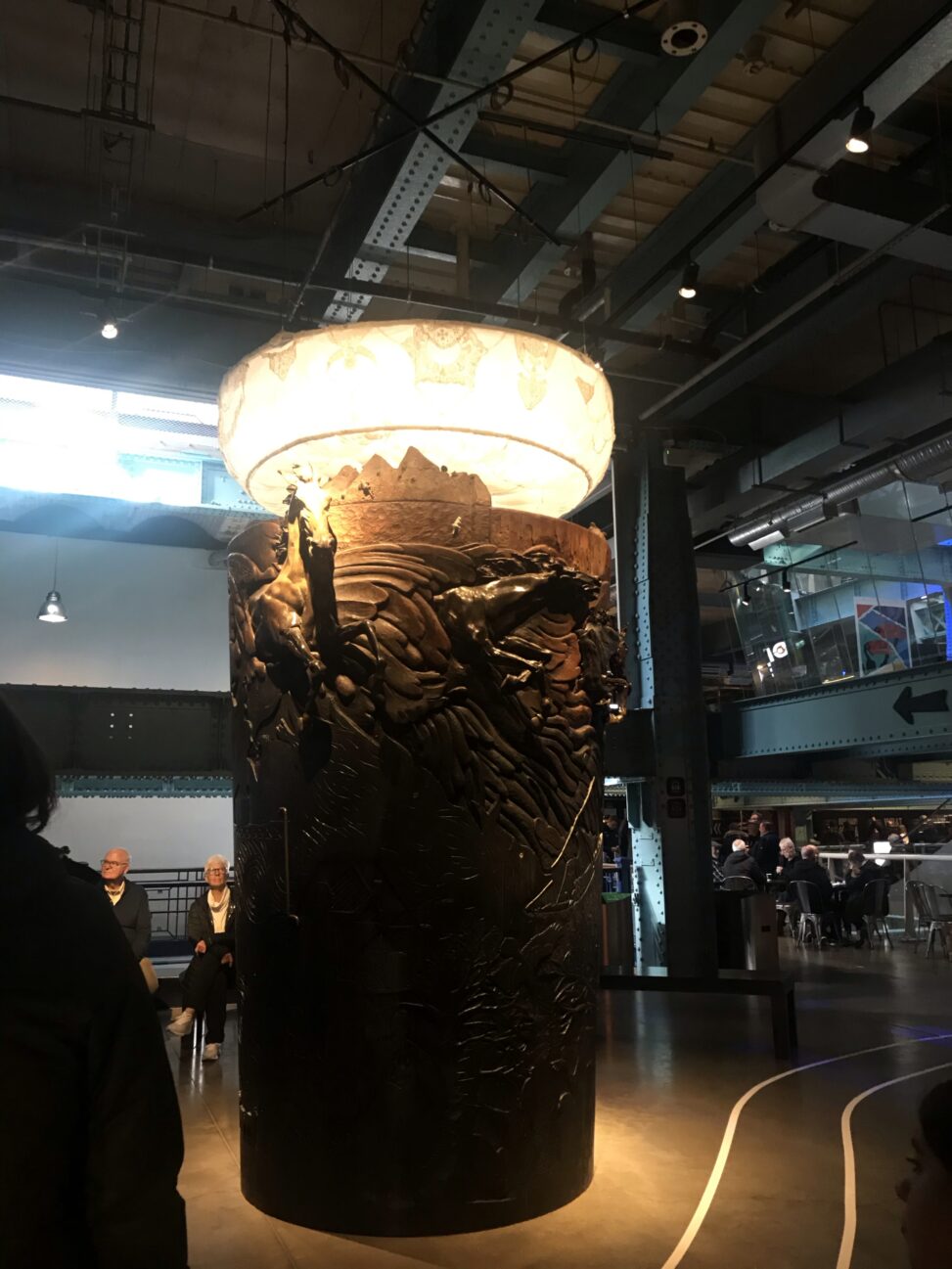
The image below is a metal-work structure with a torch on top. I took interest in this one as the torch was covered with fabric. I could not see the luminaire within but I imagine it was one large light source and the fabric wrapped around that did the effective job of diffusing quite a gentle glow. This is the look I wish to achieve with the light beam, only at a larger scale.

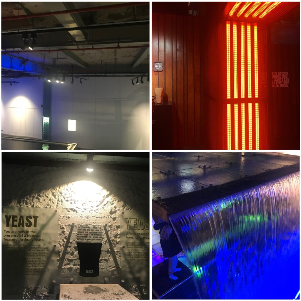
Below are some other lit spaces I found interesting. The first shows a track system which allows for the exhibition to be moved around and the lights adjusted accordingly. The second I thought was effective use of coloured lighting and choice of luminaire as it effectively imitates a heater a good choice for a room and the roasting of barley.
The third image (bottom left) I thought was a less effective use of light. The contrast was far too much especially with the black and white theme which left the text very difficult to read.
The forth image I though was a fun and eye catching use of coloured light and water. I could see where the source was but I imagine a coloured luminaire somewhere along the source of water created a bold blue space that was very enjoyable to be in.


Leave a Reply