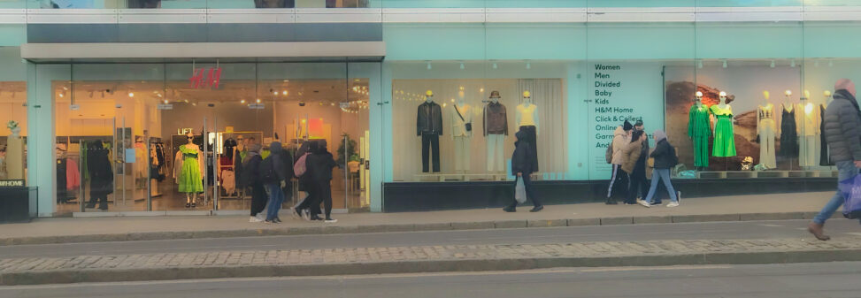


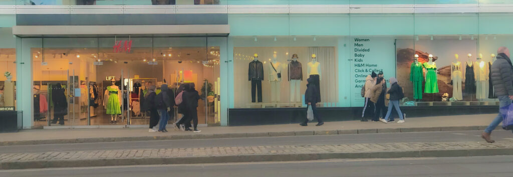
I was standing opposite the H&H on Princes Street and notices the affect of colour rendering in practice. The same green dress was on display at the front of the store as you entered and on the window display. But while one appealed very much to me the other made me change my mind. The dress, the fabric and colour, where exactly the same but two different colour temps of lighting made the dresses look quite different.
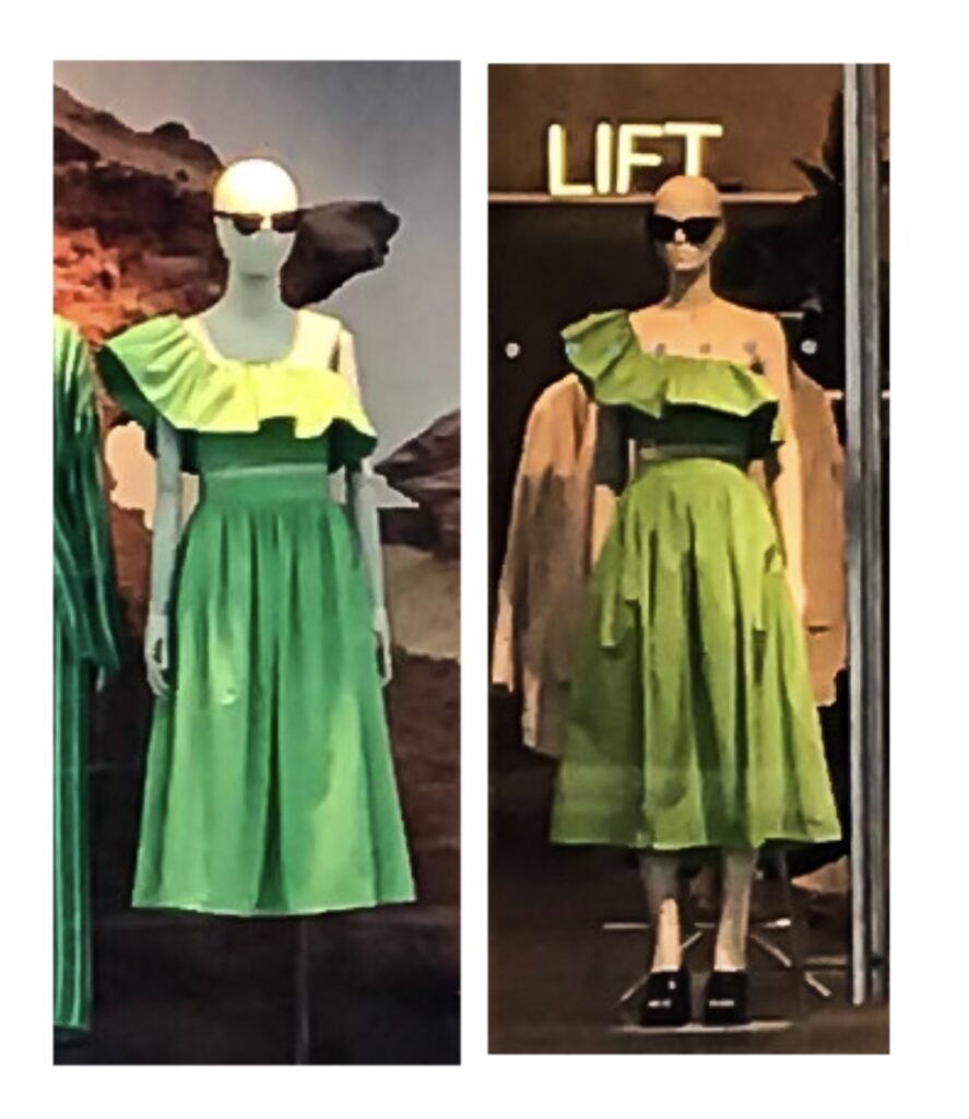
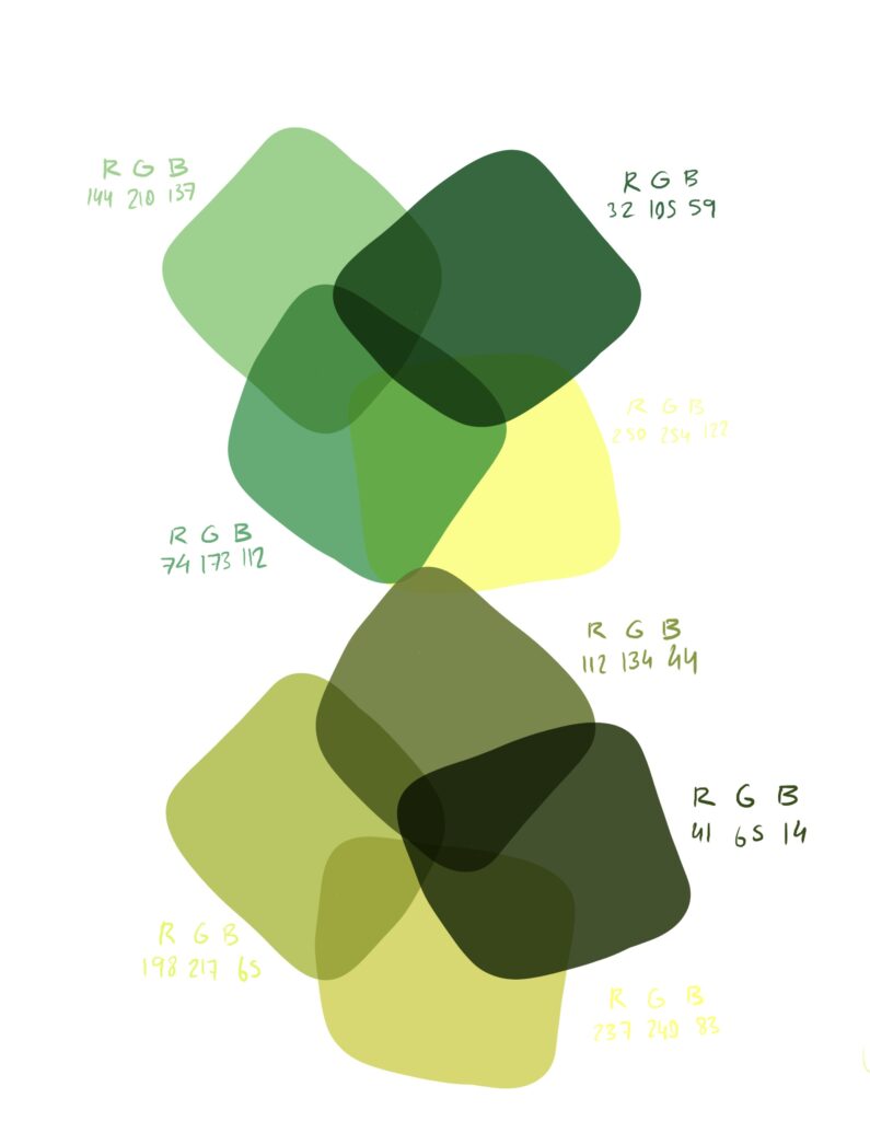
Above I’ve put them side by side to highlight the difference. I would say the colour temp of the one on the left is cooler, perhaps about 4000K, while the warmer one on the right is maybe 3000K or less. Below I’ve picked out several colours from each photo to demonstrate how the RGB of each pallet differs greatly.
This showed me in practice how colour temperature and rendering is so important, especially in retail spaces like this one. In this case a lack of consistency made me question whether I would like a piece I initially thought I would. It was the difference between purchase and no purchase.


Leave a Reply