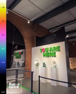
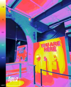
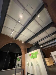
Track Lighting was the most common use of lighting design.
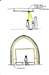
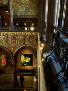
This was cleverly thought through. The lights are placed at such a heigh that no shadows are created when looking at a piece of artwork so that the experience wasn’t much different to being out in sunlight during midday.
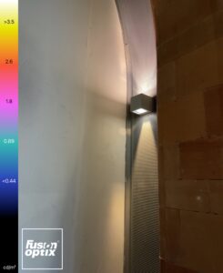
There was also a distribution of wall lights that had contrasting warmth on either side of the pendant. This wasn’t even noticeable and gave the room an evened feel.
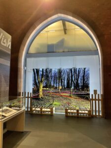
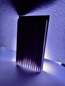
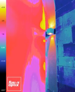
There was a piece of artwork lit up by LED strip lighting that was placed along the bottom of the canvas at the back which created this highlight effect that also worked extremely well with the arch as it gave this line of light rather than spots or a flood of light.
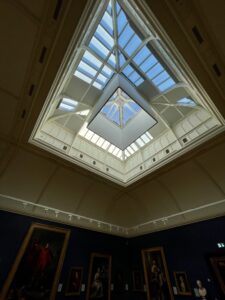
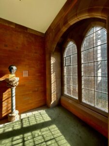
The box that was placed around the skylight is an idea that I think is really smart and I was inspired by. Due to the artworks in the space, it was essential that sunlight wasn’t directly hitting them so this shape was placed as well as blinds on specific windows to stop that sunlight from reaching the paintings without completely disregarding the daylight and making use of the skylight.
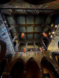
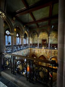
The main hall was generally quite a dark space however this made room for creating an ominous, eclectic atmosphere that wowed me. The smart use of track lighting along the balustrades adds that extra bit of light without being overpowering or too dramatic.
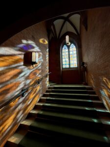
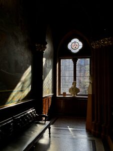
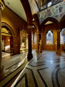
The windows do a lot of work for the lighting in the corridor spaces, letting the sun work its way around the room creating different patterns and shapes throughout the day.
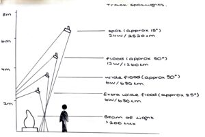
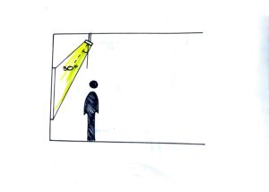
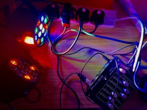
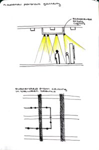
I started to look at the different effects of different heights of track and flood lighting and how important the angle work is.
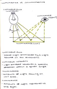
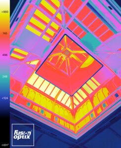
This is my understanding of luminance and illuminance.