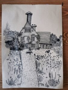
I think the light beige and the black ink creates a really simplistic balance that is so easy to look at yet the marks and scribbles creates something that makes the eye work harder. The house really blends in well and ties the whole drawing together.