Context
Our online PGT courses are delivered through Blackboard Learn Ultra LMS. From the “Analytics” tab in a course staff can view overall activity reports and per-student information.
View Blackboard Ultra course activity report overview
Some class stats require an “overall grade” to be manually set up for the course. The “Student Activity” section of the dashboard provides some visualisations based on time in course.
View Blackboard Ultra student activity details dashboard overview
What data?
The data being collected or tracked can be boiled down to tracking of student identifiers, grades, and course access times (Anthology Blackboard, no date).
Existing visualisation: Time in Course
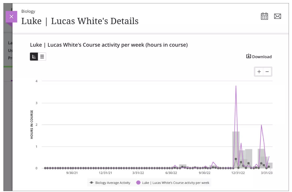
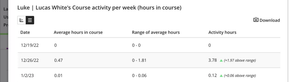
Exemplar Blackboard Learn Ultra student details graph
Hours in course per week (pink line) overlaid against the course average. Average is shown as a grey line to indicate mean, and a bar indicating standard deviation. It allows comparison of trends not readily apparent from a grid view of the same data (Mikhaylova and Pettersson, 2024). By overlaying the two lines, the visualisation invites and encourages comparison of a student’s engagement against the class average (Jarke and Macgilchrist, 2021).
This is problematic in a few ways:
- Could lead to a narrative of low-hours students being more at risk of poor outcomes (they are “below average” after all!)
- May infer that the class average is an ideal or recommended engagement for a week
- Importantly, hours in course (the LMS) excludes time outwith – time reading, researching, and writing
- The “Fantasy of perfect data” (Carter and Egliston, 2023) reminds us that these metrics and measures are fallible:
- Admin staff in our programmes have had issues with inaccurate inactivity warnings resulting in unnecessary time and stress spent contacting students to determine exactly how engaged they are with content
- Consider such warnings as a chance to get feedback from particularly (un-)engaged students (rather than evidential)?
- The colouring choices in the dashboard (green for above average time) reinforce this harmful bias (Pangrazio, 2024) – a systemic assumption/suggestion that more time in course is better (see image below)
- I noticed particularly the class scatterplot presenting a correlation of time vs grade, invited causative interpretations (Jarke and Macgilchrist, 2021)
Green is good?
Thoughts
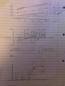
A few examples of prototype graphs
My idea is to use expected hours per week as a point of comparison:
- Courses are (should be) designed with balanced workloads throughout the course reflecting the level and type of study (part time vs full time etc). At the Digital Education Unit, we keep programme staff mindful of this during learning design sessions
- Measuring student time in course content against a consciously formulated metric, rather than arbitrarily against class average
- Minimally laborious to formulate – read/watch time for text/multimedia & discussion expectation?
- Omission of this may lead to minimalizing of course design as an important factor in student engagement and success:
- Misdirection of effort to fix students rather than improve courses
- A narrowing of interventions through foregrounding a narrow view of student activity purely within the LMS (Jarke and Macgilchrist, 2021)
- Comparison of class average against expected hours could lead course coordinators to useful insights about weeks that are under- or over-loaded with work
- Still imperfect as it hinges on data gathered through the LMS alone
- Late addition – percentage-based deviation instead of +/- absolute hours
My alternative visualisation
Expected hours vs student time – % deviation
Percentage deviation from the expected hours as y-axis, and time (weeks) in x-direction. The middle “dual band” x-axes enclose a range of expected hours (here +/- 20%). I included the class average as before. You can see class average varies further from expected hours, rather than student deviating from class average. The box comment also clarifies the limitations of this visualisation, rather than pre-empting a conclusion. I feel my graph re-frames by minimising comparison with class average, reflecting instead against expected hours.
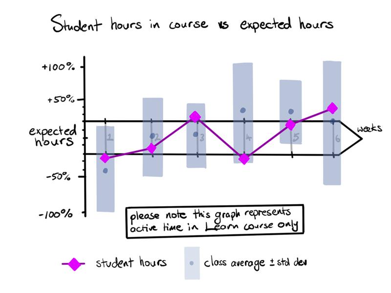
Student hours in course vs expected hours as % deviation
Creating a data visualisation providing both sufficient context and still easily readable was difficult. I tried to simplify the visualisation or remove parts while still retaining my initial intent – which circles back to creating a path leading to a conclusion, rather than presenting information from which decisions can be made. I kept a similarly beautified aesthetic to the original for simplicity and ease of comparison. I feel a move to percentages of expected time rather than absolute allows for the “range of expected hours” to remain relative and therefore more representative over a course as each week’s time commitments (and of that, time in LMS) will vary.
The dashboard also forwards course time throughout. Is this based upon research, or is it as I suspect indicative of “engagement” metrics and backend usage analytics, load-balancing server requirements etc that happens to be visible to staff as an afterthought. Considering the discussion between Selwyn and Gašević (2020) and the dubious “construct validity” of data in edtech, I wonder if the limited dimensionality of data (time and grades) available in the Learn dashboard allows for meaningful interrogation and useful conclusions to be drawn. Even with a massive class, could we really infer an ideal hours-in-course from enough students (and how that varied from expectation), or are we over-analysing an incredibly simplistic model of a fraction our student’s experience?
References
Anthology Blackboard (no date) Course Activity Report. Available at: https://help.blackboard.com/Learn/Instructor/Ultra/Performance/Course_Reports/Course_Activity_Related_to_Grades (Accessed: 22 February 2025).
Carter, M. and Egliston, B. (2023) ‘What are the risks of Virtual Reality data? Learning Analytics, Algorithmic Bias and a Fantasy of Perfect Data’, New Media & Society, 25(3), pp. 485–504. Available at: https://doi.org/10.1177/14614448211012794.
Jarke, J. and Macgilchrist, F. (2021) ‘Dashboard stories: How narratives told by predictive analytics reconfigure roles, risk and sociality in education’, Big Data & Society, 8(1), p. 20539517211025561. Available at: https://doi.org/10.1177/20539517211025561.
Mikhaylova, T. and Pettersson, D. (2024) ‘The timeless beauty of data: inventing educational pasts, presents and futures through data visualisation’, Critical Studies in Education, pp. 1–17. Available at: https://doi.org/10.1080/17508487.2024.2308689.
Pangrazio, L. (2024) ‘Data Harms: The Evidence Against Education Data’, Postdigital Science and Education, 6(4), pp. 1049–1054. Available at: https://doi.org/10.1007/s42438-024-00468-2.
Selwyn, N. and Gašević, D. (2020) ‘The datafication of higher education: discussing the promises and problems’, Teaching in Higher Education, 25(4), pp. 527–540. Available at: https://doi.org/10.1080/13562517.2019.1689388.
(https://pixabay.com/illustrations/charts-tables-graph-statistics-6246450/)


24 February 2025 at 22:30
Chris, your blog post is excellent. You have grasped the exercise very well; you took a visualisation and analysed it in terms of what it claims to communicate versus what it actually offers. Your alternative visualisation is very good and indicative of how the message could be conveyed. Your blog reflects the course theme perfectly; you utilise knowledge from the literature, cite it appropriately, and demonstrate a high level of understanding.
I don’t want to nit-pick your discussion, and this is by no means a critique, but I merely want to point out that if you wished to work with this alternative visualisation further (e.g. for your job purposes), you could unpack it in terms of how easy it is to understand, whether readers need more or less time to comprehend it, whether the emotional and affective reaction would be different, and whether it addresses the university policy in a similar, better, or worse manner than Blackboard’s visualisation, etc.
Overall, I love your analysis, and I am impressed with your work. Well done!
9 March 2025 at 19:04
Thanks! I’m quite happy with this theme’s work. I went through quite a few visualisation iterations even while finalising the blog. Thankfully doing it digitally meant I could tweak things without a complete re-do!
I definitely feel that the graph is harder to unpack than a simple line graph, but I also think that forcing a user to take time to analyse and understand something a little more critically has its uses.
10 March 2025 at 16:06
I agree, Chris. Visualisations in education are often promoted as aiding teaching and learning processes for the processes to be more thorough and insightful. So more time should be allowed when needed.