If my initial introductory effort was a product of “incidental” data collection, this is an effort to make it more “purposeful”. I collected similar data, but with a more deliberate, targeted approach.
I focused this week on my coffee making, primarily due to variability of multiple input factors and the inconsistency of enjoyment outcomes. The intent is to determine any measured factors that contribute to variation, and if there are any consistent predictors of enjoyment that emerge.
The Weekly Coffee Circle
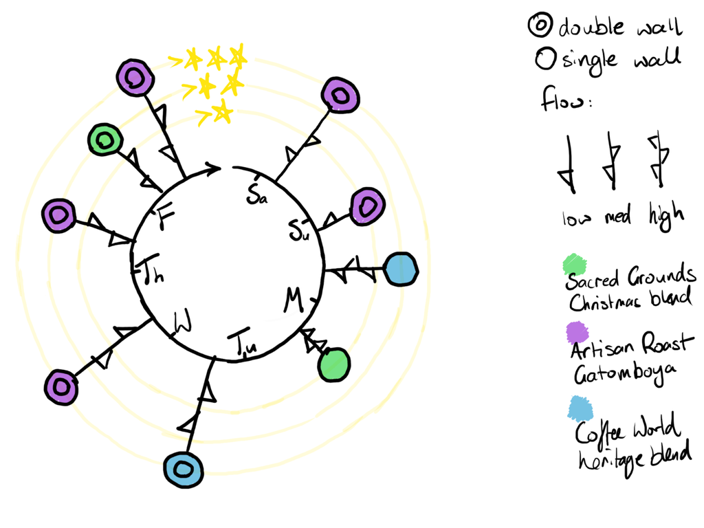
Weekly wheel of coffee version 2
Measured variables
Coffee blend
- Three brands with varied beans, blends, roasts etc
- All bought pre-ground for “espresso machine” or equivalent
Portafilter basket
- Double wall
- more “idiot proof”
- lower “quality” ceiling?
- Single wall
- usually used with self-ground beans – must dial-in a grind size and pour rate with a quality coffee grinder
- highly variable with pre-ground coffee
Flow rate
How quickly the coffee exits the portafilter into the mug.
- High: Too fast and it will be watery
- Medium: “goldilocks range” extract sufficient flavour without excess bitterness
- Low: Too slow and it will be bitter.
This means taking more detailed notes on less frequent occurrences. Gašević notes Kurne’s three parts to modelling: mapping, reduction, and pragmatics. In particular, the reductive aspect stands out to me – models represent a selection of relevant properties (Selwyn and Gašević, 2020). I chose a few components that were easy to measure. In the case of coffee blend, it can also act somewhat as a proxy for grind size (every blend’s grind will be slightly different depending on the brand).
Williamson notes that “data are inherently partial, selective and representative” – my choices of what and how data are captured lead to a bias in the model produced (Williamson, 2017). My model measures several reduced (simplified or categorised variables such as coffee blend or flow rate) factors, and rates these against a grossly simplified 3-star rating of enjoyment of the beverage.
Williamson, Bayne and Shay (2020) note that automation can be seen as or assumed to be fair or impartial, but as systems or algorithms enact the biases of their creators, this is not the case. Here, it may be useful to replicate my bias: If it were possible for a machine to “taste” the coffee on my behalf, would it be able to produce a more granular rating of “enjoyment” if calibrated sufficiently against my own likes and dislikes? Would that then allow for faster iteration across variables to find my perfect cup of coffee?
Conclusion
My initial idea was to create a very artistic presentation that used a tree trunk that wrapped in a circle to represent a clock face, and the branches split off to represent days, with each drink made represented as a coffee-cup-flower. I felt that although it was visually appealing, it did not accomplish the goal of representing enjoyment sufficiently clearly. It was also difficult to parse at-a-glance.
Draft version
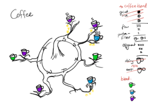
Weekly wheel of coffee (initial version)
I returned to a minimalist approach but retained the clock-face circle design to represent time. It more clearly displays all three variables plus enjoyment.
From my preferred version, you will note that medium flow rate appears to be a predictor of at least average enjoyment. Artisan Roast was mostly good with one bad outcome on Sunday, the others perhaps too few to make a reliable judgement.
References
Selwyn, N. and Gašević, D. (2020) ‘The datafication of higher education: discussing the promises and problems’, Teaching in Higher Education, 25(4), pp. 527–540. Available at: https://doi.org/10.1080/13562517.2019.1689388.
Williamson, B. (2017) Big data in education: the digital future of learning, policy and practice. SAGE PUBLICATIONS. Available at: https://www.vlebooks.com/Product/Index/965054.
Williamson, B., Bayne, S. and Shay, S. (2020) ‘The datafication of teaching in Higher Education: critical issues and perspectives’, Teaching in Higher Education, 25(4), pp. 351–365. Available at: https://doi.org/10.1080/13562517.2020.1748811.
(https://pixabay.com/photos/coffee-coffee-grinds-cafe-206142/)


10 February 2025 at 21:57
Chris, your blog is well-presented and well-written. I like that you are clear about the simplicity of your visualisation and the limits that this simplicity brings. It is also good to see that you thought about the potential value of a more artistic or appealing representation and then decided against it. You use the literature well in your text and write at an appropriate academic standard.
What I suggest for your next post is to engage a little bit more with the concepts from the literature. While you are entirely write that authors talk about data being necessarily reductionist and simplified, it seems to me the point is rather to highlight the misunderstandings or discrepancies in discoursive promises vs actual deliverables. In other words, datafication actors often promise that data can represent social phenomena more fully than they actually can. But your approach was different – you were pragmatic about recognising the reductionist necessity from the start. I sense that you entirely understood the points in the literature, but you might elaborate on the key issues just a little bit more in the blog, just so that the reader can easily see you engage with the controversies of data collection and representation.
Well done, and keep up the good work.
23 February 2025 at 19:29
Thanks Janja that is very useful.
I studied math, physics, and data science, so I am very practical (and rather cynical!) in my outlook on data and how it is represented or manipulated.
The overarching point about the promises of “digital twins” as near-infallible representations of reality was lacking, and I see I became tied up in my specific example!
I have a lot to say in my next blog, and have hopefully brought in some more thorough observations.