SharePoint is ok, but it has some features that encourage poor content design.
On the version of SharePoint we have at Edinburgh, there are two types of site that you can set up:
I recently had a go at creating a Communication site, and I was impressed with how easy it was. In a couple of steps, I’d claimed my URL and I had a basic site that I was ready to start building.
But as I worked on the site, I noticed a few features that might lead web editors astray:
- Underlined text
- Call to action components
- Stock images
Underlined text is for links
When we see underlined text on the web, it looks like a link. That’s why most content management systems don’t let you style regular text with an underline.
Here’s WordPress, for example:
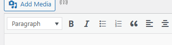
In WordPress, you can make text bold or italic, but you can’t underline it.
SharePoint generously lets you underline text, even when it isn’t a link.
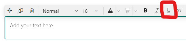
That’s very kind SharePoint. But we can politely say no thanks to this one – it’s just going to confuse people.
SharePoint’s call to action component is misleading
As a general rule, having a call to action on a page is a good thing. It helps your users get to wherever it is they want to go next.
When you’re editing a page in SharePoint and you use the built-in call to action feature, this is the prompt you get:
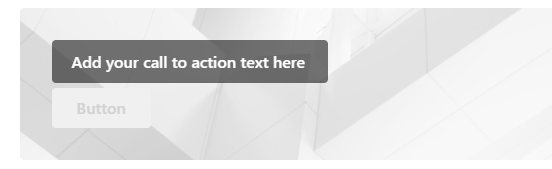
And here’s how that looks on a published SharePoint page:

There are a couple of problems with this.
First, the styling here makes it look like both items are clickable buttons. But you can only click the lower button. The upper one isn’t even a button; it’s just text inside a grey box.
Second, the prompt asks you to add the call to action text to the unclickable grey box. But you almost always want a call to action to be a link or an action. It’s usually a short phrase starting with an imperative verb. So SharePoint is telling you to write the call to action text in the wrong bit of the component, which is a bit weird.
In my opinion, it’s better to avoid this component while it looks like this. There’s another component called “Button” which is a decent way to create a less confusing call to action on your page.
Stock images don’t help users
Finally, SharePoint is pretty keen to help you add stock images to your site. That’s nice of it, but most of the time, your site will not benefit from having stock images.
Users of a SharePoint site are usually trying to find some information or get something done. Stock images don’t generally help with this.
Fans of stock images might argue that they add visual appeal to a site. That might be true, but the fact remains that most SharePoint sites are about deeply unsexy stuff that doesn’t need to have visual appeal. It just needs to be clear and easy to use.
Why this is a problem
This post is a bit of a grumble with some petty nit-picking thrown in for good measure, but there’s a serious point behind it.
There are a huge amount of SharePoint sites in use across the University of Edinburgh, and we all want them to be accessible and easy to use. A CMS can guide editors and help them to design content that meets these standards.
But there are some aspects of SharePoint that guide editors to make poor design decisions. This is a shame, because it has a lot going for it as platform for publishing internal sites.