After a soft launch of the website for testing on the 24th of March, our exhibition went live to the world on Monday the 28th of March as a way of kicking off our “Wellbeing Week” of outreach programming. The period leading up to the launch was one of intense activity, requiring a significant amount of logistical coordination to get the co-curators, technical staff, and project members into the same room at the same time. This was only enhanced by a series of delays beyond our control, in particular, problems caused by the Covid-19 pandemic. Thankfully, we had scheduled for unforeseen delays, and ensured that the project could be readily adapted to new scheduling.
We felt that the final output of the project remained true to the values we held throughout. At its core, we activated the collections by power sharing: letting the people who are most affected by the topics we were addressing do the talking. But it was also successful in another way. It allowed us to learn so many things about the process of co-curation in practice.
Lessons on… Divisions and Elitism

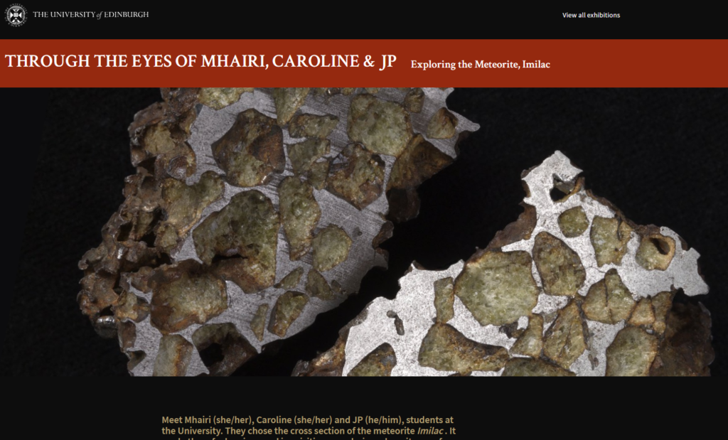
One of the student group exhibition page headers with the group of three co-curators listed.
One of our student co-curators noted that it was odd for the students to be in groups, but the staff to be individuals. Such a decision was made for purely pragmatic reasons; we received such positive feedback from the student body, with so many applications, that we wished to include as many as possible. At the same time, we struggled to get engagement from staff. Looking back, our project output does reflect the elitism and divisions that are often inherent within the university structures; something we had hoped to avoid. Spending extra resources on recruiting staff would therefore have been a valuable path to take.
Lessons on… Power-Sharing Design

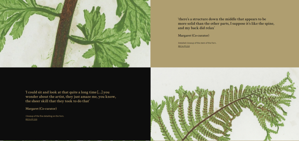
This shows the “zoomable image” portion of Margaret’s page, where direct quotations from the co-curators were taken. In terms of space, this takes up a significant amount of the page.
The designs of our site pages were intended to reflect the power-sharing dynamic of the project as a whole. We wanted the CRC’s voice and our own to be in the background. This was a significant departure from the other exhibitions on the platform. Hence, co-curators were introduced first, then their reasons for the artwork selections before all else. It is only at the end of the page that information is given about the artwork beyond its basic metadata, and even here, the interpretation was written with feedback from the co-curators and drafted to reflect the informal and wellbeing focus of the exhibition. We strove to ensure that information was still available (under clickable “full information” tabs) and traffic was directed to the CRC via the “additional engagement gallery” at the end of each page.
Lessons on… Wellbeing and Ill-Health

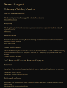
A screenshot of the resources page. We decided to list resources for both staff and students together to avoid the issue of divisions discussed earlier, though this did mean we had to limit the diversity of resources listed (especially for students).
Our focus on wellbeing allowed us to steer clear of the tricky ethical terrain of mental ill-health and allowed us to focus on providing an active resource for supporting the visitors’ mental health as a whole. Yet we had to remain aware of the reality that we were still working on a project within the field of mental health as a whole. This motivated the inclusion of a resources page, linked directly from the home page and directing traffic away from the site towards organisations such as the Samaritans or the Wellbeing Centre on campus. This was a trade-off we felt that was worth making; it would reduce the visitor count, but ensure visitors in need of support were able to find it.

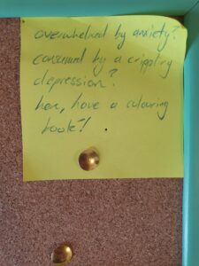
The post-it note reads “Overwhelmed by anxiety? Consumed by crippling depression? Here, have a colouring book!”.
Yet we did not always succeed, in the post-it note to the right we received a critical response at one of our wellbeing stations. A lack of clarity at those stations meant that this person saw the project as an attempt to provide treatment for mental ill-health, not as a tool for more general mental wellbeing. A clearer explanation, along with resources (perhaps leaflets or QR codes direct to the website) is needed to ensure that the aims of such engagement strategies are clear and to avoid harmful misunderstandings arising.
Key Lesson:
At its core, our project was one of balancing acts: scheduling against scale, values against practical realities, the needs of the institution against the aims of the project. It highlighted to me that there can be no ideal co-produced project, no utopia of power sharing. Projects such as this, and those more generally, have to make hard decisions that strive to stick their core mission, while being aware of what is lost.

Leave a Reply