
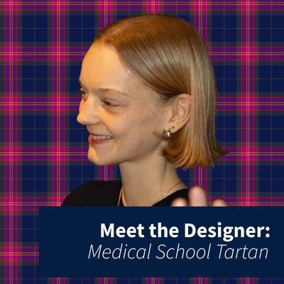
 To mark 300 years of the Medical School, an official tartan was created by Minty, a third year textiles student at the University of Edinburgh, whose winning design is now officially registered and part of our Medical School’s history. Thank you to Locharron of Scotland who manufactured the tartan.
In this Q&A, Minty answers our questions about how the tartan came to life, the meanings woven into its colours and lines, and what it’s been like to see her work adopted by the Medical School. From historical symbolism to slightly unexpected bodily references, this is a behind-the-scenes look at a design med students will be seeing (and wearing) for years to come.
Don’t miss the “Weaving Through Time” exhbition in the Anthea Bond exhibition room at Edinburgh Futures Institute where you can see the tartan for yourself until the 6th February 2026.
Please introduce yourself
I’m Minty, I am in my third year, studying textiles and I designed the new Medical School tartan.
How did designing the tartan come about?
We had been approached by the Medical School 300 team to design the tartan as part of a competition before summer last year. They had quite a general brief which was nice as it left the design completely up to us.
Tartans are full of hidden meaning, are there any colours, lines, or patterns that have a special significance people might not notice at first glance?
I think that the weirdest one has to be the yellow that has a slight hidden reference to puss. It’s quite gross to think about really but from my research, the original tartan had links to all sorts of bodily fluids and organs that I found fascinating.
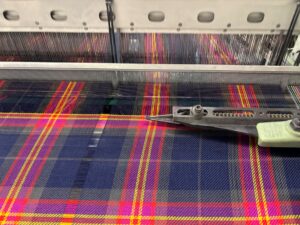 Tartans can look simple but they’re actually quite technical, did any part of the process surprise you?
I was quite surprised by how much meaning each line had to have, even down to its thickness. For example, in mine the background colour is the representative of the University of Edinburgh as a whole.
Also, the guidelines for the tartan registry. I hadn’t realised that no two tartans can look too similar, there are so many on there so it felt a bit overwhelming trying to come up with something completely original.
Was there a moment during the project where you thought, “Wow, this is actually happening”?
It definitely didn’t fully sink in until the launch of the exhibition a couple of weeks ago. Seeing it physically for the first time and as actual products that I could wear was very cool and exciting.
If you had to explain the tartan to a friend who knows nothing about tartans or medical history, how would you describe it in one sentence?
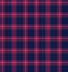
The tartan is a reflection of the medical school, its colours reveal their history, and its grid-like pattern represents a medical graph.
How did you balance tradition (300 years is a lot) with making something that still feels modern and relevant to today’s students?
A tartan in itself feels like a very traditional pattern as well, so it was quite tricky to find some sort of balance. The colours I used help a lot, although they are the University colours that have also been used for many years, the combination of bright and dark makes it a little more modern.
Did you have a favourite colour, stripe, or detail in the final design?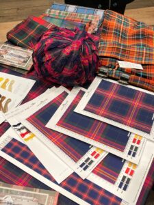
I absolutely love the red which is a bit strange for me because I usually lean into more blue/green colours in projects that we’ve done in class. We struggled a bit on finding one that wouldn’t appear too pink in the physical versions, but it has worked out really well and makes the yellow and purple around it even more striking.
Can you explain a bit more about what some of the colours from your tartan represent and anything else within the tartan that you want to expand on the meaning of?
Using established University colours was an idea I had as the tartan would then be able to fit into the collection of other College tartans under Edinburgh University.
The main ‘background’ colour is, of course, the Edinburgh University blue as this provided a nice contrast with the brighter colour that I wanted to use. The design includes triple red lines, symbols of the school’s influence from Padua, their successes in scientific advancement over the past 300 years, and the old tartan design in which it represented blood and liver!
The thicker purple lines as well as the grey are then representative of the school’s increasingly inclusive atmosphere. Purple is a colour broadly recognised as a symbol of women’s rights and has a much brighter meaning, while the grey can also link back to a time when the University was not so inclusive.
From seeing other designs at the exhibition, it feels like there are a lot more connections that my colours could have that I hadn’t even thought of either!
Now that it’s official and registered, where do you hope people will see or wear the tartan?
In the exhibition we had these amazing scrubs made up, seeing it in hospitals would feel surreal. My family and I have all been wearing our scarfs around a fair bit, I think they’d be very easy to style around campus as well!
Related Links
Weaving through time exhibition open until 6th February