This week I focused my efforts on creating more visualisations related to the witchcraft data that had been uploaded onto Wikidata. There were so many options, it was a difficult choice to decide what would be best to make in the time available. Aside from visualisations, I worked on editing the website and added all of the new visualisations.
More map making – People Associated with the Trial
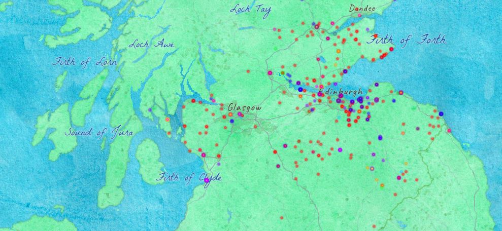
I wanted to make some more visualisations using parts of the dataset which had not yet been visualised and so started by making a map showing the places of residence for the people associated with the trial. The people associated with the trial were recorded within the database to have played a role at one or more of the witchcraft trials. These people may have had occupations such as a sheriff or were a witness of the witchcraft. There were over 1300 places of residence identified for the people associated with the trial out of the 1900 places noted in the Survey of Scottish Witchcraft Database. I decided to use ArcGIS Online for producing the map and the map was produced in a similar way to the residences of accused witches (see blog post 9).
When using the Query Service to query for information to produce the map, I asked for name, gender, occupation and residence. I then downloaded the data into a CSV file and split up the coordinates into latitude and longitude. The data was then uploaded onto ArcGIS Online to produce a map. There can be different layers shown on the map depending on what you want to highlight and these can be selected in the main menu on ArcGIS Online. I tried to use gender as the main layer but as the majority of the people associated were male, it does not make for a very interesting visualisation. But when I used occupation as the main layer it created a very colourful map with occupations greatly dispersed. But as there are residence locations for 1300 people in comparison to there being only 700 people with residences and occupation, I thought it would be important to include both visualisations on the final website.
See map with people associated with the trials residences: Here
See map with the occupation of people associated with the trials: Here
More map making – Story Map of John Kincaid
Aside from these point maps, the idea of a story map was suggested to show the story of someone recorded within the database using geographical locations. When I asked the directors of the original database whose story would be good to tell, they suggested John Kincaid a notoriously evil witch-pricker from Tranent. After looking into the cases that he was involved in, it seemed as if his life would be good to document using data contained within the database.
John Kincaid was involved as a witch-pricker or investigator in 17 cases which had a large amount of detail making them very easy to summarise. I was then able to take the location for each case and manually add these to the map by searching for locations in the search tab on ArcGIS Online in the top right corner of the map and then right clicking on the point and saving it to the map. The point can then be edited to have more information that was taken from the case pages on the online database – see John Kincaid’s database here.
Thanks to ArcGIS Online’s twitter account who provided advice, I was then able to add a timeline to the cases to understand the change in the cases locations with time, however, as there is a 10 year gap between the cases, it did not allow for a very interesting visualisation. However, the timeline aspect could be very useful to use for other dates that have been uploaded to the database in the future.
See the map with the story of John Kincaid – Here
There is also a useful blog post from ArcGIS Online that has helped create the time zone visualisations – Here
Website edits
At the end of last week I was taught how to make edits to the website that will be used to host the visualisations using HTML with a program called Brackets. Now that I know how to edit the website, I was able to make my own changes very easily and add all of the visualisations produced. The website is now updated with many visualisations that have been created over the past few weeks related to the witchcraft investigations.
I think that the website is very close to being ready for public viewing which will be very exciting!
With only one week left, I plan to spend next week getting ready to present my findings by creating a poster and presentation which will go through the full process of working with and visualising the Survey of Scottish Witchcraft data.


Leave a Reply