With our first evaluation drawing to a close, we have been several discussions regarding what the final output – in this case a report – should look like.
We have spent a lot of time trying to make sure the evaluation is useful (see the post on how to untangle evaluation aims and KM goals 1 and 2). Now, we don’t want to undermine all this work by delivering a report that might be a barrier to engaging with the findings or implementing any of the recommendations. For instance, we could deliver a report that is too dry/too colourful, too long/too short, too technical/too simplistic or one that puts too much emphasis on one section, but not enough on another section.
It is hard for us as a research team to tell exactly what sort of report will “land” well; what sort of reports would be helpful for a particular culture and context. Of course, this is primarily for the evaluation commissioners, but we also want to get a sense of what might work best for wider teams within the commissioning organisation or partner organisations, so that the evaluation can (hopefully) also have a wider impact. So below are three techniques that can help.
Three techniques to hit the right report tone
1. Ask for examples
This one is pretty straightforward; simply ask the evaluation commissioner’s if they can send an example of a “good report” (one which was received well) and a “bad report” (one which was not received so well).
If nothing immediately springs to mind, and they don’t have enough time to sift through example reports, option 2 or 3 might work better.
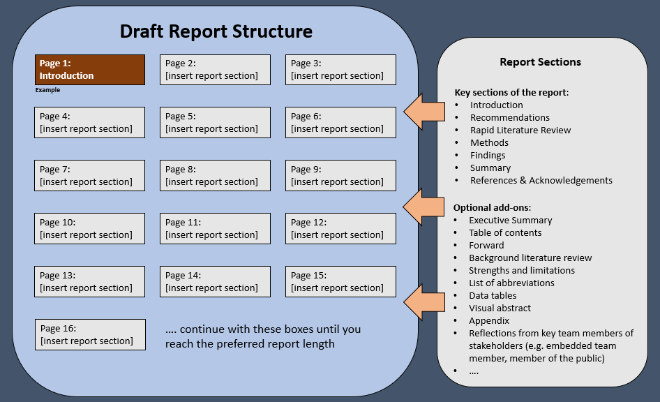
2. Draw it out together
Using PowerPoint, you can create a 1-slide template of the report, where one textbox represents one page of the report. You can then get the evaluation commissioners to fill in what they think should roughly be on each page of the report.
This one is particularly useful for getting the “ratios” right i.e. how much should the report dive into background literature, methodology, findings, recommendations, limitations etc.
See the example below:
Powerpoint template here: Draw it Out – template to draw out report sections
3. Offer a menu
This is possibly the least amount of work involved for the evaluation commissioner. You present them with a “menu of report choices” that include examples. I picked out various report types below that have been created within the PHIRST scheme, and got the evluation commissioners to pick which report format and length might suit them best.
| 1. Very short, briefing-like (4 pages) | Example |
| 2. Short, recommendations-focused (8 pages) | Example |
| 3. Short, findings-focused (8 pages) | Example |
| 4. Medium with images (16 pages) | Example |
| 5. Long, with branding throughout (78 pages) | Example |
| 6. Very Long, with limited branding (194 pages) | Example |
In addition to the techniques above, you may want to ask specific follow-up questions on:
- Report sections and the ratios of these sections
- Branding, colours and logos
- Preference for specific language or terminology
- Use of colours, textboxes, pictures or quotes (e.g. to break up the text)
- Preference for number of graphs/tables in main body of report vs in appendices
Some final thoughts
Of course, you can choose to do a blend of the three techniques above – it will depend a little on how much time the commissioner’s have, and whether they have specific ideas for the report. You might also need to ask some other key stakeholders.
The type of report that is most suitable might depend on what other outputs are created for the evaluation, and how they might complement each other. For instance, if the plan is also to create an infographic and slide deck, perhaps a longer more detailed report might be requested.
Either way, the take-home message is: the format of the report is important, and there should be some time dedicated to figuring out how to structure and present findings from the evaluation. It’s valuable time invested, as it can make a difference between engaging with the results or not.