Venue Setup
A curator’s exhibition is a artwork in itself, an integrated and independent expression that also constructs a great ecological mechanism.
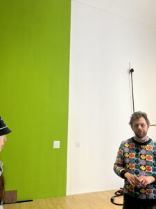
In this week’s lecture we talked about some of the things we need to consider when curating an exhibition. It’s time, budget, space and funding. James Clegg, curator of the Talbot Rice Gallery, talked to us about the layout of the artworks in an exhibition, such as the need to place objects by the windows to avoid direct sunlight, the layout of the lighting and the choice of wall colours. For example, the placement of objects by the windows to avoid direct sunlight, the layout of the lighting and the choice of wall colours.
James Clegg talking about the layout
James Clegg looks at light in curation
Individual Project Progress
Regarding my curatorial project “Food Funeral”, the exhibition tends to explore the relationship between humans and space, environment, and ecology; thus, the layout of the site should fully reflect this relationship, so that visitors can feel this connection while visiting the exhibition.
Depending on the theme of the show, some symbolic arrangements can be used. For example, the artworks can be arranged in a “prosperity” to “decline” order, beginning with food works full of vigour and vitality and gradually transitioning to works reflecting environmental damage and ecological imbalance, thereby reflecting the impact of human activities on the environment and ecology. The paintings are intended to depict the effects of human activity on the environment and ecology.
When picking a site, consider spaces with natural components, such as interior rooms with lots of greenery or outdoor spaces, to stress ecological and environmental topics. At the same time, the site’s layout should make full use of these natural components, ensuring that the artwork and the natural environment complement one another.
When selecting lighting and hues, consider how to best showcase the artwork’s traits and themes. Dimmer lights and cooler colours can be used to create a somber and gloomy atmosphere for works depicting environmental catastrophe, whilst bright lights and warmer colours can be used to showcase the energy and vigour of the works in food.Furthermore, the layout must consider visitor flow, avoiding packed or empty areas so that people may experience the artwork in a comfortable setting.
Finally, it should be emphasized that the venue layout is only one aspect of exhibition design, and it must be addressed with other aspects such as timeframe and money. As a result, when developing exhibition plans, all variables should be carefully evaluated to ensure the exhibition’s success and efficacy.
Progress of the Panel
We discussed the arrangement and selection of scenes in our respective group activities, and concluded that it was crucial to the overall atmosphere of the exhibition and the audience’s experience. We decided to pay more attention to the selection and design of scenes in our future curation in order to create an atmosphere that is more in line with the theme of the exhibition and to attract more audience interest and attention.


