It’s interesting how the mind works. I started writing down ideas for this blog post, gathering different thoughts I had brainstormed for my Futures Project. Again, as I had been doing until now, none of the ideas seemed like “the one”. And somehow, while writing them down (and simultaneously reading a data visualisation newsletter because I can’t focus on one thing at a time), I came up with an idea that seems the most ambitious and suitable for my Futures Project thus far. I will explain it in a bit. But in the meantime, I will take you through my original thinking process and the thoughts I’ve been having these days.
Semester 2 is exciting… And tiring!
The past few weeks were intense… literally. Last week, during week 5, I had 2 intensives. In the first one, Data Civics, we explored how platforms shape how we experience our lives in the cities and how this can be used as a research method. During the second intensive, Artificial Intelligence and Storytelling, we examined how AI works (at times, it got quite technical) and how we can use it to create different stories, through creating images, texts and combining both.
I also had the chance to delve more deeply into making data visualisations through some of the Representing Data exercises, using different tools, but in a critical way: understanding their capabilities and limitations.
Futures Project topic is getting closer
Thinking about a dissertation topic can be quite daunting. The Futures Project has a very specific scope: while it cannot be simple, it also cannot be so complex that it would take a year to analyse and produce.
At the same time, many of my ideas revolve around Uruguay, my country. This is because it is a small country where academic research and data availability is limited, so I would love to contribute in some way and generate something new. On the other hand, this poses the challenge that if I had to do certain kinds of fieldwork (i.e. personal interviews, gathering historical data that isn’t digitised), it would be hard to do it from Edinburgh…
Essentially, I thought about three kinds of visualisations that I would like to produce for my Futures Project potentially:[1]
- Timelines:
- How things unfolded during the Uruguay dictatorship: This follows up on the idea I mentioned in my last post.
- How the 72 days in the mountain were spent: Inspired by the award-winning film The Society of the Snow, which taps into a very well-known story in Uruguay of a plane that crashed in the Andes, I thought of doing a timeline of how facts unfolded during those 72 days that elapsed until survivors were rescued. (Then, I found that this had been partly done here).
- Uruguayan filmography…? Uruguay doesn’t have a very big cinematographic industry. That’s why I thought gathering all the films and doing an account of what they are, where to watch them, and a bit of their history could be interesting.
- Maps:
- The growth in population and urban development of Montevideo since its foundation: Inspired by the 300th anniversary of Montevideo this year and by the fact that one of my ancestors was a member of the six first families that came to populate the newfound city,[2] I thought I could make a map that also had a historical account of how the city grew and came to be what it is today.
- A physical representation of the real sizes of countries: Inspired by The True Size of and World Mapper (an example from Representing Data), I thought that this information could somehow be translated into a physicalisation form, where the user could interact with cubes, for example, of different sizes, to see how different countries are in size.
- Textual data visualisations (this is something I quite like to do and find very interesting, but I didn’t think of any concrete ideas)
So what is the big idea?
I think all these ideas could grow into something interesting and worthy of my Futures Project, but when “putting pen to paper”, I thought of another idea that resonated much more.
Reading the newsletter The Plot by Evelina Judeikyte today, I got inspiration from two main resources. The first were these college enrolment data visualisations by Venki Mandapati, one of Evelina’s students:

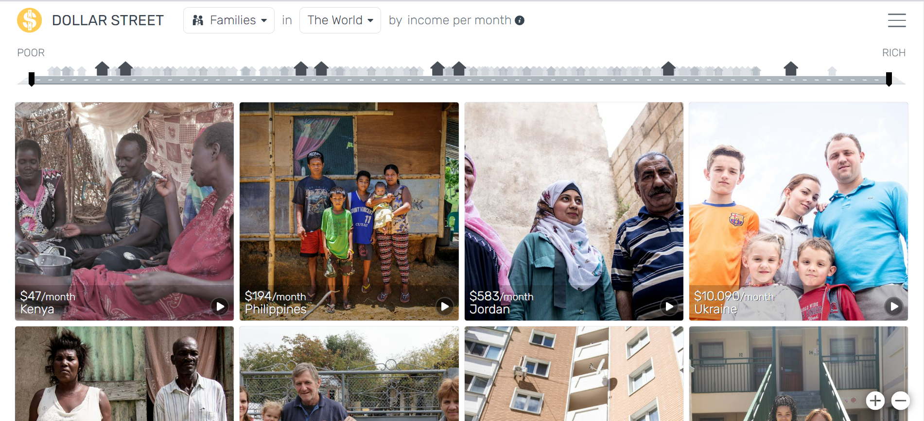
The second was the project Dollar Street by Gapminder, by which users can navigate the scope of families that live with different levels of monthly spending in different countries worldwide. I liked the interactive features of this project and the “human face” it puts on the data.
One of the main problems that Uruguay faces is education. While I am proud of my country in many ways, like the fact that it has the most solid democracy in Latin America or that it has been historically a pioneer in adopting progressive laws, this is a fact that saddens me. Only 50 % of youngsters aged 21 to 23 have finished high school, severely undermining their opportunities to access related rights.
But what are their stories? Why do adolescents drop out? What do they do after they drop out?
Having worked at UNICEF Uruguay for seven years, I was close to the issue of education and the concept of “educational trajectories”, which refers to the path that students follow throughout the educational system and the possibility of each student having a particular trajectory, different to that of another student.
What I envision for the data visualisation is to be able to have in a timeline the trajectories of different specific students, their personal stories of how their trajectories unfolded and the reasons that made them remain or drop out of the system, illustrating these ups and downs as a line chart. I would also like this visualisation to be interactive (similar to Dollar Street), where the user can hover over the different lines/persons and click to learn more about their stories.
The challenge would be (apart from the technical aspects of the interactivity), again, the fieldwork to gather these stories, but I think I can find different ways to get hold of them despite the distance.
[1] I know they’re quite different and demand different skills (i.e. maps especially can get extremely complex, and I’ve found that often, people who do maps are specialised in this field only).
[2] Yes, I’m obsessed with genealogy (by researching, I could get to branches of my family tree that reach the 15th century, which is A LOT for someone born in a 200-year-old country), and it could potentially be another topic for my Futures Project. Honestly, I just didn’t think of any good ideas for applying it.


Leave a Reply