Any views expressed within media held on this service are those of the contributors, should not be taken as approved or endorsed by the University, and do not necessarily reflect the views of the University in respect of any particular issue.
Since my last blog post, I’ve engaged in a series of illuminating meetings, each contributing to the ongoing evolution of the Futures Project. Here, I’ll distil the key takeaways and decisions made from these encounters:
Meetings Recap:
11/3 – Jillian Randolph: Communication Officer at Chaski Global (Data-driven communication agency, specialising in social organisations)
2/4 – Uta Hinrichs: Professor of Data Visualisation at the University of Edinburgh
16/4 – Victoria Blanc: Communication Officer at UNICEF Uruguay
19/4 – Alejandro Retamoso: Education Officer at UNICEF Uruguay
Communication Guidelines:
During discussions, I emphasised the need for communication guidelines that move beyond stereotypes and empower individuals within the educational context. I decided on adopting a facilitative approach, shifting focus from attributing challenges solely to students to acknowledging systemic barriers. This aligns with my previous work with children with disabilities at UNICEF, where we recognised the importance of addressing systemic issues rather than placing blame on individuals.
Data Collection:
In discussions, the importance of clear communication and transparency with participants in data collection process was highlighted. Additionally, maintaining ongoing communication came about as a critical element in fostering trust and engagement.
Data Representation:
In exploring data representation strategies, we discussed the efficacy of incorporating keywords and dynamic visualisation tools to enhance understanding and engagement. This approach will allow to structure data around key themes and provide both a high-level overview and detailed insights into educational trajectories. Drawing from our discussions, it was emphasised that technical tools should be adopted based on the unique characteristics of the data to ensure that the representation is informative and accessible to diverse audiences. Examples of potential tools mentioned include D3.js, video format, RawGraphs+Illustrator, Figma, and Flourish (scrollytelling).
Education Information:
Through discussions mainly with Alejandro and Victoria, I gained insights into the current landscape of education in Uruguay. Notably, there has been an improvement in enrolment rates over the past five years, but concerns remain regarding over-age students and learning outcomes. Repetition was identified as a common educational intervention, prompting critical questions about its efficacy and long-term impact on student achievement. Repetition is especially common in the first years of primary school. Addressing these challenges necessitates a multifaceted approach that prioritises personalised learning strategies and supports individual trajectories within the educational system.
This week, I started reaching out to people in my network to refine some aspects of my Futures Project. I met with Camila Gottlieb, an education specialist with whom I worked at UNICEF. The meeting was short and productive, and it got me thinking about different aspects of the project. I will discuss some of them below.
Quantitative information
To provide context, I will introduce some general quantitative information about education in Uruguay, graduation level, dropout, socio-economic quintiles, etc. Camila suggested three main sources for this:
Education Observatory of the National Administration of Public Education (ANEP, for its acronym in Spanish), which constitutes the second source of information. Camila told me the Observatory has the raw data available for download, which would be very interesting to analyse.
World Bank data: provides a steady record of data, and the possibility to compare with other countries.
Qualitative Information and Data Collection
One of my main concerns was accessing the data, the testimonies I would like to portray in my data visualisation. Camila immediately thought of a “headhunting” methodology, akin to the human resources practice, based on looking for specific people of a certain profile. This would rule out the possibility of associating with an organisation which would tie me to their timings and interests with less flexibility.
The headhunting would have to be done with young adults (which was another of my doubts: if I should interview adolescents or adults), to ease the approval process and to show a short- and mid-term impact of the educational trajectory. I initially thought of an age range of 18-25 years old.
As for the methodology, I was thinking about conducting interviews. Camila also suggested an ethnographic style of “contact”, by which I could establish a specific contact (e.g. send a WhatsApp message) to subjects every 7-10 days with one particular query. This would facilitate the establishment of rapport with the subjects while allowing them to asynchronously think about the questions, do the exercise of remembering, and then reply. It’s true that some of these questions will require the subjects to dive into their memories as back as ten years’ time, so allowing them time to remember would probably elicit answers of a better quality.
Another issue I’m thinking about is the personalisation of the testimonies, including whether or not to include photos and what kinds of photos. One of Camila’s suggestions was that the photos could be of the context (with, again, an ethnographic approach) instead of the people themselves, for example, of their classrooms, how they went to school (transport), what they ate, etc.
Finally, showing “good” and “bad” examples would definitely be paramount, especially highlighting the differences between quintiles, which would show that, yes, this is a problem for the whole country, but it is especially a problem for those of lower socioeconomic levels.
Target audience
When speaking with Camila, a new potential target audience arose for this data visualisation. Until this point, I had thought of society in general and decision-makers, but Camila proposed the idea of funding bodies or philanthropists. Some examples of these are Reaching U, Varkey Foundation or e.dúcate.
Final thoughts
The meeting provided me with new insights that keep fuelling my Futures Project. I think Camila would be an excellent collaborator when the time came to think about those questions to ask the subjects.
However, reaching out to people and using my network to expand my thinking of this project is very fruitful. After attending a data storytelling event this week, I reached out to one of the speakers with whom I will meet tomorrow to further discuss qualitative and human-based data visualisations. Can’t wait to share how it goes! But that will have to wait until next week.
This week I had my first meeting with my Futures Project supervisor, Stuart King. This raised new questions (but of the interesting and exciting type); things to think about from an initial idea that so far, seems “fertile”. To recap, my current idea for my Futures Project is a data visualization that shows the educational trajectories of specific people in Uruguay and tells their stories, mainly focusing on those who dropped out, what their lives are like, why they dropped out, and what their experience in the education system was like.
In this blog post, I will list some of the questions and concerns and then delve further into two specific aspects that require deeper examination.
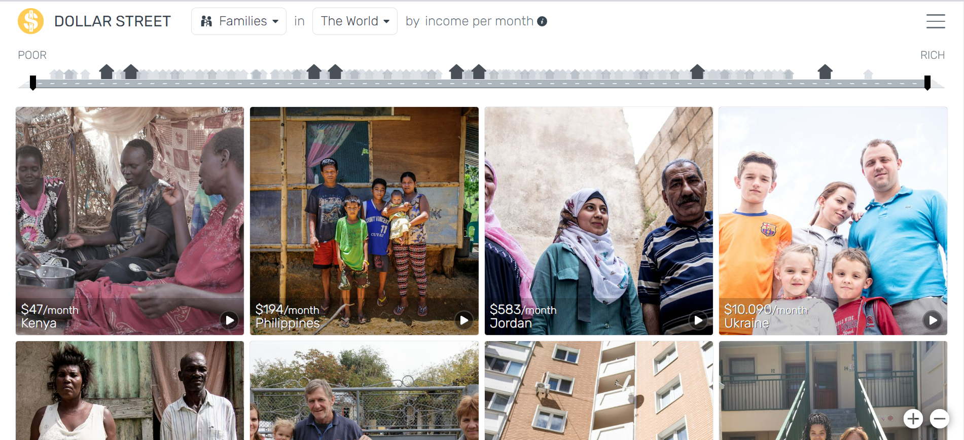
What am I going to plot? If I made a line chart, as is my initial idea, I know the independent variable would be time (measured in some way or another). But what would the dependent variable be exactly? This also raises the concern of how to show “bad examples” or trajectories that didn’t go “ideally”. These would be people that I will have interviewed and will have agreed to partake in this project. So I would have to think ways in which to portray them that preserve their dignity and don’t show them in a bad light. Even thinking about the Dollar Street project, which serves as an inspiration for my project, I don’t agree with many of the portrayals and communicational decisions made for this platform. For this, I thought of seeking advice from my former supervisor at UNICEF, who is superb at communicating development projects and stories in an empowering way.
Would a line chart be the best form of representation? As mentioned, maybe it’s the linear way of representation that’s problematic, and I could explore other methods (e.g. tree diagrams) to depict these trajectories.
Would I include a speculative/future-thinking element? While the data visualization would depict real stories of the past and present of these people, would I want to add a prospective element to picture how the future of the stories could potentially look like…? How would I build this (maybe including the protagonists’ input) …?
What message do I want to convey? Apart from telling these individual stories, what would be the take-home message that I would want the audience to leave with?
Data collection
This was one of the aspects we talked about the most during our meeting, and so I thought it deserved a section of its own.
Considering that this is a very bespoke project, it needs a data collection of its own. I think using a preexisting database wouldn’t suffice to be able to construct these stories. This brings about ethical concerns for which I would have to submit the ethics form for approval at university.
Some of the questions raised during our discussion were:
What organisations/people will I reach out to to collect the data? I have some connections through my work at UNICEF and volunteering for a charity that works in education.
Would I do a survey (easier to get responses) or an interview (would provide more thorough data)? I would conduct short interviews (15-20 minutes) to gather the insights I need since I believe a survey wouldn’t provide that much information.
How will I structure the data collection (e.g. What would the interview schedule look like?)
How am I going to collect the data from the UK? Maybe conduct Zoom interviews? But still, I would need someone in Uruguay to get in touch with the interviewees.
Would I interview adults or adolescents? I think interviewing adults would give me a more long-term perspective on their educational trajectory. But I think finding adults would be harder since they usually lose touch with charities I could potentially reach out to once they become adults.
How many stories will I aim to collect? Somewhere around twenty…? However, this would depend on the quality of the interviews and the data collected. Also, how would I ensure there’s a certain representativity, especially regarding geographic locations within the country?
Ethical considerations especially make me question the level of personalisation of the stories. For example, would I use a photo and a name to give these stories in the plot a human face (which is partly my aim with my project: to imbue humanity in the data)? Would I not use a photo and use a fake name? (This would affect the nature of the project) Could I do something in between, like using an AI-generated photo or the silhouette of the person?
Audience
I envisage the audience of this data visualisation to be the general public (i.e. as if they read this in a newspaper) and decision-makers. My supervisor’s position was that decision-makers tend to prefer broader statistical studies that provide the big picture. While I do agree, I also think that the country already has this; what it’s missing is getting to know these individual stories. Still, this statistical, broader information could be included in the data visualisation for context.
Another issue raised was that of language. The data will be collected in Spanish, and what I had initially thought was making the data visualisation in English for the purposes of the Futures Project and afterwards building a version in Spanish for local dissemination of my project and portfolio building. What I hadn’t fathomed was that translating the stories from the data in Spanish to the finished product in English would add another layer of interpretation and potential distortion of the interviewees’ accounts. On the other hand, it is true that the target audience would consume this piece in Spanish, so making it in English would be solely for the purposes of the Futures Project. For this reason, Dr. King suggested I make it in Spanish, but I remain sceptical about it. Still, we would have to formally check with EFI to see if this is possible.
Technical aspects
I envision this data visualisation to be web based, where the user would have an overview of all trajectories intertwined, and then the possibility to see “details-on-demand” (Shneiderman), by hovering over the stories and clicking to see more details.
I do not currently have all the skills to put this idea into practice, but I believe that with the practice from my Representing Data group project and with the help of Stuart King for my Futures Project, I can make it possible.
Some of the tools we discussed for this kind of data visualisation were D3, and Python (Altair, Vegalight), but also the practice of sketching and finding something that I like to reverse engineer.
Next steps
The meeting was very productive and left me with a lot of questions and thoughts to move forward. I have already set up a meeting with an education expert who I worked with at UNICEF to discuss organisations and ways to tackle data collection.
I will also look at the ethics form and inspiration from other projects to move forward.
It’s interesting how the mind works. I started writing down ideas for this blog post, gathering different thoughts I had brainstormed for my Futures Project. Again, as I had been doing until now, none of the ideas seemed like “the one”. And somehow, while writing them down (and simultaneously reading a data visualisation newsletter because I can’t focus on one thing at a time), I came up with an idea that seems the most ambitious and suitable for my Futures Project thus far. I will explain it in a bit. But in the meantime, I will take you through my original thinking process and the thoughts I’ve been having these days.
Semester 2 is exciting… And tiring!
The past few weeks were intense… literally. Last week, during week 5, I had 2 intensives. In the first one, Data Civics, we explored how platforms shape how we experience our lives in the cities and how this can be used as a research method. During the second intensive, Artificial Intelligence and Storytelling, we examined how AI works (at times, it got quite technical) and how we can use it to create different stories, through creating images, texts and combining both.
I also had the chance to delve more deeply into making data visualisations through some of the Representing Data exercises, using different tools, but in a critical way: understanding their capabilities and limitations.
Futures Project topic is getting closer
Thinking about a dissertation topic can be quite daunting. The Futures Project has a very specific scope: while it cannot be simple, it also cannot be so complex that it would take a year to analyse and produce.
At the same time, many of my ideas revolve around Uruguay, my country. This is because it is a small country where academic research and data availability is limited, so I would love to contribute in some way and generate something new. On the other hand, this poses the challenge that if I had to do certain kinds of fieldwork (i.e. personal interviews, gathering historical data that isn’t digitised), it would be hard to do it from Edinburgh…
Essentially, I thought about three kinds of visualisations that I would like to produce for my Futures Project potentially:[1]
Timelines:
How things unfolded during the Uruguay dictatorship: This follows up on the idea I mentioned in my last post.
How the 72 days in the mountain were spent: Inspired by the award-winning film The Society of the Snow, which taps into a very well-known story in Uruguay of a plane that crashed in the Andes, I thought of doing a timeline of how facts unfolded during those 72 days that elapsed until survivors were rescued. (Then, I found that this had been partly done here).
Uruguayan filmography…? Uruguay doesn’t have a very big cinematographic industry. That’s why I thought gathering all the films and doing an account of what they are, where to watch them, and a bit of their history could be interesting.
Maps:
The growth in population and urban development of Montevideo since its foundation: Inspired by the 300th anniversary of Montevideo this year and by the fact that one of my ancestors was a member of the six first families that came to populate the newfound city,[2] I thought I could make a map that also had a historical account of how the city grew and came to be what it is today.
A physical representation of the real sizes of countries: Inspired by The True Size of and World Mapper (an example from Representing Data), I thought that this information could somehow be translated into a physicalisation form, where the user could interact with cubes, for example, of different sizes, to see how different countries are in size.
Textual data visualisations (this is something I quite like to do and find very interesting, but I didn’t think of any concrete ideas)
So what is the big idea?
I think all these ideas could grow into something interesting and worthy of my Futures Project, but when “putting pen to paper”, I thought of another idea that resonated much more.
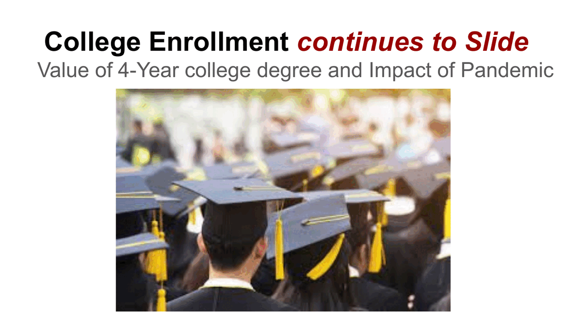
Reading the newsletter The Plot by Evelina Judeikyte today, I got inspiration from two main resources. The first were these college enrolment data visualisations by Venki Mandapati, one of Evelina’s students:
The second was the project Dollar Street by Gapminder, by which users can navigate the scope of families that live with different levels of monthly spending in different countries worldwide. I liked the interactive features of this project and the “human face” it puts on the data.
One of the main problems that Uruguay faces is education. While I am proud of my country in many ways, like the fact that it has the most solid democracy in Latin America or that it has been historically a pioneer in adopting progressive laws, this is a fact that saddens me. Only 50 % of youngsters aged 21 to 23 have finished high school, severely undermining their opportunities to access related rights.
But what are their stories? Why do adolescents drop out? What do they do after they drop out?
Having worked at UNICEF Uruguay for seven years, I was close to the issue of education and the concept of “educational trajectories”, which refers to the path that students follow throughout the educational system and the possibility of each student having a particular trajectory, different to that of another student.
What I envision for the data visualisation is to be able to have in a timeline the trajectories of different specific students, their personal stories of how their trajectories unfolded and the reasons that made them remain or drop out of the system, illustrating these ups and downs as a line chart. I would also like this visualisation to be interactive (similar to Dollar Street), where the user can hover over the different lines/persons and click to learn more about their stories.
The challenge would be (apart from the technical aspects of the interactivity), again, the fieldwork to gather these stories, but I think I can find different ways to get hold of them despite the distance.
[1] I know they’re quite different and demand different skills (i.e. maps especially can get extremely complex, and I’ve found that often, people who do maps are specialised in this field only).
[2] Yes, I’m obsessed with genealogy (by researching, I could get to branches of my family tree that reach the 15th century, which is A LOT for someone born in a 200-year-old country), and it could potentially be another topic for my Futures Project. Honestly, I just didn’t think of any good ideas for applying it.
This semester finds me excited to partake in some of the most interesting classes of my master’s degree, with Representing Data, at the forefront. So far, the course has been very practical, but at the same time, introducing theory. As someone who had been attempting this practice almost as a fanatic novice, I feel like things are starting to piece together now. Knowing the technique behind the practice makes a lot of sense and much easier! So I am very excited to keep learning more, doing more, starting to build my own portfolio of data visualisations and attempting something edgy on the group project.
Apart from classes, I have also attended some events. One of these was Hannah Ritchie’s talk on Planetary Health Data. As a big fan of Our World in Data, it was a pleasure to listen to Hannah’s take on communicating data and what we should be wary of. Her expertise not only in data storytelling but in climate change was very impressive. And also, while the talk was mainly targeted to our fellow Planetary Health students, it spoke a lot about narratives in relation to the environment (which was especially timely after the World As Story intensive).
Thinking about the Futures Project
During the winter break and these first few weeks of term 2, I have been further thinking about my Futures Project. A lot of ideas have crossed my mind, and while I am still undecided, I feel like further exploring them could give me new hints of whether I want to continue those pathways or not. As a quick brainstorming, some of the ideas are:
Doing something about my country, Uruguay, where there is data, but not enough data storytellers to turn that data into something worth telling
Using a textual corpus rather than a “numerical” one. Inspired by one of my favourite courses so far, Text Mining for Social Research, and the formative assessment my team and I are preparing for The World As Story, I am really enjoying performing analysis of big corpuses of text, rather than doing a “numerical” analysis or building a predictive model of sorts.
Using data visualisation for the construction of collective memory. Inspired in the 50th anniversary of the coup that Uruguay suffered in 1973, and subsequent dictatorship from 1973 until 1985, I was thinking about gathering voices of political prisoners (mainly women), for example, and telling their stories. There would be the challenge of the fieldwork, because I wouldn’t be in Uruguay to conduct interviews, for example. However, I could use preexisting corpuses or other preexisting works as my data. Also, this would have the challenge of the language, since primary information would be in Spanish. This piece could have different formats, like a timeline, a map or clustering the voices/discourses by topic.
One thing I have learned since I started this master’s degree is that we not only learn in the classroom but also through the events we attend and the people we meet, and with whom we interact.
Last weekend, I travelled to London for an event hosted by the Chevening Scholarships (which I’m a scholar of). There, I had the opportunity to be in the same room with 1400 postgraduate students from 140 countries. In one of the talks I attended on career planning and networking, I came out feeling very empowered to take action on specific deliverables the lecturer, communications professional Joan Wasylik, asked us to do. One of the deliverables I set out myself to do was to finally sign up for the Information Plus Conference. This 3-day conference will be exclusively focused on data visualisation, and I’m hoping I’ll be able to learn from the talks and also from the networking opportunities.
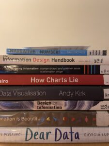
Having taken a pause on working after seven years, I want to take advantage of this year to learn and acquire the skills and knowledge that will allow me to develop a career in data storytelling, be it in the university or out of it. So building on the momentum and enthusiasm with which I came out from that event, on Tuesday, upon returning to Edinburgh, I went to the ECA library and packed my backpack with eight datavis books (I was very excited; my back, not so much…).
If you’re looking for datavis books in the library, they’re in my house… sorry!
I specifically sat down to look at the Dear Data book by Stefanie Posavec (who will be one of the keynote speakers at the Information Plus Conference, yay!) and Giorgia Lupi (whose project Happy Data was a big inspiration for my Creating Visual Narratives project) while at the library. It was exciting and insightful to see how they could find data virtually everywhere and make their visualisations based on that. This is definitely inspiring for someone starting on this journey, as it’s a matter of dipping my toes and getting my hands dirty.
I was so excited to keep learning, that I remembered I had seen a Domestika course on data visualisation by Giorgia Lupi and decided to buy it. During check-out, I was sold into buying three datavis courses for the discounted price of two, and I was so enthusiastic that I decided, why not? So now I have eight books, three online courses, an in-person conference, and a datavis assignment due on Tuesday, the 28th. I guess enthusiasm can really go a long way…? (I’ll let you know if I make it alive on Wednesday, the 29th…).
Topic
In last week’s group supervision, I mentioned I was thinking, as one of my topics, of doing a data visualisation that would depict feminism’s accomplishments and advancements throughout the world (as a map) and through time (as a video).
As much as I like this idea, I am unsure whether this could be represented as a continuum, with a gradient, for example. Firstly, I feel conflicted about judging certain practices as “more advanced” than others, representing them with a darker colour, for instance. Secondly, I do not know if there is such a thing as a continuum, meaning that where practices like female genital mutilation exist to this day and coexist with other arguably “feminist” practices, like the female vote, it is hard to judge if all accomplishments or practices can be traced linearly.
I guess this is proof of the complexity of data visualisation and the challenge of simplifying processes to communicate them more easily.
Still unsure about the project topic, I am curious to attend the Projects Bank to see if something might interest me there.
Learning from others
Following this week’s prompt, seeing how other classmates have changed their Futures Project ideas over time has been helpful. At first, I felt most people had their project ideas figured out. I felt quite at a loss because this wasn’t my case.
But now, seeing how people’s ideas evolve and change, I feel the same. My Futures Project is an evolving concept that I feel good I have time in advance to think about, but still, I think it will keep piecing together as time goes by and learnings sink in.
After finishing all my intensives for this semester (it was a turbulent first month indeed), I feel like I now need time to take it all in and settle my acquired knowledge through the post-intensives and final assessments.
I particularly enjoyed the course Text Mining for Social Research, where we dug deep into programming to analyse different corpora of texts. Having access to big corpora of digitalised information (in this course we used the newspaper The Guardian’s API, and in Narrative and Computational Text Analysis we used Chronicling America, an API with newspapers from the US, ranging from 1770 to 1962) opens up the door to endless possibilities. I feel like one can truly apply creativity in them to answer fascinating questions. I particularly liked developing my final project for the Text Mining course, where I explored the use of the term “femicide” in The Guardian articles and analysed this. This said, I know I would want to apply coding to my Futures Project for its data component.
I have yet to know what this data would be and where I would take it from (if it would be data I would gather through surveys, observation or other quantitative or qualitative methods, or if it would be data taken from a preexisting database).
As for the data visualisation component, I would need to improve my skills. In this sense, I am looking forward to next semester’s course, “Representing Data”, and attending the “Information + Conference” in November. However, in trying to apply a “dataviz” mindset, I went about my Interdisciplinary Futures illustrated autobiography as a data visualisation. I wanted to make it easy to understand and insightful, not only in its content but in its form (making form contributory to the content).
During the last supervision meeting, the type of visualisation that stood out the most was my proposal of making a 3D printed dataviz to aid visually impaired people to access that information. However, I am not 100 % sure if I want to go in this direction. I would first need to get a close approach with the target audience and investigate if this is really something necessary or how it could best work. I could potentially get involved with visually impaired organisations (I was looking into Sight Scotland and Visibility Scotland), but first, I want to make sure I want to go in that direction, which is something I haven’t yet decided.
I hope that as I embark on readings for my next assignments (mainly for The World of Story and Creating Visual Narratives), I can come across more interesting components to keep building my project.
After a very demanding week with two different intensives (Text Mining for Social Research and Creating Visual Narratives), I feel motivated by the possibilities for my Futures Project (and my work in the future, beyond university). Especially after Creating Visual Narratives, I felt deeply inspired as to how extensive and rich the visual language can be.
This confirmed my choice, as presented in my previous blog post, to link data, communication, and design through data visualisation.
Even today, after attending the EFI Makerspace induction, I feel that 3D printing could be an exciting way to convey data visualisation. For example, a 3D model of a data visualisation could be inclusive to people with visual disabilities through involving the sense of touch. Really, data visualisations could take a variety of forms and materiality, from knitting[1] to intervening photographs[2] (which is what I believe I will be exploring for my Creating Visual Narratives project), from sculptures[3] to live GPS tracking.[4]
Within the design thinking framework, I feel like I am in the ‘Ideate’ process, where the possibilities are endless, and one tries to cover the most comprehensive range of ideas. My next step would be to start to narrow it down. Maybe knowing what the data visualisation would be about would be helpful in this next step.
I am looking forward to the supervision meeting and the ideas I will be able to get from my classmates and discuss their own project ideas to keep moving forward in envisioning the future.
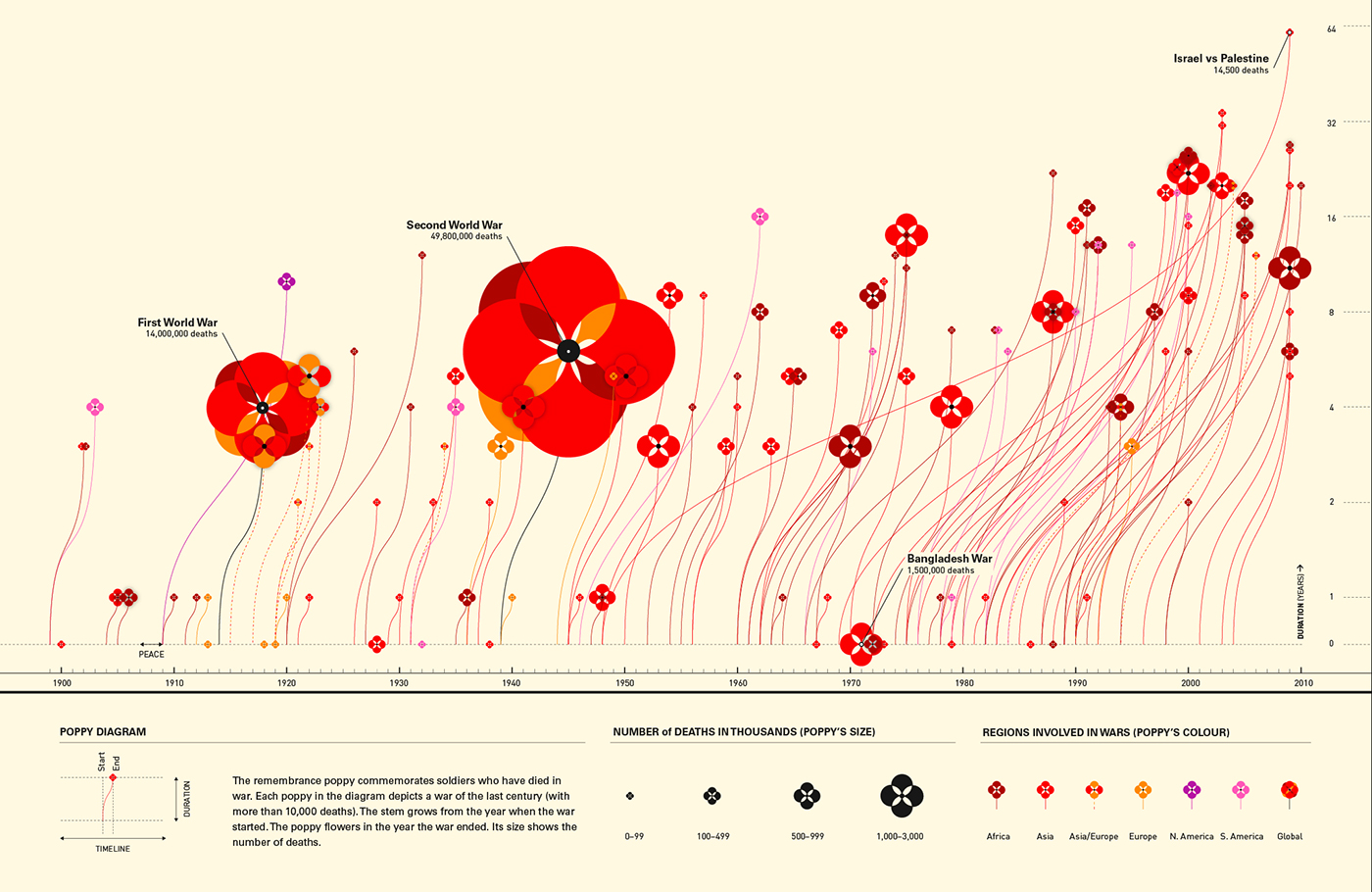
The “Poppy fields” piece is one of my favourite data visualisations: simple, beautiful and insightful.
This week’s Interdisciplinary Futures lecture made me think a lot about the practice of interdisciplinarity and how it has the inherent potential to reach new, unexplored terrain.
In interdisciplinarity, doubt feeds the praxis (e.g. in the way that Jane Alexander made her leading character coin the same doubts she herself had) and enriches the work of the two (or more) disciplines.
This, in addition to making my own intellectual autobiography, made me reflect on my ambition to work in an interdisciplinary context.
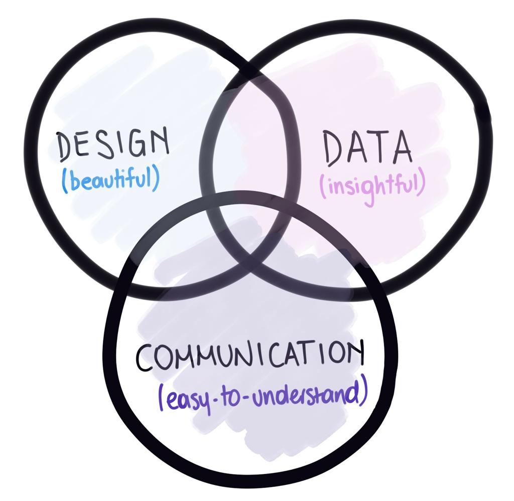
From what I’ve seen, inspired by the work on data visualisations from information designers like Giorgia Lupi, Valentina D’Efilippo or Federica Fragapane, I believe that the best ‘data visualisers’ (if that expression can be coined) are not the best designers, but precisely the people who understand the data and know how to best communicate it. I have seen some beautiful and aesthetic data visualisations in the past, but they weren’t so easy to understand. In this sense (and in many others in life), I believe less is more.
Inspired by this reflection, I came up with a diagram that shows what, to me, a good data visualisation should be and how it is inherently embedded in interdisciplinarity.
In this, my ambition for my Futures Project is to successfully develop a data visualisation that can lay in balance in the overlap of these three disciplines.
More ambitiously, I would like this data visualisation piece or series to challenge the reader/viewer to take some action. However, this part of the communication process would be harder to control from the author’s perspective (as seen in Graham Mort’s “Finding Form in Short Fiction” in The World of Story course). Still, as the author, I will do my best to achieve my desired outcome.
Mort, Graham. “Finding Form in Short Fiction”. Short Circuit: a Guide to the Art of the Short Story / Edited by Vanessa Gebbie, Second edition. Salt, 2013, pp. 4-16
My academic journey began closely related to humanities and linguistics, having studied a BA in Corporate Communication and a technical degree in Copy editing/Proofreading (in Spanish). I am deeply passionate about words and languages. But from when I studied for my degree and in the seven years I spent working after that, I also felt that I had an analytical mindset that slightly diverged from the words-based study choices I had made.
At the same time, specialising in digital communications at work, I enjoyed delving into key performance indicators and analytics platforms —at times even more so than writing posts. Building reports and digging into numbers to draw relevant conclusions to inform new strategies captivated me, and time often passed quickly when I performed those tasks.
Still, I felt I could improve my work and take it to previously uncharted territories with more data analytics skills. That was how I searched and came across EFI and the Narrative Futures programme, where I thought I could suitably combine the world of storytelling with data analysis.
My professional aim is to harness the power of well-constructed data to create compelling messages to help counter misinformation. In communication, I believe that not only the media play a role, but also organisations and institutions (public and private) are fundamental in helping combat such a pressing issue as misinformation. And communications professionals within organisations are instrumental in that process.
This path is so broad and versatile that it has the potential to work in any topic, from social movements to health, from education to transportation. So, this is where I stand more hesitantly. I know what I want to do, but I don’t know what I want to do it about. I have a whole range of interests, like urbanism, sustainability, or feminism (very varied, as you can see), but I have yet to make these interests land into something more concrete.
I look forward to continuing my studies at EFI, sparking areas of interest and potential project topics that will help me in the quest for more informed societies that can better assert their rights.