One thing I have learned since I started this master’s degree is that we not only learn in the classroom but also through the events we attend and the people we meet, and with whom we interact.
Last weekend, I travelled to London for an event hosted by the Chevening Scholarships (which I’m a scholar of). There, I had the opportunity to be in the same room with 1400 postgraduate students from 140 countries. In one of the talks I attended on career planning and networking, I came out feeling very empowered to take action on specific deliverables the lecturer, communications professional Joan Wasylik, asked us to do. One of the deliverables I set out myself to do was to finally sign up for the Information Plus Conference. This 3-day conference will be exclusively focused on data visualisation, and I’m hoping I’ll be able to learn from the talks and also from the networking opportunities.
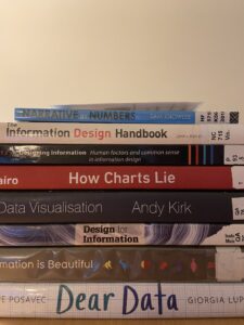
Having taken a pause on working after seven years, I want to take advantage of this year to learn and acquire the skills and knowledge that will allow me to develop a career in data storytelling, be it in the university or out of it. So building on the momentum and enthusiasm with which I came out from that event, on Tuesday, upon returning to Edinburgh, I went to the ECA library and packed my backpack with eight datavis books (I was very excited; my back, not so much…).
If you’re looking for datavis books in the library, they’re in my house… sorry!
I specifically sat down to look at the Dear Data book by Stefanie Posavec (who will be one of the keynote speakers at the Information Plus Conference, yay!) and Giorgia Lupi (whose project Happy Data was a big inspiration for my Creating Visual Narratives project) while at the library. It was exciting and insightful to see how they could find data virtually everywhere and make their visualisations based on that. This is definitely inspiring for someone starting on this journey, as it’s a matter of dipping my toes and getting my hands dirty.
I was so excited to keep learning, that I remembered I had seen a Domestika course on data visualisation by Giorgia Lupi and decided to buy it. During check-out, I was sold into buying three datavis courses for the discounted price of two, and I was so enthusiastic that I decided, why not? So now I have eight books, three online courses, an in-person conference, and a datavis assignment due on Tuesday, the 28th. I guess enthusiasm can really go a long way…? (I’ll let you know if I make it alive on Wednesday, the 29th…).
Topic
In last week’s group supervision, I mentioned I was thinking, as one of my topics, of doing a data visualisation that would depict feminism’s accomplishments and advancements throughout the world (as a map) and through time (as a video).
As much as I like this idea, I am unsure whether this could be represented as a continuum, with a gradient, for example. Firstly, I feel conflicted about judging certain practices as “more advanced” than others, representing them with a darker colour, for instance. Secondly, I do not know if there is such a thing as a continuum, meaning that where practices like female genital mutilation exist to this day and coexist with other arguably “feminist” practices, like the female vote, it is hard to judge if all accomplishments or practices can be traced linearly.
I guess this is proof of the complexity of data visualisation and the challenge of simplifying processes to communicate them more easily.
Still unsure about the project topic, I am curious to attend the Projects Bank to see if something might interest me there.
Learning from others
Following this week’s prompt, seeing how other classmates have changed their Futures Project ideas over time has been helpful. At first, I felt most people had their project ideas figured out. I felt quite at a loss because this wasn’t my case.
But now, seeing how people’s ideas evolve and change, I feel the same. My Futures Project is an evolving concept that I feel good I have time in advance to think about, but still, I think it will keep piecing together as time goes by and learnings sink in.

Alexa Pukall
There’s a German magazine that is known for using maps very creatively to convey information. Unfortunately, their translation feature is… lacking, but maybe it’d be valuable regardless to have a scroll through and see different options of how maps can be used to visualize data (and if anything is of interest, I’d be happy to translate):
https://www.instagram.com/katapultmagazin/
s1727645
Really fascinating week you’ve had, Paula!
I totally agree with the thoughts you’ve shared under ‘Topic’. It would be really difficult to measure how ‘progressive’ a feminist act is when there are conflating practices occurring. However, perhaps you could do it a little differently – like how safe women feel in these countries? Or in terms of access to education/equal pay? Or the safest places to visit/live as a woman?
Just some ideas! But it all sounds great so far and super interesting! ^^