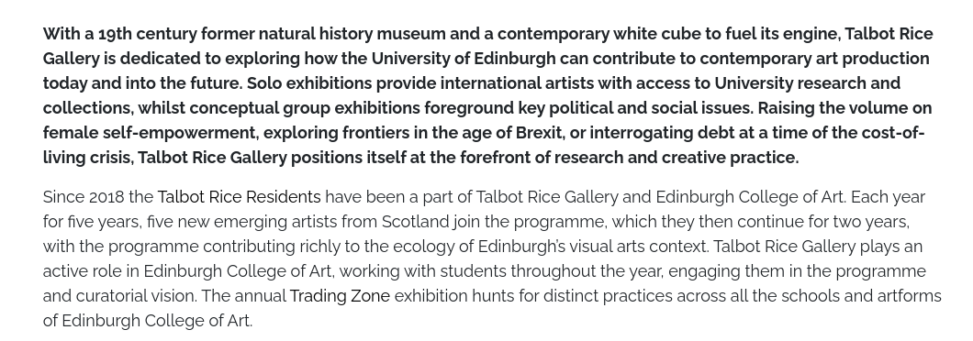
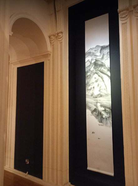
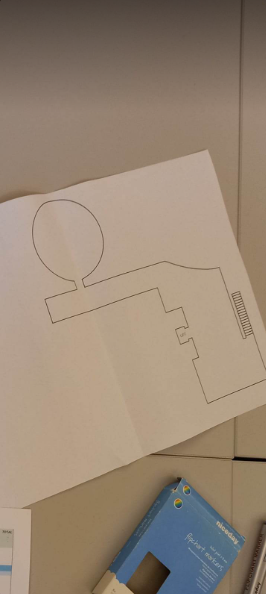
It was useful to walk around a gallery space and be made aware of the particulars that are involved in the curation process within various spaces. The space dictates what artwork is best suited to it, for example we began in the white space of the gallery which had extensive wall space, lots of light (windows on walls and ceiling), sizeable and almost square shaped; this means video or sound pieces may not be the best fit for this space and would need to be considerably darkened and sound-proofed which could rise costs further. The next space differentiates itself by having grey walls (absorbs light), signifying a ‘change in atmosphere’. The dilemma came up of how to best use smaller spaces, especially if this area is a walkway between bigger exhibition spaces. Currently it is a seating area with books so people can think more in depth at what they have just seen, talk about it, or look at further reading to what interests them, perhaps the number/or lack of seating is responding to visitor number expectations or as a signifier of how many visitors should be in the space comfortably? The upstairs space I think works really well for film, the two spaces a low ceilings have an intimate feel to viewing artwork, although with this comes the challenge of placing projectors and equipment so it is not in the way of the works or visitors. Also, for the current exhibition of film, there is a wall to contain wires and other tool/equipment that can be messy to view and hazardous to visitors; this is also mentioned in the other spaces as plug sockets through the floor as this is hidden but easily reachable. The round room is an interesting space as most wall space is curved, as was proving tricky for the next installation there, and generally smaller. Here there is much natural light via a ceiling window, but as this is not strong enough for hanging work, the wall space is predominantly used. The next space is big in size and contains much architectural adornments around the room, this can maybe be quite reductive to work as it seeks to be seen in-between these pillars and, as viewing Qiu Zhijie’s work, can be framed by it. The way of approaching an historic building that is listed is to use the space to its advantage and what kinds of works or artists it would suit and could inhabit it comfortably. In all areas of the gallery it is crucial to respond to criteria for each artwork regarding light and humidity levels and that this is consistent in each room (light/temp readings). Health and safety is also an important aspect to think about when installing, how the exhibition will function and for events. This can be achieved through high levels of planning and organisation, ensuring nothing is or will block entry points, equipment is pat tested and the exhibition result is surveyed. As the building has only one small lift, this is restricting the size of artworks that can be exhibited in the gallery and adds much cost if this needs to be brought in another way. Making work within the space?

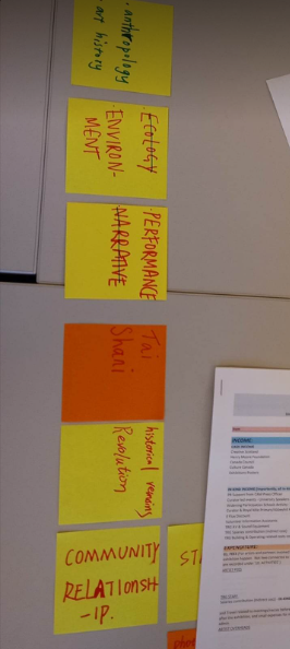
The making of an exhibition was quite a challenge with such a big group, especially when coming up with themes and finding a consensus between them, this was eventually found with the ‘body’ and its dynamics towards surroundings, each other and how it is seen. It was very informative to both discuss and create an exhibition; how this would happen in real time, what needs to be considered and in what order, tools to help with this. By gradually narrowing down a theme you can begin to think of artists that may be interesting to show and what could work as a group. This can also start as an extensive list and be worked through according to space and what works could be effective in forming the theme. The actual assigning artworks to spaces on the floor plans was difficult as some works are more obvious in the area they should be or more than one work would be ideal in the same place. Is this where you negotiate? We also covered advertising and a public programme, for exhibitions more generally, installation, health and safety, memorandum for artists, insurance, funding and expenditure.
Embassy
This visit from the Embassy gallery was very useful in getting another perspective of what a gallery can be and do, differing greatly from Talbot Rice Gallery. This was very similar in terms of organisational structure, values and aims as Generator Projects, Dundee (see week 2 blog post).
- It was interesting to deconstruct existing hierarchies within galleries and demonstrate how artist-run spaces can offer alternatives to this; situated in care and criticality.
- Seeing the archives and learning about how they are built up and used was great, a good way of finding connections between the present and before.
- Research trips to keep updated on whats going on in other spaces/galleries and ethics involved
- Online exhibitions- how these are situated within Embassy’s ethos


Leave a Reply