Week 7
Colours and light
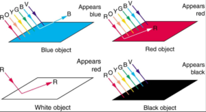
In this week we learnt about colours and light. Firstly, I learnt that different colours have different wavelength and which colour gets
reflected from the surface depends on the colour of the surface. The surface absorbs the wavelength of colours which are not present
in the surface and reflects back the rest.
Secondly, how we perceive colours depend on the background it is placed on. Our visual system takes into account the overall leve
l of illumination in the environment, the color and texture of nearby objects, and other contextual factors that can influence our perception of color.

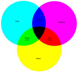
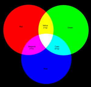
I learned that there are two types of primary colors: additive and subtractive. Additive primary colors are Red, Green, and Blue (RGB), and they are used in light color mixing. When mixed together, they produce white. This means that the more RGB colors are added together, the brighter the resulting color becomes. Additive color mixing is used in electronic displays such as TVs, computer monitors, and projectors.
On the other hand, subtractive primary colors are Cyan, Magenta, and Yellow (CMY), and are used in printing. When mixed together, they produce black. I learned that this is because each of these colors absorbs one of the additive primary colors (RGB), resulting in the absence of all colors, which is black. Subtractive color mixing is used in printing, where colors are printed on white paper. However, I also learned that black ink is also used in printing, as it is difficult to achieve a true black by mixing the subtractive primary colors alone. Therefore, the CMY colors are combined with black ink to create a wider range of colors and shades.
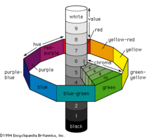
Finally, I came across the concepts of hue, saturation, and lightness. Hue refers to the actual color of an object, saturation describes how intense or pure the color appears, and lightness refers to the brightness or darkness of the color. To help visualize the relationships between these elements, we were introduced to a color wheel. I found this to be a fascinating way to represent all three concepts in one place.
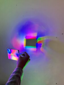
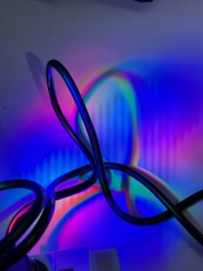
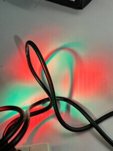
In the workshop session, we tried to create interesting effects with the different luminaires provided.


Recent comments