Week 3
Site Visit – Scottish National Portrait Gallery, Edinburgh
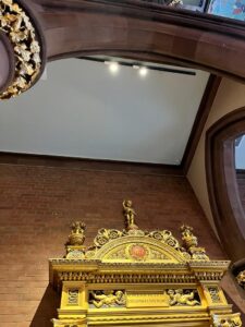
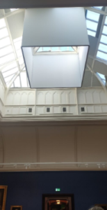
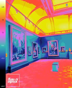
Central lobby with atrium
We went to the National Portrait Gallery this week. We were asked to observe both sunlight and
artificial light used in the gallery to highlight the exhibits. The following image is taken in the central
lobby. While standing in the middle of the lobby, we can see that the track lights are positioned
suitably so that we cannot see the luminaires, but the angle of the lighting is regulated such
that it illuminates the display.
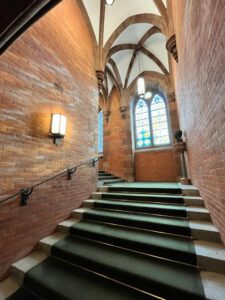
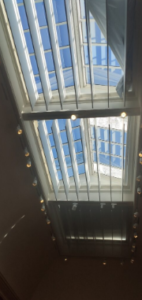
We can still see the presence of sunlight in the gallery. Nonetheless, much of the direct sunshine
is found in stairwells or in big, empty halls. The stairwells were lit with stained glass windows
creating a beautiful work of art on the walls. A wall mount lamp and a pendant light were the only
artificial lights present. The lighting in this area is kept to a minimum to emphasize the room’s
architectural intricacies.
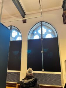
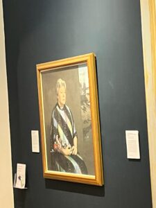
Only the arched-windows in the room that were higher than the displays allowed the daylight to
enter. Black shading screens in the exhibition hall prevented the natural light from entering the
space where oil paintings and photographs are displayed.
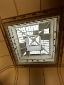
It was observed that the indoor light was weaker with cube occlusion and stronger without
occlusion. It was perhaps provided to create an ambient lighting effect with the sunlight rather
than completely blocking them out. I felt the box surrounding the skylight was a pretty clever
design. It was crucial that sunlight wasn’t hitting directly on the artworks in the room, thus this
design and shades were installed on some windows to block the sunshine without totally
eliminating the daylight and using the skylight.
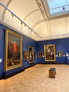
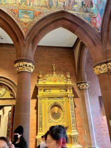
This image compares the contrast levels in the lighting and the colours used in the
space. Dark colours are used in the walls to create a focus on the paintings by
creating a contrast. Here, blue is used for the walls and gold (orange) frames for
the paintings both of which are complementary colours.
Track Lighting was the most common use of lighting design. The lights are placed
at such a heigh that no shadows are created when looking at a piece of artwork.
Multiple lights from different sides and angles focus on a single display to avoid
the shadows. We can find this by looking at the number of shadows under a picture.


Recent comments