Artificial Light Workshop
In the fifth week, we learned about artificial lighting. In this class, we got a teacher who works in lighting design. He introduced the color of light, the quality of light, and the commonly used color of light to us in detail. He also brought many lamps, which play an important role in interior design. I think these lights have fixed categories, but the choices we make in the design are still specific, so there is no detailed record of the types of lamps. It is only understood that the heat, irradiation range, intensity, size, mobility, and energy consumption of different lamps are different, so people make different choices when choosing lamps.
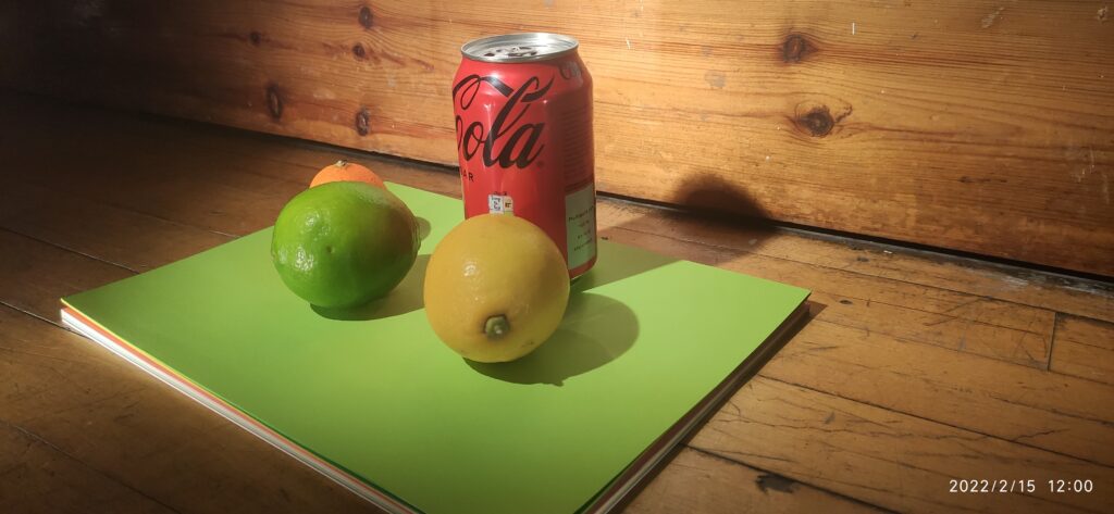
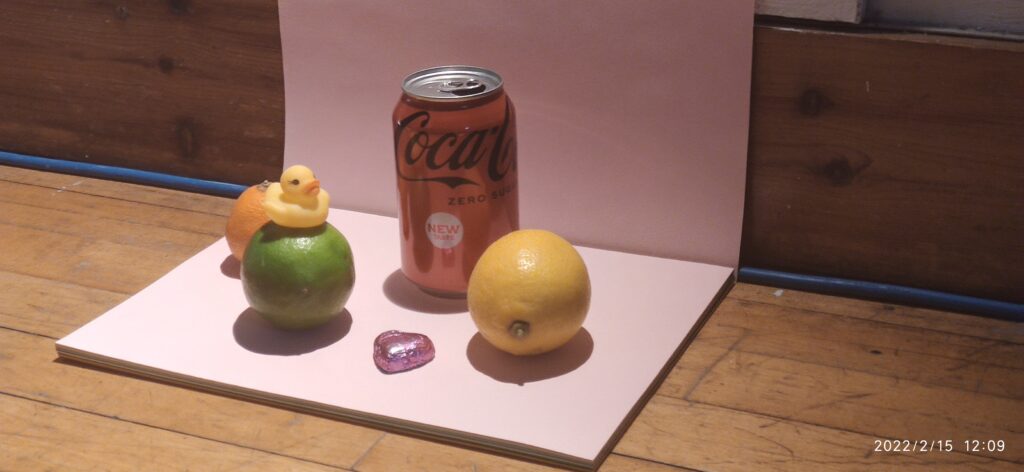
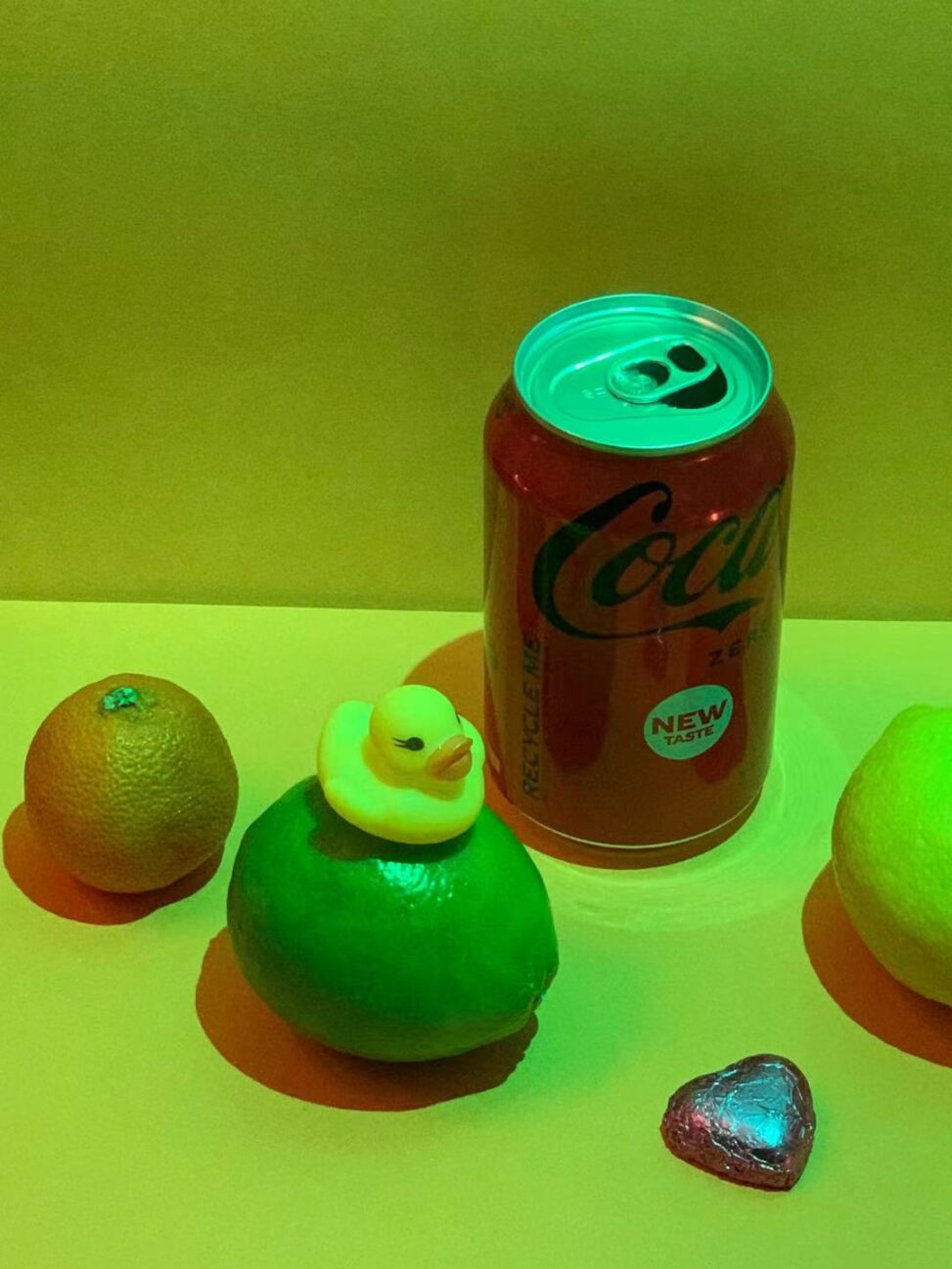
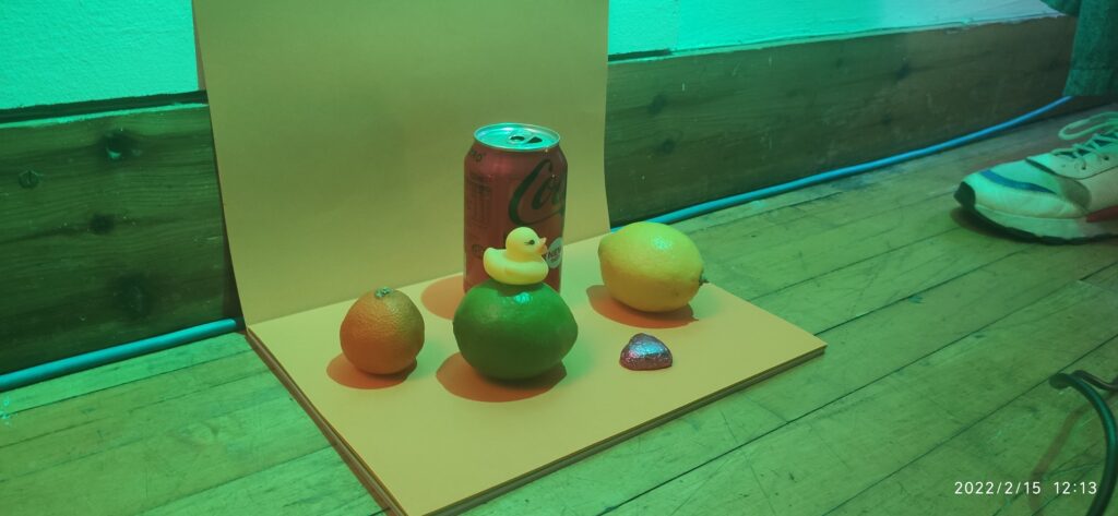
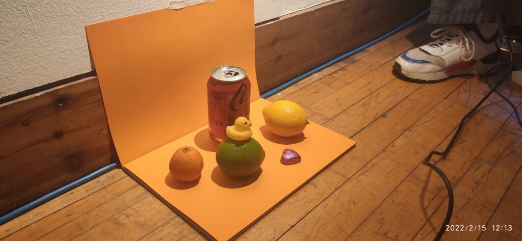
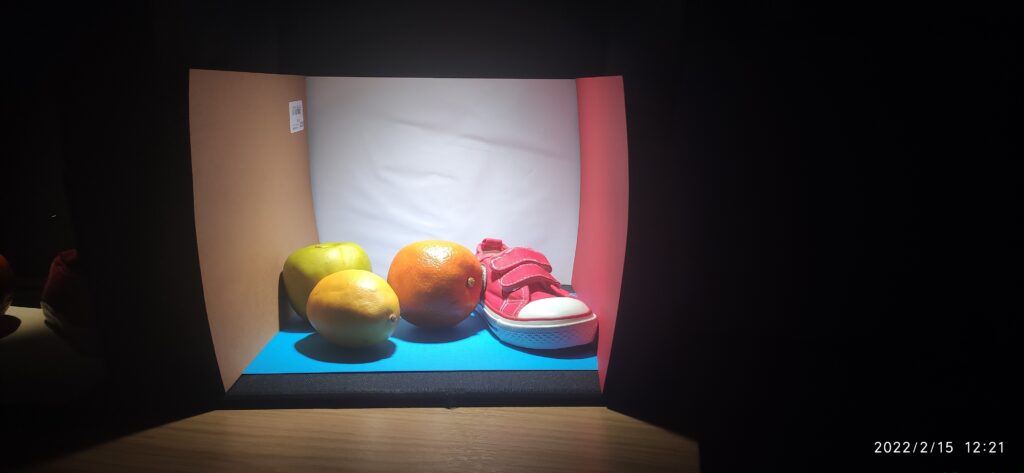
This is a comparison of a series of objects against a cold and warm background with artificial light of circular light.
As can be seen from the picture, for food, a warm background makes it feel more delicious and natural, while a relatively cool background can highlight the warm theme in the whole environment. Therefore, the appropriate choice of the background color is also very important for interior design, which can convey different information under the same light source.
Of course, the distance from the light source to the subject also affects our senses. A more focused light source highlights the subject, while scattered light allows the object to blend better with its natural environment.
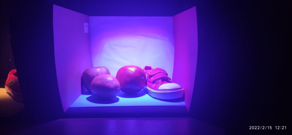
We compared them with different light source colors, and the results were obvious. Some relatively rare light source color in daily life seems to be unable to harmoniously coexist with these subjects. In fact, I think it’s just the nature of our optic nerve cells that makes us dislike these colors: green and violet, for example.
Because the cones in the human eye don’t recognize and absorb these colors well at the farther end of the color spectrum, they send a confusing message to our brains, making us dislike living in light of these colors for long periods. For example, in the lower-left corner of the picture, I can’t give the exact color of the dark side. It would have sent me into a tailspin for a long time. And I get tired of trying to identify the colors under blue light for a long time. To think about it another way, maybe it’s not that objects don’t harmonize in these particular lights, it’s just that our brains can’t adapt to this environment for the time being.
This is a video of the artificial light fading to nothing, and you can see how the object gradually changes under the influence of natural light.
These are the dials that are spinning in blue light and in daylight. We can see the pattern change on the wheel. This is the stroboscopic effect of different color lights, which can also be applied to design, for example, different information can be given by different frequency light sources, perhaps for basic encryption of information.
And I think this is really interesting because once again our eyes deceive ourselves: there are more sources of information available to us than we think, just on different visual levels.


Leave a Reply