
When the class began, the teacher, asked us what is color and what is light. I think it’s very interesting that when we study something, we always start to define its essence, but rarely put the two things together for correlation research. Now, I was inspired to think about not just the essential definitions of the two, but the connections between them.
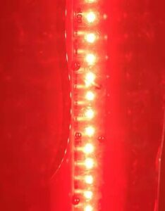
Color is directly related to one of our most important senses: the eyes, or vision. In physics, color is associated specifically with electromagnetic radiation of a certain range of wavelengths visible to the human eye. Radiation of such wavelengths constitutes that portion of the electromagnetic spectrum known as the visible Spectrum – i.e. for light.
Color is closely related to light because the intensity of light can affect the range of colors we can recognize. On a more academic level, even under identical conditions, the same object may appear red to one observer and orange to another. Clearly, the perception of color depends on vision, light, and individual interpretation, and an understanding of color involves physics, physiology, and psychology.
The electromagnetic spectrum has been introduced to help define it in measurable terms: Colour is a mixture of light, which is a kind of melody and wave line. This means that when white light is exposed to a surface, Most of the colors we can see are the color reflected in our eyes.
At the same time, light is diffracted by certain opaque media. Rough surfaces cause diffused reflection of light. So, when the surface texture has a pattern that has a similar spacing to a particular wavelength of light, The result is diffracted light. The diffracted light will appear to change color as the observer’s Angle of light.
Then we talk about the color: Because of the different wavelengths, we can see only a limited number of colors under normal circumstances. And some colors are very rare: blue, for example, is due to its short wavelength. There is also some mixing of colors: the three primary colors of light, red, green, and blue. So most of the colors of light are made up of these three colors. Purple, for example, is essentially a mixture of red and blue light, rather than a natural violet.


Then came the concepts of warm and cold light. As I was explaining this, I was thinking: why just use orange or blue light to represent warm and cold colors, rather than red or purple, which is more extreme? After that, I got the teacher’s reply: in fact, the original tendency of warm light or cold light already contained relatively extreme colors, but the expression of colors was weakened when they were mixed with white light. You can think of it as a lot of white paint mixed with a little bit of red, and whatever it is, it’s going to end up being a little bit lighter than the red. Warm light and cold light tend to our daily life, so the expression of color tendency is more suitable for human needs, that is, some colors that make the vision feel comfortable.
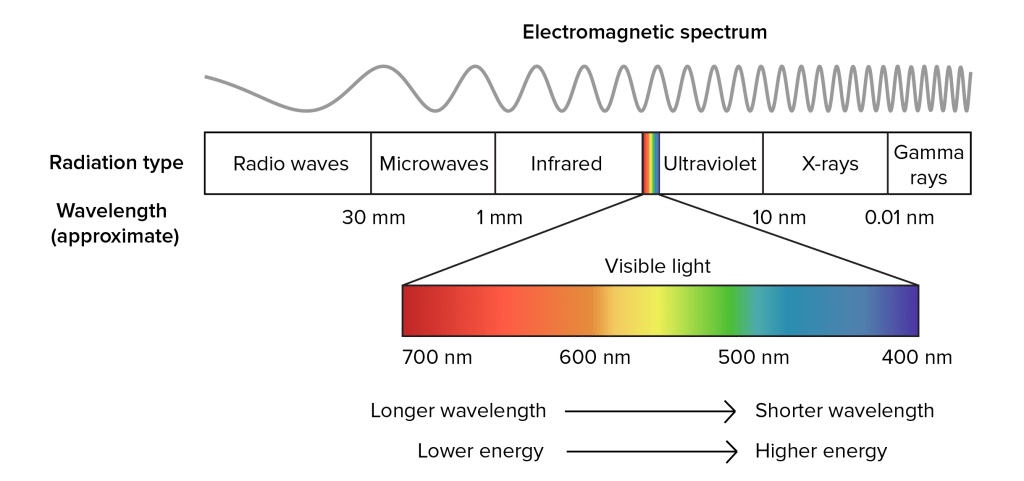
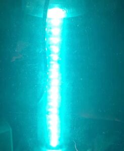
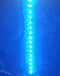
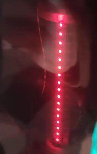
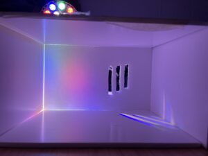
I wrapped the white light source with colored PVC to get the following colors. Later, I tried to overlay PVC paper and found that except for the directly luminous part, most of the scattered light source had been absorbed by the paper and could not transmit light. Therefore, even if it is a transparent object, as long as there are three primary colors of light involved in the mixture, still has the role of shading.

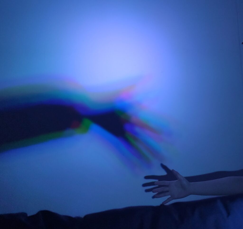
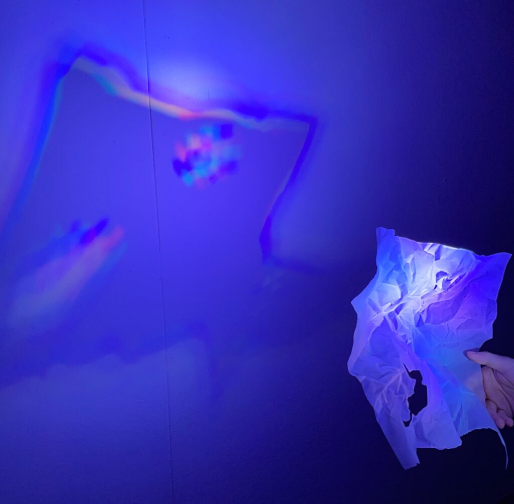
After that, we shone a colored spotlight on the arms of one classmate and found that the shadow colors were not uniform. It’s more like light coming from all angles. The same result also appeared in the projection of tracing paper, but the semi-transparent material of the paper surface made the projection softer without clear color dispersion.
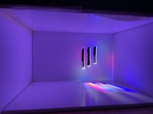
The same state occurs in slanted light at different angles. When the three primary colors of light are mixed together, it is white light, and when dispersed, it is different colors of light. This is very different from the three primary colors in the painting, which is very interesting.


Leave a Reply