Working With the Found Object:
Photo: Dimitri Otis/Getty
My chosen objects were mugs as they’re a pretty simple design yet so effective that it’s been used for probably as long as humans, or pre-humans, have been picking up water. My aim was to experiment with this timeless design and make objects that either look like, or could be used as something to drink out of while not fitting with what we today expect for a mug.
Primary:
 I began by studying different shaped drinking vessels I could find and thinking how I could reinvent this shape. However, when it came time to source the mugs, I found it very difficult to obtain any. This then forced me to shift my project, but I didn’t want to give up on my original idea entirely. I began collecting packaging but was unsure of where to go from there.
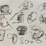
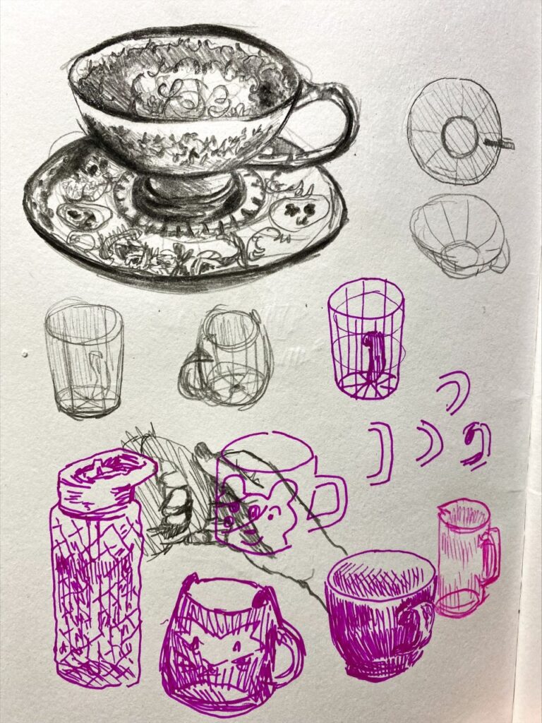
‘Studies 1’, Ink and graphite, 14.8 cm x 21 cm. (left)
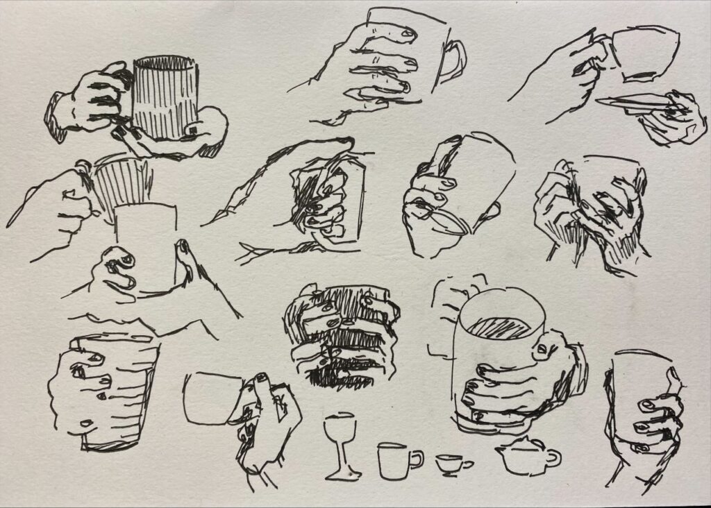
‘Studies 2’, Ink, 21cm x 14.8cm.
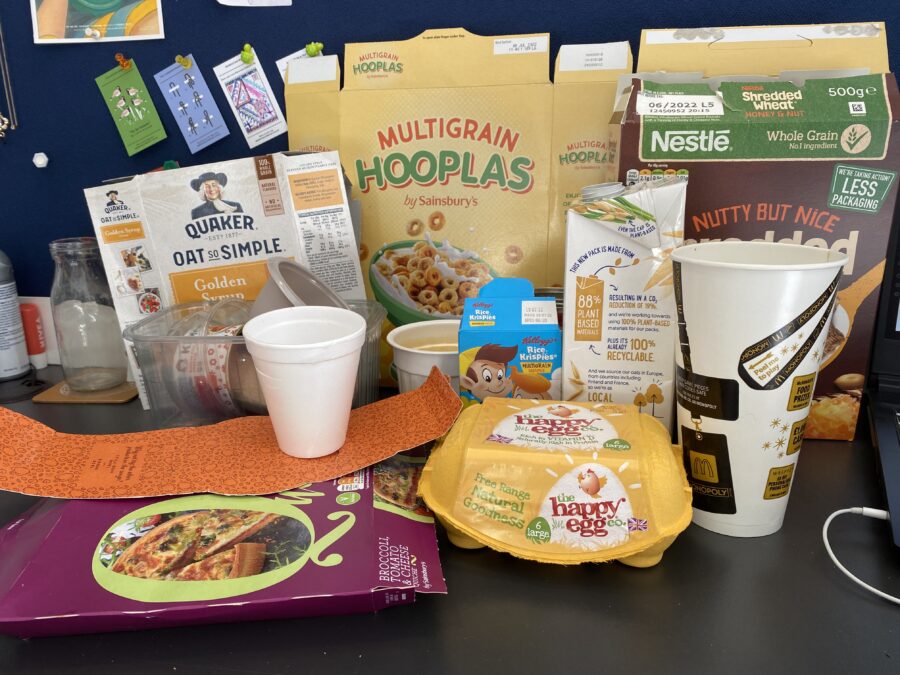
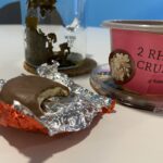
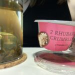
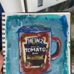
Collection of found objects.
Secondary:
The work from Kowalczyk and Wikander was very influential at this point. Kowalczyk’s work can still be used while Wikander’s is simply to be viewed. I found both outcomes to be very interesting and thus had the idea to test the usability of my own work.

Tim Kowalczyk, ‘Cardboard Mug #tk743′, Ceramics. // Photo taken by Eric Botbyl.
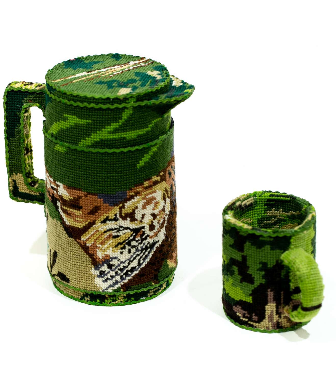
Ulla-Stina Wikander, ‘Thermos and Mug’, Cross-stitch on appliances.
‘Edits of Potential Outcomes’, digital.
Resolved artworks:
I made a series of pieces, but these were the ones I thought were the most successful.
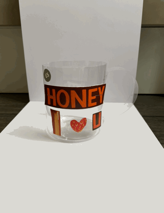
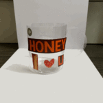
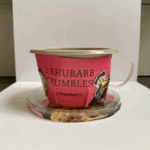
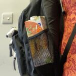
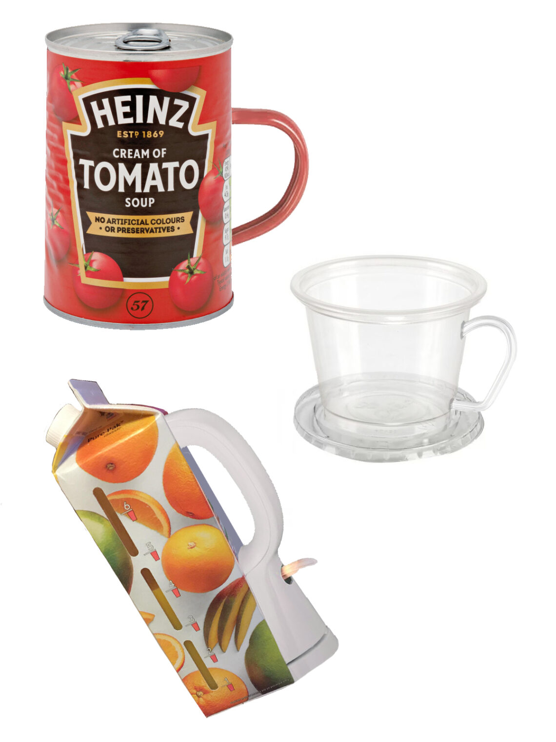
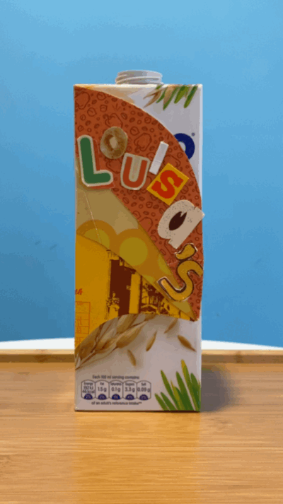
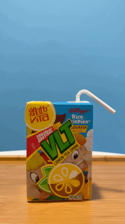
‘Valentine’s Mug’, Plastic, cereal box, staples, 8cm x 9.3cm. (GIF see original blog post)
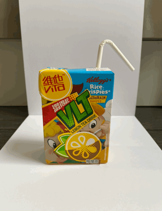
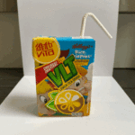
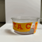
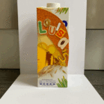
‘Juice Carton’, Cereal box, tea carton and tape, 7cm x 10.5cm. (GIF see original blog post)
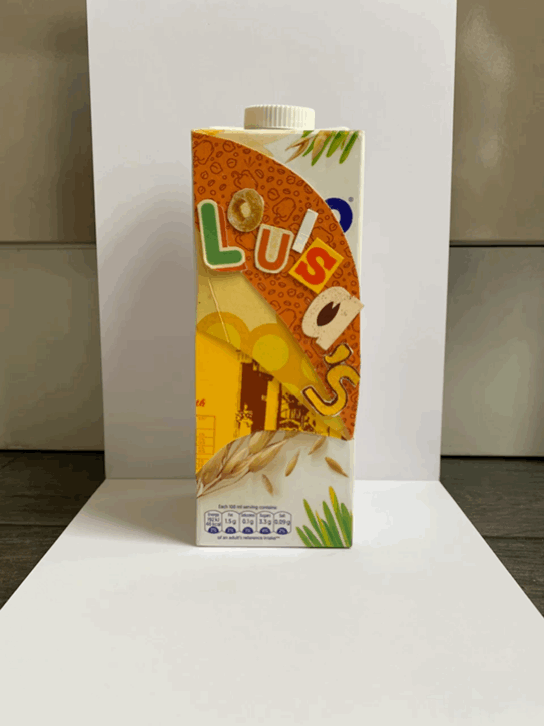
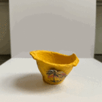
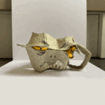
‘Water Bottle’, Carton, packaging, double-sided tape, 7.4cm x 20.5cm. (GIF see original blog post)
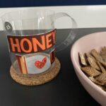
Usability tests:
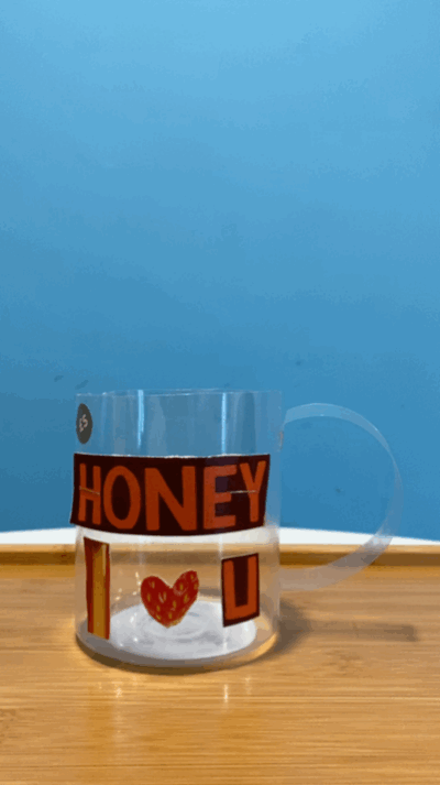
Usability tests with tea. (GIFs see original blog post).
Making and Breaking the Narrative
Even in the city flowers and plants are all around us, they’re in our homes, public spaces, and streets. We give them as gifts of love, friendship, congratulations, and grief. It’s common knowledge that different flowers hold different meanings, but the vast majority have faded from the general public’s knowledge. My aim was to create a piece that references the meaning both officially and personally of a flower. I researched several different flowers but settled on the fuchsia as it had the most meaning to me.
Primary:
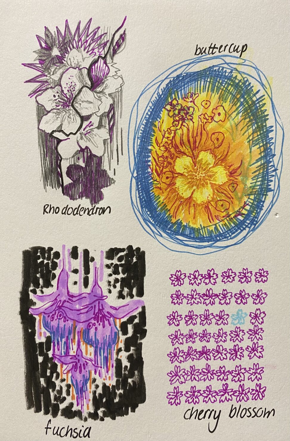
‘Thumbnail compositions’, Mixed media, 14.8cm x 21cm.
Fuchsia- elegance, amiability, confiding love: I remember these from my Grandparent’s garden. I think the overall shape and colours really intrigued me as they looked like something almost alien. I found the meanings reflected my real like experience with them and my time with my Grandparents.
Secondary:

Yuko Kurihara, ‘Vanda’, 2018. Iwa-enogu on Japanese paper.
I Love the vibrant colours and the small dot or line details Kurihara includes in her work. I find her ability to take everyday objects like plants and make then so visually interesting very inspirational.

Chris Cozen, ‘Interconnected’, 2016. Mixed Media.
Cozen seems to pick such precise and interesting colour palettes in her work which I found very appealing when going through her work. She also leans heavily into contrast and boldness which creates such a striking impact on the viewer.
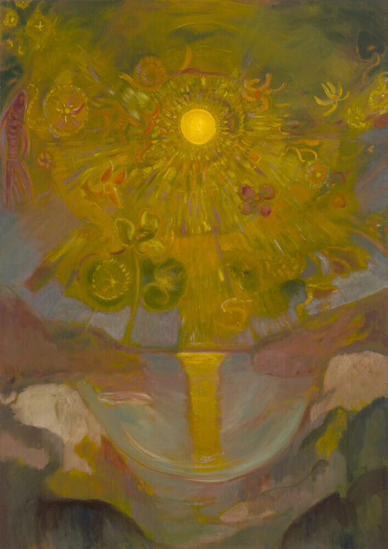
Darby Milbrath, ‘The Sun’, 2021. Oil on Linen, 62 x 44 in.
I love the way Milbrath is able to convey feelings and emotions through her art. Her choice of colours and her hazy yet precise style is incredibly interesting to me.
Resolved work:
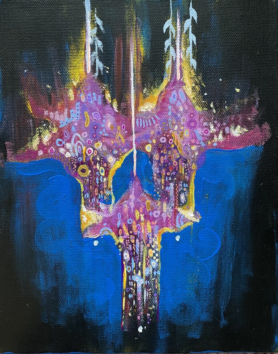
‘Family of Fuchsias’, Acrylic and ink on canvas, 20cm x 25cm.
Originally I wanted to create a more realistic piece but as I was working I instead focused more on the emotions I associated with fuchsias and less on the details of the flower resulting in this outcome.
Mapping the Soundscape
My accommodation is along Abbeyhill so to get to Princes Street I walk down Regent Road. I found that the soundscape along this journey to be extremely varied in the types and volume of noises as you make your way into town. My aim was to show this rise in volume and difference in noises.
Primary:
Edited recording of walk from Regent Road to Princes Street. (Video see original blog post).
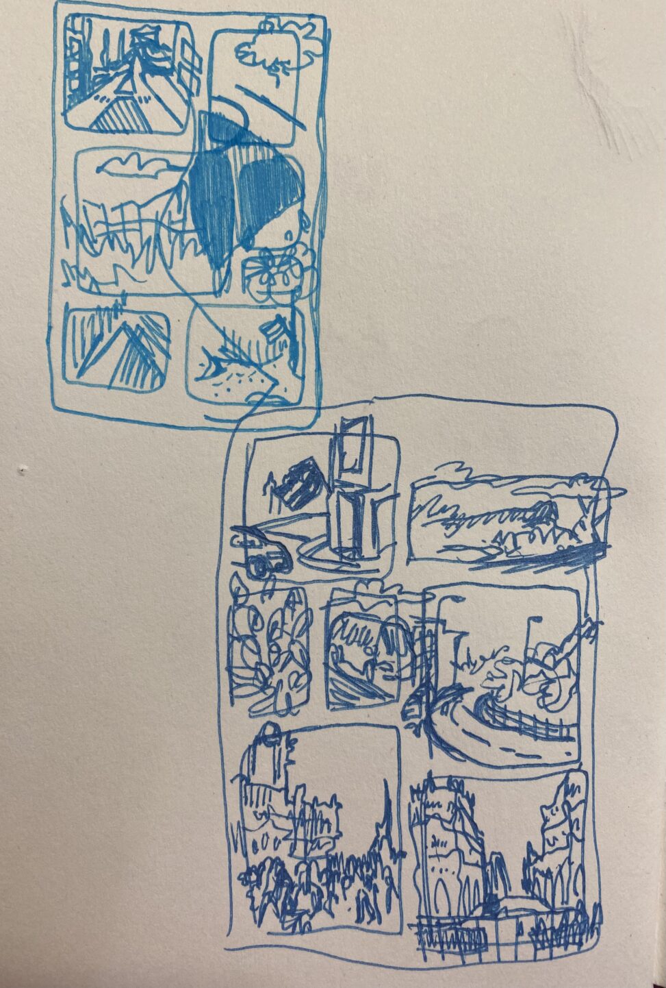
‘Thumbnail sketches of potential layout’, ink, 14.8cm x 21cm.
I love comics and animation so thought this would be a way to make my map more interesting. I had quite a hard time with the technology side of it however, as I was using programs and techniques that were new to me.
Secondary:

Byun YoungGeun, ‘Dry and Glow, P18’, 2016. Watercolour on paper, 21.5cm x 30.5cm.

Byun YoungGeun, ‘Between Winter and Spring #13’, 2014. Watercolour on Canvas, 23cm x 30.5cm.
Resolved Work
‘Soundscape of My Walk into Town’, Animation and audio recording, digital. (Link see original blog post).
Through doing this project I am now far more comfortable with the process and now hope to implement animation into some of my other work in the future.


Leave a Reply