
Analogue visualisation of learning Kiswahili
I decided that for my learning analytics visualisation activity, I would log how many times I use Google Translate to look up a word in Kiswahili.
I have been learning Swahili for a year, and I have two lessons a week, on Skype, with a retired Tanzanian Professor.
I live in Nairobi, where English is very much the lingua franca; however, for the past two years, we have been building a house in Kilifi, at the coast. Very few people speak English at the coast, so I need to improve my spoken Swahili.
I use Swahili in the following situations:
- shopping
- talking with people who do not speak much English – gardening, housekeeping, fishermen (!)
- reading signs
- writing lists
- during my bi-weekly Swahili lessons – reading, writing, listening and speaking
I use Google Translate to:
- look up individual words
- look up phrases
- grammar
- as a security blanket
Last week, we were in Nairobi for Monday and Tuesday. One Wednesday, we drove down to Kilifi. I had a Swahili lesson on Thursday and Friday.
I really found it difficult to draw my data visualisation. I realised that I had to consider:
- when I looked something up
- why I needed to resort to Google Translate
- what I looked up (grammar, English to Swahili, Swahili to English, words, phrases)
- where I was (Nairobi – not much need to use Google Translate; Kilifi – use it a lot to survive)
Therefore, the data visualisation became increasingly multi-dimensional. Would it be better to choose a timeline scenario to plot Monday to Sunday? Or would it be better to focus on reasons why I used the App? For example, logging the data to revolve around what I looked up everytime I had a lesson, or everytime I had a conversation with somebody.
I had three attempts.
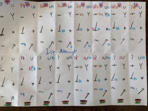
The first did not communicate successfully – it was disjointed, yet it did show when I looked up something from English to Swahili and vice versa. I didn’t produce the key, as I decided it wasn’t worth pursuing. Too much nitty gritty information.
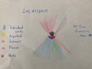
The second attempt showed that I looked up a high proportion of individual words and often the same word! But it did not convey the multi-dimensional time aspect I wanted. It gave no indication of what I was doing to necessitate looking up a word, nor did it show different times throughout the week.
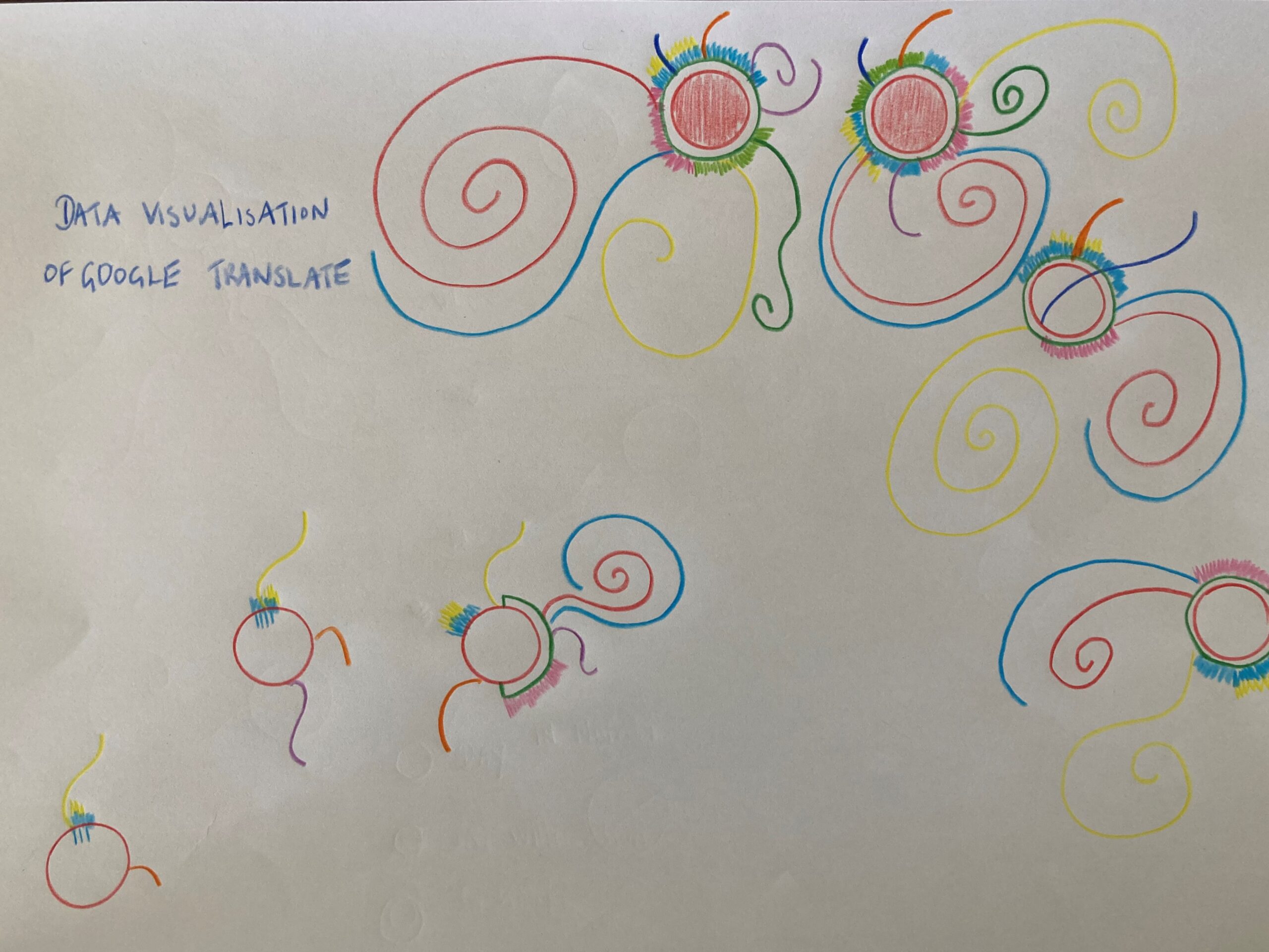
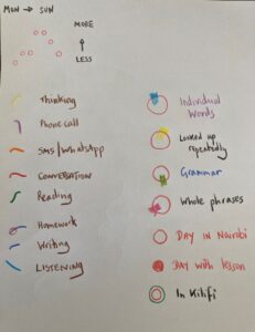
My Final Visualisation
I ended up producing a picture that had a timeline, with each day represented by a circle. The higher up vertically the circle is, the more I used Google Translate. If I was in Nairobi, the circle was red, and if I was in Kilifi, there was an additional green circle.Thereby, I achieved the when and where.
In order to represent the why I chose different coloured swirls, which represented:
- thinking about a word or phrase
- a phone call
- SMS/WhatsApp sent in Swahili
- a conversation
- reading
- Homework
- writing
- listening
To log the what I was able to use shading in different colours to show individual words; looking something up repeatedly, grammar, whole phrases.
What did my data visualisation tell me?
I used the Google Translate App when I needed it. As the week went on, I used it more – this depended on whether I was in Nairobi or Kilifi. The days that I had my lessons, I used it the most. I used it mostly for individual words and I clearly use it as an emotional/confidence crutch, using it to repeatedly to look up the same word or phrase (yellow shading on top of blue). The data shows that I spent a lot of my Swahili learning by thinking (yellow swirl) about vocabulary and looking it up. I also needed it more during conversations and listening. I did not do a lot of homework and very little writing.
This information conveys that my Kiswahili language learning revolves around the spoken word. It also conveys that I am motivated, as I think a lot about words. It also shows that I lack confidence and rely too heavily on the App by looking up things I already know or repeatedly forget. I would say that this is an accurate picture of my learning behaviour over the last week.


What a great visualisation. It is interesting to see the earlier version and their strengths and weaknesses leading up to the final iteration that gives a suitably rich description of your use of google translate. Good work.