
The lighting in a gallery is extra important. It must highlight while not overbearing the artworks on display. I have visited the Portrait Gallery often before but coming in with the view of exploring the lighting made for quite a different experience.

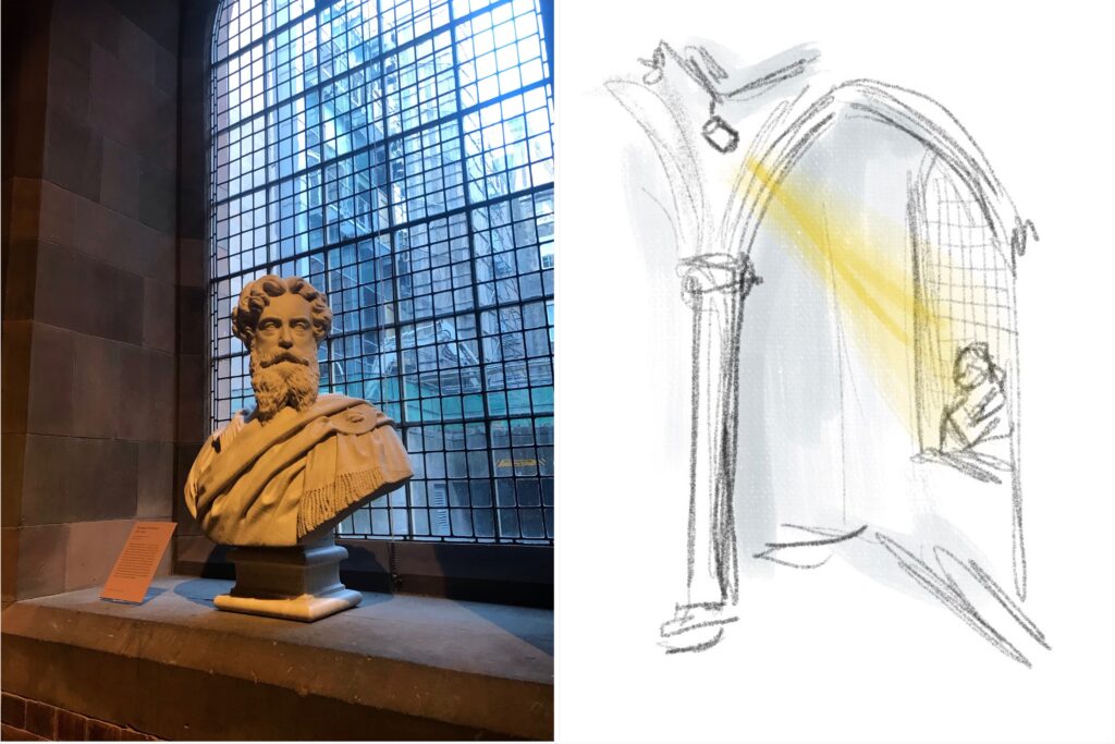
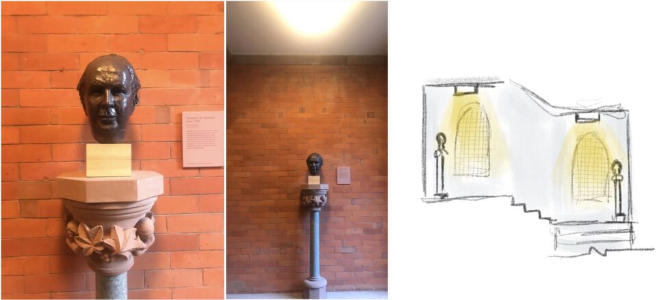
I looked a lot at the lighting used for the different busts around the gallery. When I go to the gallery it is usually to sketch statues and busts as it is very good practice for capturing a 3D form with just light and shadow to inform, so seeing the choices for lighting these was most interesting to me. The ones above that are found on the landings of the staircases I found to be less effective. That is because they were lit by a light source above that’s primary purpose was to light the landing, so it was not angled specifically to hit the curves of the bust. The image and sketch below however shows a far more effective and purposely lit bust. The light source was one specifically chosen for the purpose fitted on a track above in a the corner behind the arch and positioned perfectly to fall over this single bust. The result is a very legible form that would be a pleasure to sketch.
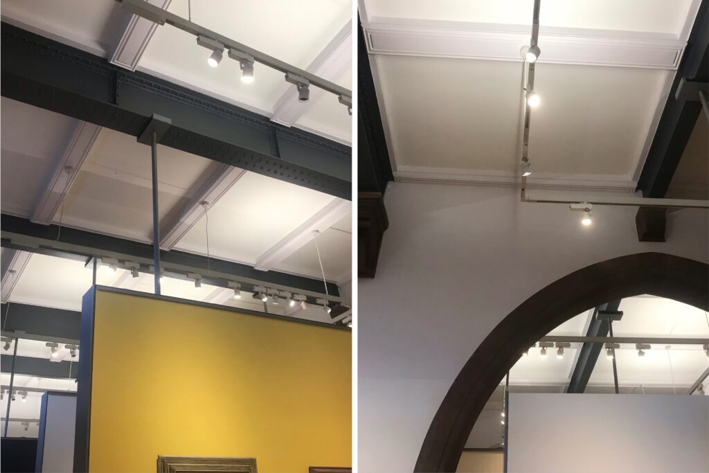
Above are some photos I took of the suspended tracks used on the first floor for the contemporary exhibitions.
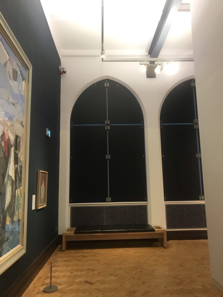
Light has to be meticulously controlled in a gallery so the large windows that if left open would let natural light flood in has been covered up using black out shutters. This allows for light to be precisely added to the spots in needs to be.
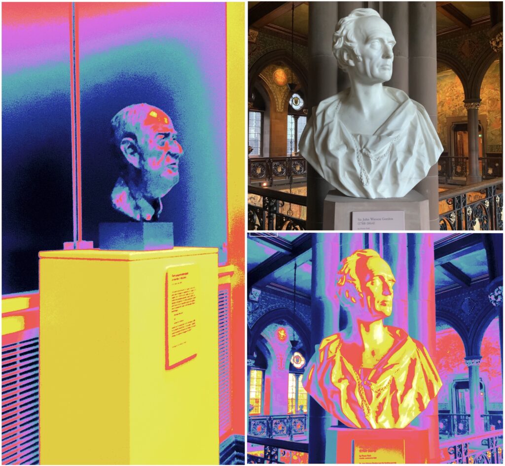
Again I found some examples of well lit and less effectively lit busts. This time I used the Fusion Optix Luminous camera to show this. You can see the image on the left has very little contract, the bust disappears into the background behind. The bust to the right however stands out brightly. The bust is a lighter colour which helps with the already dark background but the red and pink shadows on the bust itself shows how the light was effectively placed to highlight the form of the bust.
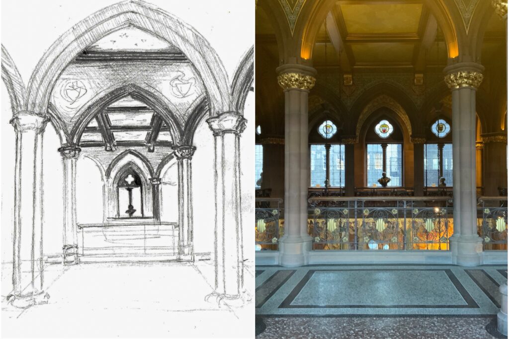
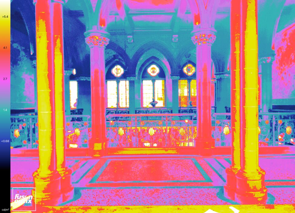
Above I started a sketch from the top of the centre foyer. I thought this view included many contacts in dark and light as well as the colour or natural light and the artificial light in the space. I will visit the gallery again to complete the sketch.


Leave a Reply