Any views expressed within media held on this service are those of the contributors, should not be taken as approved or endorsed by the University, and do not necessarily reflect the views of the University in respect of any particular issue.
I have this idea that placing my translucent works on a bright window might make really cool effects. The weather has been rather dull so I haven’t been able to try this idea out how I really want but I feel this idea might work really well when displaying all my work together.
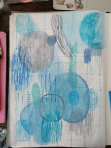
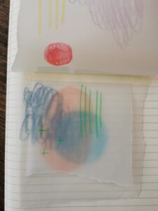
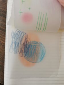
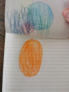
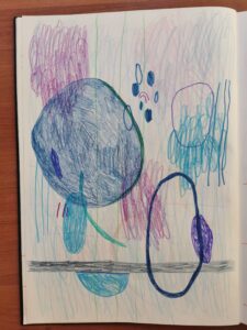
Continuing working with monochrome experiments I tried out this blue work. It’s really not my favourite as it seems a lot more flat than my other works. This is probably because my smaller developments were made up of many layers of tracing paper but this development only has one layer. The grey colour I used also cools the piece a lot which i really don’t like. I’d prefer if the tones were a little warmer.
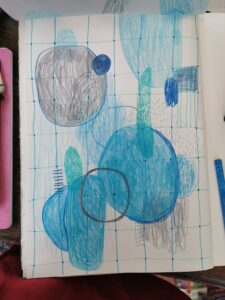
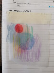
This is the piece without the tracing paper which I think I prefer for some reason. I’ll continue to experiment with tracing paper as i really love the effects of it.
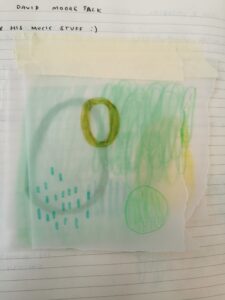
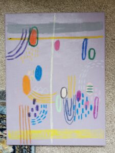
Taking into account the feedback I received during my tutorial group, I tried making a drawing with all the aspects everyone liked. I think it came out quite effective.
I really wanted to try and introduce tracing paper into my work. I really like how ghostly it made the drawings. It kinds of elevates them from bright and innocent drawings to something potentially interactive. I’d really like to develop this idea further…
I received a lot of good feedback on my more monochromatic developments. This wasn’t surprising as one colour in lots of different shades always looks really good. I’m really glad i got nice feedback on my use of texture as well, texture (second to colour) is one of the most important features of my work. I find my work to just be flat and rather dull without a heavy use of texture. I’d really love to be able to create textures from rubbings, maybe getting the texture of rough concrete or crunchy litter. This may be quite challenging however as the paper i typically use is quite thick. Maybe I colour find a thinner, but still absorbent, paper that might be helpful.
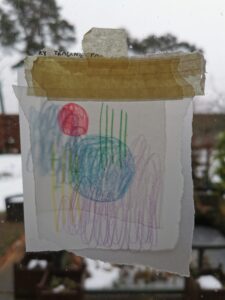
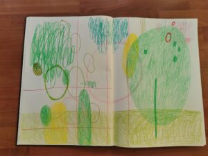
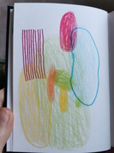
I really liked this tiny drawing I did in my sketchbook, it’s so simple and just jumps out in between the pages of drawings. The colours are my favourite and immediately soothe me when I stare into them. This is something I enjoy making, works that are made exactly how I like them. I’d really like to build more research and narrative into my projects as I feel in my earlier projects they lacked development and thought.
Stokker’s work is really up my alley. Her happy use of colour is super engaging with me and her fun blobs are really cool. She finds her colour palettes in baby clothes and I found that incredibly interesting. Finding colour inspiration from unconventional sources is something i’m quite interested in. I have the idea to walk around my town, recording colours i find in unintentional places that have great chemistry, like pieces of litter, or council signs etc. Choosing colours from places around me will hopefully help me consider why I’m applying colours together in 1 piece and help me to just be more thoughtful when painting.
In colour is exactly the type of project i’ve been waiting for. Colour is such a big part of my practice and it’s something I admire in other artist’s work. I’d really love to develop my skills in colour and try and get better at choosing colour schemes. With my colour work in the past, I usually just slap all the colours I can find onto the canvas. Typically I have no thought process when using colour. This semester I’d like to change that and really explore what colours I find especially effective working together in pieces.
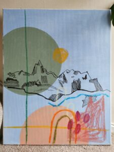
working through the balance of chaos and a thought through composition, I feel like not having my pieces as crazy and bright and punchy is actually quite nice.