
Hello, I’m Chris and I work as an e-learning assistant at the Digital Education Unit in the Royal (Dick) School of Veterinary Sciences at the University of Edinburgh. My role is varied and includes media creation, lecture processing (convert (and fix) PowerPoint lectures to video, audio, and PDF) and other things related to online postgraduate teaching. Prior to this I taught English as a foreign language in Japan for 5 years, and completed a data science bootcamp that dealt primarily with data processing and visualisation using python and popular libraries such as pandas. It will be interesting to approach data from another perspective.
In this introductory section I will show and discuss my practice data visualisation.
Since returning to the UK from working abroad, my partner and I have taken to coffee in addition to tea (for me – drop of milk, no sugar). We have gone as far as to procure a small second-hand Sage barista machine that works very well for our purposes. Particularly over winter, these hot drinks have been a regular feature throughout the days and I thought that would be a good starting point. With that inspiration, I have compiled a week (5 days, to be precise) of hot drinks.
I noticed a few things when collecting and collating the data:
- Grading my coffee enjoyment felt easier than tea – Is that our coffee-making being less consistent, different beans (we have a few different packs of coffee), or tea having a narrower range of “enjoyment” for me?
- Standing in front of the coffee machine at home, I always wanted to make sure I made a coffee better than the Saturday morning restaurant one I found merely passable.
- Did that foreknowledge of data collection impact on effort to make better coffee than I otherwise would have? How might that apply more generally, where a party with deeper knowledge of data processes has an advantage – targeting metrics to focus improvements/efforts in order to appear more effective?
Deciding what to present and challenges. Some notes:
- Do I clump all “teas” together or separate them out?
- I consolidated because my tea varieties ended up a little limited this week.
- Similarly, should I note the type of coffee (latte, americano etc)?
- I decided against this because my coffees this week have been majority latte or latte-ish
- How do I represent quality/enjoyment of a drink? Stars? Size? Colour?
- I considered representing data points as cups or mugs with a letter or colour to denote drink, and stars above to rate. After some initial sketches I felt it was too laborious. I also appreciate the minimalism of the monochromatic lines I chose to go with.
- Should I note if I had it at home or out, who made it, did I eat/snack with the drink etc?
For layout I was somewhat inspired by Dear Data’s use of straight lines in some weeks, the idea of something like a population pyramid (two sided histogram), in combination with 27 (Stefanie’s) and 45 (apologies) organic, branching themes (Lupi, 2016). I was in a minimalist mood, and prefer drawing with pencil where possible, so it is a monochrome affair.
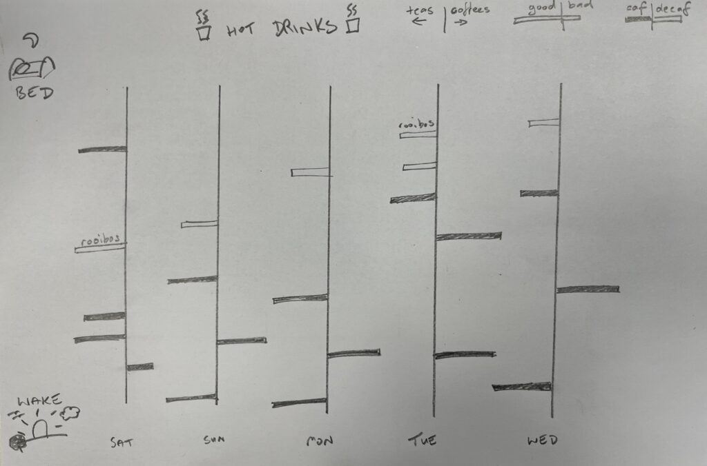
Hot Drinks data vis
Some observations from the visualisation:
- I generally enjoy decaf drinks less.
- I usually only have one coffee per day.
- I do often feel turned off by the more involved process of using an espresso machine & cleanup after vs boiling a kettle, which may contribute!
- Does the relative infrequency of coffee consumption effect enjoyment?
- I definitely look forward to my daily coffee more than a cup of tea. Is frequency an inversely proportional factor to enjoyment?
- When at home in the mornings (Sunday, Monday, Wednesday) I start with a tea.
- I feel less motivated to expend effort making coffee early in the day.
- If I was looking for specific information (such as where I most enjoy coffee – cafe/work/home etc) perhaps I would try to focus more narrowly on a single drink, but with more context.
Going forward I would like to try something similar to the circular timeline presented in Dear Data Week 22 (A week in my past) as I like that aesthetic.
References
Lupi, G. (2016) Dear Data. Princeton Architectural Press. Available at: https://www.vlebooks.com/Product/Index/871923.
(https://pixabay.com/photos/teapot-tea-traditional-ceremony-6123746/)


27 January 2025 at 18:10
Hi Chris,
I’ve already commented on your post in Moodle, but I want to reiterate how much I appreciated your visualisation experiment and your insightful reflection on it.
Regarding your queries about data representation and detail: I believe this ties back to one’s objectives, purpose, and context. What do you aim to accomplish with your data and visualisations? How will you achieve this? Which elements are essential? It might be useful for you to experiment a bit in the next step—not just freely explore the data but maybe also by setting a specific goal for yourself with the data visualisation. It could be an interesting approach to see how it influences your work.
By the way, I also got the Sage coffee machine, and I’m always pushing myself to make delicious coffee with it. Unfortunately, it’s just for me since my husband doesn’t drink coffee 😊.
Janja