This first blog is an exercise in introducing the themes of the project through its banner and logo. If you are reading this blog, you are probably interested in the research and impact landscape at our universities. Our aim in taking you through our visuals is to open up a critical conversation around deconstructing, de-linking and re-thinking current conceptualisations of Knowledge exchange and Impact (or KEI in short).
The project team were aware early on that we would need visuals that speak to the themes that we intended to focus on. But how might one effectively visualise abstract categories such as ‘knowledge exchange,’ ‘engagement’ or ‘impact,’ especially when the project aims to draw critical attention to these categories? And how could a ‘decolonial approach’ to KEI be visualised? We realised we needed an illustrator with creative vision and an understanding of the themes and categories we were planning to engage with. We found one in Alice Kaye, art student at Edinburgh College of Art, who showed a good understanding of the issues that the project explores. Having never commissioned an illustrator before, it took us a few attempts to give Alice a steer on what we were looking to convey! It’s been a fantastic collaboration in visualising our ideas: Alice brought to our notice symbols and images, a few of which we were unfamiliar with, and at other points, we tweaked her suggestions to convey a bit more sharply what we are doing in the project.
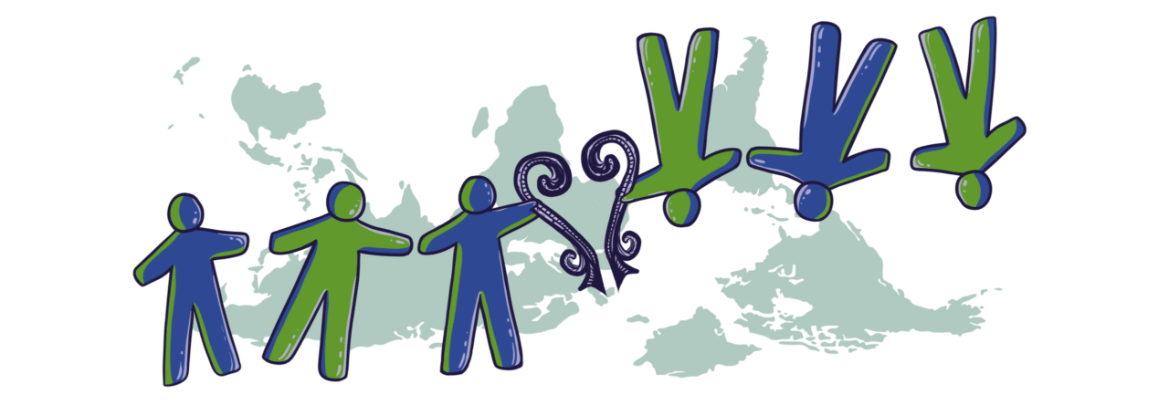
One key image that we wanted Alice to bring into our project logo and banner design was a visual reference to Uruguayan artist, Joaquin Torres Garcias,’ America Invertida (1943). As the title suggests, it is an inverted map of South America that works as a critique of European colonization of the Americas and the cultural suppression and silencing of indigenous epistemologies, expressions and art forms. His pen and ink drawing has been treated as a kind of visual manifesto for his proposition of ‘The School of the South’ where he advocated the notion of ‘the South’ as the ‘new North’ for Latin American artists. We asked if Alice could take a cue from Torres Garcias’ inversion of traditional hierarchy and critique of imperial cartography that mapped the globe north as the centre of the world. This visual challenge to historic eurocentric representations of the global north as the centre and the rest as its periphery worked well as an idea we could borrow to represent the decolonial approach we wished to introduce to the KEI landscape. The upside-down map of the world speaks of the possibility of inverting the centre or ‘source’ of knowledge construction through research and impact activities. And such a re-mapping helps to articulate questions around whose knowledge gains traction as universally applicable and valued knowledge?; global progress on whose terms?; and who benefits from the supposed advantages of a modernity birthed by coloniality in the global north?
Alice introduced the linked human figures to indicate a sense of community across the globe. Does the globe ‘produce’ certain forms of community or do communities create the world? Alice was keen “to draw on symbols of knowledge from across the globe, harmonising them…[with] the focus to be on community – hence the figures.” Yet these figures that are not identical, with some figures on their feet and others not, indicating the plurality and diversity of knowledges, lived experiences and values. We asked if she could alternate the blue and green figures, to suggest that we not just recognize difference but actively find ways of working with each other.
What is it that the two sets of figures hold, connecting them? Alice introduced to us the figure of the Sankofa “a symbol from the Akan people of Ghana, symbolising learning from the past,” which she felt “fitted well with the project’s ethos.” The Sankofa we agreed helps to move us beyond stock images of ‘enlightenment’ and the ‘rational’ as defined in the global north.
The banner and the logo share this core imagery: the yin-yan figures curving into a circle that suggest a globe, with the image of the world map, again ‘inverted’, superimposed on the figures. We agreed with her that the repetition of the visual tropes between the banner and the logo helped to reinforce our emphases on care, critical thinking and change—for communities, for partners and for researchers.
To view other artworks by Alice, please visit Alice Kaye@onesmallalice


Leave a Reply