The “Life of the Blue Whale” exhibition at London’s Natural History Museum takes a flagship item from their collection, one that sits in pride of place in the Museum’s Hintze Hall and embeds it into a digital setting that is freely available online, browser based, and strives to offer an immersive and visually engaging experience to the visitor. While the site appears to be custom designed for the purposes of the exhibition, as a case study it offers a fantastic insight into immersive design principles for an online exhibition such as ours. Here we can look to its structure, that is, the general way that the pages link together and we can also consider the ways the exhibition presents its information, along with its more general design strategies. While many of these might not be available to us on the university platform, the reasons behind them are insightful and interesting – and this comes down to the simple fact that all exhibitions, whether offline or online, have a shared common interest, as is described by Kim:
An exhibition is a communication medium, not only in museums but also in the commercial and public service arenas. In museums, exhibitions are used as the principal method of communication with the public and the museum’s emphasis has changed from mainly collecting and preserving objects to providing information to and communicating with visitors (Kim, 2018, p.243).
This paradigm shift is true of online museum content too, with the Covid-19 pandemic incentivising an accelerated shift away from the simple provision of data and towards a more visitor-centric focused provision of engagement beyond catalogues (Kidd et al, 2021). Our goal when designing an online exhibition centres on one of communication: allowing and encouraging the visitor to engage with the content that we feel that the institution wants to communicate. What, then, are the tricks we can utilise to achieve this end?
Structure & Content
The Life of a Blue Whale makes simple but effective structure and content choices which are careful not to overwhelm the visitor with information (with on-screen text rarely above 50 words), and it disperses its content through three layers that use an eclectic array of sub-exhibits to communicate its core messages. At the same time, the exhibition is unified by its focus on a single collection item: the whale itself.
Whether online or offline, this carefully curated limit on text is a well known balancing challenge: sufficient text to be informational and communicate the message, but not so much as to overwhelm the visitor or cause them to start skipping pages (or even leave the exhibition entirely!). The V&A notes in its own guidance that these text limits do not restrict the amount of information retained by the visitor; on the contrary – they can in fact increase it (V&A, 2013, p.9)! The CRC platform also discourages large text blocks, but it is important to plan from the start how to distribute the information: the structure of the Blue Whale exhibition is what allows such short text-snippets, with each piece of information distributed throughout the website, easy to discover should the visitor so wish it.
Playing with Perception: Neither Offline Nor Online
The exhibition feels immersive, striking a balance between mimicking (but importantly, not attempting to replicate) the physical experience of a museum and utilising the strengths of a digital platform. Hoffman highlights the many issues that arise from exhibitions that too closely strive to mimic the experience of the offline visit (2020, p.213). In general, these place unnecessary constraints on the design, limiting the power of the digital space (in a our humdrum everyday lives, we are forced to walk everywhere – in an online space we can fly. Why limit that?). Yet mimicking a physical space to some degree does come with advantages. Visitors know how to pick up on navigation cues when walking through an exhibition, and they have experience of interacting with online exhibits. Taking this experience and utilising it on the online platform is something that the Life of the Blue Whale does well; for instance, the exhibits are presented as branches off a central “chamber”, the Hintze Hall itself, where they can “move” to and explore further.
At the other end of the spectrum a similar challenge is faced when ensuring that the exhibition doesn’t come off as “just another website”. Here the Life of the Blue Whale excels, but has the advantage of its entirely customised platform which allows it to use a number of tricks to add layers of depth and an illusion of interactivity that visitors would not expect from a “normal” website. As such, our exhibition cannot utilise these tricks directly, but the principles behind those tricks will certainly be illuminating and useful.
As soon as the exhibition page is opened, the audio provides immersive sounds as a backdrop. Visual cues such as the following are also utilised to create an illusion of space and exploration, moving beyond the simple expectations of a website visit:
Parallax movements tied to the mouse cursor give an illusion of depth and interactivity. (Fig.1)
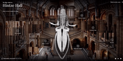
Figure 1: Parallax motion. As the cursor moves, the rearmost layers move at a slower rate creating an illusion of depth. © The Trustees of The Natural History Museum, London. Screengrab taken from https://www.nhm.ac.uk/bluewhale/hall/ on 09/10/21
Icons that “cross out” once a “room” has been visited give a sense of achievement and exploration (fig.2)
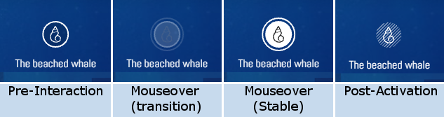
Figure 2: Diagram of mouseover transitions. © The Trustees of The Natural History Museum, London. Screengrabs of icons taken from https://www.nhm.ac.uk/bluewhale/ocean/ on 09/10/21
The landing page (fig.3) breaks with a user’s expectation that a standard webpage’s content is vertically organised. This also mimics entry into a physical space (in which we look left to right).
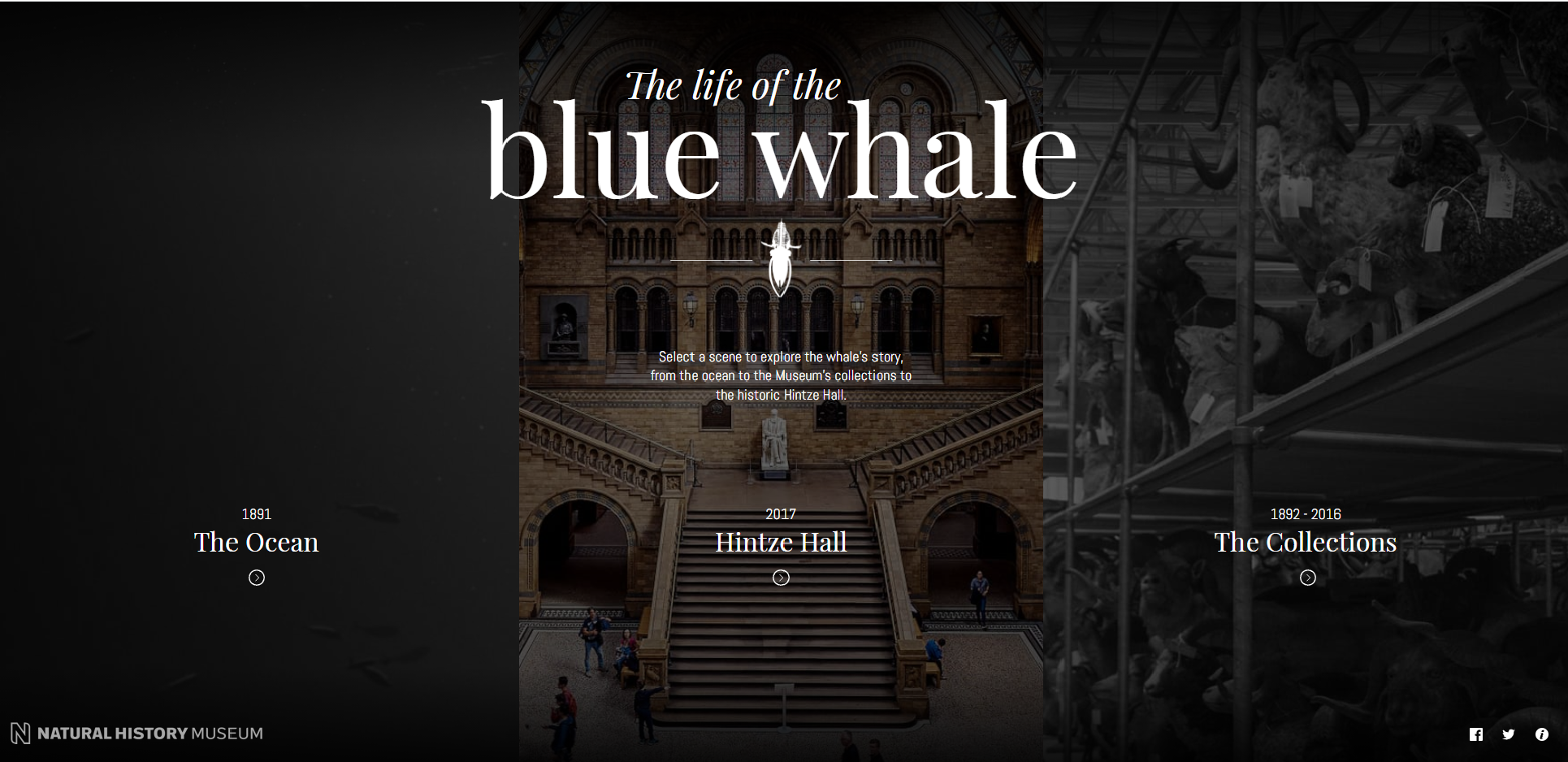
Figure 3: The landing page for the exhibition, with the three exhibition hubs arranged left to right. Colour shifts to each section on mouseover. © The Trustees of The Natural History Museum, London. Screengrab taken from https://www.nhm.ac.uk/bluewhale/ on 09/10/2021
Our project is built around a younger platform, one that is still in the process of evolving. Parallax scrolling, for instance, is not within the capacity of the platform but this does not mean that we are unable to take the lessons learned and apply them more generally. Through utilising the tools we do have available we can nudge the visitor into feeling like they are engaging with an exhibition, rather than “just another website”. As Hoffman (2020, p.211) points out – while we may be utilising different technologies, ultimately we are working from the same toolbox of text, vision, and audio resources relayed through a screen. For instance, by utilising horizontal, rather than purely vertical layouts we can break down the standard impression of a website, as has been acomplished both in the case study above and in, for example, this page by the Rijksmuseum. Through structuring the pages to distribute text into short bites, we can ensure that the communication is clear, but not overwhelming. And by integrating multimedia content into the exhibition, it will create a sense of exploration and discovery.
References
‘From Home: We bring the museum to you’ (n.d.) Rijksmuseum. https://www.rijksmuseum.nl/en/from-home (Accessed: 25 April 2022).
‘Gallery text at the V&A: A Ten Point Guide’ (2013) V&A https://www.vam.ac.uk/__data/assets/pdf_file/0009/238077/Gallery-Text-at-the-V-and-A-Ten-Point-Guide-Aug-2013.pdf (Accessed: 25 April 2022)
Hoffman, S. K. (2020) ‘Online Exhibitions during the COVID-19 Pandemic, Museum Worlds’ 8(1), 210-215. Retrieved Apr 25, 2022, from https://www.berghahnjournals.com/view/journals/museum-worlds/8/1/armw080115.xml
Kidd, Jenny, Nieto McAvoy, Eva and Ostrowska, Ania. (2021) ‘Implications of the COVID-19 digital ‘pivot’ in museums and galleries: lessons from practitioners’ AHRC Policy and Evidence Centre, Cardiff University https://www.pec.ac.uk/discussion-papers/pivot-to-digital-how-museums-and-galleries-responded-to-covid-19
Kim, Soyeon. (2018) ‘Virtual exhibitions and communication factors’ Museum Management and Curatorship, 33(3), pp.243-260.
http://www.doi.org/10.1080/09647775.2018.1466190
‘The life of the blue whale’ (n.d) Natural History Museum. https://www.nhm.ac.uk/bluewhale/