Details November 2023
November 2023 – 3900.78 Release
- Image insertion option for Ultra Documents, Journals, Discussions, Assessment attempts, and Course Messages
- Matching question updates: partial credit auto-distribution and other updates
- Late submission indicator in submission receipts
- Tab navigation for Journals
- Sorting controls for Student Name, Overall Grade, Assessments, and Manual Columns in grid view
- Gradebook grid view performance improvements
Image insertion option for Ultra Documents, Journals, Discussions, Assessment attempts, and Course Messages
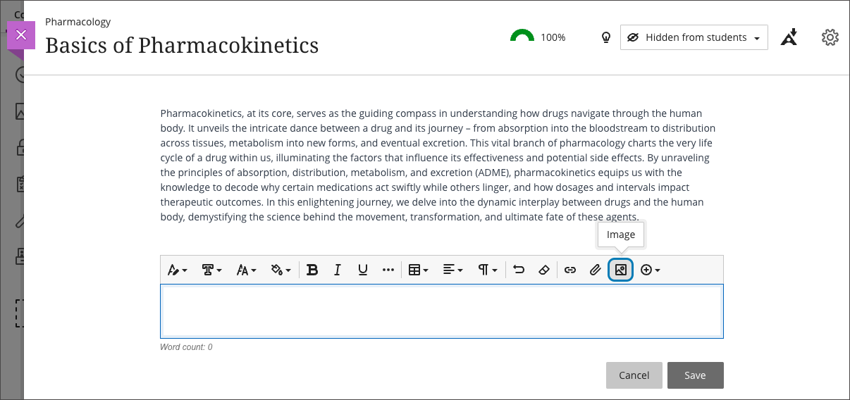
Images play an important role in a student’s education experience. Images help to enhance comprehension of and engagement with course content. To help instructors more easily identify high-quality images, we have added a new image button in the content editor in the following places:
- Ultra Documents
- Journal prompts
- Discussions
- Course Messages
Image 1. Instructor view – New image button on content editor for Ultra Documents
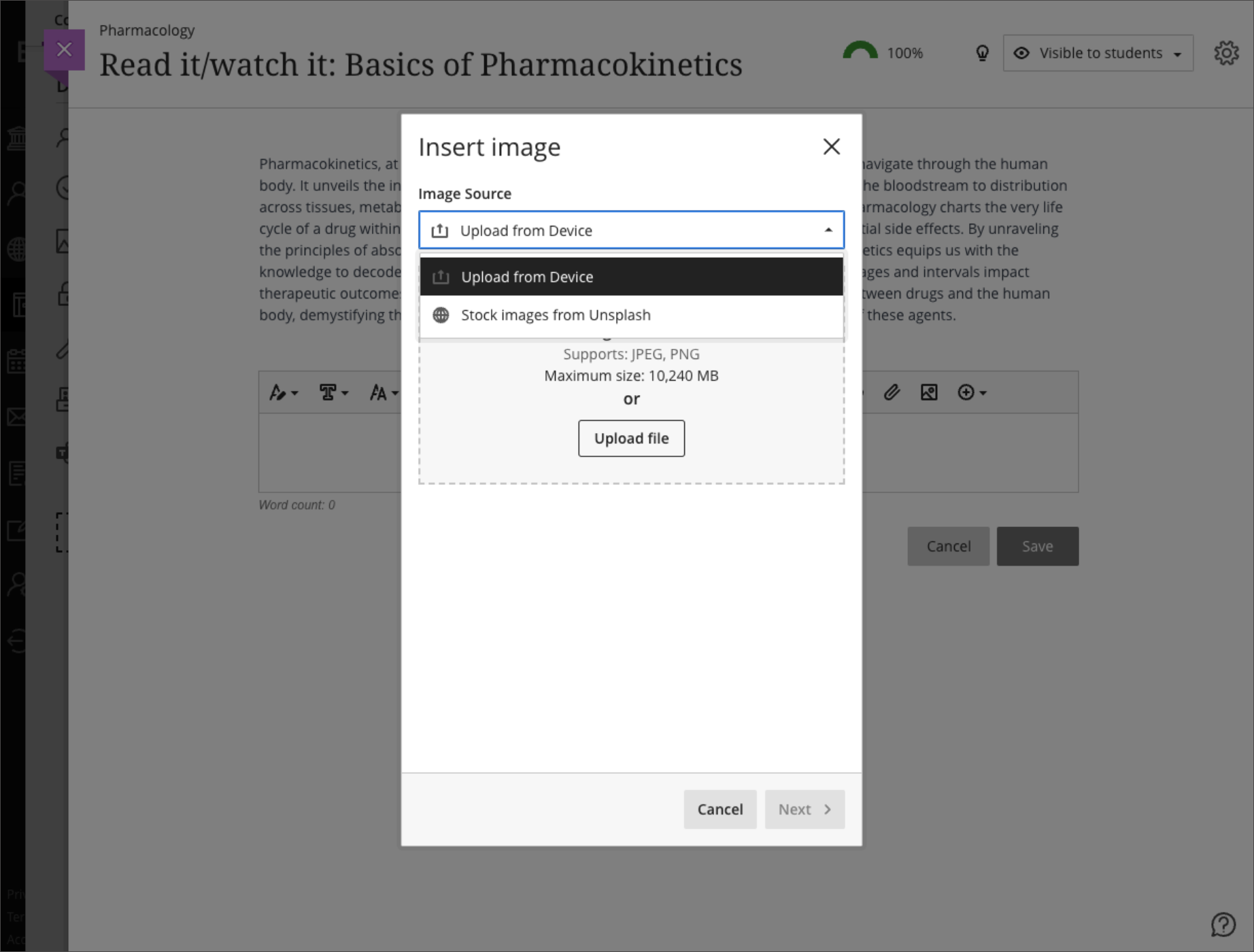
When selected, the instructor has the following options:
- Upload an image through selection or drag and drop
- Select a royalty-free, high-quality image from Unsplash.
- Generate images using AI (initially, only for Ultra documents)
Image 2. Instructor view – Image source options
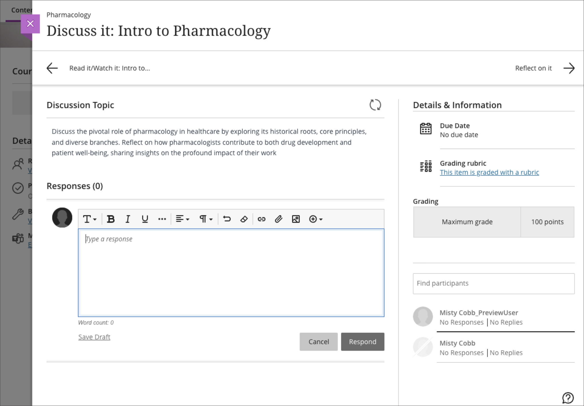
Students can also access the new image button on the content editor in the following areas:
- Discussion responses
- Assessments and test question inputs
- Course Messages
Image 3. Student view – New image button on content editor for discussion response
Image 4. Student view – Drag and drop or upload an image file
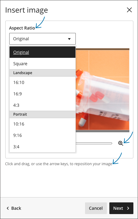
After selecting the image, instructors and students can reposition the focus and zoom of the image. There’s also an option to alter the aspect ratio of the image.
Image 5. Modify the zoom and focus of the image; set the aspect ratio.
Users can rename the image. It is important always to consider the accessibility of course content. The user should mark the image as decorative or provide suitable alternative text.
Instructors can also set the view and download file options for the image. After the image is inserted, the user can resize the image.
Matching question updates: partial credit auto-distribution and other updates
Matching questions are useful for testing a student’s skill in making accurate connections between related concepts. This question type also checks students’ understanding in a structured format.
To reward students who show partial understanding, some instructors wish to award partial and/or negative credit for matching questions.
In the past, instructors selected a scoring option:
- allow partial credit,
- all or nothing,
- subtract points for incorrect matches, but question score can’t be negative
- or allow negative question scores.
These options were exclusive and, at times, created confusion for instructors. We removed these options.
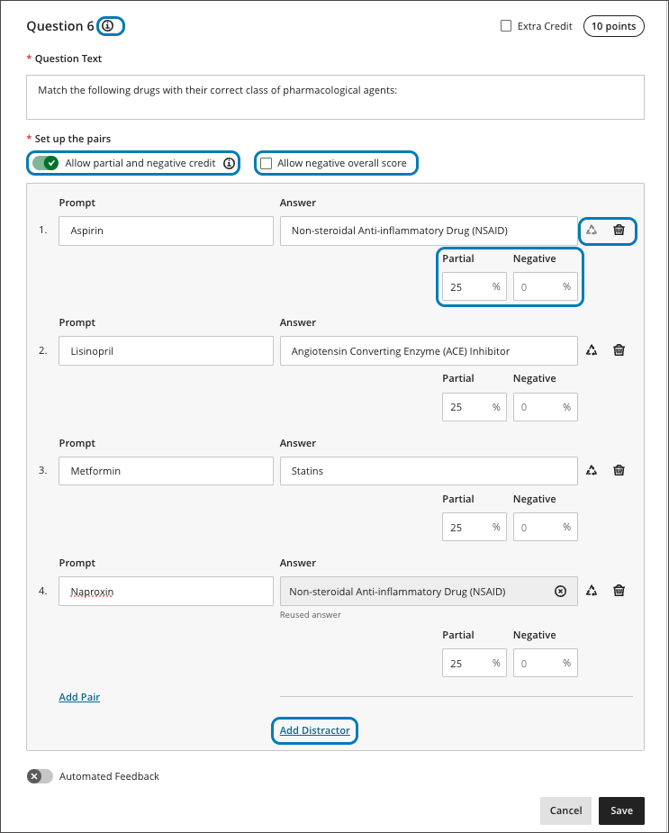
Now, partial and negative credit is turned on by default. We auto-distribute partial credit as a percentage across the matching pairs. The auto-distribution of credit saves instructors time. Instructors can edit the partial credit values if needed to grant some pairs more or less credit. Values for partial credit must sum to 100%.
If desired, instructors may also specify a negative credit percentage to any pair. Negative credit is only assessed when applied and when a student mismatches a pair. If desired, instructors may choose to allow an overall negative score for the question.
We also made a few other improvements to this question:
- We re-worded the question construction guidance and moved it to an info bubble.
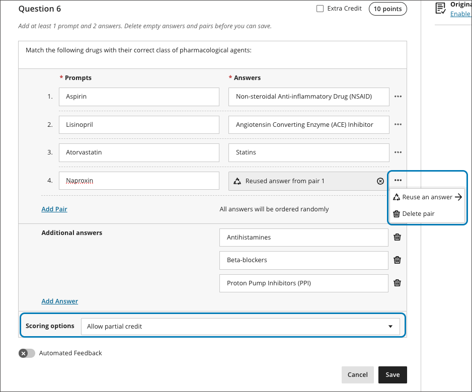
- In the past, the “reuse an answer” and “delete pair” options were behind the three-dot menu. Now, these options appear on the right side of the answer for each pair.
- Before reused answers appeared as “Reused answer from pair #” in the answer field. Now, the answer itself is displayed in the answer field. “Reused answer” appears beneath the answer for the pair.
- We renamed “Additional answers” to “Distractors.”
Image 1. Before – Matching question
Image 2. After – Matching question
Late submission indicator in submission receipts
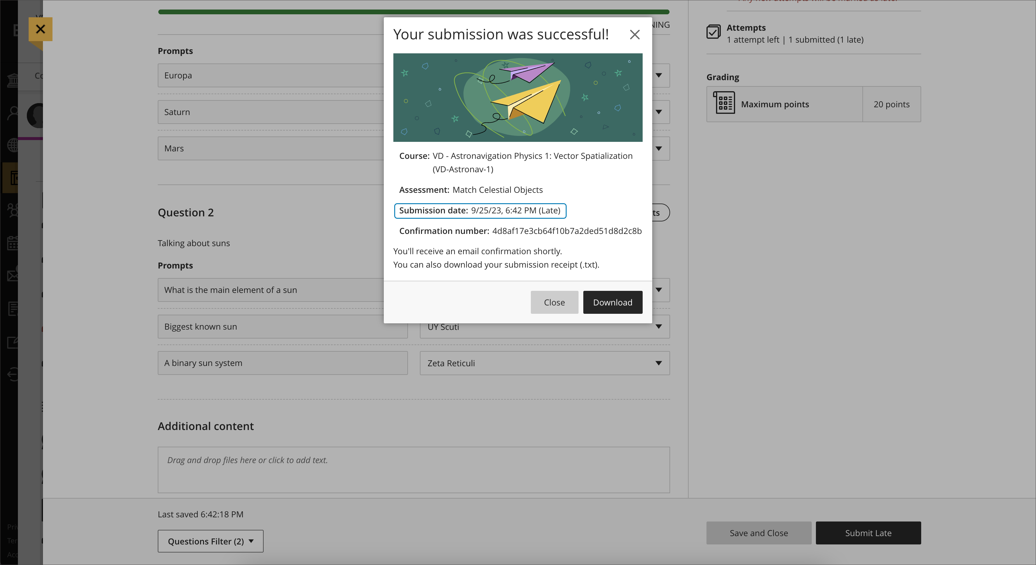
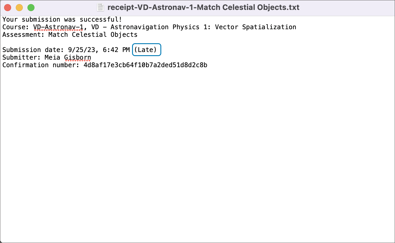
Students lead busy lives and sometimes submit assessments late. Some instructors and institutions use penalties or deduct points for late submissions. Based on direct feedback from instructors, we added a new ‘late indicator’ to the submission receipt. This indicator is present only if a student submits the assessment late.
Students can view the late submission indicator in:
- the confirmation modal displayed upon a successful submission,
- the downloaded version of the submission receipt, and
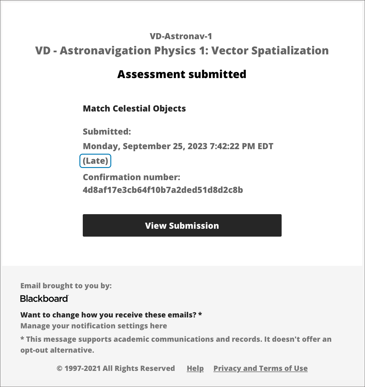
- the emailed submission confirmation.
Image 1. Student assessment submission receipt confirmation with ‘late’ indicator
Image 2. Late submission indicator in downloaded submission receipt
Image 3. Late submission indicator in email submission confirmation
Tab navigation for Journals
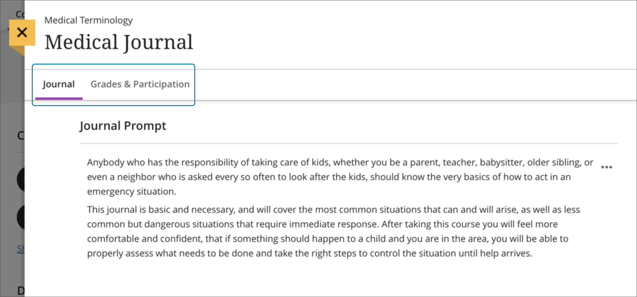
To improve navigation for journals, we have introduced a new tab navigation. Now, instructors can switch between the Journal and the Participation page. When an instructor sets up a journal for grading, the Participation is replaced by Grades & Participation. This update improves the usability of the journal. It also provides consistency of navigation with discussions and assessments.
Image 1. Tab navigation for a graded journal
Sorting controls for Student Name, Overall Grade, Assessments, and Manual Columns in grid view
Sorting options in the gradebook provide a more efficient grading experience.
Now instructors can sort the following gradebook grid view columns:
- Student Name
- Overall Grade
- Tests and Assignments
- Manual columns
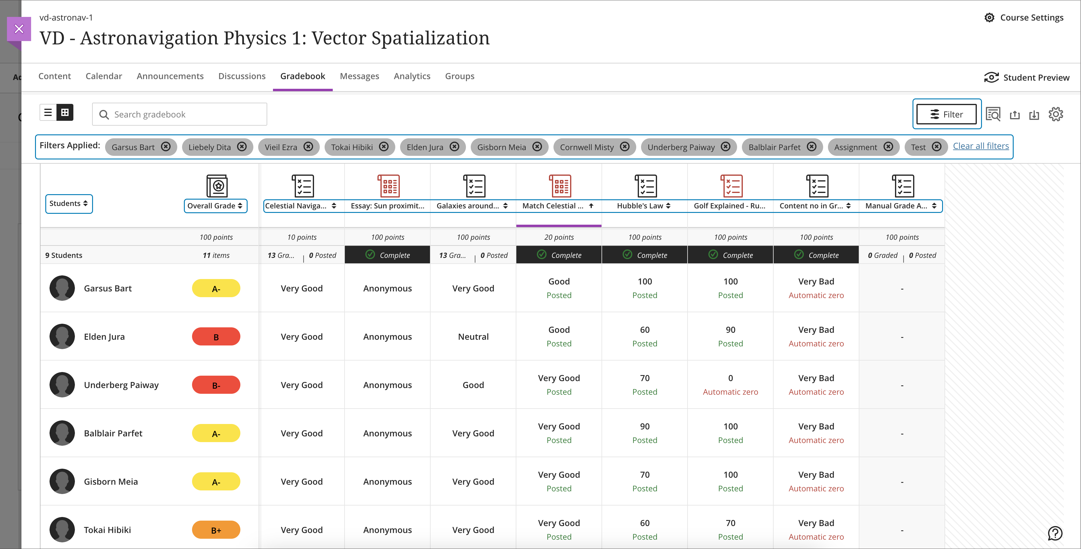
Instructors can sort records in ascending or descending and remove any applied sorting. A purple highlight in the column header helps instructors identify where sorting is applied.
Any sorting applied yields a temporary change to the sort order of all columns in the gradebook grid view.
Image 1. Sorting an assessment in the grid view with filters applied
Gradebook grid view performance improvements
Some instructors prefer to work in the gradebook grid view. To improve the user experience, we made several improvements to this view. These improvements address overall performance and reduce the load time.
Performance tested scenarios:
- 25K student enrollments and 400 gradable items:
Load time reduced from 108 s (about 2 minutes) to 14s (87% performance improvement) - 2000 student enrollments and 400 gradable items:
Load time reduced from 19s to 8s (57% performance improvement) - 40 students and 400 gradable items:
Load time reduced from 8s to 6.8s (14.75% performance improvement)



Comments are closed
Comments to this thread have been closed by the post author or by an administrator.