Details December 2023
December 2023 – 3900.80 Release
- Large Rubric Support
- Group assessment due date exceptions
- Prevent students from earning full credit when selecting all answers choices on multi-select question with partial credit
- Grid view sorting controls
- Automatic zero gradebook improvement
- Additional image insertion and generate options
- Enhancements to Grades
- Improved mobile experience for Course Content page
Large Rubric Support
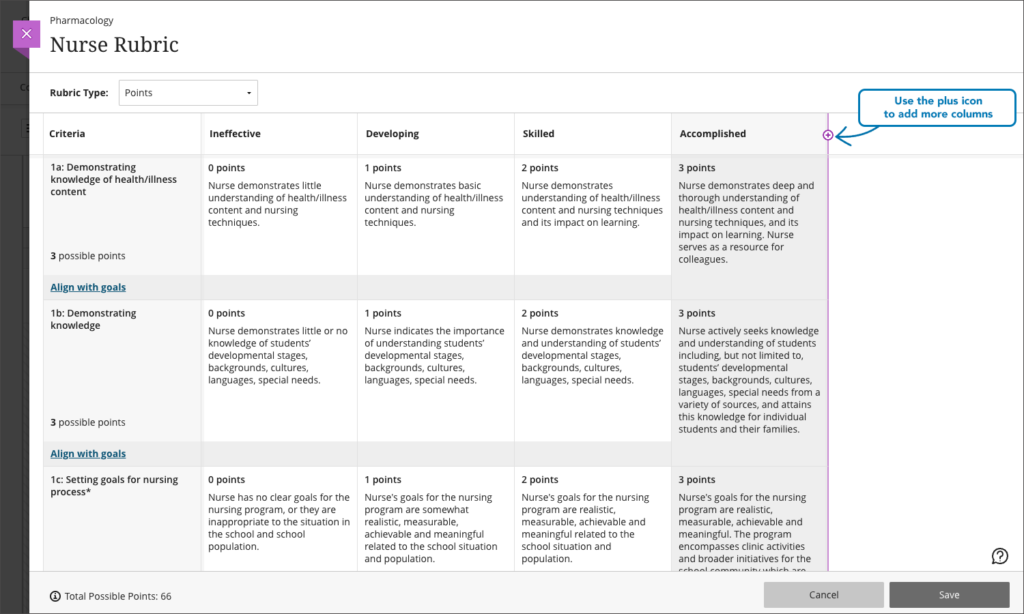
Rubrics serve as a well-organised and transparent framework for assessing student work. We now support an unlimited number of rubric criteria and performance levels, up from 15 each. This change empowers instructors to craft rubrics that support diverse assessment scenarios. Unbound rubrics are valuable where a higher number of criteria are needed. Larger rubrics also prove invaluable for rubrics employed in accreditation processes.
Image 1. Large rubric support with the potential for the addition of more rows
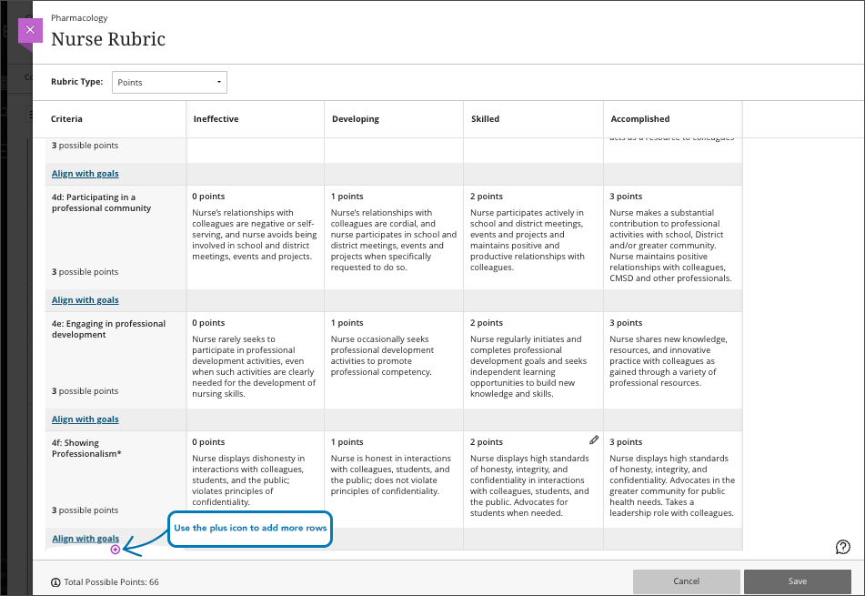
Image 2. Large rubric support with the potential for the addition of more columns
Group assessment due date exceptions
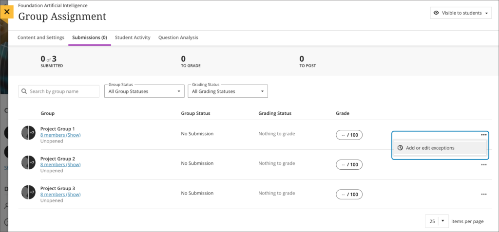
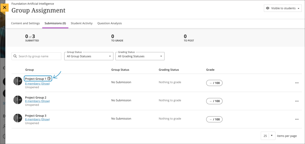
Instructors may want to set different due dates for each group working on a group assessment. In the past, there was no way to assign varying due dates for each group working on a group assessment. Now, instructors can assign a unique due date to each group using the exceptions workflow. On the group assessment Submissions page, the instructor may add or edit exceptions for a group.
Image 1: Instructor view – add or edit exceptions option on the group assessment Submissions page
The Exceptions panel displays relevant information such as the assignment name and selected group name. This helps ensure the accuracy of an exception. Instructors can select a due date for the group using the date and time picker.
Image 2: Instructor view – exceptions panel
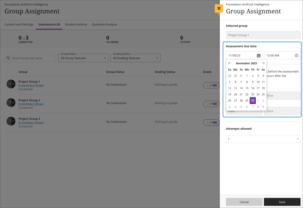
Image 3: Instructor view – group assessment Submissions page displays the exceptions indicator for Project Group 1
Prevent students from earning full credit when selecting all answers choices on a multi-select question with partial credit
Multi-select questions require students to select multiple correct answers from a list. This variation of a multiple choice question encourages critical thinking. Some instructors may award partial credit to students on these types of questions. Partial credit promotes a fairer and more accurate assessment of students’ knowledge.
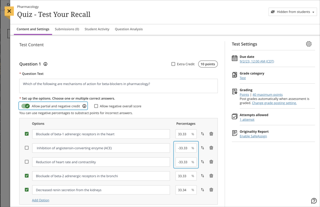
In the past, students received full credit when selecting all answer choices for a multi-select question with partial credit. This happened because there was no penalty or negative credit applied for wrong answer choices.
Now, when an instructor designs a multi-select question and allows partial and negative credit, the negative credit auto-distributes across wrong answer choices. An instructor can remove or edit the negative credit if desired.
Image 1: Partial and negative credit auto-distributed across correct and incorrect answer choices for a multi-select question
Grid view sorting controls
Sorting options in the gradebook provide a more efficient grading experience.
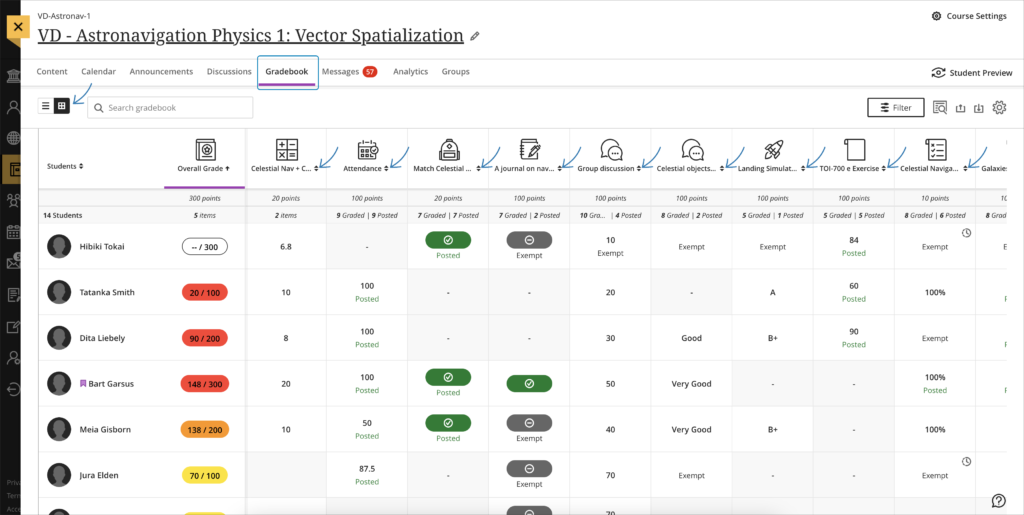
We extended the sorting options to all remaining columns in the gradebook grid view:
- SCORM
- Journal
- Group Assessment
- Group Discussion
- LTI
- Calculations
- Attendance
- Discussion
Instructors can sort records in ascending or descending order and remove any applied sorting. A purple highlight in the column header indicates sorting is applied.
Image 1: Sorting controls on all grid view columns headers
Automatic zero gradebook improvement
Instructors can configure their gradebooks to assign automatic zeros to past due work. In the past, automatic zeros were assigned to past due work regardless of a student’s course enrollment status. For example, automatic zeros were applied to past due items for withdrawn students. This was problematic as, in some cases, it skewed course data.
Now automatic zeros are assigned to past due work only if the student has an enabled course enrollment. Automatic zeroes are no longer applied to past due items for withdrawn students. This helps to ensure that academic records are preserved as they are at the time of withdrawal.
Additional image insertion and generate options
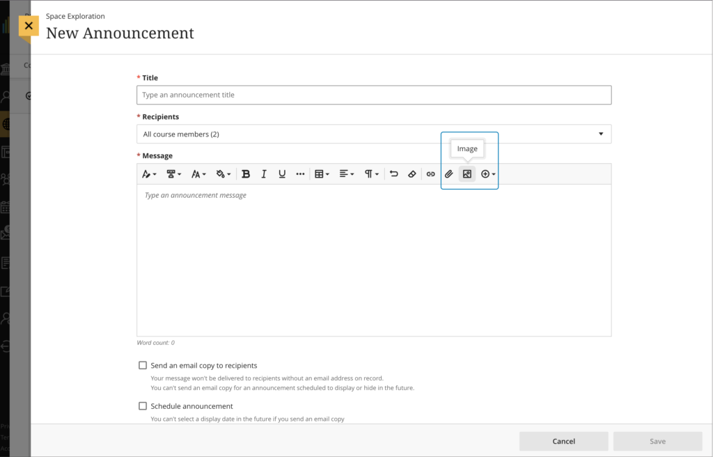
Images enhance comprehension of and engagement with course content. Instructors and students want to use high-quality images in content and submissions. To help, we have added a new image button in the content editor in the following places:
- Announcements
- Assessment Questions
- Student answers on questions (local file upload only)
- Submission feedback (standard view)
- Journal entries and comments
Image 1. Instructor view – image button on content editor for Announcements
We also added the option for instructors to generate images in journal prompts and assessment questions.
Enhancements to Grades
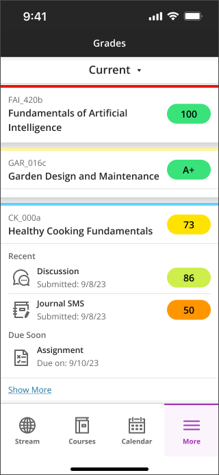
In response to user feedback, we’ve made improvements to the Grades page. The Grades page now offers more comprehensive information for students and instructors. We enhanced both the appearance and functionality.
For Instructors:
- Upcoming Grading:
Upon expansion, instructors find items that need grading. - Concise View:
We’ve limited the display to only three items at a time.
A Show More link is available, leading to the gradebook for that course. - Efficient Navigation:
Instructors can access grading tasks by selecting the respective item. - In the past, grade pills were black. Now grade pills display corresponding grade colors.
Image 1. Instructor view of Grades
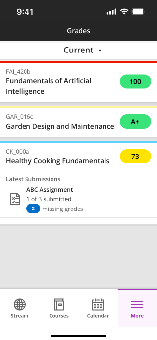
For Students:
- Upcoming Due Items:
When expanding the section, students now find items that are due within a week. - Recently Graded:
Expanded sections display items that have been recently graded. - Concise View:
To avoid clutter, we’ve limited the display to only three items at a time.
A Show more link is available, leading to the gradebook for that course. - Quick Access:
By selecting any item, users can navigate to the specific assessment or activity. - In the past, grade pills were black. Now grade pills display corresponding grade colors.
Image 2. Student view of Grades
Improved mobile experience for Course Content page
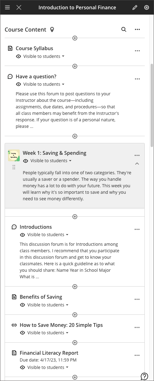
The Course Content page had several issues on mobile devices. We have made the following improvements:
- Anthology Ally icons no longer overlap with other elements on the page.
- Items nested in learning modules and folders no longer occupy as much space.
- Icons on the content page are smaller, providing more space for titles and descriptions.
- Titles and descriptions are no longer truncated. The full title and description are always visible now.
- The button to make an item visible to students or hidden from students no longer goes off the page.
Image 1. The course content page before improvements.
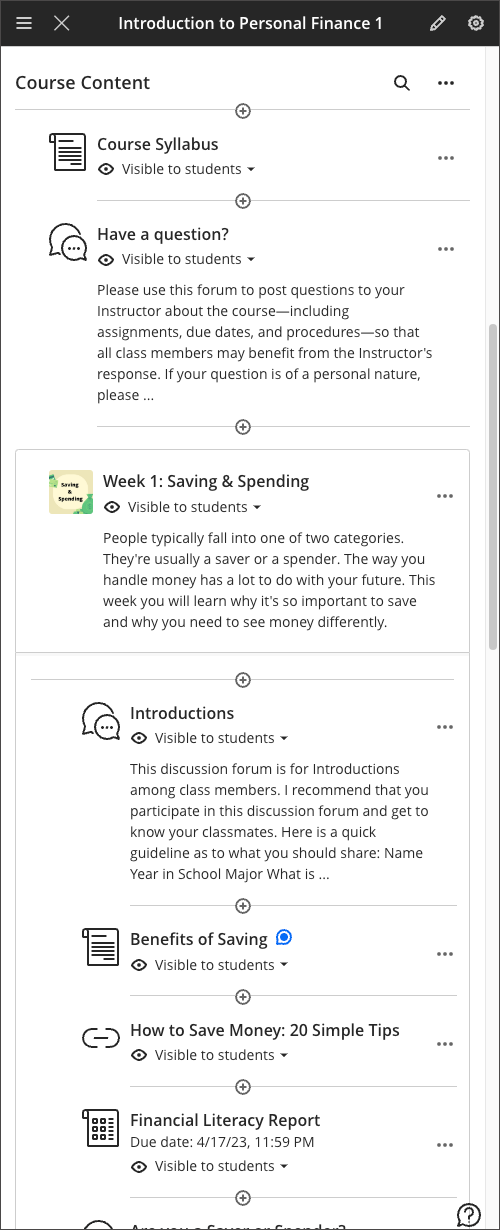
Image 2. The course content page after improvements.


Comments are closed
Comments to this thread have been closed by the post author or by an administrator.