Details April 2023
- Hotspot question: Circle Shape and Usability Improvements
- Multiple Grading Schemas: Add, Edit, Copy
- Submission page sorting controls
- Gradable Items View usability improvements
- Bb Annotate: Enhanced comments
- Course Content Title Search
- Discussion navigation improvements
- Deactivated students no longer show in student progress reports
- Course Activity Report accessibility improvements
- Updated Text for Copies and Imports
Assessment and Grading
Hotspot question: Circle Shape and Usability Improvements
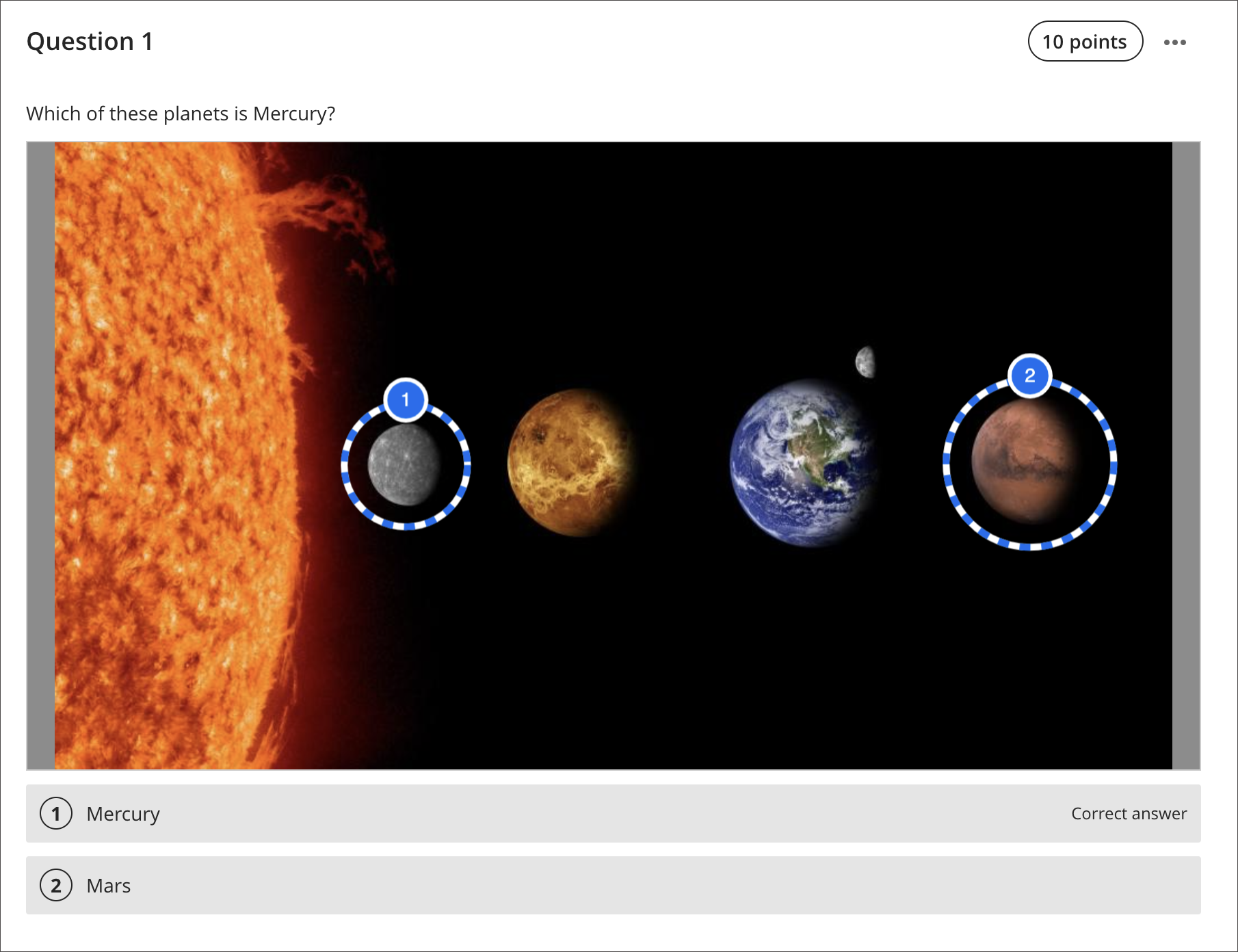
Instructors may want to assess a student’s knowledge of visual content. The hotspot question type is popular for this type of assessment. This question type is also good for reducing the potential of cueing or guessing.
Hotspot questions present an image without any answer options for students to choose. Students must mark a certain area of the image that is within the area the instructor defined as correct.
We continue to improve this question type:
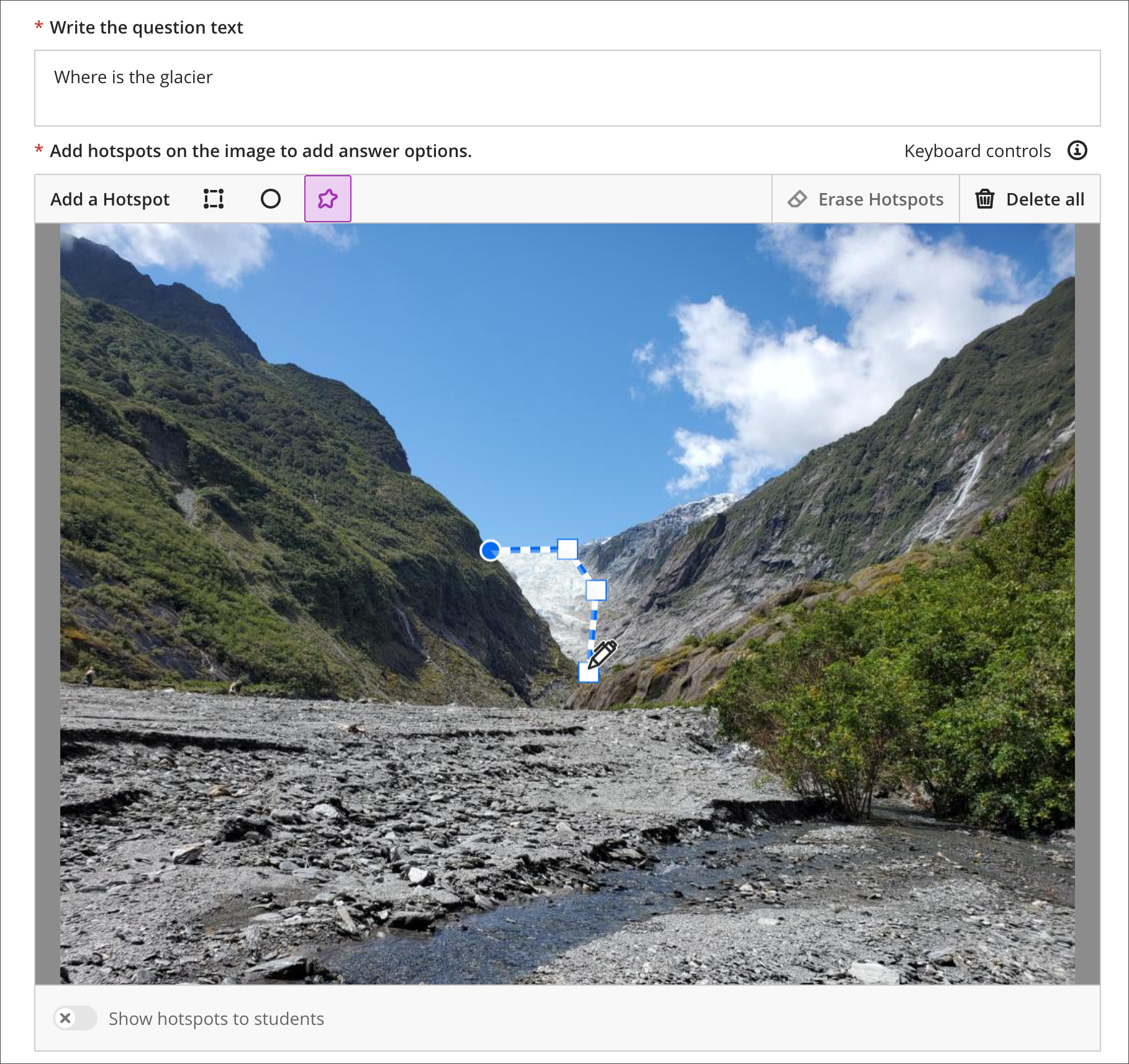
- Instructors may now use a circle-shape selector to draw a circle to mark the hotspot.
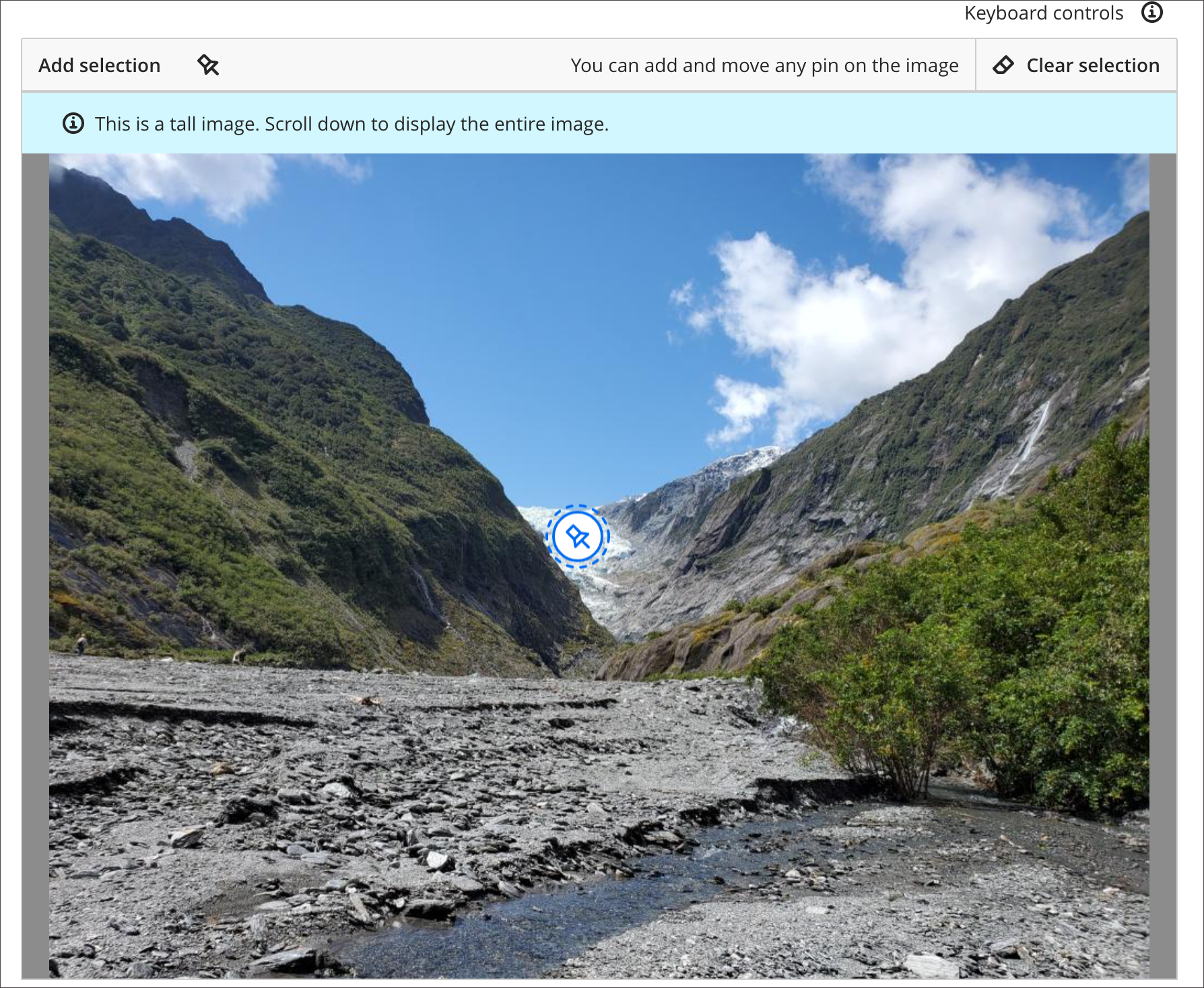
- Now when students select the image, a pin is automatically placed on the selection.
- The polygon shape selector and selected pins have improved color contrast.
Image 1. Instructor view – Add circle hotspots to an image
Image 2. Instructor view – Color change for first point in polygon shape
Image 3. Student view – Color change when student selects a pin
Multiple Grading Schemas: Add, Edit, Copy
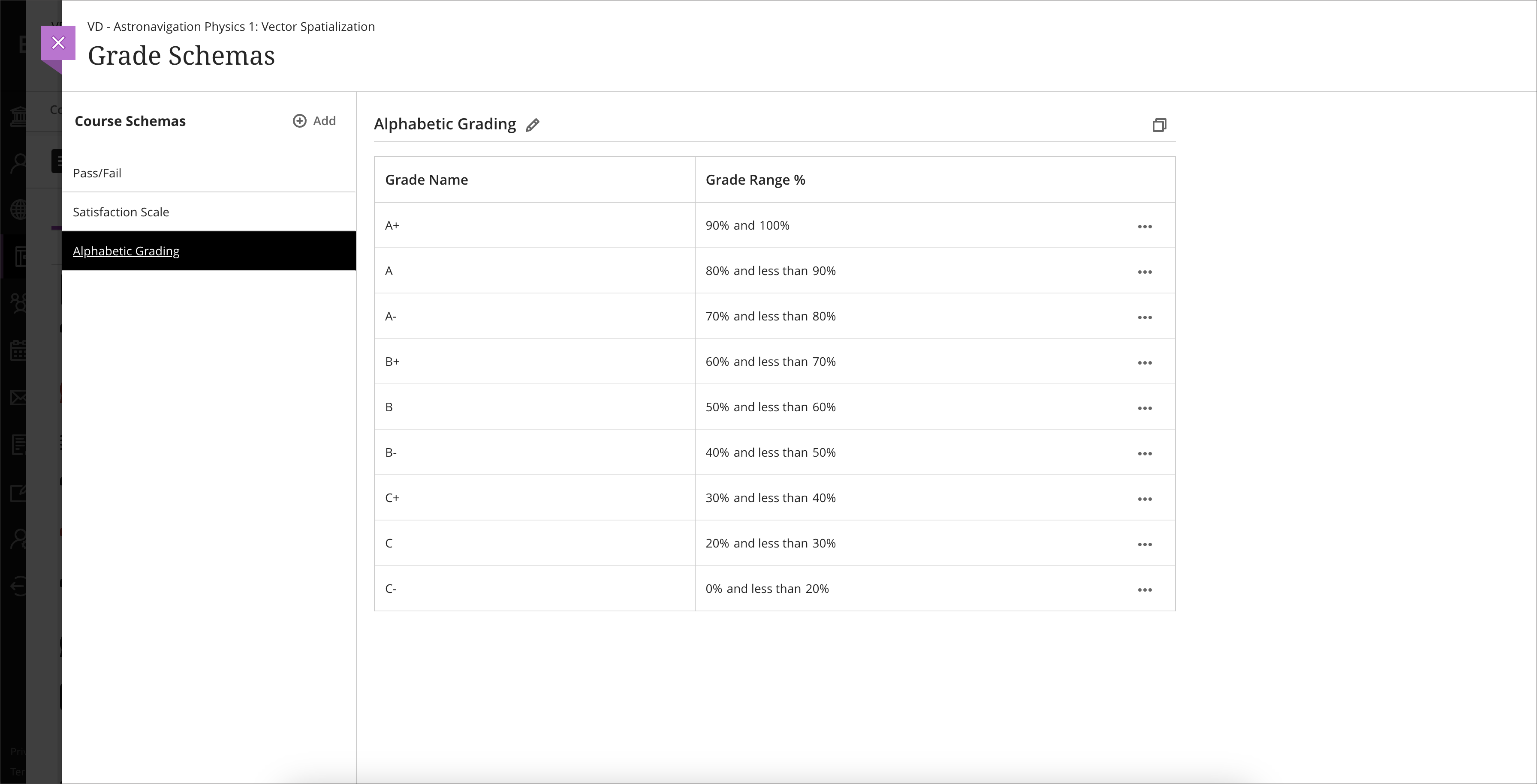
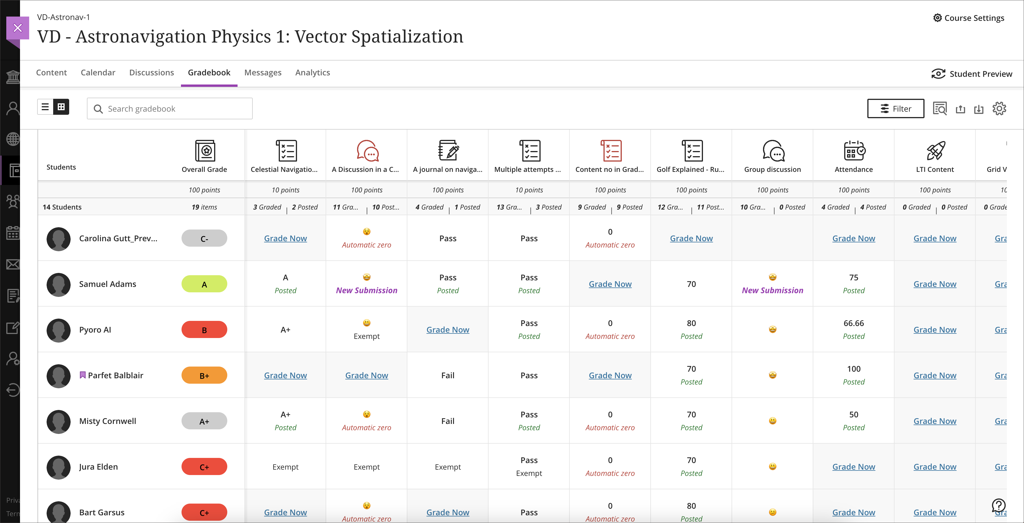
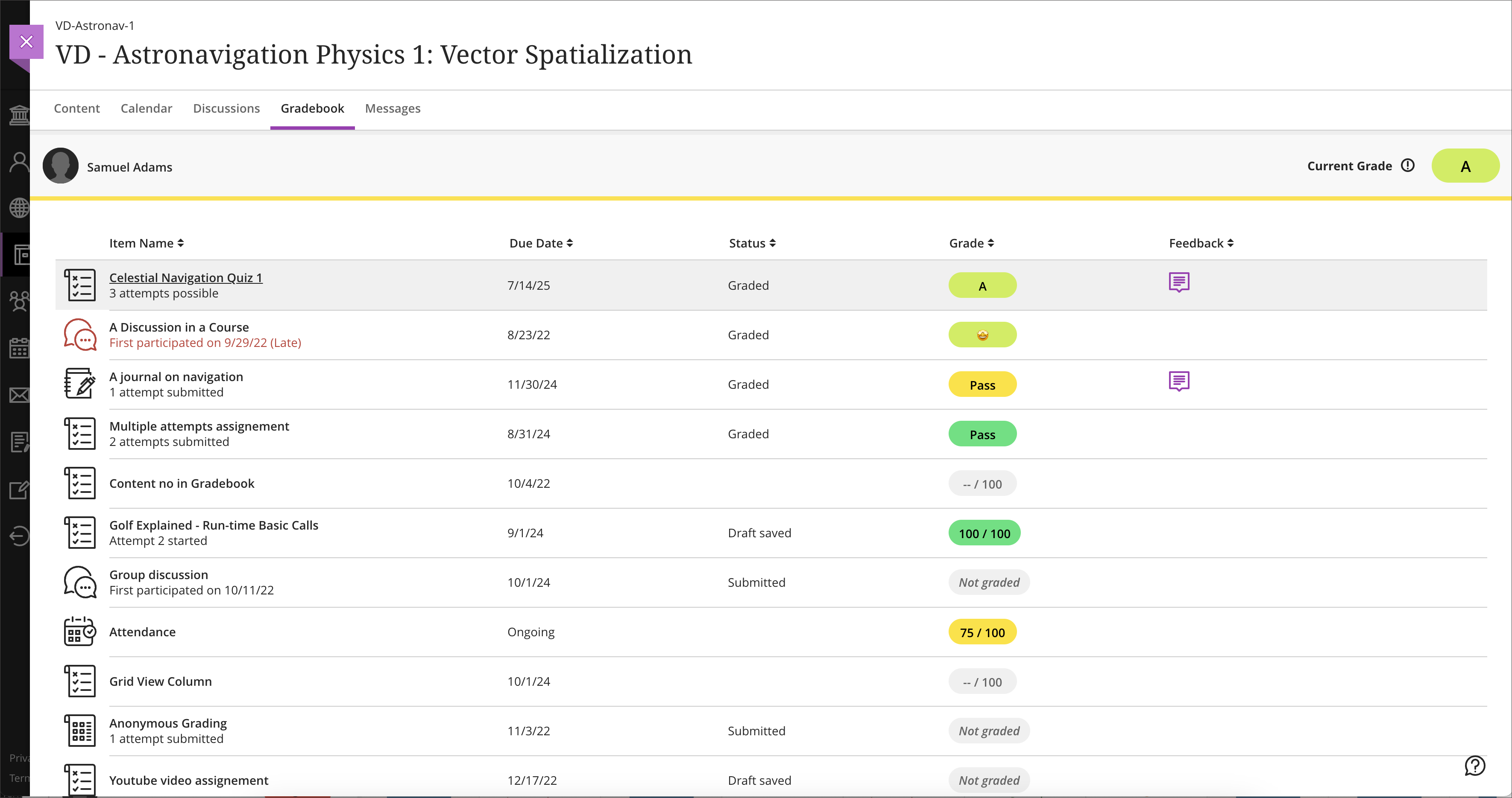
In the past, Ultra courses allowed only one grading schema per course. Now instructors can add, copy, and edit up to 100 grading schemas per course. Items copied from other courses will keep their grading schemas. When copying, any configured schemas copy even if not aligned to gradable items.
Instructors can now choose the best grading schema for each assessment in a course.
Image 1. Grading schema creation
Image 2. Instructor view – Grading schema gradebook grid view
Image 3. Student View – grading schema
Submission page sorting controls
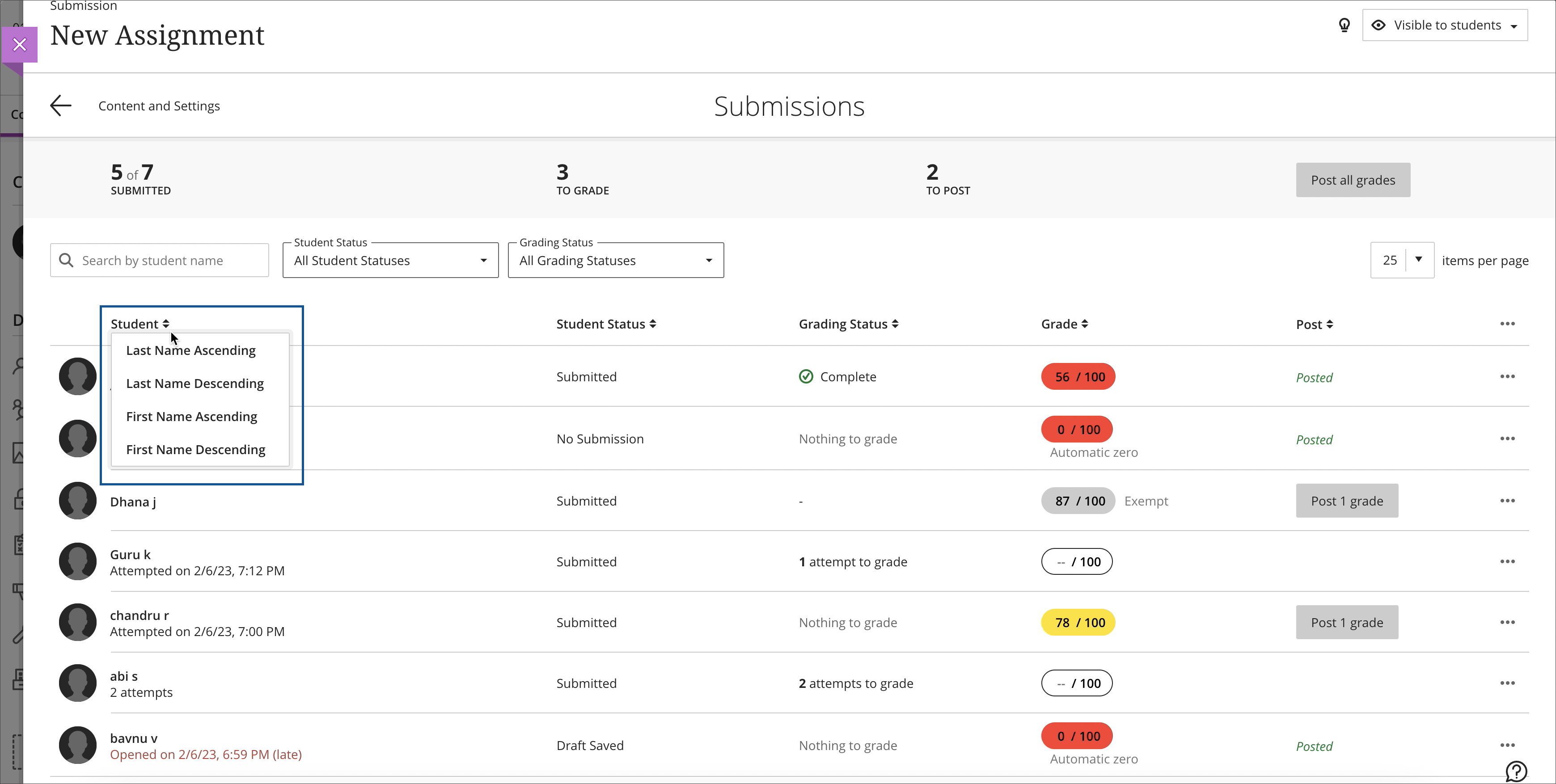
Record sorting provides a more efficient grade review experience. Instructors may wish to sort students by grade to identify submissions at a grade boundary. This helps instructors make any changes necessary before posting grades.
Any sorting applied yields a temporary change to the sort order of all columns on the Submissions page.
Instructor view – sorting students by name
Gradable Items View usability improvements
It is important for the gradebook to support efficient workflows. We have made several improvements to improve the Gradable Items View:
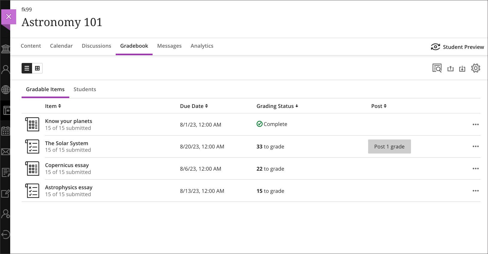
- Instructors can now sort the records of any column on this page. Sorting helps instructors more easily find the desired information. For example, instructors may sort on Grading Status to locate assessments that need grading.
- Selecting the assessment name now navigates the instructor to the selected assessment.
- Selecting ‘# to grade’ now navigates to a Needs Grading filtered Submissions page. This provides instructors with quick entry into the grading process.
- The new Post column provides instructors with status information for an assessment. This also simplifies the action to post all grades for the assessment.
Image 1. Instructor view – Sorting by Grading Status
Bb Annotate: Enhanced comments
It is important for instructors to provide rich and meaningful feedback for students. We have improved formatting and editing options for instructors.
- Instructors can now include richer formatting in comments. This includes font colors, bold, underline, and hyperlinks.
- Instructors can now edit already placed comments.
Course Content Title Search
It is sometimes difficult to remember the location of a course item. In the past, locating an item was a time-intensive task and unintuitive. Searching for the item would involve opening every folder or learning module to find the item.
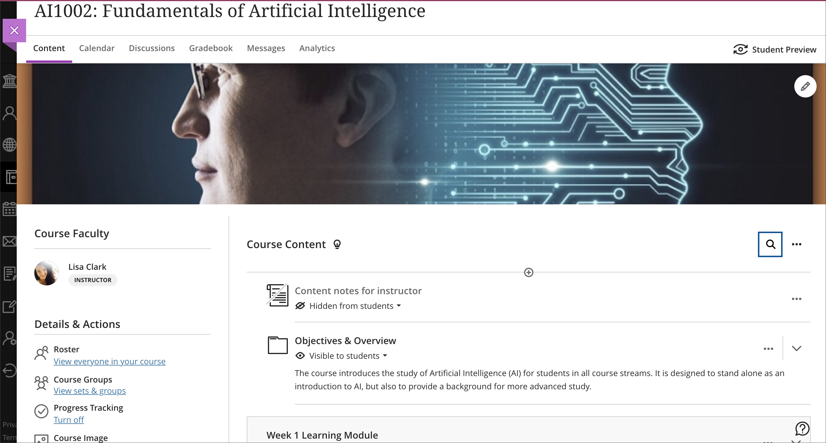
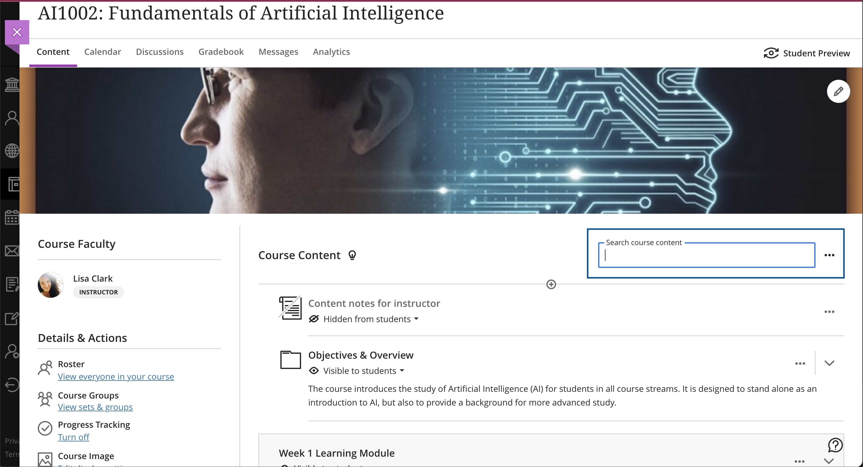
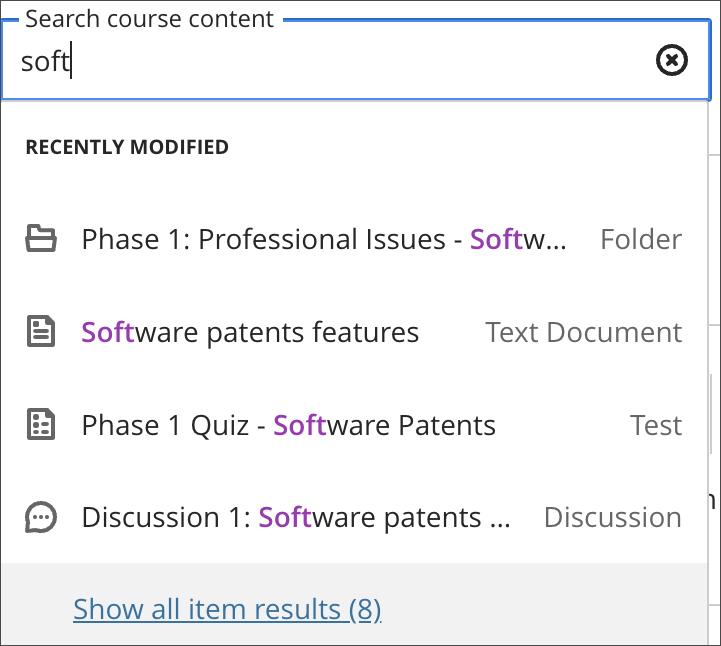
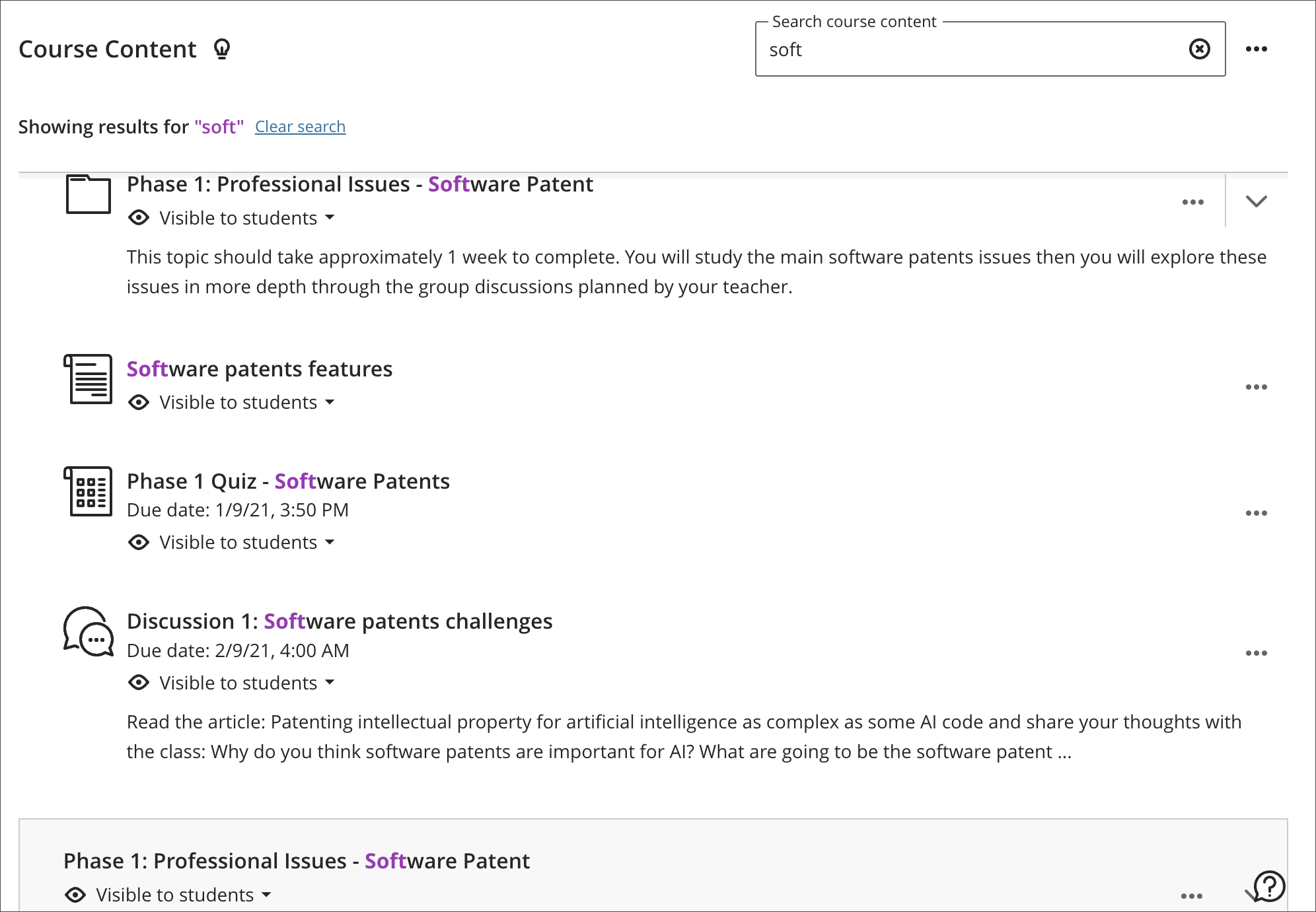
You can now search course content titles to find these items on the course content page. The course search icon, a magnifying glass, is easy to find at the top of the course content page. When a user types a few letters, the course search function displays a list of matching items by title. A user may expand the search results to view more information related to the course item(s).
Image 1. Course content with course search icon in top right
Image 2. Course Search Text Box
Image 3. Course Search findings
Image 4. “Show all item results” window
Image 5. “Clear search” option
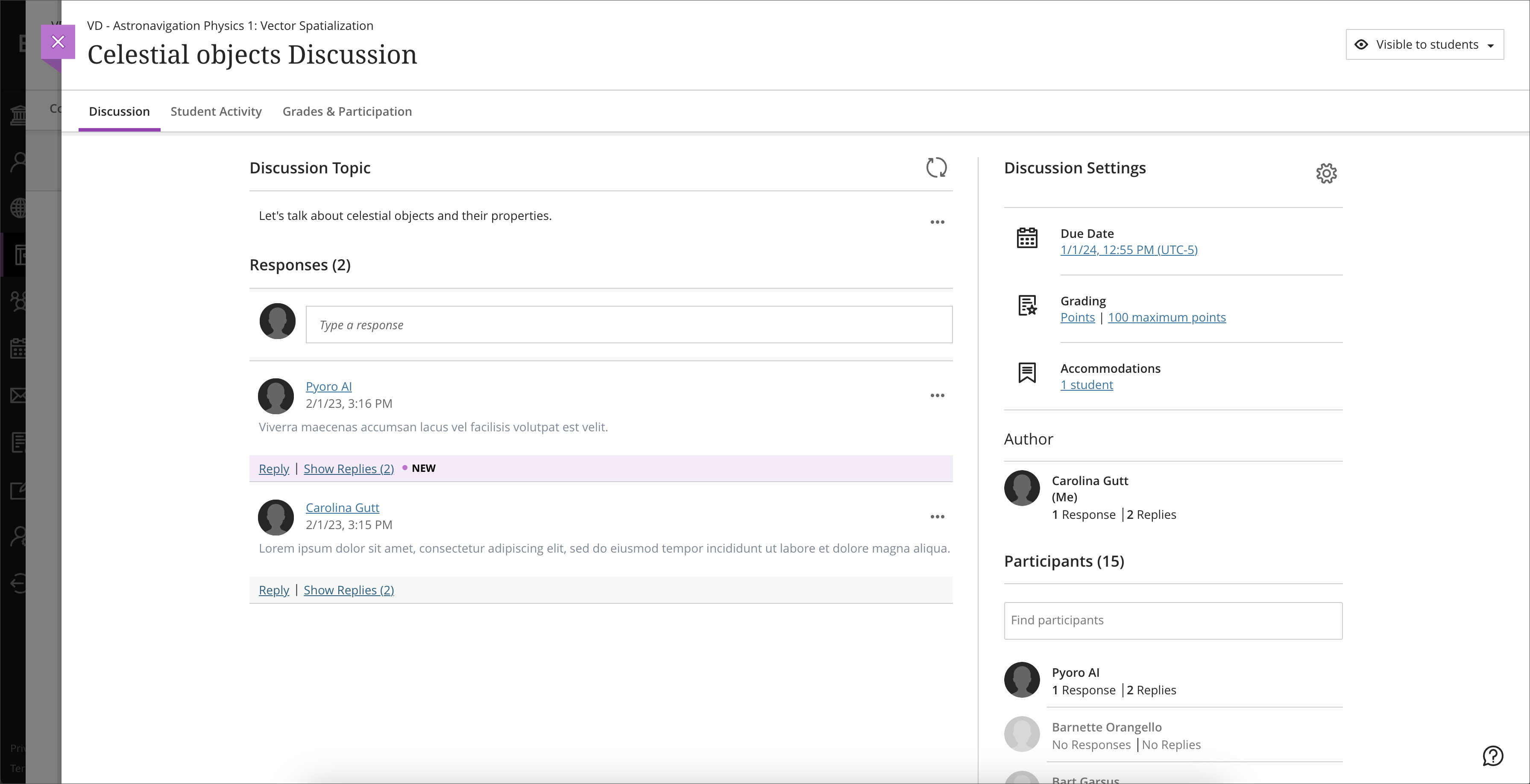
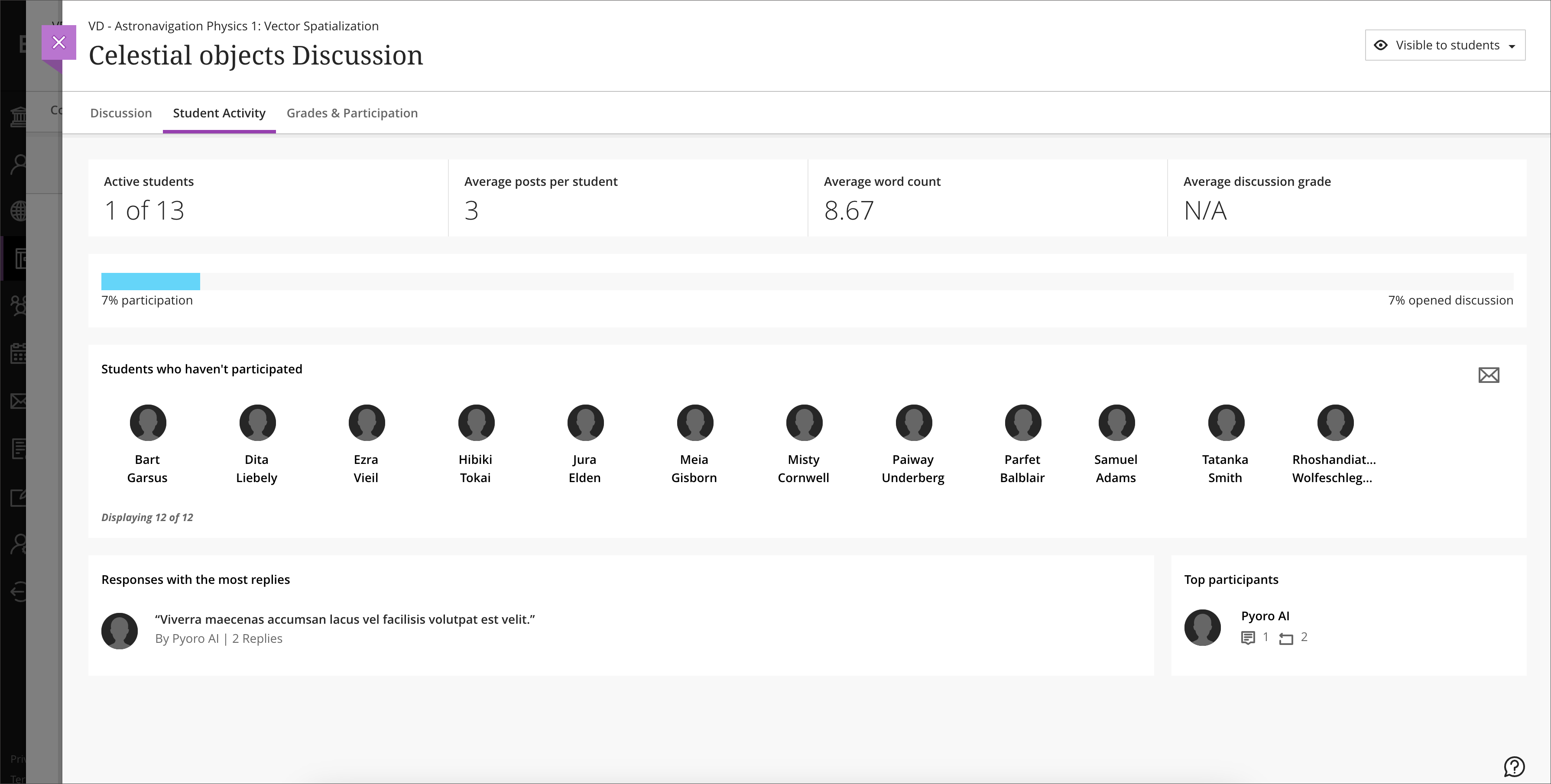
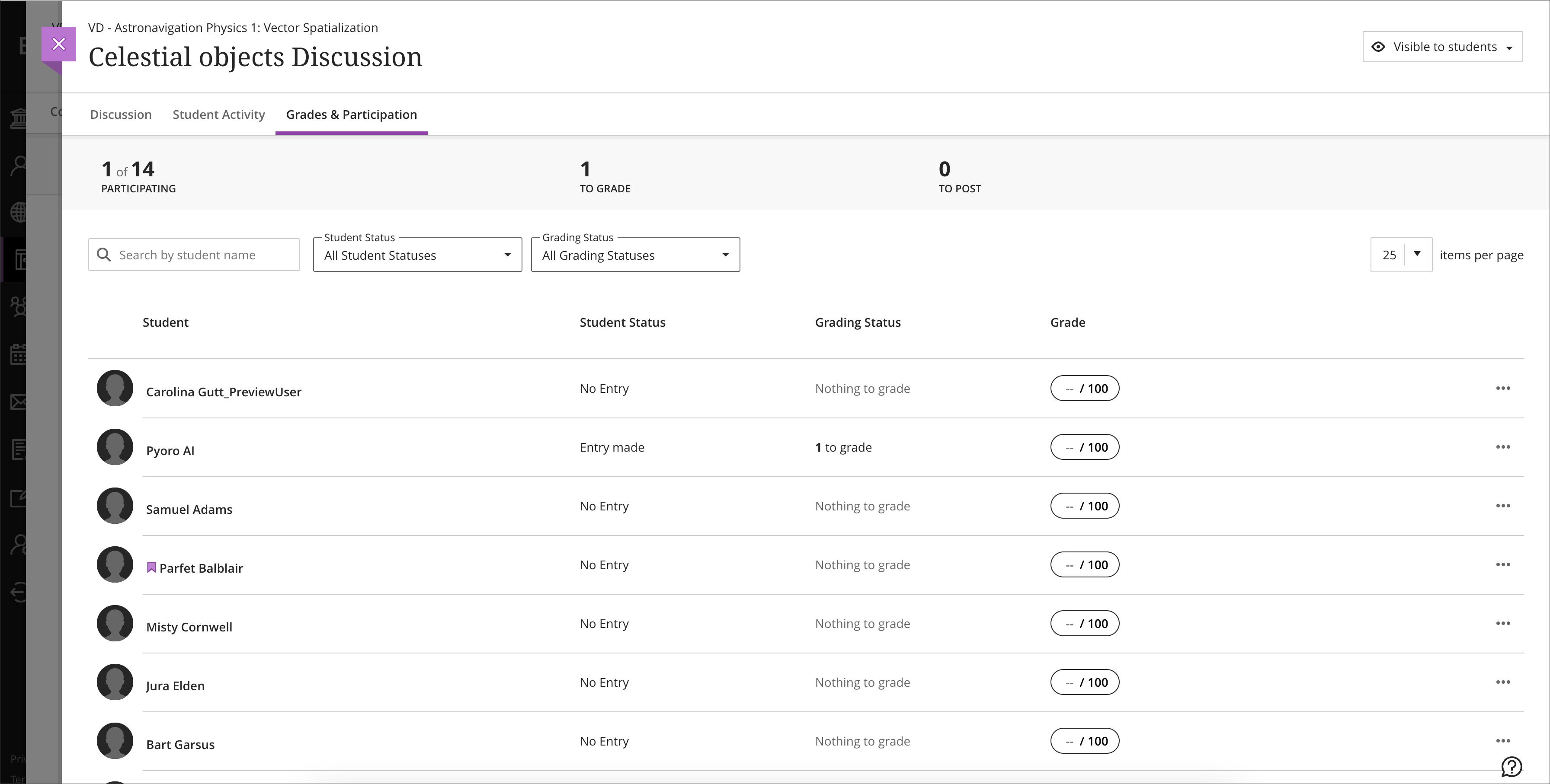
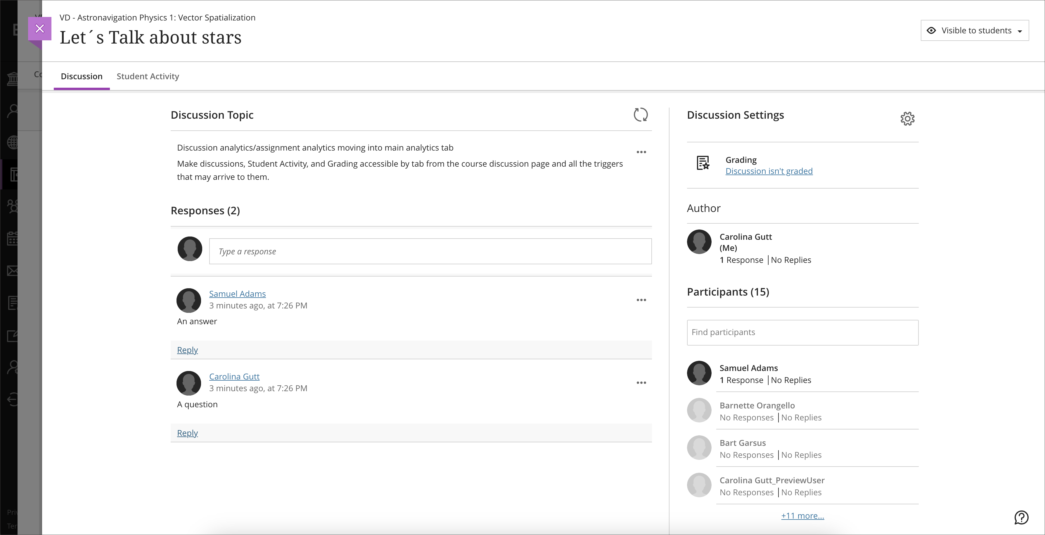
Discussion navigation improvements
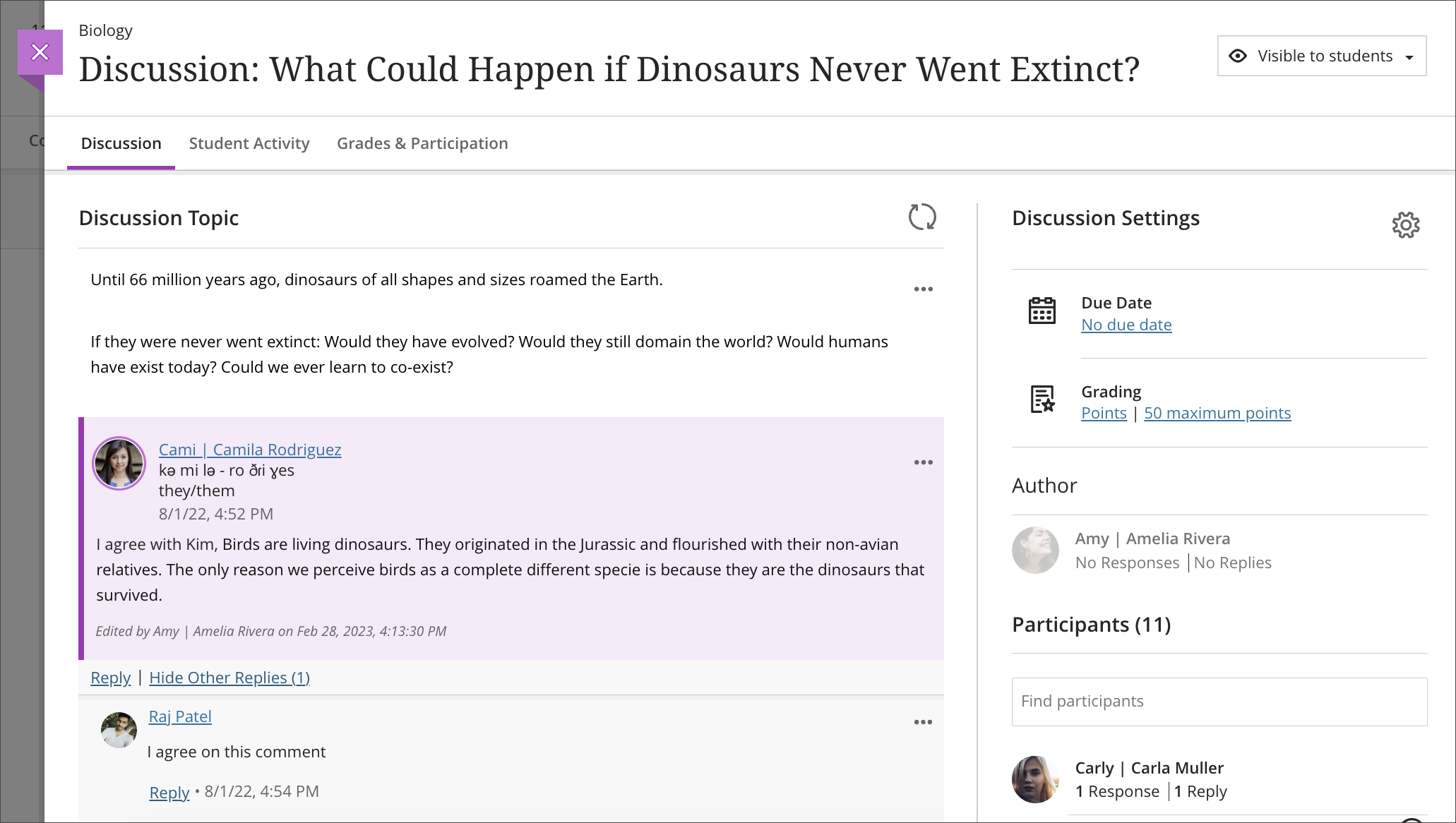
Instructors often review various aspects of course discussions to assess and engage students. To improve navigation and increase visibility, we have introduced a new tab navigation:
- Discussion
- Student Activity
- Grading & Participation
The Grading & Participation appears only when the discussion is marked for grading.
Image 1. Discussion tab
Image 2. Student Activity tab
Image 3. Grades & Participation tab
Image 4. Tab options when a discussion is not marked for grading
Data & Analytics
Deactivated students no longer show in the student progress reports
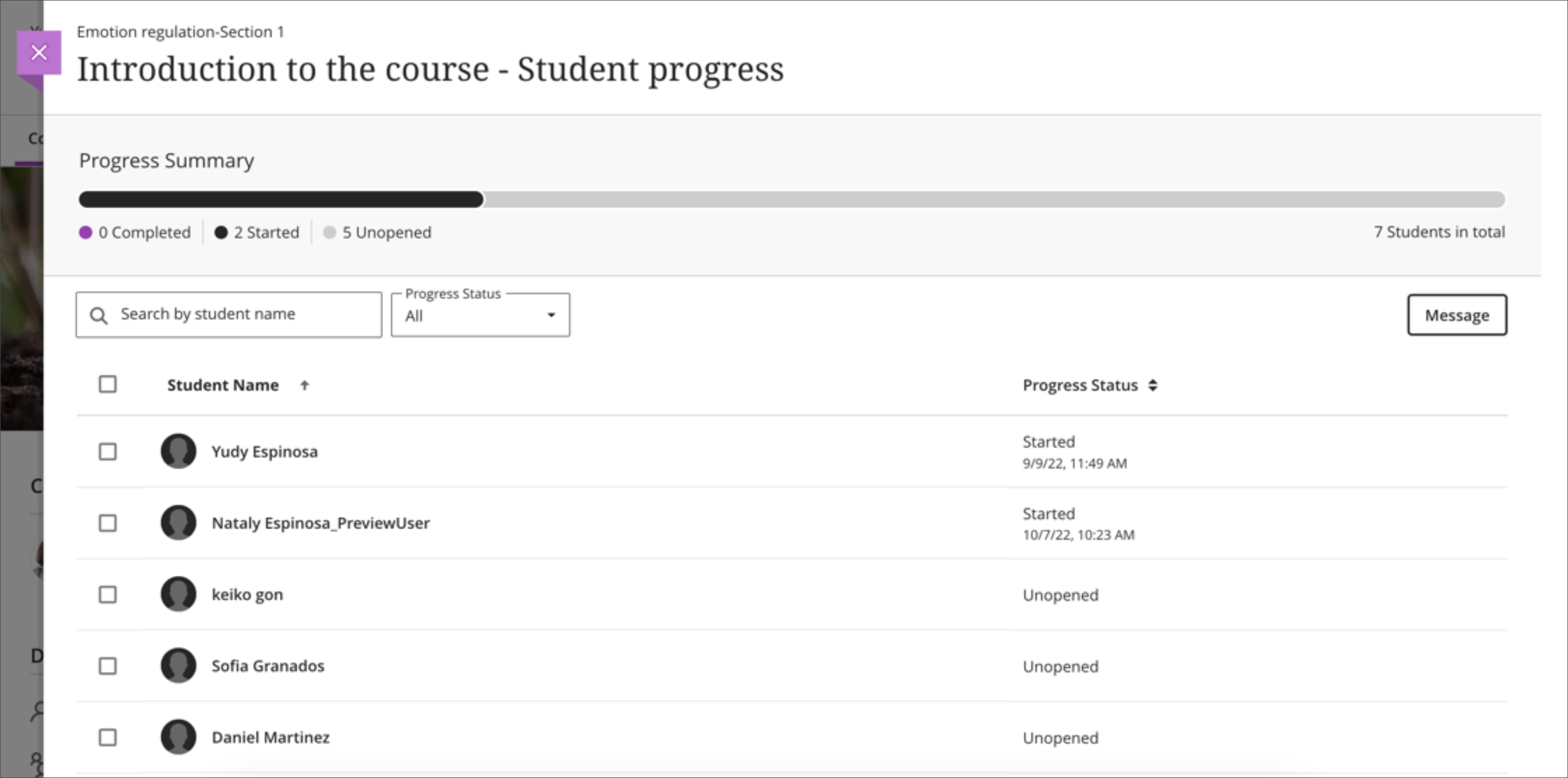
Instructors want to know their students’ engagement with course material. The per item progress report offers the information needed, such as if a student has started or if an item is unopened. Now this report excludes deactivated students. This may happen when a student drops the course. The numbers in the report are aligned with the actual number of active students in the course. Students who cannot access the course but are not deactivated will continue to display. These students who cannot access are identified in the report.
Image 1. Progress report before and after students have been deactivated.
Before:
After:
New access points to Student Overview
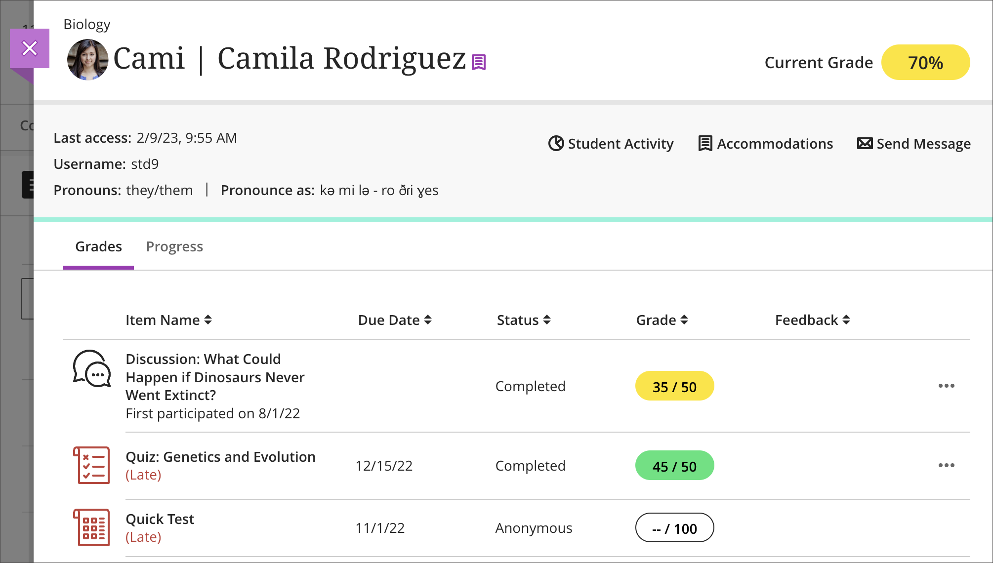
Quick access to student information is helpful during the grading and feedback process. The Student Overview page provides the most important information for each student.
Image 1. Student Overview
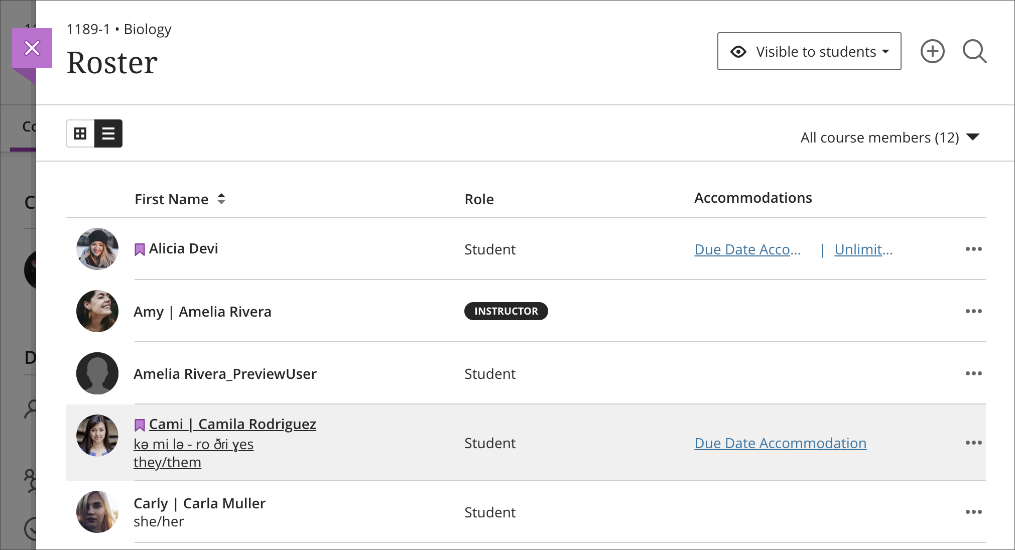
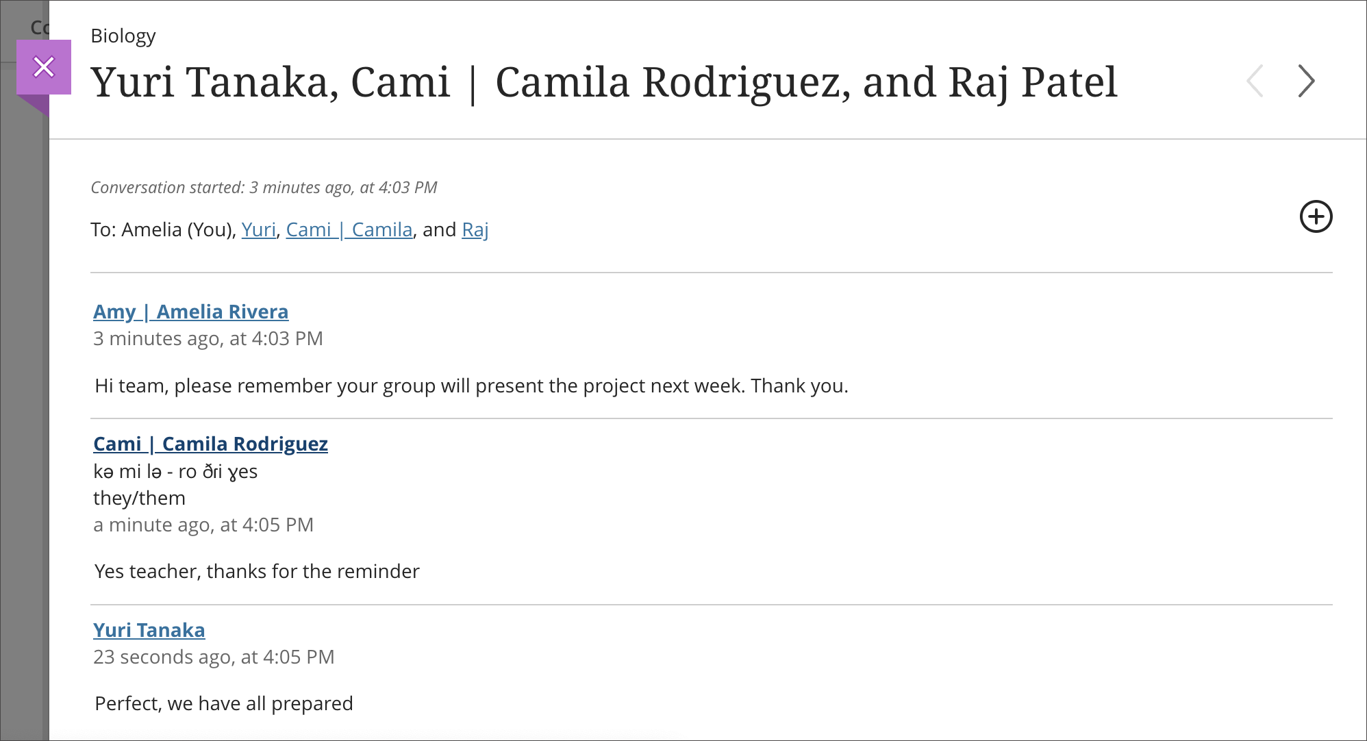
Now instructors can access the Student Overview page in 3 locations:
- Roster
- Messages
- Discussions
These additional access points provide instructors with convenient access to this student information. As before, instructors can continue to reach this page by selecting a student in the Gradebook.
Image 2. An instructor may access the Student Overview by selecting a student from the Roster
Image 3. An instructor may access the Student Overview by selecting a student in the conversation participants section of a Message or in a Message thread
Image 4. An instructor may access the Student Overview by selecting a student in a discussion response or reply
Most of the time when closing the Student Overview, the instructor will return to the point of access. However, if navigating deeply and opening many panels, there may be times when navigation varies. An instructor may return to the student list in the Gradebook when closing the Student Overview. This navigation is designed to avoid circular referencing.
Course Activity Report accessibility improvements
We commit to providing accessible and inclusive solutions for all users. Many users navigate Ultra using assistive technologies. To better support instructors using assistive technology, we have made several accessibility improvements to the Course Activity Report:
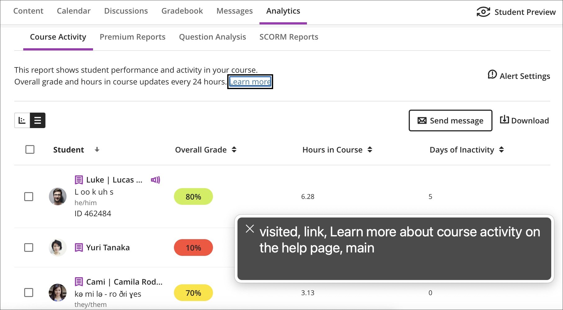
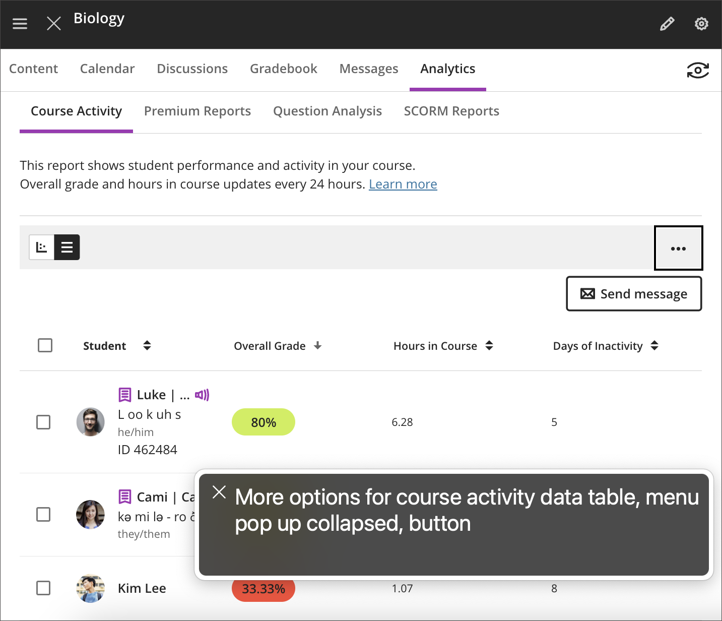
- The description of the Course Activity Report includes a “Learn more” link. Now the screen reader states this link, directing the instructor to the related Help documentation.
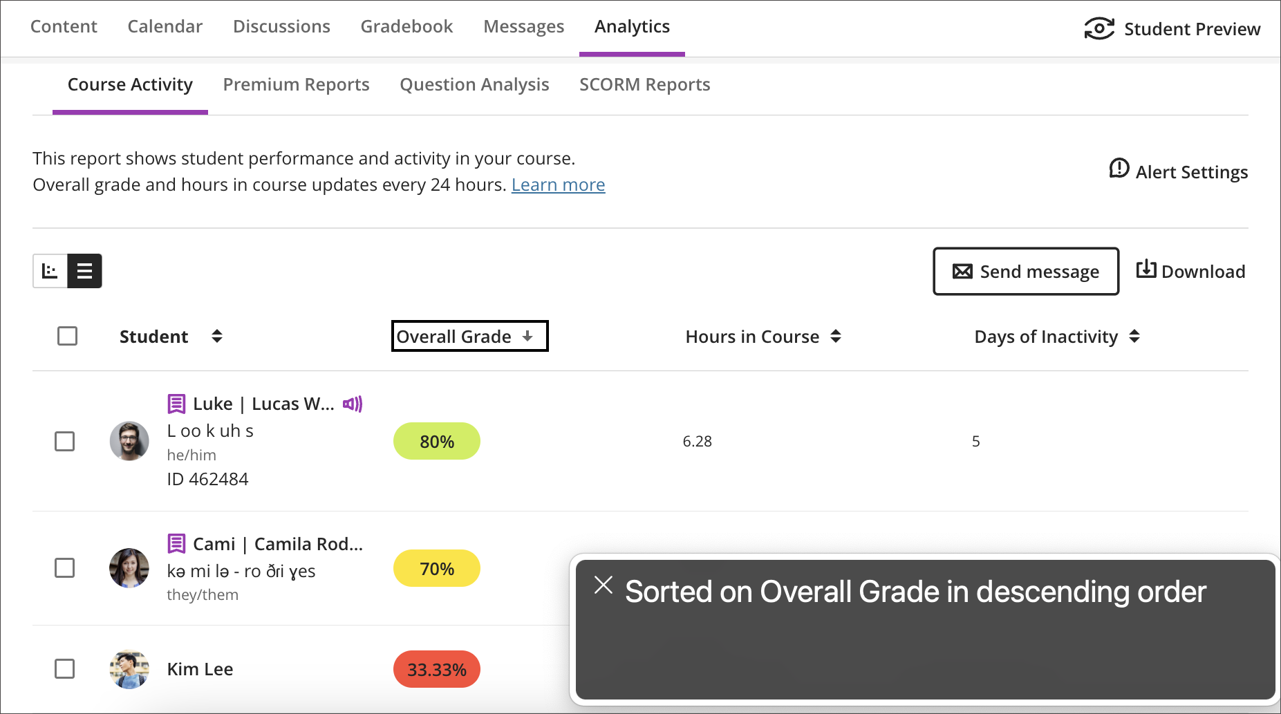
- Instructors can sort data on any column. Now screen readers indicate if column sorting is in ascending or descending order.
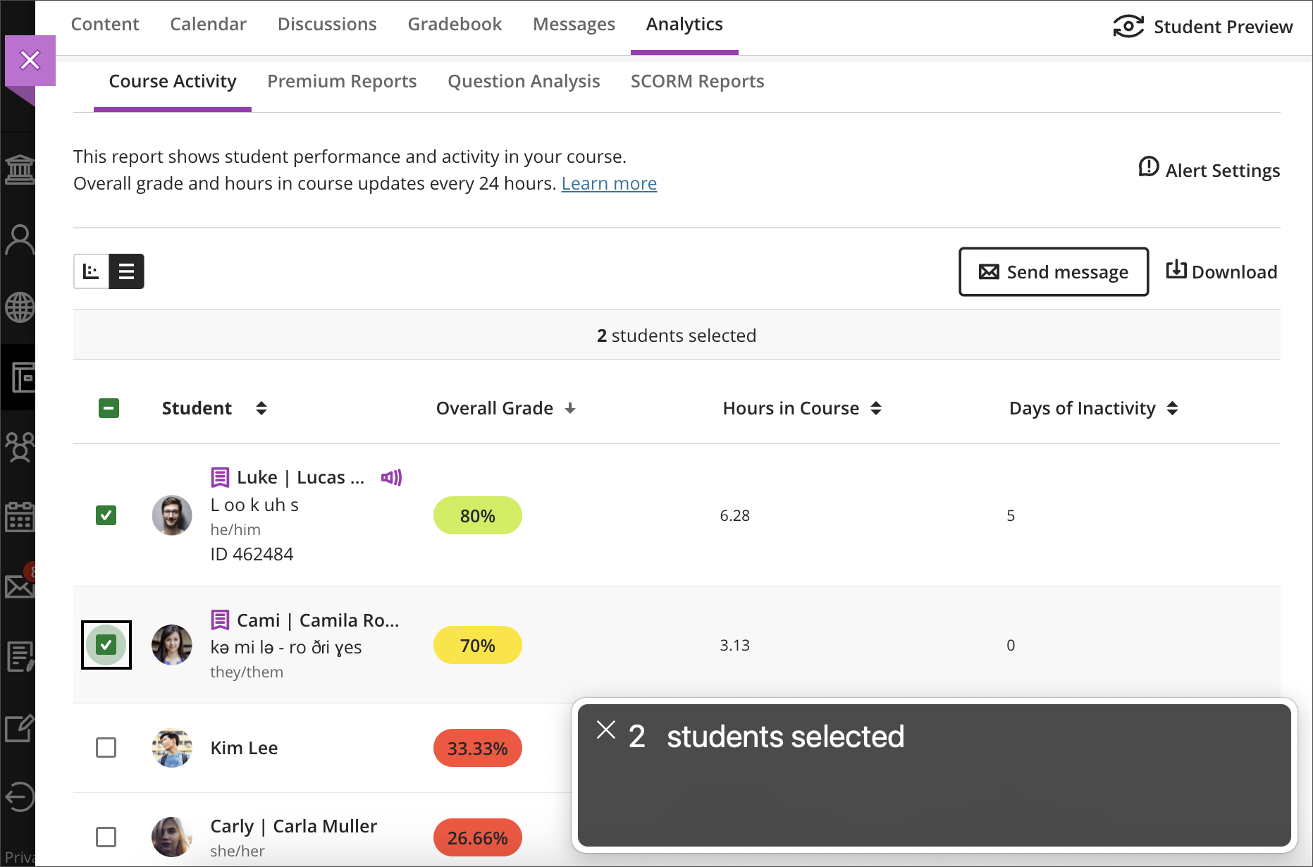
- Instructors can select many students to send messages. Now screen readers state the number of students selected.
- Screen readers now state when an instructor selects or deselects all students.
- In medium and small screens some options of the Course Activity Report combine in a single drop-down menu. Now screen readers state that the 3-dot menu contains more options.
Image 1. The screen reader indicates the “Learn more” link directs the user to the related help page
Image 2. The screen reader indicates that sorting is applied to the Overall Grade in descending order
Image 3. The screen reader indicates that 2 students are selected
Image 4. The screen reader indicates that the 3-dots button displayed in medium and small screens contains more options
LTI Tool Content: Standardize default icons
Blackboard are moving to ensure that there is standardization of LTI icons that have not been defined by the institution. This means that some LTI tools will now revert to showing the rocket icon. We are working to add LTI icons for all of our tools that have not already been set by suppliers but the rocket icon will show in the meantime.
These icons appear in these locations in the base navigation and Ultra course:
- Content Outline
- Gradebook grid view
- Gradebook list view
- Gradable Items tab
- Students Grades Overview
- Grades tab on Base Navigation
- Course Calendar Day Schedule
- Course Calendar Day Due Dates
- Base Nav Calendar Day Schedule
- Base Nav Calendar Day Due Dates
- Books & Tools
- Base Nav Calendar
- Overall Calculations
Image 1. LTI Tools default icon as shown on the Course Content page
Updated Text for Copies and Imports
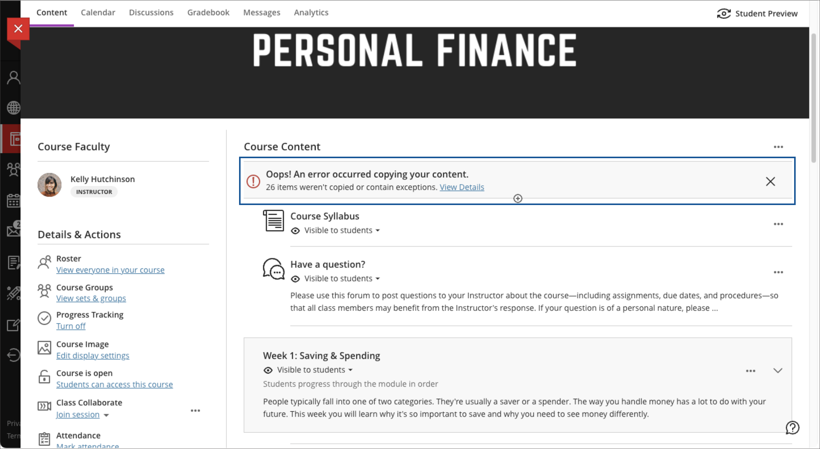
When copying entire courses or individual items from courses, instructors may have seen the following message: “Oops! An error occurred copying your content”. The message has created concerns when copying materials from Original courses. The text gives the impression that there are a lot of errors with copy and conversion. Yet, most exceptions are notifying instructors of changes during conversion.
Image 1. Misleading Error Message
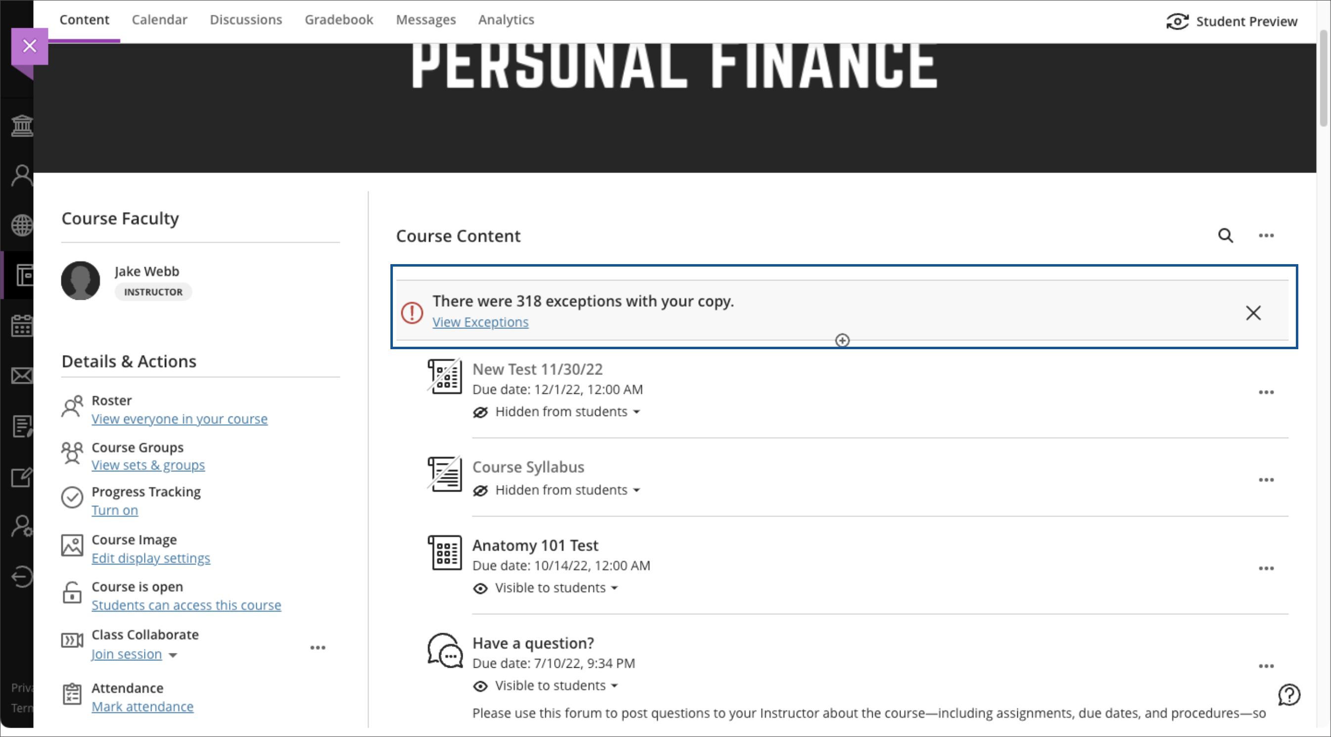
We have updated the message to reduce the association of exceptions with errors. Exceptions are for the most part changes to content during conversion. Our hope is that this change will reduce fear when copying from Original courses.
Image 2. Updated Error Message
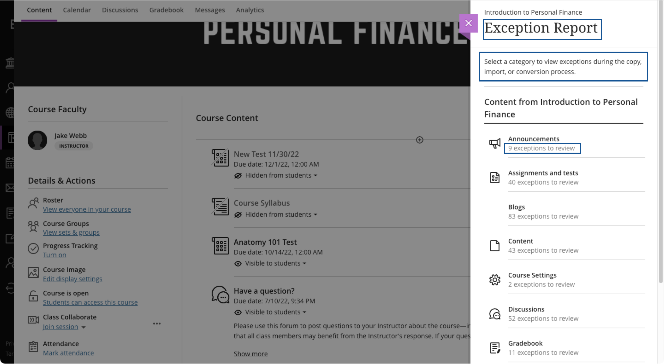
Another example of where we have made a change is with the results from a copy, import, or conversion. Before, instructors would see this message under each category: “# items were not copied”. The message gave the impression that each exception message was a failure to copy, which is not true.
Image 3. Misleading Text on Copy Results
We have updated the message to inform users that they have exceptions to review.
Image 4. Updated Text on Copy Results





Comments are closed
Comments to this thread have been closed by the post author or by an administrator.